Spotting Bad Data Visualizations
Good (or bad) Data visualizations can significantly help (or hurt) your case. Learn more about how poorly people can spot bad data visualizations.
To explore how people identify and respond to bad data, Software Advice created an online survey, collecting nearly 800 total responses from randomly selected U.S. adults. We also spoke to data visualization experts for advice on how you should be presenting your data. Here’s what we found.
Most People Can Spot Bad Data Visualizations
When it comes to making mistakes in your charts, graphs and other visual data representations, do people really notice? According to our survey, they do - 56% have correctly identified bad visualizations.
Which of the following charts/data visualizations have something wrong with them?
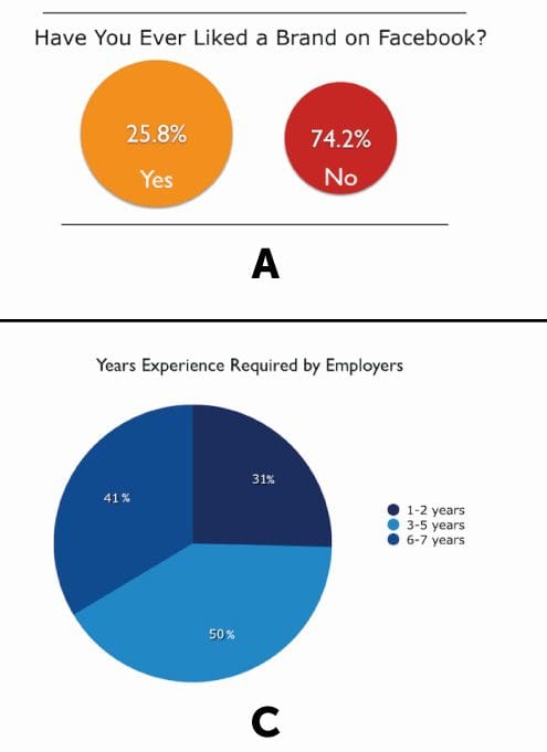
The first option was an image portraying percentages of “yes” and “no” answers, scaled with incorrect proportions. This faulty visualization was correctly identified as problematic by 22 percent of respondents. The third option was a pie chart with percentages that added up to more than 100 percent. This poorly-presented visualization was correctly identified as problematic by 34 percent of respondents.
Which of the following charts/data visualizations have something wrong with them?
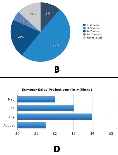
Two of the other options (B and D) were charts that had nothing wrong with them. Nonetheless, these were still identified as “wrong” by a combined 20 percent of respondents. The final choice, which was “none of these” (and was incorrect, as two of the options were, in fact, wrong), was selected by 24 percent of respondents.
Excerpted from Software Advice, a data visualization software review site.
Read more in the original post Survey: Are Your Data Visualizations Negatively Impacting Your Company?.
Related:
- Data Visualization of Census Data with R
- Top KDnuggets tweets, Jun 20-22: Great visualization of English letters; Good list of R functions to manipulate data
- MicroStrategy Analytics Desktop – visual tool, free download