Open Source Enabled Interactive Analytics: An Overview
Explaining the aspects of creating an interactive data driven dashboard using open source technologies i.e. MongoDB, D3.Js, DC.JS and Node JS.
By Anmol Koul (Wincere).
Over the past couple of years we have seen the emergence of open source visualization libraries as a viable alternative to the traditional BI tools like Qlik, Spotfire, Tableau etc.
While these tools are really powerful and help bringing insights quicker to the business, their web integration as a part of a web based application leaves some things to be desired. Embedding your analysis into a web app using these tools is possible but I will not call it perfect.
Open source libraries on the other hand are a bit coding intensive as you will not get an easy GUI interface like the tools but then you can customize them to your (business) hearts content. Once we are comfortable with the visualization libraries we can move from basic charts to advanced charts.
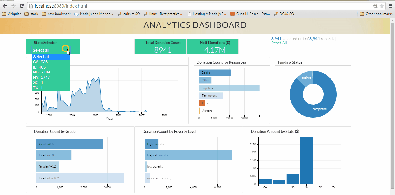
Fig 1. Analytics Dashboard (click on the image to see large animated gif showing dynamic visualization)
Here our visualization model is made up of five core components:
- MongoDB: Our friendly NoSQL database which is hosting our data. MongoDB stores the data in a document format which makes it schema less and saves us from the traditional RDBMS issues.
- D3.JS: The library powering our visualizations. D3 is a JavaScript library which allows data visualization by allowing manipulation of data and creating visuals for the web.
- DC.JS: is an awesome wrapper library for D3.JS. Using DC helps us to create visualizations quickly and efficiently by utilizing wrappers built on top of D3.
- Node.JS: Our web server which will host the data from MongoDB as an API and then will host our web app.
- Crossfilter.JS: Crossfilter is a JavaScript library for exploring large multivariate datasets in the browser. It enables drilldowns and crosslinking within our data so our charts become reactive.
The Visualization engine flow is as follows:
Step 1: The data already exists in your MongoDB instance. Otherwise we load some data into MongoDB. I believe MongoDB can act as a robust data mart. If you are implementing a big data stack with Hadoop and all, MongoDB can serve as a really nice data staging platform. Using Apache Spark we can automate the ETL on the Hadoop data and bring it into MongoDB
Step 2: The Node JS server setup. Call the node routes to fetch data from MongoDB and assign them an address where the data will be hosted. Node JS is a very capable and scalable web server and I find it to work very well for analytics applications. It is really easy to perform custom querying on MongoDB using Node JS, so you can avoid data transfer overhead. The data is served as JSON which is really good for us as D3 works really well with JSON.
Step 3: The frontend Setup. We ingest the API data into our Crossfilter instances and define dimensions and groups. The good thing here is since it is all programmable JavaScript, you can write custom map reduce functions to tailor the data to your needs. Create a web page and insert your charts into it. Crossfilter and DC.JS ensure that the charts are dynamic and good looking. Do thank D3 for enabling these features.
Customize the app to your heart’s content, make custom JavaScript dropdowns, advanced analytics, map charts, filters and what not. Imagination and JavaScript is the limit here.
For a detailed view of the whole process with step by step implementation please go to
http://anmolkoul.wordpress.com/2015/06/05/interactive-data-visualization-using-d3-js-dc-js-nodejs-and-mongodb
Happy Visualizing!
Bio: Anmol Koul learned quite a bit about the different tools and technologies in the market. His hobbies include playing Basketball, Badminton and contemplating whether the Avengers are better than Justice league.
Related