Lift Analysis – A Data Scientist’s Secret Weapon
Gain insight into using lift analysis as a metric for doing data science. Understand how to use it for evaluating the performance and quality of a machine learning model.
By Andy Goldschmidt, Akanoo.
Whenever I read articles about data science I feel like there is some important aspect missing: evaluating the performance and quality of a machine learning model.
There is always a neat problem at hand that gets solved and the process of data acquisition, handling and model creation is discussed, but the evaluation aspect too often is very brief. But I truly believe it's the most important fact, when building a new model. Consequently, the first post on this blog will deal with a pretty useful evaluation technique: lift analysis.
Machine learning covers a wide variety of problems like regression and clustering. Lift analysis, however, is used for classification tasks. Therefore, the remainder of this article will concentrate on these kind of models.
The Reason Behind Lift Charts
When evaluating machine learning models there is a plethora of possible metrics to assess performance. There are things like accuracy, precision-recall, ROC curve and so on. All of them can be useful, but they can also be misleading or don't answer the question at hand very well.
Accuracy [1] for example might be a useful metric for balanced classes (that is, each label has about the same number of occurrences), but it's totally misleading for imbalanced classes. Problem is: data scientists have to deal with imbalanced classes all the time, e.g. when predicting if a user will buy something in an online shop. If only 2 out of 100 customers buy anyway, it's easy for the model to predict everyone as not buying and it still would achieve an accuracy of 98%! That's absolutely not useful, when trying to assess the model's quality.
Of course, other metrics like precision and recall give you important information about your model as well. But I want to dig a bit deeper into another valuable evaluation technique, generally referred to as lift analysis.
To illustrate the idea, we'll consider a simple churn model: we want to predict if a customer of an online service will cancel its subscription or not. This is a binary classification problem: the user either cancels the subscription (churn=1) or keeps it (churn=0).
The basic idea of lift analysis is as follows:
- group data based on the predicted churn probability (value between 0.0 and 1.0). Typically, you look at deciles, so you'd have 10 groups: 0.0 - 0.1, 0.1 - 0.2, ..., 0.9 - 1.0
- calculate the true churn rate per group. That is, you count how many people in each group churned and divide this by the total number of customers per group.
Why is This Useful?
The purpose of our model is to estimate how likely it is that a customer will cancel its subscription. This means our predicted (churn) probability should be directly proportional to the true churn probability, i.e. a high predicted score should correlate with a high actual churn rate. Vice versa, if the model predicts that a customer won't churn, then we want to be sure that it's really unlikely that this customer will churn.
But as always, a picture is worth thousand words. So let's see how an ideal lift chart would look like:
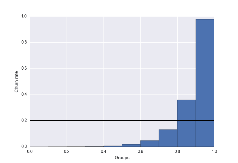
Here you can see that the churn rate in the rightmost bucket is highest, just as expected. For scores below 0.5, the actual churn rate in the buckets is almost zero. You can use this lift chart to verify that your model is doing what you expect from it.
Let's say there would be a spike in the lower scored groups; then you know right away that your model has some flaw, it doesn't reflect the reality properly. Because if it would, then the true churn rate can only decrease with decreasing score. Of course, lift analysis can help you only that far. It's up to you to identify the cause of this problem and to fix it, if necessary [2]. After improving the model, you just can come back to the lift chart and see if the quality improved.
Additionally, I drew a black line for the hypothetical average churn rate (20%). This is useful to define a targeting threshold: scores below the threshold will be set to 0, scores above to 1. In our example, you might want to try to keep customers from cancelling their subscription by giving them a discount. Then you would target all users with a score between 0.8 and 1.0, because this is the range where the churn rates are higher than the average churn rate. You don't want to pour money down the drain for customers, who have a below-average churn probability.
But What is Lift Exactly?
Until now, we only looked at nice charts. But usually you're interested in the lift score as well. The definition is pretty simple:
lift = ( predicted rate / average rate )rate in our situation refers to the churn rate, but might as well be a conversion rate, response rate etc.
Looking back at our example chart, the highest group would have a lift of 0.97 / 0.2 = 4.85 and the second highest group of 1.8. That means, if you only target users with a score higher than 0.9, you can expect to catch nearly five times more churning users than you would by targeting the same number of people randomly.
Conclusion
Just like every other evaluation metric lift charts aren't an one-off solution. But they help you get a better picture of the overall performance of your model. You can quickly spot flaws, if the slope of the lift chart is not monotonic. Additionally, it helps you to set a threshold, which users are worth targeting. Last but not least, you have a estimate how much better you can target users compared to random targeting.
I hope this first blog post gave you some new insights or you enjoyed it as a refresher. If you have any questions or feedback, just leave a comment or shoot me a tweet.
[1] Ratio of correctly labeled observations to total number of observations.
[2] There might be cases where this does not matter, e.g. when your main goal is to target everyone who churns, but it doesn't matter, if you also target some people who won't churn.
Bio: Andy Goldschmidt is a data scientist from Hamburg, Germany. He currently works for Akanoo, an onsite targeting startup. Previously he worked in the data team of a DIY website builder.
Original. Reposted with permission.
Related: