Analytics 101: Comparing KPIs
Different business units in the organisation have different behaviours (e.g. turnover rate) and they can’t be compared with each other. So, how can we tell whether the changes in their behaviour are reasons for concern?
By Thomas Speidel.

Organizations are often interested in comparing performance metrics (KPI) such as web traffic, sales, safety indicators, customer churn, turn over, defects and so on. These metrics can then be used for planning, prioritizing, reporting, or bench-marking.
Suppose a company is interested in measuring voluntary turnover rates across its business units. However, some business units, by their very nature, experience higher turnover than others. Therefore, we wouldn’t expect turnover to be the same across business units. How can we tell what’s typical for a business unit and what’s not? How can we tell whether changes in turnover should be reason for concerns?
One of the soundest approach is to compare a KPI to its own predicted range. If the observed KPI falls outside of the predicted confidence range, we should take a closer look for signs of problems.
The predicted range is typically calculated from a regression model that accounts for factors known to influence voluntary turnover: from demographics characteristics to an employee’s line of work (see: what is a regression model?).
Optimum decisions don’t consider “positives” and “negatives” but rather the estimated probability of the outcome. Harrell, 2016.
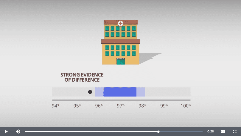
A quick overview of the method is illustrated in a UK initiative aimed at better informing the public about children’s heart surgery outcomes:
Example & Simulation
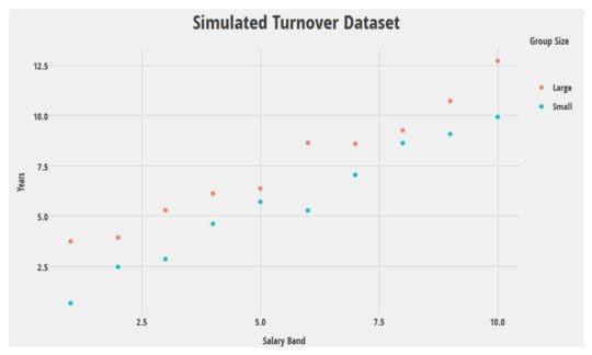
Let’s illustrate this with a simple simulation*. I’ve generated 20 rows of data. Let’s pretend turnover looks as in the graph at below where Years is the number of years before an employee leaves voluntarily.
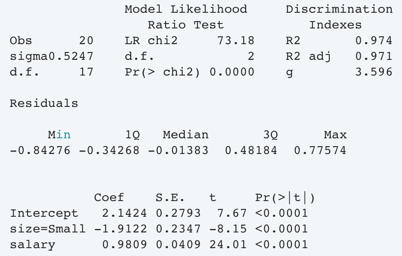
Next, we fit a (ridiculously oversimplified) regression model:
Now, suppose HR looks at voluntary turnover, and a group, say accounting, stands up as unusual compared to previous years. Is that reason for concern? The analyst looks at the trend over the past 5 years but is unable to tell whether the 2016 blip is unusual:
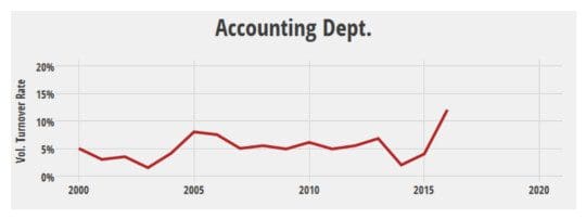
The analyst knows there was a reorganization in 2004 and a merger in 2013 but nothing unusual happened in 2016 that could explain the increase in turnover. Worse, it would not make sense to compare accounting with retail sales, since the two are very different.
Upon further investigation, the analyst finds out the following:
- Median years worked (2016): 7
- Median salary band (2016): 8
- Average team size (2016): Large
Let’s use the model to estimate (predict) what would be expected of these data:
  salary  size     yhat    lower    upper
       8 Large     9.99     9.58     10.4
This tells us that the expected number of years till voluntary leave is 10. If, hypothetically, we had 100 accounting departments, just like this one, we would expect 95 of them to experience between 9.6 and 10.4 years before voluntary leave on average.
So what does this tell us?
Because the observed 2016 value of 7 falls outside of the prediction range, there is strong evidence that what we observed is, in-fact, rather unusual and should be investigated further (careful interpretation of the model may shed some light as to the reasons).

If, on the other hand, the observed value fell within the predicted range, we would would not have enough evidence to conclude that something is unusual.
Limitations & Alternatives
There are other methods that attempt to level the playing field when comparing things, though they tend to be more complex. One promising one is based around propensity scores matching and is illustrated here for hospital rating. It is often the case that many of these methodologies are developed in health research. This is unlikely by coincidence: high risks, a rich scientific heritage, requirement for transparency and constant peer criticism has made it a breeding ground for research.
This approach does not always produce useful results: at times, the data is not enough or the uncertainty too high for the predicted range to be useful. If something we observe falls within its predicted range, we cannot be entirely sure that there is no difference (no methodology can: absence of evidence is not evidence of absence).
This approach requires a model be fitted to the data and this can take time, experience and domain expertise.
Despite what some have claimed over the years, we’re still nowhere near the point where Artificial Intelligence or some other form of automation can replace a competent statistician […]. The growing complexity of statistical science is actually making this goal more elusive. Kevin Gray , 2017.
* We use a contrived example to illustrate the method. I do not imagine that turnover is affected by salary and team size alone; nor that the number of years till voluntary leave is an appropriate measure of turnover. Moreover, the model used in this example is not appropriate for this type of data.
Original. Reposted with permission.
Bio: Thomas Speidel is a Statistician and Data Scientist at Suncor Energy, in Calgary, AB, Canada.
Related: