K-means Clustering with Tableau – Call Detail Records Example
We show how to use Tableau 10 clustering feature to create statistically-based segments that provide insights about similarities in different groups and performance of the groups when compared to each other.
By Rathnadevi Manivannan, Treselle Systems.

Objective
In this blog, we will discuss about clustering of customer activities for 24 hours by using K-means clustering feature in Tableau 10. Tableau 10 clustering feature automatically groups similar data points together. This type of clustering helps you create statistically-based segments that provide insights about similarities in different groups and performance of the groups when compared to each other.
You can use clustering on any type of visualization ranging from scatter plots to text tables and even maps.
In our previous blog post – “Call Detail Record Analysis – K-means Clustering with R”, we have discussed about CDR analysis using unsupervised K-means clustering algorithm.
Data Description
A daily activity file from Dandelion API is used as a data source, where the file contains CDR records generated by the Telecom Italia cellular network over the city of Milano. The daily CDR activity file contains information for 10,000 grids about SMS in and out, Call in and out, and Internet activity.
This dataset has 5 Million records and the size of the dataset is 314 MB.
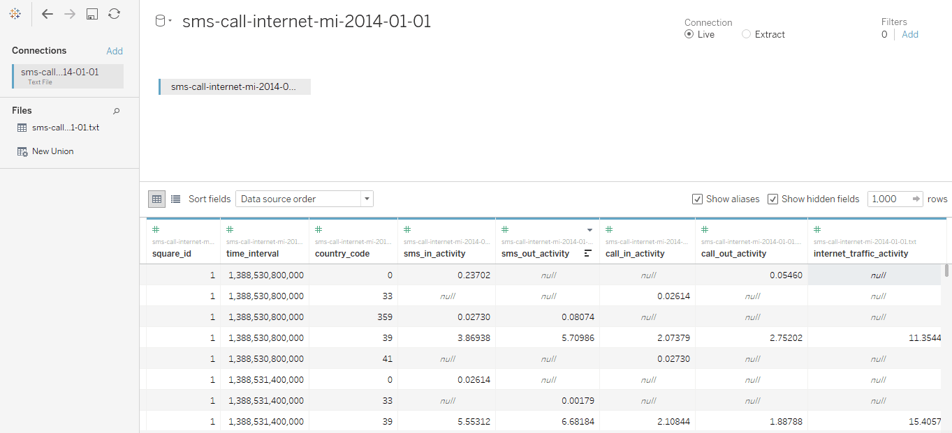
The below table, created in Tableau, shows the total activity of SMS, Call, and Internet activity by hours and total number of records per hour. The Grand Total section shows the cumulative total activity for SMS, call, and Internet.

Data Preprocessing
To preprocess data, perform the following steps:
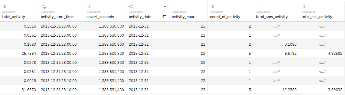
- Derive new fields such as “activity_start_time”, “activity_date”, and “activity hour” from “time interval” field.
- Find total activity, which is the sum of SMS in and out activity, call in and out activity, and Internet traffic activity.
- Find total SMS activity, which is the sum of SMS in and out activity.
- Find total call activity, which is the sum of call in and out activity.
Calculation of the above new fields can be done in Tableau easily with “Create Calculated Field” features.
Calculated Fields in Tableau
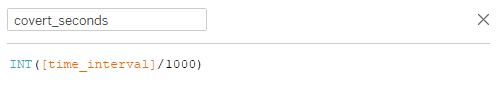
The below screenshot shows the formula used in Tableau for calculating “activity_start_time”.

If the epoch time is in milliseconds, then divide the value by 1000 to convert into seconds.
The formula for calculating other fields are as follows:
activity_date : DATE ([activity_start_time])
activity_hour : DATEPART (‘hour’, [activity_start_time])
total_activity : SUM(IFNULL([call_in_activity],0) + IFNULL([call_out_activity],0) + IFNULL([sms_in_activity],0) + IFNULL([sms_out_activity],0) + IFNULL([internet_traffic_activity],0))
total_sms_activity : SUM (IFNULL ([sms_in_activity], 0) + IFNULL ([sms_out_activity], 0))
total_call_activity : SUM (IFNULL ([call_in_activity], 0) + IFNULL ([call_out_activity], 0))
Note: IFNULL () is used to replace null value with zero while doing SUM ().
The below screenshot shows the derived fields in Tableau:
CDR Exploratory Data Analysis (EDA)
Tableau is bundled with rich set of visualizations to analyze the data. Exploratory Data Analysis is the process of analyzing the data visually. It involves outlier detection, anomaly detection, missing values detection, aggregating the values, and producing the meaningful insights.
The following visualizations are created as part of EDA on 5 million data:
Total Activity by Activity Hours
This visualization is used to find out:
- Total activities by hour.
- Hours producing more traffic respective to total activity.
- Hours producing less traffic respective to total activity.
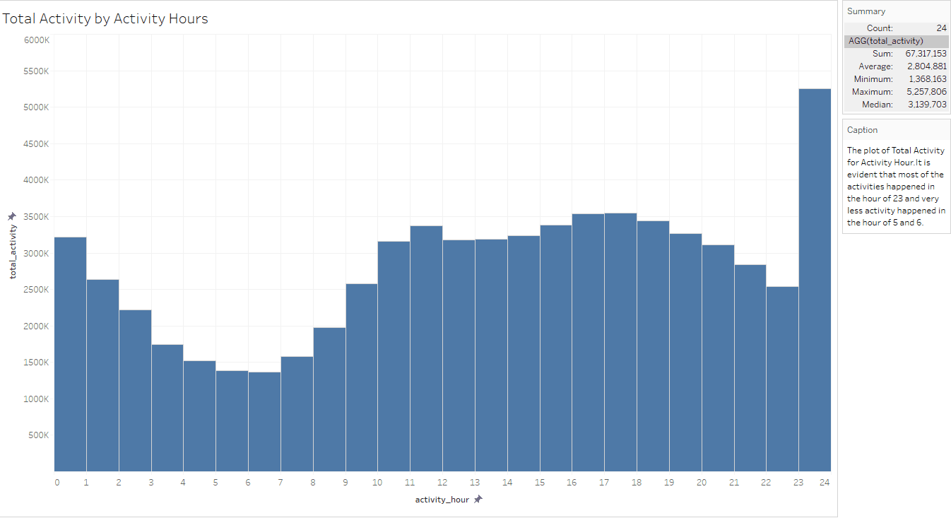
From the above visualization, it is evident that most of the activities happened in the hour of 23 and very less activity happened in the hours of 5 and 6.
Top and Bottom 10 Square Grids by Total Activity
This visualization is used to find out:
- Top 10 Square grids producing more traffic with total activity in those grids.
- Bottom 10 Square grids producing more traffic with total activity in those grids.
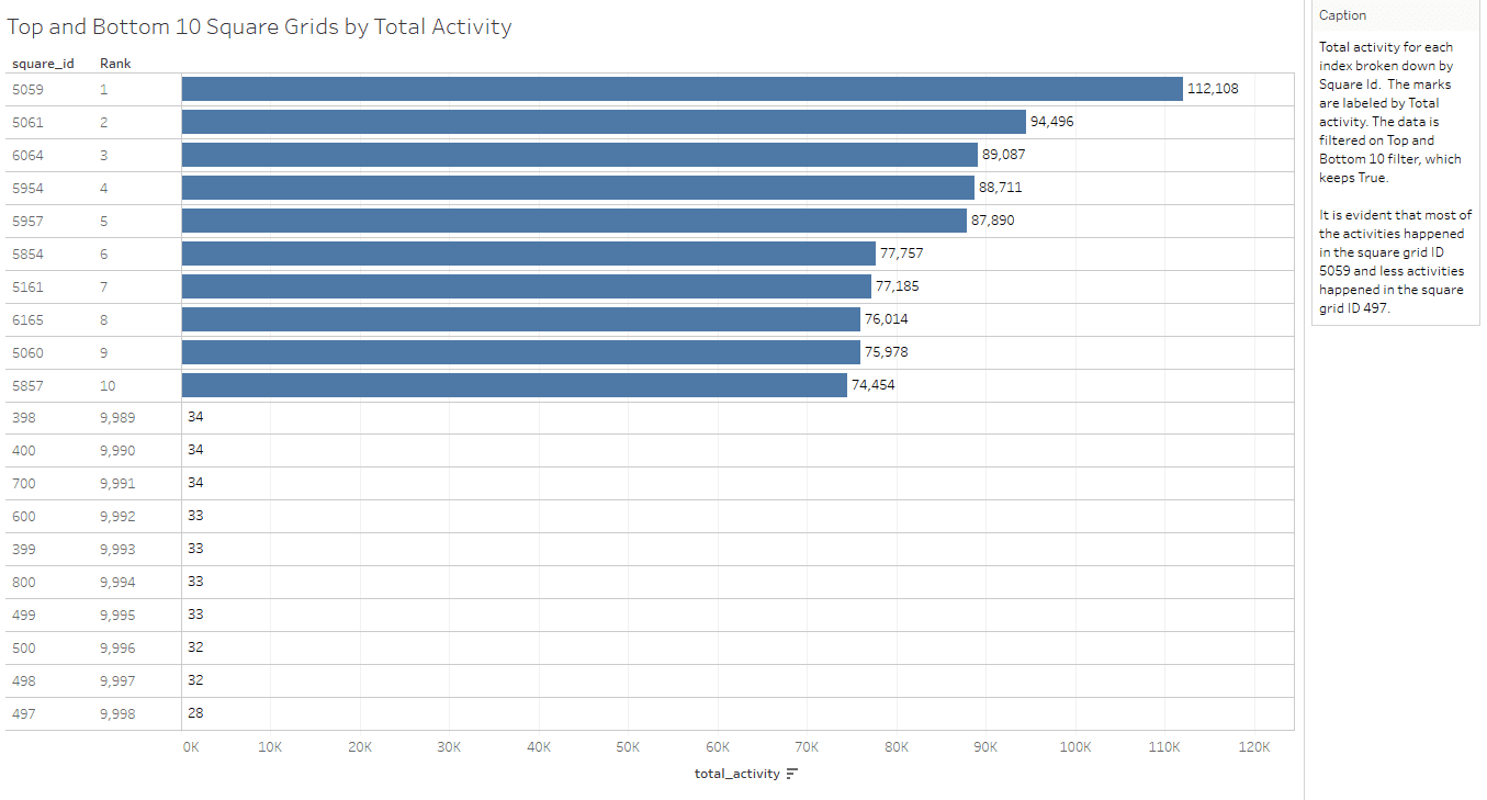
From the above visualization, it is evident that most of the activities happened in the square grid ID 5059 and less activities happened in the square grid ID 497.