Overview of Python Visualization Tools
An overview and comparison of the leading data visualization packages and tools for Python, including Pandas, Seaborn, ggplot, Bokeh, pygal, and Plotly.
Bokeh
Bokeh is different from the prior 3 libraries in that it does not depend on matplotlib and is geared toward generating visualizations in modern web browsers. It is meant to make interactive web visualizations so my example is fairly simplistic. Import and read in the data:
import pandas as pd

from bokeh.charts import Bar
budget = pd.read_csv("mn-budget-detail-2014.csv")

budget = budget.sort('amount',ascending=False)[:>10]
One different aspect of bokeh is that I need to explicitly list out the values we want to plot.
details = budget["detail"].values.tolist()

amount = >list(budget["amount"].astype(>float).values)
Now we can plot it. This code causes the browser to display the HTML page containing the graph. I was able to save a png copy in case I wanted to use it for other display purposes.
bar = Bar(amount, details, filename="bar.html")

bar.title("MN Capital Budget - 2014").xlabel("Detail").ylabel("Amount")

bar.show()
Here is the png image:
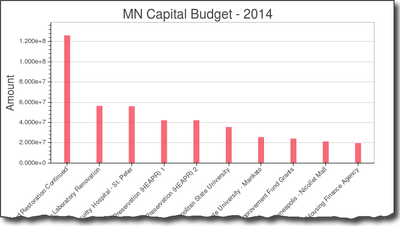
As you can see the graph is nice and clean. I did not find a simple way to more easily format the y-axis. Bokeh has a lot more functionality but I did not dive into in this example.
Pygal
Pygal is used for creating svg charts. If the proper dependencies are installed, you can also save a file as a png. The svg files are pretty useful for easily making interactive charts. I also found that it was pretty easy to create unique looking and visually appealing charts with this tool. Do our imports and read in the data:
import pandas as pd

import pygal

from pygal.style import LightStyle
budget = pd.read_csv("mn-budget-detail-2014.csv")

budget = budget.sort('amount',ascending=False)[:>10]
We need to create the type of chart and set some basic settings:
bar_chart = pygal.Bar(style=LightStyle, width=>800, height=>600,

legend_at_bottom=True, human_readable=True,

title='MN Capital Budget - 2014')
One interesting note is human_readable which does a nice job of formatting the data so that it mostly “just works.” Now we need to add the data to our chart. This is where the integration with pandas is not very tight but I found it straightforward to do for this small data set. Performance might be an issue when there are lots of rows.
for index, row >in budget.iterrows():

bar_chart.add(row["detail"], row["amount"])
Now render the file as an svg and png file:
bar_chart.render_to_file('budget.svg')

bar_chart.render_to_png('budget.png')
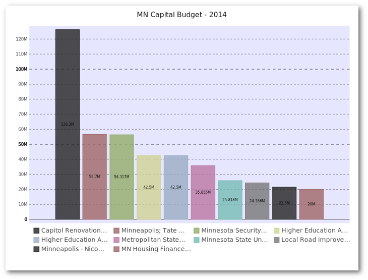
I think the svg presentation is really nice and I like how the resulting graph has a unique, visually pleasing style. I also found it relatively easy to figure out what I could and could not do with the tool. I encourage you to download the svg file and look at it in your browser to see the interactive nature of the graph.
Plot.ly
Plot.ly is differentiated by being an online tool for doing analytics and visualization. It has robust API’s and includes one for python. Browsing the website, you’ll see that there are lots of very rich, interactive graphs. Thanks to the excellent documentation, creating the bar chart was relatively simple. You’ll need to follow the docs to get your API key set up. Once you do, it seems to all work pretty seamlessly. The one caveat is that everything you are doing is posted on the web so make sure you are ok with it. There is an option to keep plots private so you do have control over that aspect. Plotly integrates pretty seamlessly with pandas. I also will give a shout out to them for being very responsive to an email question I had. I appreciate their timely reply. Setup my imports and read in the data
import plotly.plotly as py

import pandas as pd

from plotly.graph_objs import *
budget=pd.read_csv(“mn-budget-detail-2014.csv”)
budget.sort(‘amount’,ascending=False,inplace=True)
budget = budget[:>10]
Setup the data and chart type for plotly.
data = Data([

Bar(

x=budget["detail"],

y=budget["amount"]

)

])
I also decided to add some additional layout information.
layout = Layout(

title='2014 MN Capital Budget',

font=Font(

family='Raleway, sans-serif'

),

showlegend=False,

xaxis=XAxis(

tickangle=->45

),

bargap=>0.05

)
Finally, plot the data. This will open up a browser and take you to your finished plot. I originally didn’t see this but you can save a local copy as well, using py.image.save_as . This is a really cool feature. You get the interactivity of a rich web-based report as well as the ability to save a local copy to for embedding in your documents.
fig = Figure(data=data, layout=layout)

plot_url = py.plot(data,filename='MN Capital Budget - 2014')

py.image.save_as(fig, 'mn-14-budget.png')
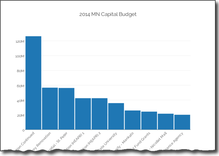
Check out the full-interactive version too. You can see a lot more robust examples on their site. The out of the box plot is very appealing and highly interactive. Because of the docs and the python api, getting up and running was pretty easy and I liked the final product.
Summary
Plotting data in the python ecosystem is a good news/bad news story. The good news is that there are a lot of options. The bad news is that there are a lot of options. Trying to figure out which ones works for you will depend on what you’re trying to accomplish. To some degree, you need to play with the tools to figure out if they will work for you. I don’t see one clear winner or clear loser. Here are a few of my closing thoughts:
- Pandas is handy for simple plots but you need to be willing to learn matplotlib to customize.
- Seaborn can support some more complex visualization approaches but still requires matplotlib knowledge to tweak. The color schemes are a nice bonus.
- ggplot has a lot of promise but is still going through growing pains.
- bokeh is a robust tool if you want to set up your own visualization server but may be overkill for the simple scenarios.
- pygal stands alone by being able to generate interactive svg graphs and png files. It is not as flexible as the matplotlib based solutions.
- Plotly generates the most interactive graphs. You can save them offline and create very rich web-based visualizations.
As it stands now, I’ll continue to watch progress on the ggplot landscape and use pygal and plotly where interactivity is needed. Feel free to provide feedback in the comments. I am sure people will have lots of questions and comments on this topic. If I’ve missed anything or there are other options out there, let me know.
Bio: Chris Moffitt is a Director, Pricing and Contracting at Boston Scientific. He has extensive experience in pricing and contracting in the medical device industry and also leading teams in IS and business functional roles to develop and support new applications for sales and marketing organizations.
Related