 Eight iconic examples of data visualisation
 Eight iconic examples of data visualisation
A collection of the most exemplary examples of data visualizations, including Napoleons invasion of Russia and the iconic London Underground map.
By James Cook University Online.
We live in the age of data. From global temperatures to shopping habits, new technologies have made it easier to collect, store and access information than any time in history. But our use of these technologies has also eroded our attention spans and fueled “post-truth” misunderstandings.
So, how do we present evidence in ways that the human mind can rapidly and accurately absorb it? Professionals who study data visualisation frequently innovate ingenious and moving solutions.
Check out eight top data visualisation examples below.
1. Napoleon’s invasion of Russia
It’s no flashy infographic, but many information scientists consider this 150-year-old squiggle to be the best data visualisation ever created. Drawn by Charles Joseph Minard in 1869, it tells the story of Napoleon’s ill-fated 1812 invasion of Russia.
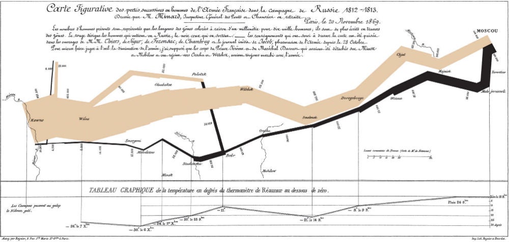
As the band moves left to right (in beige) then back again (in black), its dwindling width represents the loss of Napoleon’s troops to combat, starvation and exposure. 680,000 left France for the campaign, the thin black streak that returns show how few survived.
The brutal elegance of this graphic communicates the horror of this tragedy more viscerally than numbers ever could. It also shows us distance, latitude, longitude, direction, geography and temperature (if you can read French!)
2. Global Wind Map
Sometimes a data set is so massive it’s difficult to imagine how it could be visualised. In their live, animated graphic of the world’s wind currents, designers Fernanda Viégas and Martin Wattenberg do this not just effectively, but beautifully. The exquisite, interactive map proves that to study data visualisation is to blend science and art.
3. Syrian War factions
Data visualisation is a great way to make confusing networks of relationships digestible. This chart from Slate simply explains the complex alliances and enmities between the major factions of the Syrian War. The interactive graphic is also a diving board for readers seeking deeper information.
4. Supplementary Evidence
This interactive graph from the team at Information Is Beautiful compares the level of scientific evidence behind different alternative medicine supplements. The size of each balloon represents the popularity of each remedy, and where it floats signifies the extent to which it’s been proved to work.
5. Tube Map
If this 1931 map of the London Underground looks familiar, it’s because train maps in most cities of the world borrow from this design. The geographically accurate railway maps that came before it were sprawling tangles that left commuters hopelessly confused. A technological draftsman named Harry Beck realised that depicting London to scale got in the way of the real goal: communicating a complex system in an understandable way. Beck drew the map in his spare time. Its efficiency and clever use of colour were revolutionary.

6. Baby Boomer Bulge
This nifty animated “age pyramid” from Pew Research powerfully depicts the ageing of the US population over recent and coming decades. By presenting their findings in a simple, intuitive gif, Pew transforms seemingly dry demographic statistics into a startling story of a changing world.

7. US wealth distribution
Video allows data to be presented in dynamic and impactful ways. This animated clip on YouTube depicts the contrast between perceived and actual wealth inequality in US with powerful metaphors and changing visualisations.
8. Flight radar 24
The Flight Radar 24 live air tracker shows the shifting locations of all the world’s aircraft currently in flight. With its simple yellow plane icons, this data visualisation couldn’t be much clearer – or cooler.
Original. Reposted with permission.
Related: