Evaluating the Business Value of Predictive Models in Python and R
In these blogs for R and python we explain four valuable evaluation plots to assess the business value of a predictive model. We show how you can easily create these plots and help you to explain your predictive model to non-techies.
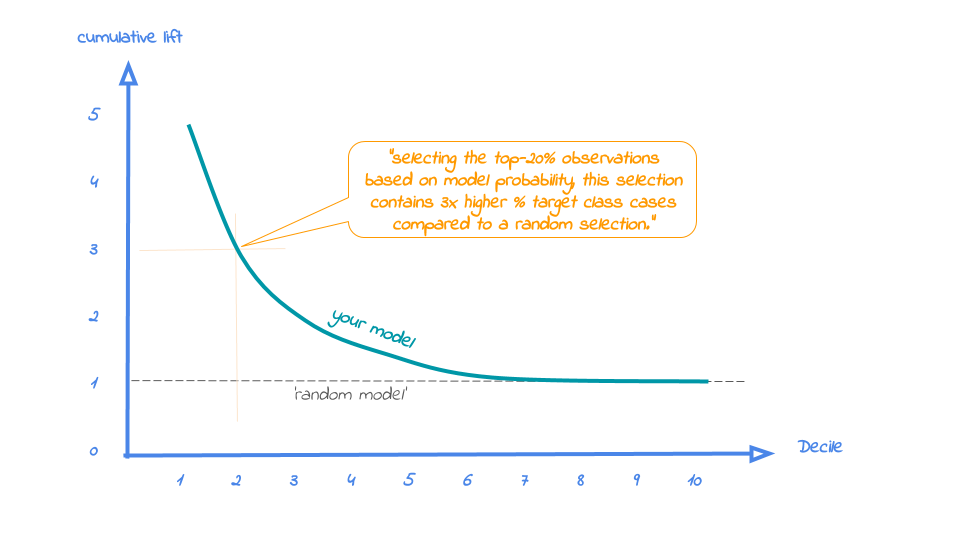
2. Cumulative lift plot
The cumulative lift plot, often referred to as lift plot or index plot, helps you answer the question:
When we apply the model and select the best X deciles, how many times better is that than using no model at all?
The lift plot helps you in explaining how much better selecting based on your model is compared to taking random selections instead. Especially when models are not yet used within a certain organisation or domain, this really helps business understand what selecting based on models can do for them.
The lift plot only has one reference line: the 'random model'. With a random model we mean that each observation gets a random number and all cases are devided into deciles based on these random numbers. The % of actual target category observations in each decile would be equal to the overall % of actual target category observations in the total set. Since the lift is calculated as the ratio of these two numbers, we get a horizontal line at the value of 1. Your model should however be able to do better, resulting in a high ratio for decile 1. How high the lift can get, depends on your quality of your model, but also on the % of target class observations in the data: If 50% of your data belongs to the target class of interest, a perfect model would only do twice as good (lift: 2) as a random selection. With a smaller target class value, say 10%, the model can potentially be 10 times better (lift: 10) than a random selection. Therefore, no general guideline of a 'good' lift can be specified. Towards decile 10, since the plot is cumulative, with 100% of cases, we have the whole set again and therefore the cumulative lift will always end up at a value of 1. It looks like this:
To generate the cumulative lift plot for our random forest model predicting term deposit buying, we call the function plot_cumlift(). Let's add some highlighting to see how much better a selection based on our model containing deciles 1 and 2 would be, compared to a random selection of 20% of all customers:
# plot the cumulative lift plot and annotate the plot at decile = 2
mp.plot_cumlift(ps, highlight_decile = 2)
When we select 20% with the highest probability according to model random forest in dataset test data, this selection for target class term deposit is 4.01 times than selecting without a model.
The cumulative lift plot is saved in C:\Users\nagelk000\AppData\Local\Temp\intro_modelplotpy.ipynb/Cumulative lift plot.png

<Figure size 432x288 with 0 Axes>
<matplotlib.axes._subplots.AxesSubplot at 0x20da4be0>
A term deposit campaign targeted at a selection of 20% of all customers based on our random forest model can be expected to have a 4 times higher response (396%) compared to a random sample of customers. Not bad, right? The cumulative lift really helps in getting a positive return on marketing investments. It should be noted, though, that since the cumulative lift plot is relative, it doesn't tell us how high the actual reponse will be on our campaign...
3. Response plot
One of the easiest to explain evaluation plots is the response plot. It simply plots the percentage of target class observations per decile. It can be used to answer the following business question:
When we apply the model and select decile X, what is the expected % of target class observations in that decile?
The plot has one reference line: The % of target class cases in the total set. It looks like this:
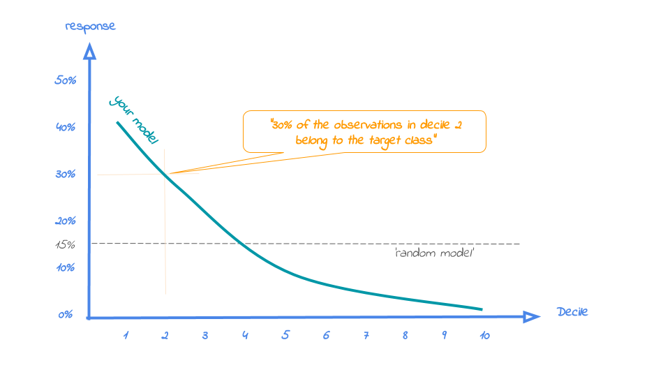
A good model starts with a high response value in the first decile(s) and suddenly drops quickly towards 0 for later deciles. This indicates good differentiation between target class members - getting high model scores - and all other cases. An interesting point in the plot is the location where your model's line intersects the random model line. From that decile onwards, the % of target class cases is lower than a random selection of cases would hold.
To generate the response plot for our term deposit model, we can simply call the function plot_response(). Let's immediately highlight the plot to have the interpretation of the response plot at decile 1 added to the plot:
# plot the response plot and annotate the plot at decile = 2
mp.plot_response(ps, highlight_decile = 1)
When we select decile 1 from model random forest in dataset test data the percentage of term deposit cases in the selection is 58%.
The response plot is saved in C:\Users\nagelk000\AppData\Local\Temp\intro_modelplotpy.ipynb/Response plot.png

<Figure size 432x288 with 0 Axes>
<matplotlib.axes._subplots.AxesSubplot at 0x20e2d240>
As the plot shows and the text below the plot states: When we select decile 1 from model random forest in dataset test data the percentage of term deposit cases in the selection is 55%.. This is quite good, especially when compared to the overall likelihood of 11%. The response in the second decile is much lower, about 28%. From decile 3 onwards, the expected response will be lower than the overall likelihood of 10.4%. However, most of the time, our model will be used to select the highest decile up until some decile. That makes it even more relevant to have a look at the cumulative version of the response plot. And guess what, that's our final plot!
4. Cumulative response plot
Finally, one of the most used plots: The cumulative response plot. It answers the question burning on each business reps lips:
When we apply the model and select up until decile X, what is the expected % of target class observations in the selection?
The reference line in this plot is the same as in the response plot: the % of target class cases in the total set.
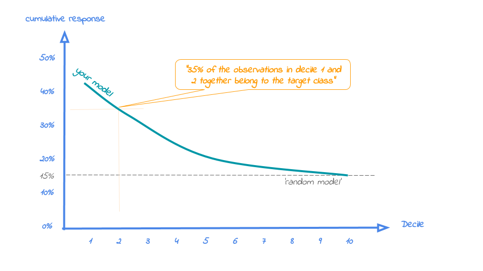
Whereas the response plot crosses the reference line, in the cumulative response plot it never crosses it but ends up at the same point for decile 10: Selecting all cases up until decile 10 is the same as selecting all cases, hence the % of target class cases will be exactly the same. This plot is most often used to decide - together with business colleagues - up until what decile to select for a campaign.
Back to our banking business case. To generate the cumulative response plot, we call the function plot_cumresponse(). Let's highlight it at decile 3 to see what the overall expected response will be if we select prospects for a term deposit offer based on our random forest model:
# plot the cumulative response plot and annotate the plot at decile = 3
mp.plot_cumresponse(ps, highlight_decile = 3)
When we select deciles 1 until 3 according to model random forest in dataset test data the percentage of term deposit cases in the selection is 33%.
The cumulative response plot is saved in C:\Users\nagelk000\AppData\Local\Temp\intro_modelplotpy.ipynb/Cumulative response plot.png

<Figure size 432x288 with 0 Axes>
<matplotlib.axes._subplots.AxesSubplot at 0x21d8f7f0>
When we select deciles 1 until 3 according to model random forest in dataset test data the percentage of term deposit cases in the selection is 33%. Since the test data is an independent set, not used to train the model, we can expect the response on the term deposit campaign to be 33%.
The cumulative response percentage at a given decile is a number your business colleagues can really work with: Is that response big enough to have a successfull campaign, given costs and other expectations? Will the absolute number of sold term deposits meet the targets? Or do we lose too much of all potential term deposit buyers by only selecting the top 30%? To answer that question, we can go back to the cumulative gains plot. And that's why there's no absolute winner among these plots and we advice to use them all. To make that happen, there's also a function to easily combine all four plots.
All four plots together
With the function call plot_all we get all four plots on one grid. We can easily save it to a file to include it in a presentation or share it with colleagues.
# plot all four evaluation plots and save to file
mp.plot_all(ps, save_fig = True, save_fig_filename = 'Selection model Term Deposits')
The plot all plot is saved in Selection model Term Deposits

<Figure size 432x288 with 0 Axes>
<matplotlib.axes._subplots.AxesSubplot at 0x21fc9f60>
Neat! With these plots, we are able to talk with business colleagues about the actual value of our predictive model, without having to bore them with technicalities any nitty gritty details. We've translated our model in business terms and visualised it to simplify interpretation and communication. Hopefully, this helps many of you in discussing how to optimally take advantage of your predictive model building efforts.
Get more out of modelplotpy: using different scopes
As we mentioned discussed earlier, the modelplotpy also enables to make interesting comparisons, using the scope parameter. Comparisons between different models, between different datasets and (in case of a multiclass target) between different target classes. Curious? Please have a look at the package documentation or read our other posts on modelplot.
However, to give one example, we could compare whether random forest was indeed the best choice to select the top-30% customers for a term deposit offer:
# set plotting scope to model comparison
ps2 = obj.plotting_scope(scope = "compare_models", select_dataset_label=['test data'])

# plot the cumulative response plot and annotate the plot at decile = 3
mp.plot_cumresponse(ps2, highlight_decile = 3)
compare models
The label with smallest class is ['term deposit']
When we select deciles 1 until 3 according to model multinomial logit in dataset test data the percentage of term deposit cases in the selection is 33%.
When we select deciles 1 until 3 according to model random forest in dataset test data the percentage of term deposit cases in the selection is 33%.
The cumulative response plot is saved in C:\Users\nagelk000\AppData\Local\Temp\intro_modelplotpy.ipynb/Cumulative response plot.png

<Figure size 432x288 with 0 Axes>
<matplotlib.axes._subplots.AxesSubplot at 0x23874c88>
Seems like the algorithm used will not make a big difference in this case. Hopefully you agree by now that using these plots really can make a difference in explaining the business value of your predictive models!
In case you experience issues when using modelplotpy, please let us know via the issues section on Github. Any other feedback or suggestions, please let us know via pb.marcus@hotmail.com or jurriaan.nagelkerke@gmail.com. Happy modelplotting!

from IPython.core.display import display,HTML
display(HTML("<style>.container { width:100% !important; }</style>"))
display(HTML('<style>.prompt{width: 0px; min-width: 0px; visibility: collapse}</style>'))
#np.set_printoptions(linewidth=110)
Jurriaan Nagelkerke is a Consultant in Advanced Analytics & Data Science @ Cmotions (Dutch consultancy firm focused on advanced analytics @ Data science).
Pieter Marcus is a Data Scientist @ De Persgroep Nederland (biggest publisher in the Netherlands)
Original. Reposted with permission.
Related:
- Lift Analysis – A Data Scientist’s Secret Weapon
- The Data Science Delusion
- Data Science For Business: 3 Reasons You Need To Learn The Expected Value Framework