5 Pandas Plotting Functions You Might Not Know
Utilize these plotting functions to improve your visualization game.

Image by rawpixel.com on Freepik
Pandas is a famous data manipulation package used by many. It is famous because it is intuitive and easy to use. Furthermore, Pandas have much support from the community to enhance the packages.
However, only a few know that Pandas also have a plotting function. Some plotting functions by Pandas were special and offered insight for your data analysis. What were these functions? Let’s explore it together.
For our example, we would use the Commercially Available Titanic Data from Kaggle.
Bootstrap Plot
Boostrap plot is a plotting function from Pandas to estimate the statistical uncertainty by using the bootstrap function (Data sampling with replacement). It’s a quick plot to use when measuring the data statistic (mean, median, midrange) with interval estimation.
Let’s try using the function with the data sample.
import pandas as pd

df = pd.read_csv('train.csv')
pd.plotting.bootstrap_plot(df['Fare'], size = 150, samples = 1000)
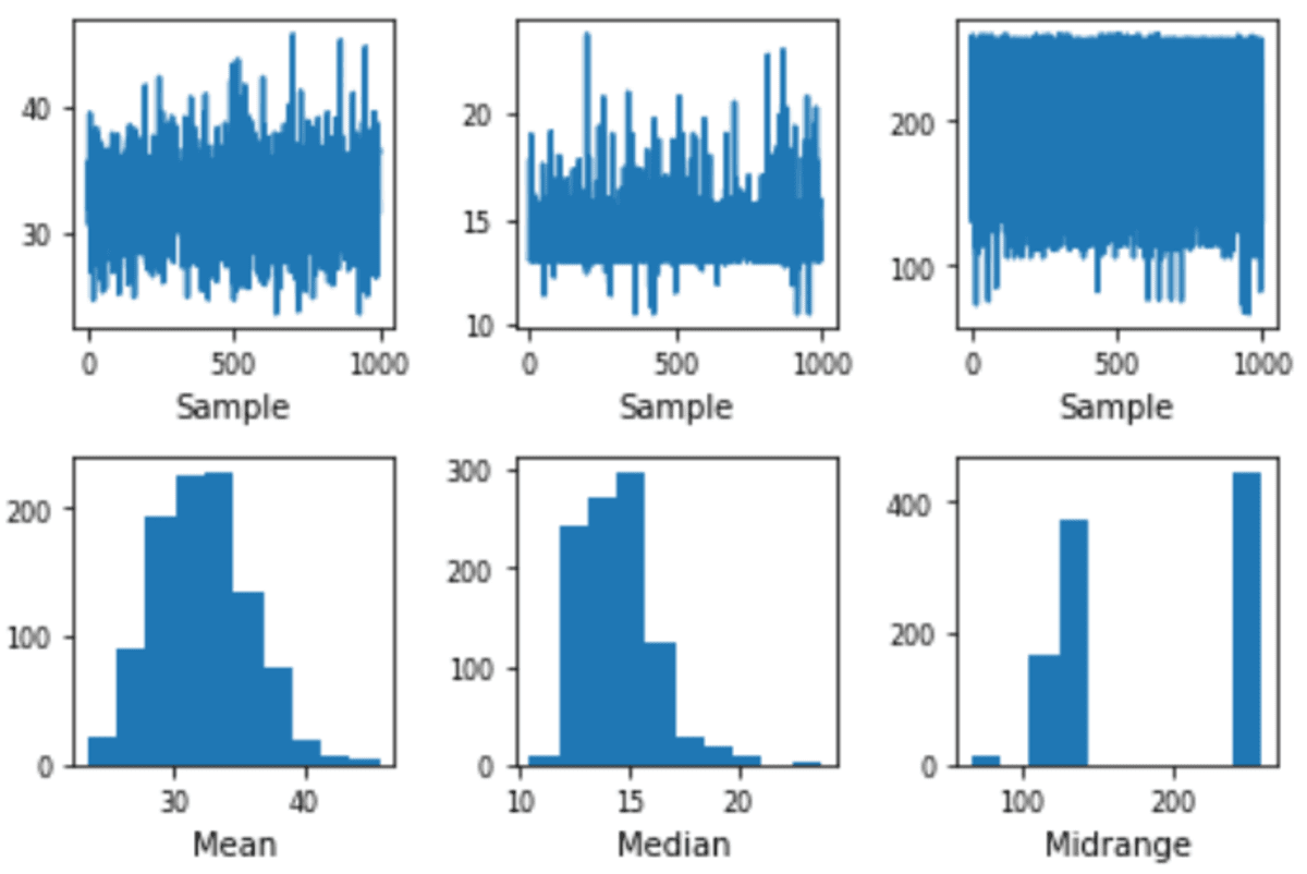
The plot would resampling the data as much as the samples parameter with the data number is on the size parameter.
The spread estimation of the means is close to 30 to 40, and the Median is close to 12 to 15. With this plot, we can try to estimate the actual population statistics. Your result could be different compared to mine as the sampling is randomized.
Scatter Matrix Plot
Scatter Matrix plot is a Pandas plotting function to create a scatter plot from all the available numerical data. Let’s try the function to learn about the scatter matrix.
pd.plotting.scatter_matrix(df)
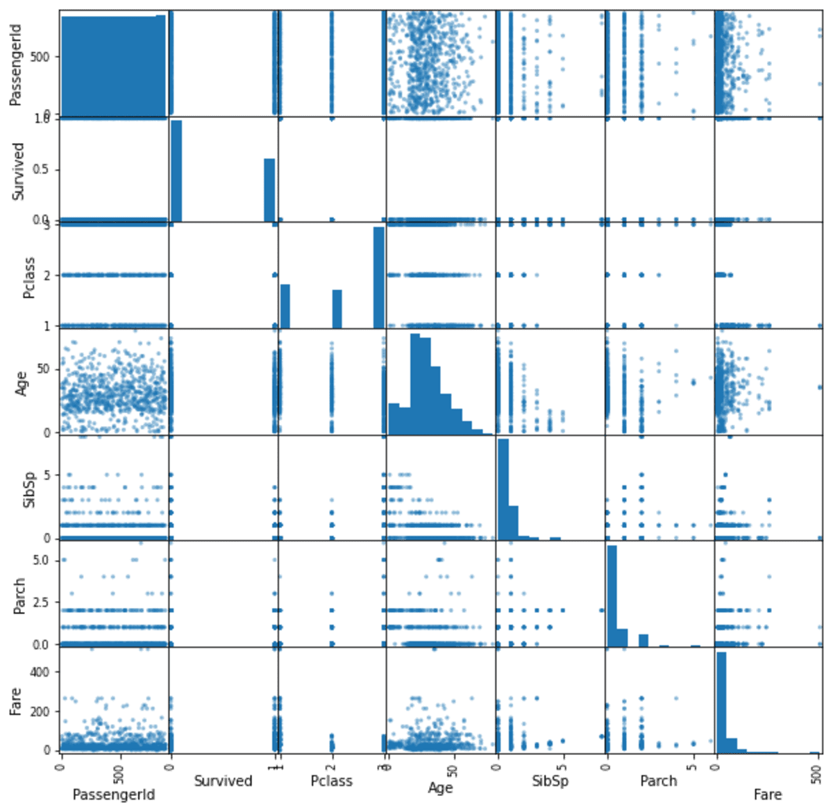
As you can see from the image above, the scatter matrix function automatically detects all the numerical columns from the data frame and create a scatter matrix for each combination. The function creates a histogram plot for the same column to measure the data distribution.
Radviz Plot
Radviz plot is a plot to visualize N-dimension data into a 2D plot. Usually, data with more than 3 dimensions would be hard to visualize, but we can do it with Radviz Plot. Let’s try it with the data example.
pd.plotting.radviz(df[['SibSp', 'Parch', 'Pclass', 'Age', 'Fare','Survived']], 'Survived', color =['blue', 'red'])
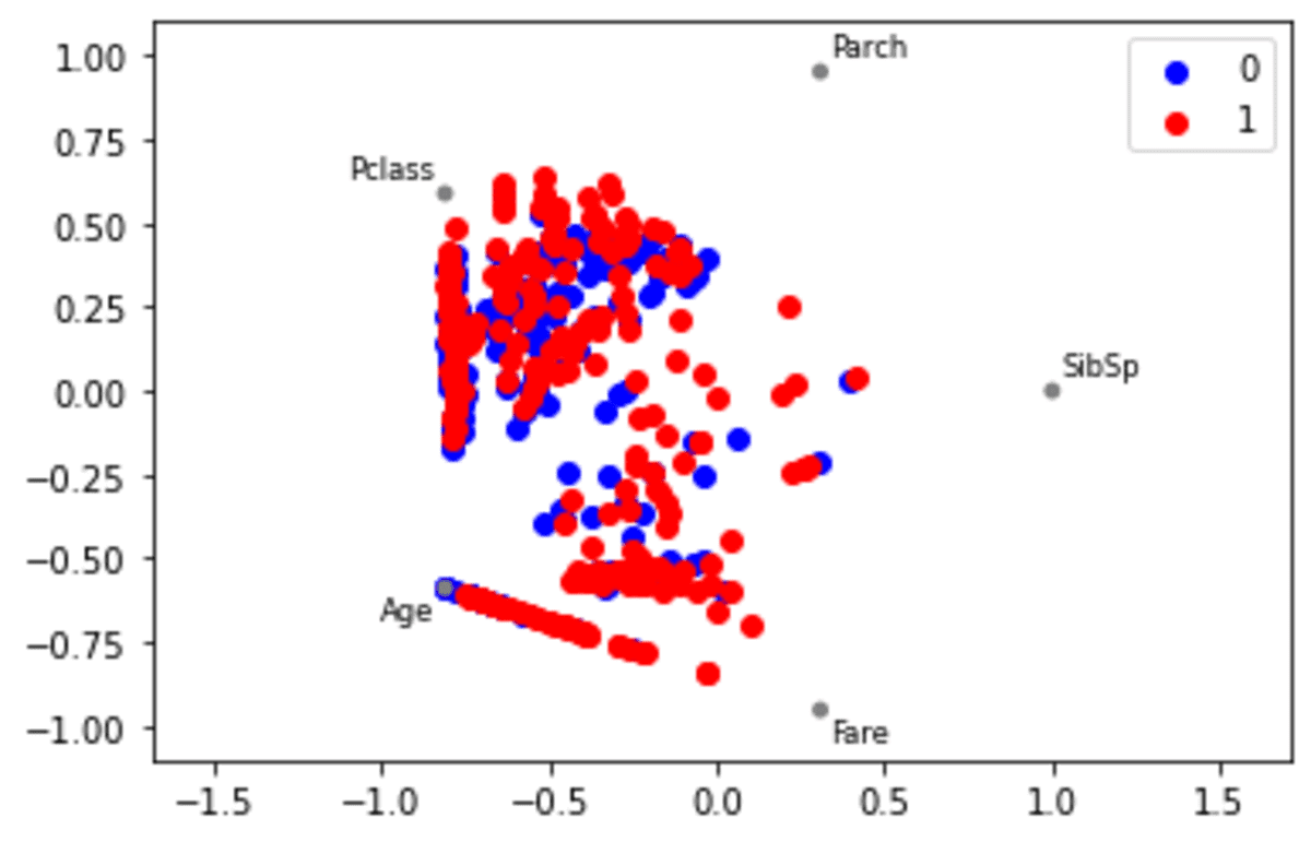
In the function above, we only use the numerical data with the target to divide the data.
The result is shown in the image above. However, how could we interpret the plot above? For each variable, it would be evenly represented as a circle. Each data point in the variable would be plotted inside the circle according to its values. The highly correlated variable would be closer in the circle than the low correlated variables.
Andrew Curves Plot
Andrew Curves plotting is a method to visualize multivariate data to potentially identify clusters within the data. It also could be used to identify if there is any separation within the data. Let’s try it out with the data example.
Andrew Curves work best when the data is normalized within 0 to 1, so we would preprocess the data before applying the function.
from sklearn.preprocessing import MinMaxScaler

df = df.drop(['PassengerId', 'Name', 'Sex', 'Ticket', 'Cabin', 'Embarked'], axis =1)
scaler = MinMaxScaler()
df_scaled = scaler.fit_transform(df.drop('Survived', axis =1))

df_scaled = pd.DataFrame(df_scaled, columns = df.drop('Survived', axis =1).columns)
df_scaled['Survived'] = df['Survived']

pd.plotting.andrews_curves(df_scaled, 'Survived', color =['blue', 'red'])
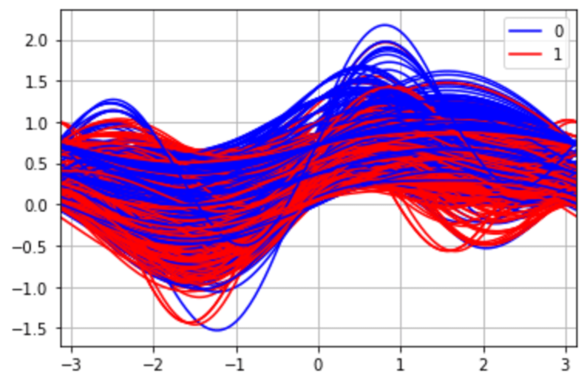
From the image above, we can see a potentially different cluster for the Survived class.
Lag Plot
Lag plot is a specific time-series data plot to check if the time-series data is correlated to themselves and random. A lag plot works by plotting the time data with their lag. For example, T1 data with lag 1 would be T1 plotted against T1+1 (or T2) data. Let’s try the functions to understand better.
We would create sample time-series data for this example.
np.random.seed(34)
x = np.cumsum(np.random.normal(loc=1, scale=5, size=100))
s = pd.Series(x)
s.plot()
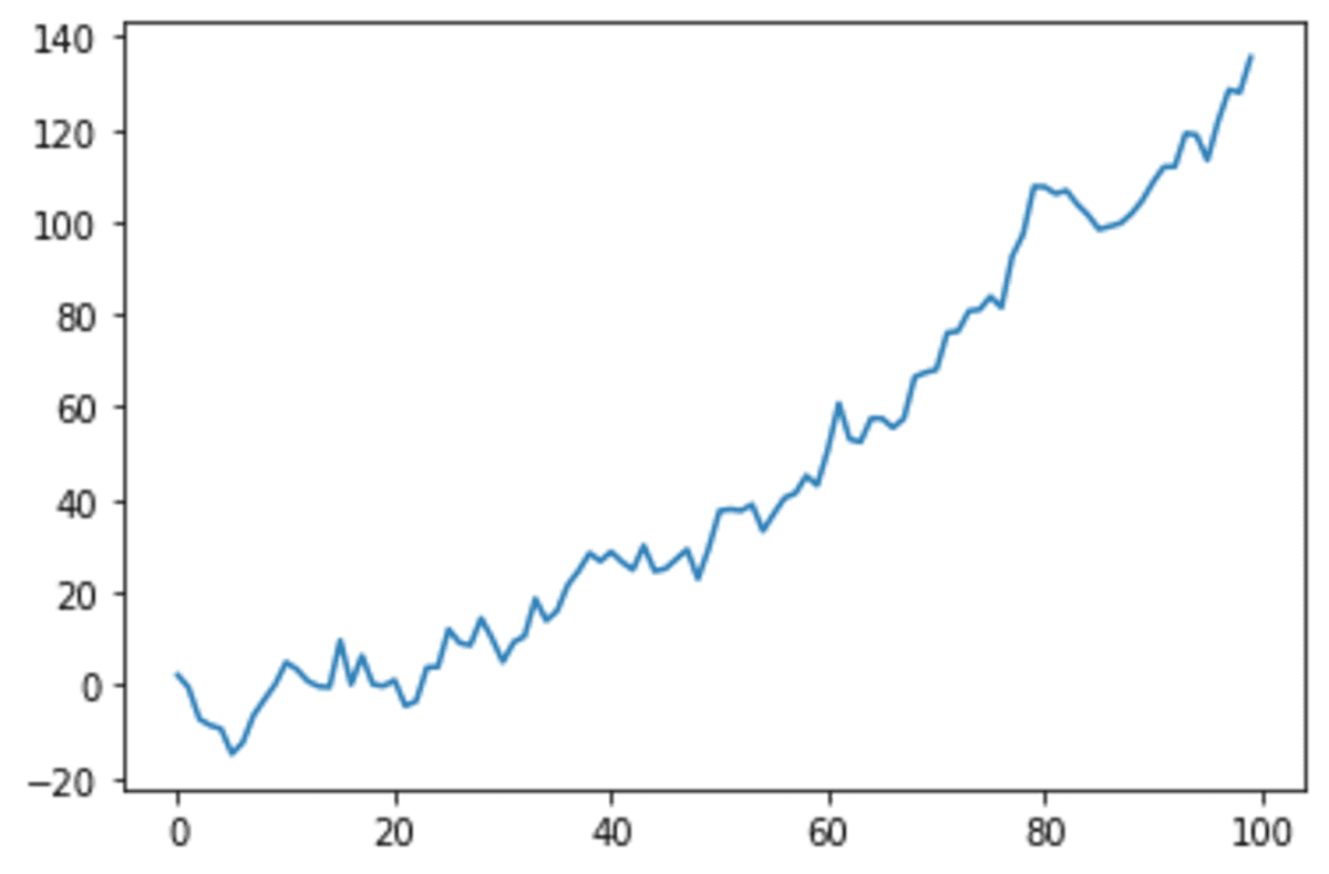
We can see our time series data showing an increasing pattern. Let’s see what it looks like when we use the lag plot.
pd.plotting.lag_plot(s, lag=1)
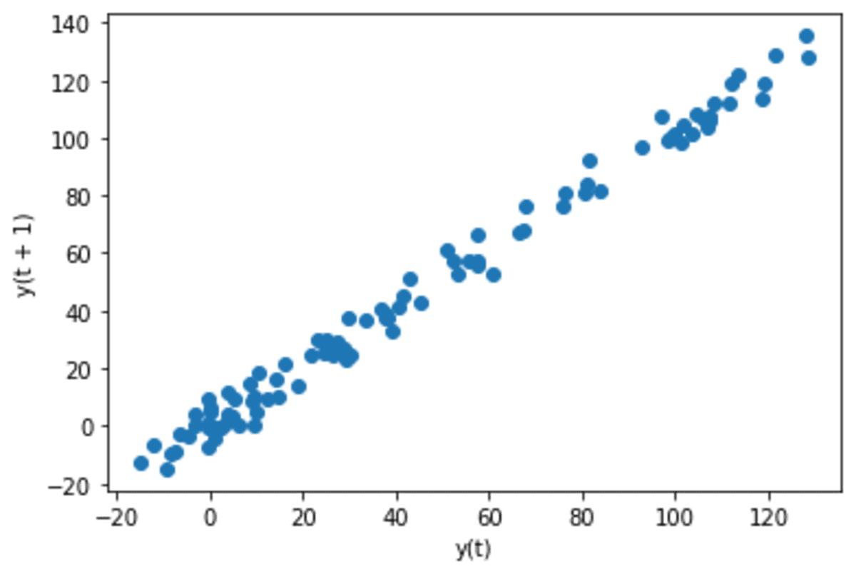
We can see the data shows a linear pattern when we use a lag plot with lag 1. It means there is an autocorrelation with 1-day differences in data. Let’s see the data if there is a correlation when we use a monthly basis.
pd.plotting.lag_plot(s, lag=30)
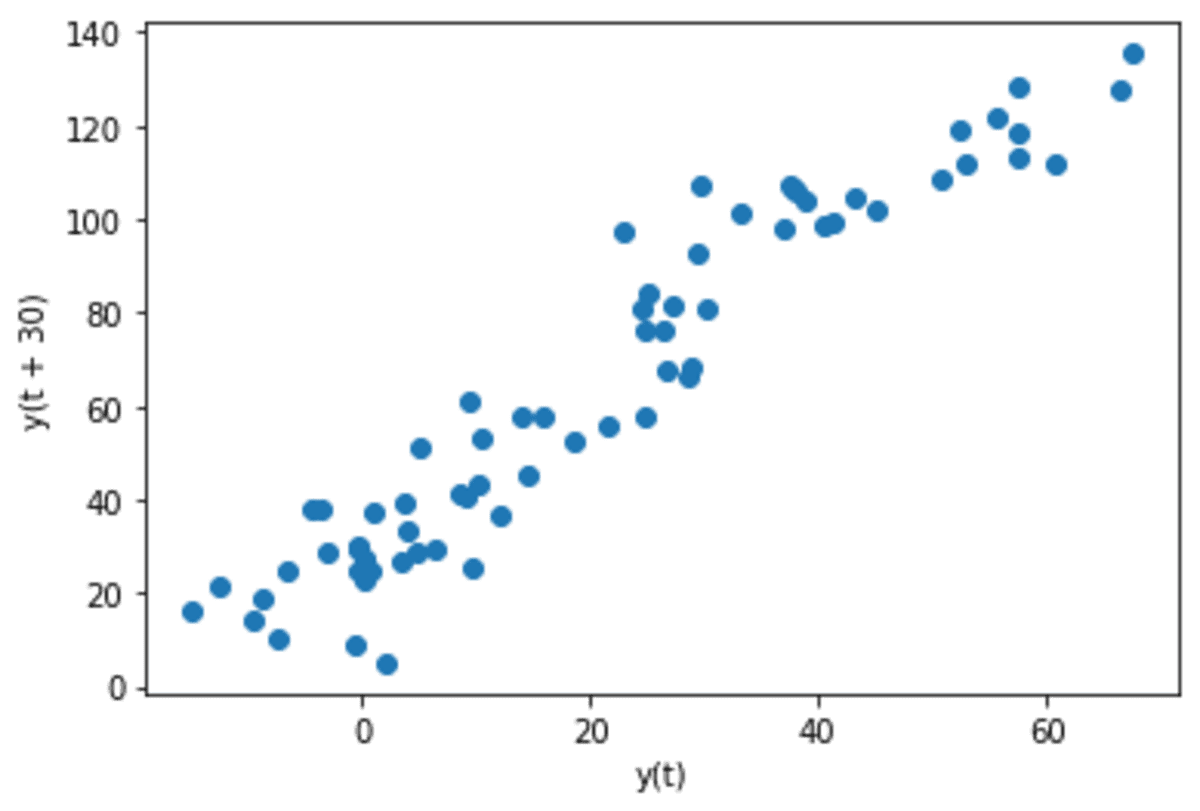
The data now becomes slightly more random although there are still linearity patterns that exist.
Conclusion
Pandas is a data manipulation package that also provides various unique plotting functions. In this article, we discuss 5 different Pandas plotting functions:
- Bootstrap Plot
- Scatter Matrix Plot
- Radviz Plot
- Andrew Curves Plot
- Lag Plot
Cornellius Yudha Wijaya is a data science assistant manager and data writer. While working full-time at Allianz Indonesia, he loves to share Python and Data tips via social media and writing media.