Exploring Data Distributions with Histograms
Learn the basics of exploring data distributions using histograms.

Image from Bing Image Creator
A Histogram is a data visualization that is used extensively in data science and statistics to explore the distribution of data. To create a histogram, the feature values of interest are grouped into bins, and the total number of data entries within the bins are counted, and these values represent the count. A histogram is a plot of the data values (independent variable) and the count (dependent variable). Generally, the feature to be plotted represents the horizontal axis, while the count is the vertical axis.
Exploring Male and Female Height Data Distribution with Histograms
To illustrate the use of histograms for exploring data distributions, we will use the heights dataset. This dataset contains male and female heights data.
# import necessary libraries
import numpy as np
import matplotlib.pyplot as plt
import seaborn as sns

# obtain dataset
df = pd.read_csv('https://raw.githubusercontent.com/bot13956/Bayes_theorem/master/heights.csv')

# display head of dataset
pd.head()
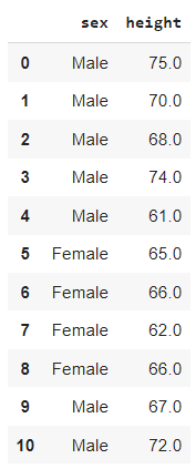
Head of heights dataset showing Male and Female heights (measured in inches). Image by Author.
Histogram for All Heights
We can plot the distribution of all heights using the code below.
sns.histplot(data = df, x="height")

plt.show()
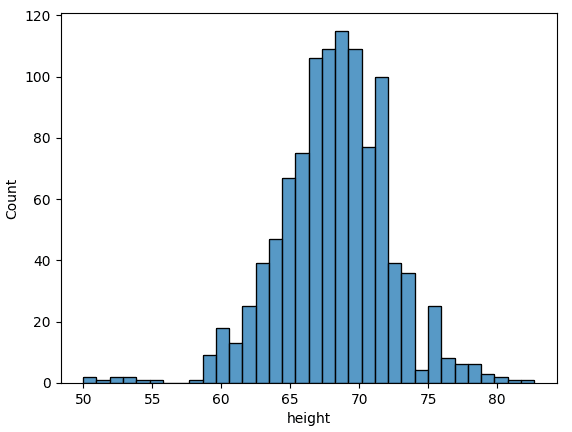
Histogram showing distribution of all heights in the dataset. Image by Author.
Histogram Showing Male and Female Height Categories
Since the dataset is categorical, we can generate a histogram for the male and female heights distributions as shown below.
sns.histplot(data=df, x="height", hue="sex")

plt.show()
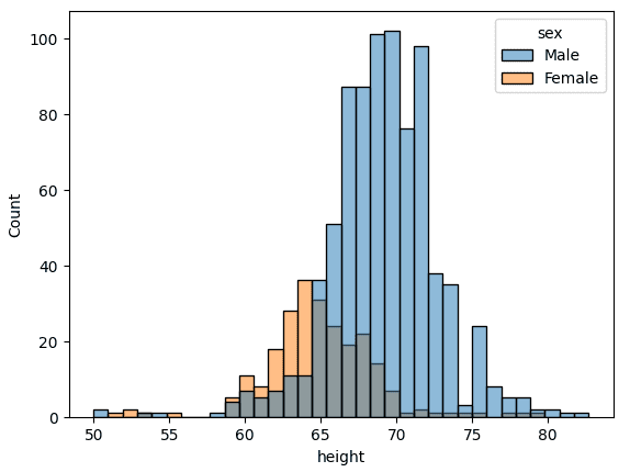
Histogram showing distribution of Male and Female heights. Image by Author.
Separate Histograms for Male and Female Heights
We can plot separate histograms for the male and female heights as shown below.
sns.histplot(data = df[df.sex=='Male']['height'], color='blue')

plt.show()
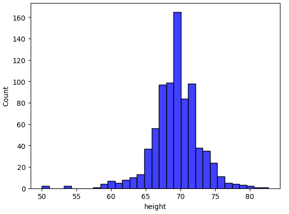
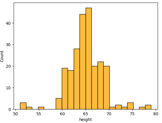
Histogram showing distribution of Male heights. Image by Author.
sns.histplot(data = df[df.sex=='Female']['height'], color='orange')

plt.show()
Histogram showing distribution of Female heights. Image by Author.
Histograms with Kernel Density Estimate Plot
A kernel density estimate (KDE) plot can be added to smooth out the histogram and to estimate the probability distribution of the data.
sns.histplot(data = df, x = 'height', KDE = 'True')

plt.show()
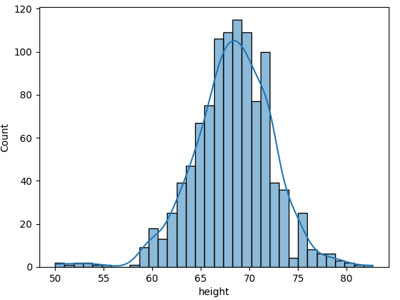
Histogram with KDE plot for all the heights in dataset. Image by Author.
sns.histplot(data=df, x="height", hue="sex", KDE = 'True')

plt.show()
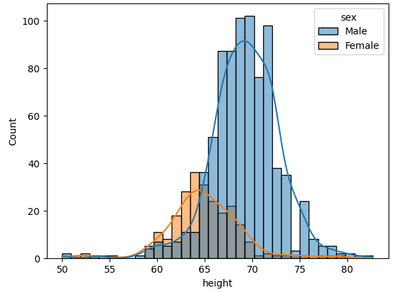
Histograms with KDE plots for the Male and Female height distributions. Image by Author.
Clearly, we observe from the figure above that the heights data is bimodal, corresponding to the Male and Female categories.
Summary
In summary, we have reviewed the use of histograms for exploring data distributions. Using the heights dataset, we showed that it is important to generate histograms for each category in the dataset. We also showed how KDE plots can be used for smoothing the histogram to produce an approximate continuous distribution curve.
Benjamin O. Tayo is a Physicist, Data Science Educator, and Writer, as well as the Owner of DataScienceHub. Previously, Benjamin was teaching Engineering and Physics at U. of Central Oklahoma, Grand Canyon U., and Pittsburgh State U.