
LinkedIn announced a new Labs feature, called InMaps. InMaps is an interactive visual representation of your professional universe that answers all of the above questions. It's a great way to understand the relationships between you and your entire set of LinkedIn connections. With it you can better leverage your professional network to help pass along job opportunities, seek professional advice, gather insights, and more.
Your map is automatically color-coded to represent different affiliations or groups from your professional career, such as your previous employer, college classmates, or industries you've worked in.
I tried to visualize my connections, and was mostly able to name meaningful clusters based on different colors (automatically generated). I wish however that there was an option to move the clusters for better visual separation.
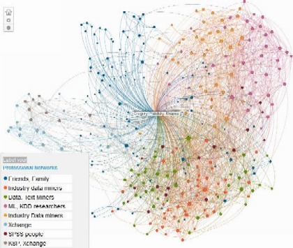
Gregory Piatetsky-Shapiro Linked Map
See LinkedIn blog explaining InMaps: blog.linkedin.com/2011/01/24/linkedin-inmaps/