
DiscoveryCorps, By Tim Graettinger, April 2012
In this article, we review two, intertwined tools in the data mining arsenal: correlation and scatter plots. These tools are fundamental for gauging the relationship (if any) between pairs of data elements (say, the age and income of your customers). As we'll soon see, there are good, bad, and ugly things that can happen when we apply a purely computational method like correlation. My goal is to help you avoid the usual pitfalls, so you can use correlation and scatter plots effectively in your own work.
 ...The Ugly
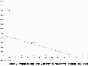
Let's turn now to a second example of correlation gone awry. Suppose that a single data entry error occurs (let's say a shifting of the decimal point [f2]), and the data elements originally shown in Figure 1 appear now as in Figure 5. Like the previous example, we are challenged by a single outlying value.
There are important differences in this case, however, compared to the previous. Here, a strong relationship does exist between the two data elements, and it has a positive sense. That is, the true, best-fit line slants upward to the right, as we see in Figure 1. The introduction of one outlier, per Figure 5, not only reduces the strength of the correlation, it also destroys the sense - note how the best-fit line in Figure 5 slants down to the right. Blindly using only the correlation value, we would infer that income decreases with age.
Read more.