
Regardless of the political persuasion, data scientists and data miners search for truth, and try to present it in the best way, and so I was quite upset when I read Jeff Leek post on Simply Statistics about some of the methods statisticians from Fox News use to persuade voters.
If you have you seen more examples of misuse of graphs and stats on either side of political spectrum, please comment below.
One classic technique is truncating the y-axis, as shown in this snapshot from Fox news. For comparison, I put next to it the same graph, but with Y-axis starting at zero.
 (via)
(via)
Numbers that don't add up
Whether intentional or not, this seems to be a novel approach to (mis)leading information, by producing percentages that add up to more than 100%, making some choices appear more convincing.
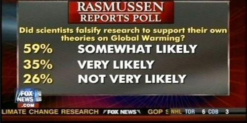
The numbers in this poll add up to 120%. Draw your own conclusions about scientific literacy of climate change sceptics.
Here is another example:
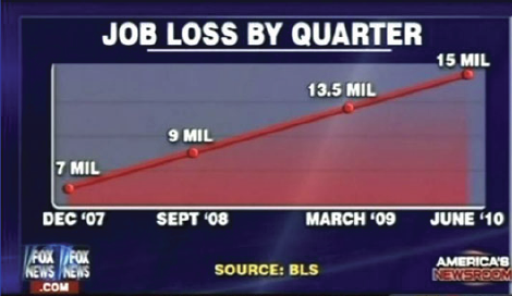
Changing trends by sub-sampling x values (also misleading chart titles)
Here is a graph that shows unemployment rates over time and the corresponding chart with the x-axis appropriately laid out.

Read more.
| Next post |