
Here are some of the more interesting tools demonstrated at the Computer-Assisted Reporting (CAR) conference last month. For a full list and in-depth review, see 22 free tools for data visualization and analysis, by Sharon Machlis (ComputerWorld, April 20, 2011)
Data cleaning
- DataWrangler: web-based service from Stanford University's Visualization Group is designed for cleaning and rearranging data so it's in a form that other tools such as a spreadsheet app can use.
- Google Refine: can be described as a spreadsheet on steroids for taking a first look at both text and numerical data.
 Statistical analysis and Visualization
- The R Project for Statistical Computing: a general statistical analysis platform and environment.
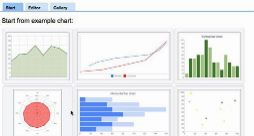
- Google Fusion Tables: one of the simplest ways to visualize uploaded data, including map, heatmap, line chart, bar graph, pie chart, scatter plot, timeline, storyline or animation.
- Tableau Public: can turn data into any number of visualizations, from simple to complex. You can drag and drop fields onto the work area and ask the software to suggest a visualization type, then customize everything from labels and tool tips to size, interactive filters and legend display.
- Many Eyes: a pioneer in Web-based data visualization, IBM's Many Eyes project combines graphical analysis with community, encouraging users to upload, share and discuss information.
- VIDI: graphics created by the site's visualization wizard can be used on any HTML page. Upload your data, select a visualization type, do a bit of customization selection, and your chart, timeline or map is ready to use via auto-generated embed code (using an iframe).
free analytics and data mining software suites.
Advanced tools, Coding required
- Exhibit: This spin-off of the MIT Simile Project is designed to help users "easily create Web pages with advanced text search and filtering functionalities, with interactive maps, timelines and other visualization."
- Google Chart Tools: designed to visualize data residing elsewhere, such as your own website or within Google Docs. Google offers both a Chart API using a "simple URL request to a Google chart server" for creating a static image and a Visualization API that accesses a JavaScript library for creating interactive graphics.
IBM Word-Cloud Generator: if you're looking for easy desktop software dedicated to the task, IBM's free Word-Cloud desktop application fits the bill.
Other tools that can generate word clouds include Many Eyes and the Google Visualization API, as well as the website Wordle (which is a handy tool for making word clouds from websites instead of text files).
Social and other network analysis
- Gephi: this open-source beta project is designed for visualizing statistical information, including relationships within networks of up to 50,000 nodes and half a million edges (connections or relationships) as well as network analyses of factors such as "betweenness," closeness and clustering coefficient.
- NodeXL: This Excel plug-in displays network graphs from a given list of connections, helping you analyze and see patterns and relationships in the data.