Latest Posts |
|---|
|


From Our Partners |
|---|
More Recent Posts
- Data Scientist Breakdown: Skills, Certifications, and Salary
- Semantic Search with Vector Databases
- How to Standout and Safeguard Your Job in the Generative AI Era
- 5 Free Stanford University Courses to Learn Data Science
- Ultimate Collection of 50 Free Courses for Mastering Data Science
- Vector Databases in AI and LLM Use Cases
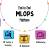
- 7 Steps to Mastering MLOPs
- Get University Level Certified for Next to Nothing