3 Julia Packages for Data Visualization
A gentle introduction of Plots.jl, Gadfly.jl, and VegaLite with code examples.
Image by Author
Julia programming language is making new strides with data visualization tools that are similar to Pythons’ matplotlib and R’s ggplot. These packages provide ease of use with the speed of C++ and parallel processes right out of the box. So, it is quite useful when you are visualizing a large dataset.
In this blog, we will learn about Plots.jl, Gadfly.jl, and VegaLite.jl with code examples. So, let’s start by installing required packages.
import Pkg; Pkg.add(["RDatasets","Plots","Gadfly","VegaLite"])
Plots.jl
Plots.jl is a powerful visualization tool in Julia. It is a meta-package that uses GR, PythonPlot, PGFPlotsX, or Plotly on the backend. If one of the backend does not support your desired features, you can always switch to another without changing the code.
Plots.jl is a lightweight, Intuitive, Concise, Flexible, and Consistent plotting package.
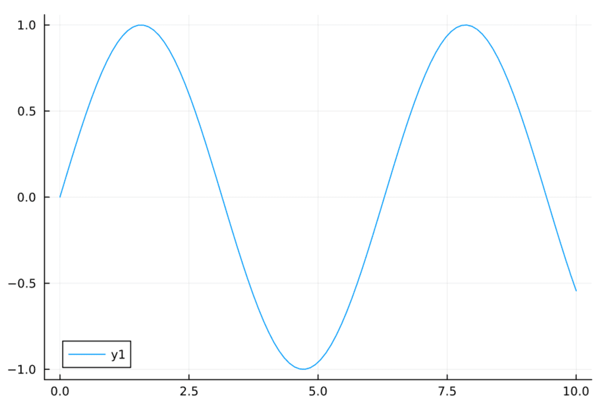
Example 1
To display the sin wave, we have to import the package and then create x and y1 variables.
- x: range from 0 to 10.
- y: sin(x)
To display a line plot, we just have to provide x and y arguments to the Plots.plot function.
using Plots
x = range(0, 10, length=100)
y1 = sin.(x)
Plots.plot(x, y1)
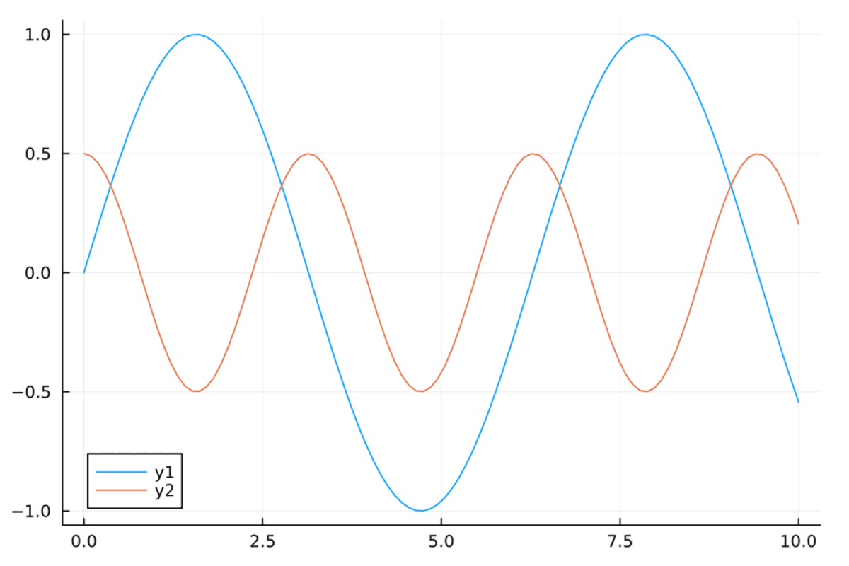
You can overlap the graph by using Plots.plot! function. It will show both graphs of the same axis.
y2 = @. cos(x)^2 - 1/2
Plots.plot!(x, y2)
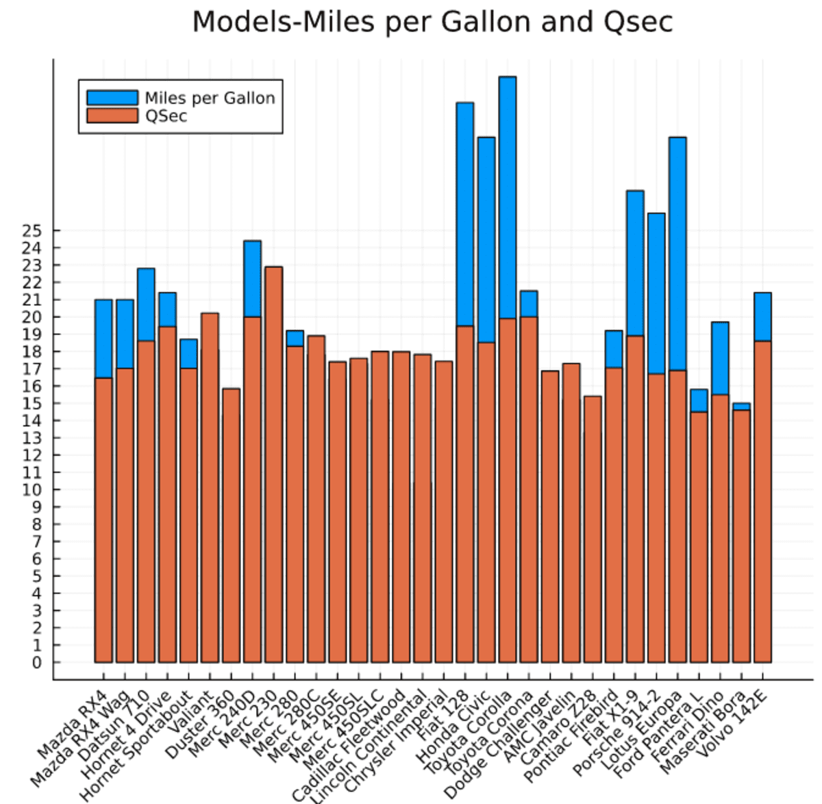
Example 2
Let’s plot a complex bar chart, for that we will first import the cars dataset from the RDatasets package.
using RDatasets
cars = dataset("datasets", "mtcars")
first(cars,5)

After that, we will use Plots.bar function to “Miles per Gallon” and QSec for each model.
We have customized the function to our needs:
- Renamed the labels.
- Add the title.
- Rotate x ticks to 45 degrees.
- Limit the size of the chart.
- Change the location of the legend.
- Display all the car models.
- Limit the y ticks.
Plots.bar(cars.Model,
    [cars.MPG,cars.QSec],
    label = ["Miles per Gallon" "QSec"],
    title = "Models-Miles per Gallon and Qsec",
    xrotation = 45,
    size = [600, 600],
    legend =:topleft,
    xticks =:all,
    yticks =0:25)
Example 3
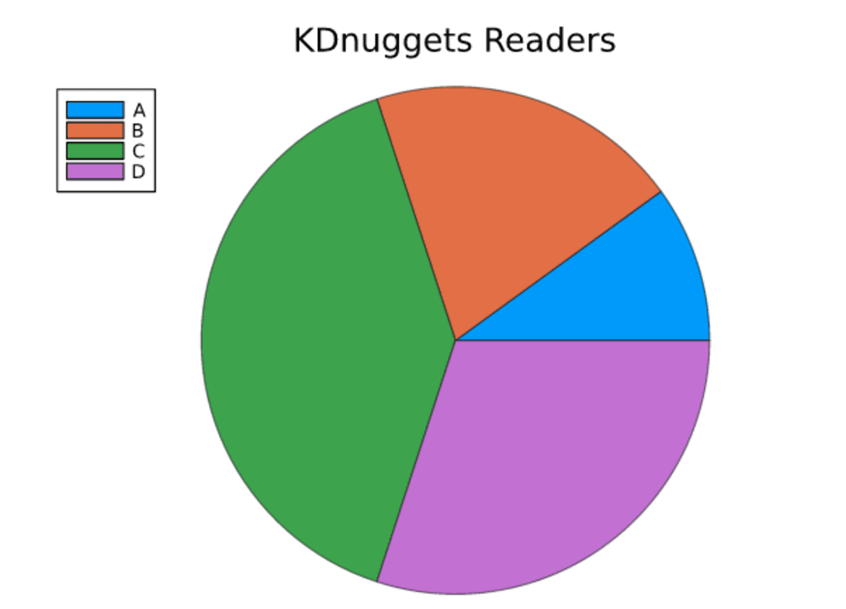
For plotting pie charts, we just need to add labels and values to the Plots.pie function. We have also added the title and line width.
x = ["A","B","C","D"]
y = [0.1,0.2,0.4,0.3]
Plots.pie(x,y,title ="KDnuggets Readers" ,l = 0.5)
Gadfly.jl
Gadfly.jl is a popular statistical plotting and data visualization tool. It is highly influenced by R’s ggplot library.
Key features:
- It works with Ijulia and Jupyter Notebook.
- Render high-quality plots to SVG, PNG, Postscript, and PDF.
- It has strong integration with DataFrames.jl.
- It also provided interactivity like panning, zooming, and toggling.
- Supports a large number of common plot types.
Example 1
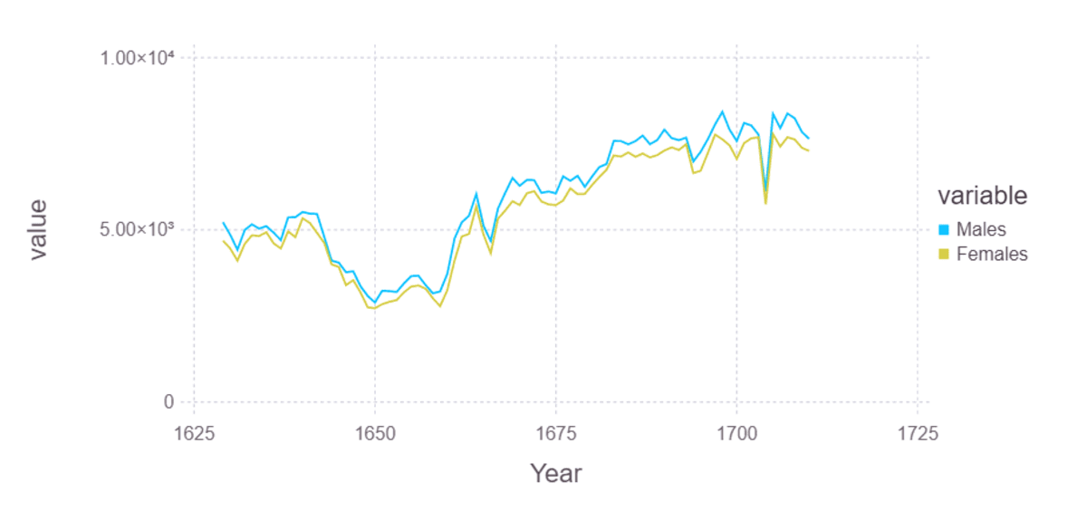
To plot historical data of Males and Females, we will import London birth rate data. After that, we will convert wide-form data into long-form using the stack function.
It will give us the year, variable, and value columns. The variable will be male or female, and the value will be birth rate.
births = RDatasets.dataset("HistData", "Arbuthnot")[:,[:Year, :Males, :Females]]
stacked_birth = stack(births, [:Males, :Females])
first(stacked_birth,5)
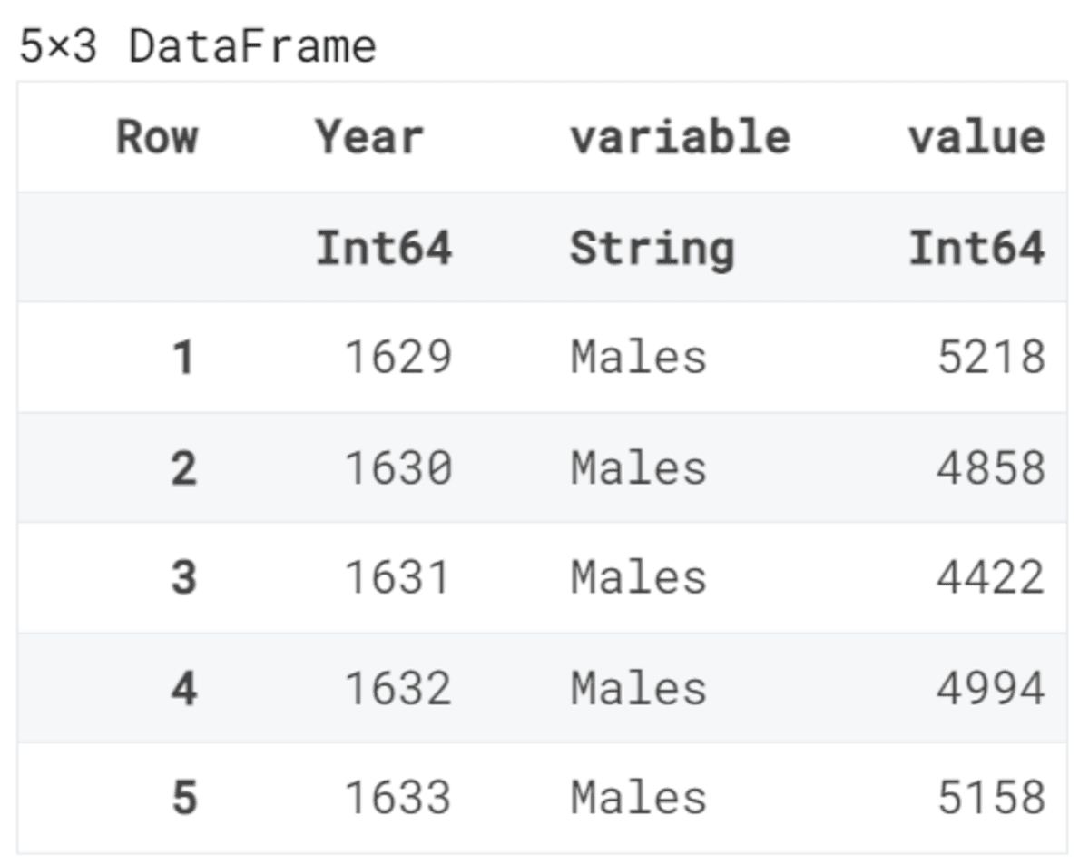
We are stacking the columns so that we can display two charts with different colors.
The Gadfly.plot function requires a dataset, x and y variables, color, and the type of the plot. In our case, we are displaying a line plot.
using Gadfly
Gadfly.plot(stacked_birth, x=:Year, y=:value, color=:variable,
     Geom.line)
Example 2
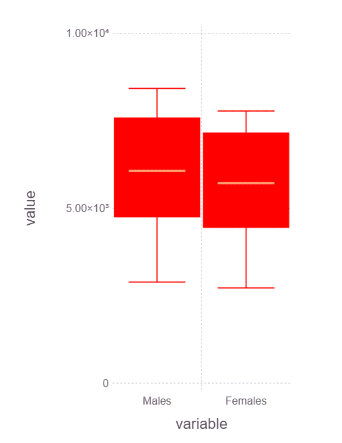
In the example, we will set the default size and display boxplot based on variables and values. We are using the same function with different plot types and themes.
Note: you can learn more about themes by following the documentations Themes · Gadfly.jl.
set_default_plot_size(8cm, 12cm)


Gadfly.plot(
            stacked_birth,
            x=:variable,
            y=:value,
            Geom.boxplot,
            Theme(default_color="red")
            )
VegaLite.jl
VegaLite.jl is an interactive plotting package for the Julia programming language. It is based on Vega-Lite and has similar functionality to Altair which is interactive, simple, and a fast Python library.
Example 1
In the example, we are importing VegaLite and piping cars dataset to @vlplot function to display point plot.
In our case, we have provided:
- Type of plot.
- X and y variables.
- Added the ‘Cyl’ column to a color argument.
- Set the width and height of the graph.
Note: we are converting integers into categorical values by adding :n in front of the column name. In our case, it is “Cyl:n”.
using VegaLite

cars |> @vlplot(
    :point,
    x=:HP,
    y=:MPG,
    color="Cyl:n",
    width=400,
    height=300
)

Example 2
In the second example, we are going to plot a bar chart of cylinder types. For the x argument, we will use “Cyl” as categories, and for y, we are using “count()” that will count the number of categories in the “Cyl” column.
@vlplot(
    data=cars,
    height=350,
    width=300,
    :bar,
    x="Cyl:n",
    y="count()",
)

Abid Ali Awan (@1abidaliawan) is a certified data scientist professional who loves building machine learning models. Currently, he is focusing on content creation and writing technical blogs on machine learning and data science technologies. Abid holds a Master's degree in Technology Management and a bachelor's degree in Telecommunication Engineering. His vision is to build an AI product using a graph neural network for students struggling with mental illness.