Creating Interactive Dashboards with D3.js
Learn how to build interactive dashboards where users can interact with data in greater detail, explore trends and patterns dynamically using D3.js.
Image by Choong Deng Xiang on Unsplash
Dashboards are indispensable tools for data visualization in many enterprises. They aid in the easy digestion of information and improved decision-making. But not every dashboard is made equally. Interactive dashboards are a better option for many applications than static dashboards since they provide several advantages.
The need for interactive dashboards has increased recently as companies realize the benefits of real-time data visualization and analytics. With the help of interactive dashboards, users may interact with data in greater detail and explore trends and patterns dynamically and easily, unlike static dashboards. As a result, several technologies have been developed to make creating interactive dashboards simpler and more accessible.
Some of the popular tools for building interactive dashboards include Tableau, which is known for its powerful data visualization capabilities; Tableau gives users the flexibility to create shareable and highly interactive dashboards connecting different data sources and UIs, making it a popular business choice. Another example is Power BI, which Microsoft developed; this is a powerful analytics tool used by businesses across the globe to create interactive visualizations and business intelligence capabilities. It integrates seamlessly with other Microsoft products, making it easy for existing Microsoft ecosystem users.
Among the various tools available, D3.js stands out for its flexibility and customization level. Unlike many other dashboard tools that provide a more user-friendly, drag-and-drop interface, D3.js gives developers the power to create truly bespoke visualizations tailored to specific needs.
In this article, we will explore D3.js's features and benefits and how it can be used to build compelling interactive dashboards.
Data-Driven Documents (D3.js)
D3.js is a powerful library used to create dynamic and interactive data visualizations on the web in JavaScript. Whether you're looking to build simple charts or complex data-driven graphics, D3.js provides the tools to bring your data to life.

D3.js landing page
This powerful JavaScript library allows you to bind data to HTML, SVG, and CSS, enabling the creation of data-driven documents. It helps you turn data into visual representations such as bar charts, pie charts, scatter plots, and complex interactive graphics. The best part? It’s highly customizable, so you can create visualizations that perfectly fit your needs.
Key Features of D3.js
The key features of D3.js include the following:
- Support for SVG: Working with Scalable Vector Graphics (SVG) is seamless in D3.js. SVG provides high-quality visuals that can scale to any size without losing clarity, which is perfect for detailed data visualizations
- Data Binding: D3.js allows you to bind data to HTML elements, such as paragraphs, divs, and SVG elements. This means you can easily update your visualizations based on your provided data, ensuring that your charts and graphs reflect the latest information
- Transitions and Animations: You can animate changes to your visualizations, making the data updates visually appealing and easier to follow
- Interactivity: Interactivity is a standout feature of D3.js. You can add tooltips, zooming, panning, and clickable elements to your visualizations. This interactivity makes your charts more engaging thereby enabling a more detailed data exploration
- Customizable Visualizations: One of the most powerful aspects of D3.js is its flexibility. You have complete control over the look and feel of your visualizations. You can style your charts with CSS, create custom shapes and paths, and use various color schemes to match your design preferences
- Enter, Update, and Exit Patterns: With D3.js, you can manage data-driven changes efficiently. The enter, update, and exit patterns let you seamlessly add new data points, update existing ones, and remove old ones. This dynamic updating is crucial for real-time data visualization
- Scalability: D3.js supports a variety of scales and axes, making it simple to map data values to screen coordinates. Whether you’re working with linear scales for simple charts or logarithmic scales for more complex data, D3.js has you covered
Building Interactive Dashboards with D3.js
To create interactive dashboards with D3.js, you should be familiar with HTML, CSS, and JavaScript. If you aren't, I highly suggest refresh your knowledge before proceeding with this article.
You can find the complete D3 zip file from here. Create a folder on your local machine and unzip the file. Inside, you'll find the JavaScript files named d3.js and d3.min.js.
You have limited options to load the D3 library into your file; you can either load it from your local machine using the unzipped file or directly from the source using CDN. Be sure to include this script in the section.
Let’s have a quick example:
<div class="container">
       <h2>Animated Bar Chart</h2>
       <div id="chart"></div>
</div>
       var bardata = [];

       for (var i = 0; i < 50; i++) {
           bardata.push(Math.round(Math.random() * 30))
       }

       bardata.sort(function compareNumbers(a, b) {
           return a - b;
       })
       var margin = { top: 30, right: 30, bottom: 40, left: 50 }

       var height = 400 - margin.top - margin.bottom,
           width = 600 - margin.right - margin.left,
           barWidth = 50,
           barOffset = 5;

       var tempColor;

       var tooltip = d3.select('body').append('div')
           .style('position', 'absolute')
           .style('padding', '0 10px')
           .style('background', 'white')
           .style('opacity', 0)

       var yScale = d3.scale.linear()
           .domain([0, d3.max(bardata)])
           .range([0, height])

       var xScale = d3.scale.ordinal()
           .domain(d3.range(0, bardata.length))
           .rangeBands([0, width], .3)

       var color = d3.scale.linear()
           .domain([0, bardata.length * .63, bardata.length])
           .range(['#ffb832', '#c61c6f', '#d33682'])

       var myChart = d3.select('#chart').append('svg')
           .style('background', '#e7e0cb')
           .attr('width', width + margin.left + margin.right)
           .attr('height', height + margin.top + margin.bottom)
           .append('g')
           .attr('transform', 'translate(' + margin.left + ',' + margin.top + ')')
           .selectAll('rect')
           .data(bardata)
           .enter()
           .append('rect')

           .style('fill', function (d, i) {
               return color(i);
           })
           .attr('width', xScale.rangeBand())
           .attr('x', function (d, i) {
               return xScale(i);
           })
           .attr('height', 0)
           .attr('y', height)

           .on('mouseover', function (d) {

               tooltip.transition()
                   .style('opacity', 0.9)
               tooltip.html(d)
                   .style('left', (d3.event.pageX - 35) + 'px')
                   .style('top', (d3.event.pageY - 40) + 'px')


               tempColor = this.style.fill;
               d3.select(this)
                   .style('opacity', .5)
                   .style('fill', 'yellow')
           })
           .on('mouseout', function (d) {
               d3.select(this)
                   .style('opacity', 1)
                   .style('fill', tempColor)
           })

       myChart.transition()
           .attr('height', function (d) {
               return yScale(d);
           })
           .attr('y', function (d) {
               return height - yScale(d);
           })
           .delay(function (d, i) {
               return i * 20;
           })
           .duration(5000)
           .ease('elastic')

       var vGuideScale = d3.scale.linear()
           .domain([0, d3.max(bardata)])
           .range([height, 0])

       var vAxis = d3.svg.axis()
           .scale(vGuideScale)
           .orient('left')
           .ticks(10)

       var vGuide = d3.select('svg').append('g')
       vAxis(vGuide)

       vGuide.attr('transform', 'translate(' + margin.left + ',' + margin.top + ')')
       vGuide.selectAll('path')
           .style({ fill: 'none', stroke: '#000' })
       vGuide.selectAll('line')
           .style({ stroke: '#000' })

       var hAxis = d3.svg.axis()
           .scale(xScale)
           .orient('bottom')
           .tickValues(xScale.domain().filter(function (d, i) {
               return !(i % (bardata.length / 5));
           }))

       var hGuide = d3.select('svg').append('g')
       hAxis(hGuide)
       hGuide.attr('transform', 'translate(' + margin.left + ',' + (height + margin.top) + ')')
       hGuide.selectAll('path')
           .style({ fill: 'none', stroke: '#000' })
       hGuide.selectAll('line')
           .style({ stroke: '#000' })
From the code above, we were able to build an animated bar chart using bar data populated with 50 random values between 0 and 30 sorted in ascending order. The margins and dimensions for the chart are defined to provide padding around the chart area.
Now, let us move on to build a project with this knowledge. We will build an interactive data dashboard that will help us understand some factors regarding customer churn rate. The image below illustrates what we will build in this project for a more visual overview.

Dashboard built using D3.js in this article | Image by author
To achieve this, we will use d3.js and Flask. Flask is a Python library that can be used to build and develop simple web applications.
Project Initialization
While working with Flask, we will use a virtual environment to prevent global installations and package collisions.
# Install virtualenv package
pip install virtualenv

# In the project's root directory, set up a virtual environment:
virtualenv flask

# Before installing any packages, activate the virtual environment. Run this command from the project's root directory:
source flask/bin/activate
Install Flask and Pandas from your terminal using the following command:
pip install Flask
#Install the Pandas library:
pip install pandas
After installing all these packages, your project directory should look like this:
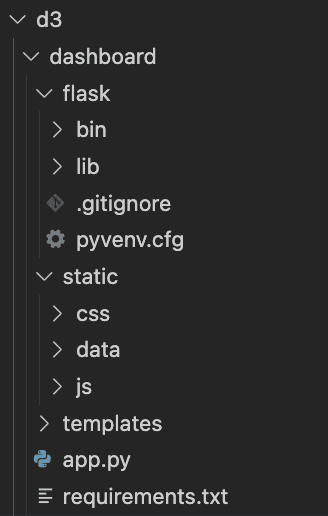
Project directory
In the static/data directory, create a file named customer_churn_data.csv and insert the provided content into it. Next, include the following code snippet in the app.py file:
from flask import Flask, jsonify, render_template
import pandas as pd
import numpy as np

app = Flask(__name__)

# Load and filter the data
data_df = pd.read_csv("static/data/churn_data.csv")
churn_data = data_df[data_df['Churn'] == "Yes"]

@app.route('/')
def home():
    return render_template('index.html')

def get_percentage(value, total):
    """Calculate percentage of a value in relation to the total"""
    percentage = np.round((value / total) * 100, 2)
    return percentage

def prepare_data_list(data_list, percentages, categories, group_name=None):
    for i, percent in enumerate(percentages):
        item = {
            'category': categories[i],
            'value': percent,
            'group': group_name
        }
        data_list.append(item)

@app.route('/piechart_data')
def piechart_data():
    contract_categories = ['Month-to-month', 'One year', 'Two year']
    contract_counts = churn_data.groupby('Contract').size().values
    contract_percentages = get_percentage(contract_counts, np.sum(contract_counts))

    piechart_data_list = []
    prepare_data_list(piechart_data_list, contract_percentages, contract_categories)
    return jsonify(piechart_data_list)

@app.route('/barchart_data')
def barchart_data():
    tenure_groups = ['0-9', '10-19', '20-29', '30-39', '40-49', '50-59', '60-69', '70-79']
    churn_data['tenure_group'] = pd.cut(churn_data['tenure'], bins=range(0, 81, 10), labels=tenure_groups)
    contract_data = churn_data[['tenure_group', 'Contract']]

    month_contract = contract_data[contract_data['Contract'] == 'Month-to-month']
    one_year_contract = contract_data[contract_data['Contract'] == 'One year']
    two_year_contract = contract_data[contract_data['Contract'] == 'Two year']

    month_counts = month_contract.groupby('tenure_group').size().values
    month_percentages = get_percentage(month_counts, np.sum(month_counts))

    one_year_counts = one_year_contract.groupby('tenure_group').size().values
    one_year_percentages = get_percentage(one_year_counts, np.sum(one_year_counts))

    two_year_counts = two_year_contract.groupby('tenure_group').size().values
    two_year_percentages = get_percentage(two_year_counts, np.sum(two_year_counts))

    total_counts = contract_data.groupby('tenure_group').size().values
    total_percentages = get_percentage(total_counts, np.sum(total_counts))

    barchart_data_list = []
    prepare_data_list(barchart_data_list, total_percentages, tenure_groups, "All")
    prepare_data_list(barchart_data_list, month_percentages, tenure_groups, "Month-to-month")
    prepare_data_list(barchart_data_list, one_year_percentages, tenure_groups, "One year")
    prepare_data_list(barchart_data_list, two_year_percentages, tenure_groups, "Two year")

    return jsonify(barchart_data_list)

if __name__ == '__main__':
    app.run(debug=True)
The index.html file acts as the entry point for the app.py file, containing two main sections: the writeup and the visualization area. Add the following code to the index.html file:
Customer - Dashboard
   <div class="about">
       <h1>Customer - Dashboard</h1>
       <h2>Description: Creating Interactive Dashboards with D3.js</h2>

       <p>Project Overview: This is an analysis of churned customer. The <a href="https://www.kaggle.com/blastchar/telco-customer-churn">dataset</a> contains rows and columns, each
           row
           represents a customer, each column contains customer's attributes described on the column Metadata.
       </p>
       <h2>Author: Shittu Olumide</h2>
       <h4>The code for this dashboard can be found in this Github <a href="https://github.com/zenUnicorn/Customer-churn-Dashboard-with-D3.js-and-Flask/">repo</a>
       </h4>
   </div>

   <div class="visualization">
       <div id="pieChart"></div>
       <div id="barChart"></div>
   </div>

       const pieChartDataUrl = "{{ url_for('piechart_data') }}";
       const barChartDataUrl = "{{ url_for('barchart_data') }}";
The next step is to create charts to render the data in the web interface. We will create two charts, a pie chart, and a bar chart.
Pie Chart
The renderPieChart function described below takes in two parameters:
- dataSet — contains the data for the pie chart.
- barChartDataSet — updates the bar chart when a slice of the pie chart is selected. This function utilizes SVG elements to offer a variety of shapes, providing greater flexibility and control.
function renderPieChart(dataSet, barChartDataSet) {
   // Set the SVG container dimensions and properties
   const margins = {top: 20, right: 20, bottom: 20, left: 20};
   const chartWidth = 350 - margins.left - margins.right,
   chartHeight = 350 - margins.top - margins.bottom,
   outerRadius = Math.min(chartWidth, chartHeight) / 2,
   innerRadius = outerRadius * 0.5,
   colorScale = d3.scaleOrdinal(d3.schemeSet1);  // Define the color scheme

   // Select the div with id pieChart in the index.html file
   const svgContainer = d3.select('#pieChart')
       .append("svg")      // Insert an SVG element
       .data([dataSet])    // Bind the pie chart data
       .attr("width", chartWidth)
       .attr("height", chartHeight)
       .append("g")        // Group the SVG components together
       .attr("transform", "translate(" + outerRadius + "," + outerRadius + ")"); // Set position for the pie chart

   const pieData = d3.pie()   // Create the data object to form the pie slices
       .sort(null)
       .value(function(d) { return d.value; })(dataSet);  // Retrieve values tied to the 'value' key from the JSON data

   // Define the arc generator for the outer circle of the pie
   const outerArc = d3.arc()
       .outerRadius(outerRadius)
       .innerRadius(0);

   // Define the arc generator for the inner circle
   const innerArc = d3.arc()
       .innerRadius(innerRadius)
       .outerRadius(outerRadius);

   // Create slices based on the generated pie data
   const slices = svgContainer.selectAll("g.slice")
       .data(pieData)
       .enter()        // Bind the data to elements
       .append("g")    // Append group elements
       .attr("class", "slice")
       .on("click", handleClick);  // Trigger click event for each slice

   slices.append("path")    // Append path element for each slice
       .attr("fill", function(d, i) { return colorScale(i); })  // Apply color to each slice
       .attr("d", outerArc)  // Draw each slice using the arc generator
       .append("title")      // Add a title to each slice for hover information
       .text(function(d) { return d.data.category + ": " + d.data.value + "%"; });

   d3.selectAll("g.slice")   // Select all slice groups
       .selectAll("path")
       .transition()        // Apply transition on load
       .duration(200)
       .delay(5)
       .attr("d", innerArc);  // Redraw the inner arc

   slices.filter(function(d) { return d.endAngle - d.startAngle > .1; })  // Filter for larger angles
       .append("text")  // Append text element for labels
       .attr("dy", "0.20em")  // Adjust y-axis position of the text
       .attr("text-anchor", "middle")  // Align text in the center of the slice
       .attr("transform", function(d) { return "translate(" + innerArc.centroid(d) + ")"; })  // Position the text
       .text(function(d) { return d.data.category; });  // Set label text to the category name

   svgContainer.append("text")  // Append chart title in the center of the pie chart
       .attr("dy", ".20em")
       .attr("text-anchor", "middle")
       .text("Churned Customers")
       .attr("class", "chart-title");

   // Function to update bar chart when a slice is clicked
   function handleClick(d, i) {
       updateBarChart(d.data.category, colorScale(i), barChartDataSet);
   }
}
Bar Chart
The renderBarChart function sets up the default group that the browser will display when the page loads without a specific contract class selected. This default group shows the tenure distribution of churned customers. The `renderBarChart` function takes a single argument: the bar chart data to be displayed.
Inside the `static` folder, create a `cs_barChart.js` file and add the following code to it:
// Set SVG dimensions and general chart properties
const margins = {top: 20, right: 10, bottom: 20, left: 20},
chartWidth = 350 - margins.left - margins.right,
chartHeight = 350 - margins.top - margins.bottom,
paddingBetweenBars = 5,
chartLabels = {ylabelOffset: 4, xlabelHeight: 5, titleHeight: 9};

// Default group to be displayed
const defaultGroup = "All";

// Function to extract the percentage values for a specific group from the full dataset
function extractPercentage(selectedGroup, barChartDataSet){
   const percentageData = [];
   for (let i in barChartDataSet) {
       if (barChartDataSet[i].group === selectedGroup) {
           percentageData.push(barChartDataSet[i]);
       }
   }
   return percentageData;
};

function renderBarChart(barChartDataSet) {
   const initialData = extractPercentage(defaultGroup, barChartDataSet);

   const xScale = d3.scaleLinear()  // Create the scale for the X-axis
       .domain([0, initialData.length])  // Set the scale domain from 0 to the dataset length
       .range([0, chartWidth]);

   const yScale = d3.scaleLinear()  // Create the scale for the Y-axis
       .domain([0, d3.max(initialData, function(d) { return d.value; })])  // Domain set to the maximum value in the dataset
       .range([chartHeight, 0]);

   // Select the div with id barChart from the index.html template
   const svgContainer = d3.select('#barChart')
       .append('svg')
       .attr('width', chartWidth + margins.left + margins.right)
       .attr('height', chartHeight + margins.top + margins.bottom)
       .attr('id', 'barChartContainer');

   // Add title to the bar chart
   svgContainer.append('text')
       .attr('x', (chartWidth + margins.left + margins.right) / 2)
       .attr('y', chartLabels.titleHeight)
       .attr('class', 'title')
       .attr('text-anchor', 'middle')
       .text('Churned Customers by Tenure Group');

   const chartArea = svgContainer.append('g')
       .attr("transform", "translate(" + margins.left + "," + (margins.top + chartLabels.ylabelOffset) + ")");

   chartArea.selectAll("rect")
       .data(initialData)
       .enter()
       .append("rect")
       .attr("x", function(d, i) {
           return xScale(i);
       })
       .attr("width", chartWidth / initialData.length - paddingBetweenBars)
       .attr("y", function(d) {
           return yScale(d.value);
       })
       .attr("height", function(d) {
           return chartHeight - yScale(d.value);
       })
       .attr("fill", "#757077");

   // Add labels to the bar chart
   chartArea.selectAll('text')
       .data(initialData)
       .enter()
       .append("text")
       .text(function(d) {
           return d.value + "%";
       })
       .attr("text-anchor", "middle")
       .attr("x", function(d, i) {
           return (i * (chartWidth / initialData.length)) + ((chartWidth / initialData.length - paddingBetweenBars) / 2);
       })
       .attr("y", function(d) {
           return yScale(d.value) - chartLabels.ylabelOffset;  // Set the Y position based on the value in the dataset
       })
       .attr("class", "yAxis");

   const xLabelsGroup = svgContainer
       .append("g")
       .attr("transform", "translate(" + margins.left + "," + (margins.top + chartHeight + chartLabels.xlabelHeight) + ")");

   xLabelsGroup.selectAll("text.xAxis")
       .data(initialData)
       .enter()
       .append("text")
       .text(function(d) { return d.category; })
       .attr("text-anchor", "middle")
       .attr("x", function(d, i) {
           return (i * (chartWidth / initialData.length)) + ((chartWidth / initialData.length - paddingBetweenBars) / 2);
       })
       .attr("y", 15)
       .attr("class", "xAxis");
}
We have successfully created the default bar chart so far. To make the charts fully functional, we need to add interactivity.
In the static folder, we have to create a file cs_updateBarChart.js. The job of this file is to able us to update the bar chart based on any selection from the pie chart. It will contain an refreshBarChart function that takes three arguments:
- selectedGroup – the selected group on the pie chart
- barColor – the color of the selected pie chart slice
- barChartDataSet – the updated bar chart data
function refreshBarChart(selectedGroup, barColor, barChartDataSet) {
   const updatedData = extractPercentage(selectedGroup, barChartDataSet);

   // Define chart scaling similar to the default configuration
   const xScale = d3.scaleLinear()
       .domain([0, updatedData.length])
       .range([0, chartWidth]);

   const yScale = d3.scaleLinear()
       .domain([0, d3.max(updatedData, function(d) { return d.value; })])
       .range([chartHeight, 0]);

   const svgChart = d3.select('#barChart svg');  // Select the SVG element within the barChart container

   // Update the title for the bar chart
   svgChart.selectAll("text.title")
       .attr("x", (chartWidth + margins.left + margins.right) / 2)
       .attr("y", chartLabels.titleHeight)
       .attr("class", "title")
       .attr("text-anchor", "middle")
       .text("Churned Customers by Tenure Group: " + selectedGroup);

   const chartUpdate = d3.select('barChartPlot')
       .datum(updatedData);  // Bind the updated data to the SVG elements

   chartUpdate.selectAll('rect')
       .data(updatedData)
       .transition()
       .duration(750)
       .attr('x', (chartWidth + margins.left + margins.right) / 2)
       .attr('y', chartLabels.titleHeight)
       .attr('class', 'title')
       .attr('text-anchor', 'middle')
       .text("Churned Customers by Tenure Group: " + selectedGroup);

   const barUpdate = d3.select('#barChartPlot')
       .datum(updatedData);  // Rebind the updated data to multiple SVG elements

   barUpdate.selectAll('rect')
       .data(updatedData)
       .transition()  // Apply transition effect to reflect changes
       .duration(800)
       .attr('x', function(d, i) {
           return xScale(i);
       })
       .attr('width', chartWidth / updatedData.length - paddingBetweenBars)
       .attr('y', function(d) {
           return yScale(d.value);
       })
       .attr('height', function(d) {
           return chartHeight - yScale(d.value);
       })
       .attr('fill', barColor);

   barUpdate.selectAll("text.yAxis")
       .data(updatedData)
       .transition()
       .duration(750)
       .attr("text-anchor", "middle")
       .attr("x", function(d, i) {
           return (i * (chartWidth / updatedData.length)) + ((chartWidth / updatedData.length - paddingBetweenBars) / 2);
       })
       .attr("y", function(d) {
           return yScale(d.value) - chartLabels.ylabelOffset;
       })
       .text(function(d) {
           return d.value + '%';
       })
       .attr("class", "yAxis");
};
The script above follows a functional programming approach, by making use of various functions to construct components within a central file index.js.
Here is the code snippet for the index.js file:
const urls = [pieChartDataUrl, barChartDataUrl];

Promise.all(urls.map(url => d3.json(url))).then(run);

function run(dataset) {
   renderPieChart(dataSet[0], dataSet[1]);
   renderBarChart(dataSet[1]);
};
Finally, inside the body tag of the index.html file, insert the following snippet to connect the JavaScript files with the HTML file:
const pieChartDataUrl = "{{ url_for('piechart_data') }}";
       const barChartDataUrl = "{{ url_for('barchart_data') }}";
CSS styling
This is the final piece of the puzzle, although the application looks operational, it still needs to look good. Create a styles.css file under the CSS directory and add the following code:
/* Reset default browser settings */

/* Box sizing rules */
*,
*::before,
*::after {
   box-sizing: border-box;
}

/* Remove default padding and margin */
* {
   padding: 0;
   margin: 0;
}

/* Set core body defaults */
body {
   position: fixed;
   display: flex;
   background: #fdfdfd;
   scroll-behavior: smooth;
   text-rendering: optimizeSpeed;
   /* font-family: "Roboto Mono", monospace; */
   /* font-family: Cambria, Cochin, Georgia, Times, 'Times New Roman', serif; */
   font-family: 'Trebuchet MS', 'Lucida Sans Unicode', 'Lucida Grande', 'Lucida Sans', Arial, sans-serif;
   font-weight: bold;
   -webkit-font-smoothing: antialiased;
   overflow-x: hidden;
}

/* Make images easier to work with */
img {
   max-width: 100%;
   display: block;
}

.about {
   margin: 10% 2%;
   width: 40%;
   text-align: justify;

}

h1 {
   text-decoration: underline;
   margin: 0.5em 0em;
}

p,
h2,
h6 {
   margin: 0.7em 0em;
}

a {
   text-decoration: none;
}

.visualization {
   display: flex;
   align-items: center;
   flex-direction: column;
   width: 60%;
}

#pieChart {
   margin-top: 4em;
   font-size: 12px;
}

#barChart {
   font-size: 9px;
   margin-top: 4em;
}

#pieChart .title,
#barChart .title {
   font-weight: bold;
}

.slice {
   font-size: 8px;
   font-family: "Roboto Mono", monospace;
   fill: white;
   font-weight: bold;
   cursor: pointer;
}
Conclusion
In conclusion, we have explored the D3.js framework to build a dynamic data visualization dashboard in this article. This is barely scratching the surface as D3.js is helping developers and daa scientist transform unstructed data into compelling dashboards on a daily basis.
To access the complete project, visit this GitHub repository.
Shittu Olumide is a software engineer and technical writer passionate about leveraging cutting-edge technologies to craft compelling narratives, with a keen eye for detail and a knack for simplifying complex concepts. You can also find Shittu on Twitter.