Mining Twitter Data with Python Part 5: Data Visualisation Basics
Part 5 of this series takes on data visualization, as we look to make sense of our data and highlight interesting insights.
By Marco Bonzanini, Independent Data Science Consultant.
A picture is worth a thousand tweets: more often than not, designing a good visual representation of our data, can help us make sense of them and highlight interesting insights. After collecting and analysing Twitter data, the tutorial continues with some notions on data visualisation with Python.

From Python to Javascript with Vincent
While there are some options to create plots in Python using libraries like matplotlib or ggplot, one of the coolest libraries for data visualisation is probably D3.js which is, as the name suggests, based on Javascript. D3 plays well with web standards like CSS and SVG, and allows to create some wonderful interactive visualisations.
Vincent bridges the gap between a Python back-end and a front-end that supports D3.js visualisation, allowing us to benefit from both sides. The tagline of Vincent is in fact “The data capabilities of Python. The visualization capabilities of JavaScript”. Vincent, a Python library, takes our data in Python format and translates them into Vega, a JSON-based visualisation grammar that will be used on top of D3. It sounds quite complicated, but it’s fairly simple and pythonic. You don’t have to write a line in Javascript/D3 if you don’t want to.
Firstly, let’s install Vincent:
sudo pip install vincent
Secondly, let’s create our first plot. Using the list of most frequent terms(without hashtags) from our rugby data set, we want to plot their frequencies:
import vincent

word_freq = count_terms_only.most_common(20)
labels, freq = zip(*word_freq)
data = {'data': freq, 'x': labels}
bar = vincent.Bar(data, iter_idx='x')
bar.to_json('term_freq.json')
At this point, the file term_freq.json will contain a description of the plot that can be handed over to D3.js and Vega. A simple template (taken from Vincent resources) to visualise the plot:
<html>
<head>
    <title>Vega Scaffold</title>
    <script src="http://d3js.org/d3.v3.min.js" charset="utf-8"></script>
    <script src="http://d3js.org/topojson.v1.min.js"></script>
    <script src="http://d3js.org/d3.geo.projection.v0.min.js" charset="utf-8"></script>
    <script src="http://trifacta.github.com/vega/vega.js"></script>
</head>
<body>
    <div id="vis"></div>
</body>
<script type="text/javascript">
// parse a spec and create a visualization view
function parse(spec) {
  vg.parse.spec(spec, function(chart) { chart({el:"#vis"}).update(); });
}
parse("term_freq.json");
</script>
</html>
Save the above HTML page as chart.html and run the simple Python web server:
python -m http.server 8888 # Python 3
python -m SimpleHTTPServer 8888 # Python 2
Now you can open your browser at http://localhost:8888/chart.html and observe the result:
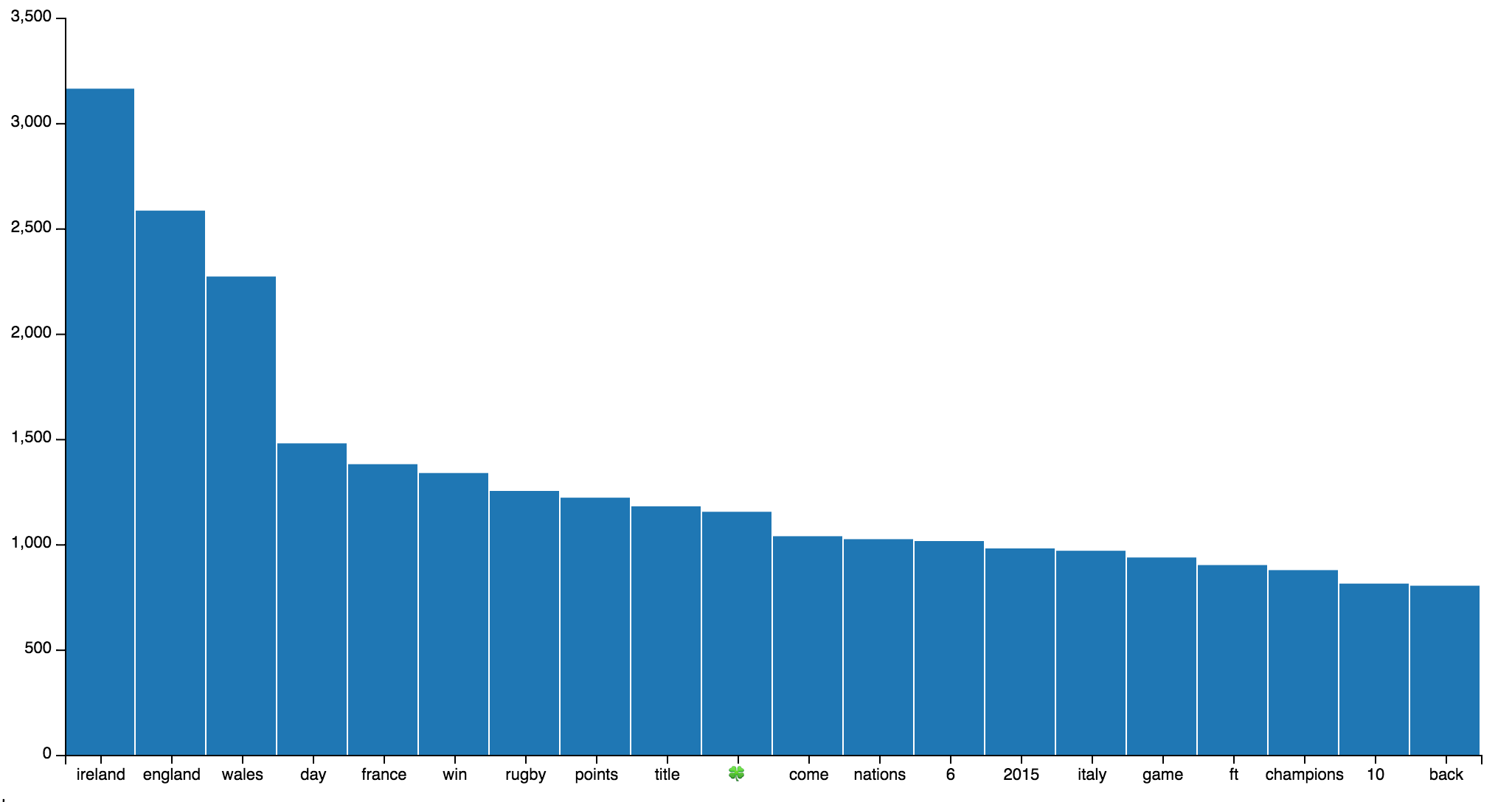
Click to enlarge.
Notice: you could save the HTML template directly from Python with:
bar.to_json('term_freq.json', html_out=True, html_path='chart.html')
but, at least in Python 3, the output is not a well formed HTML and you’d need to manually strip some characters.
With this procedure, we can plot many different types of charts with Vincent. Let’s take a moment to browse the docs and see its capabilities.
Time Series Visualisation
Another interesting aspect of analysing data from Twitter is the possibility to observe the distribution of tweets over time. In other words, if we organise the frequencies into temporal buckets, we could observe how Twitter users react to real-time events.
One of my favourite tools for data analysis with Python is Pandas, which also has a fairly decent support for time series. As an example, let’s track the hashtag #ITAvWAL to observe what happened during the first match.
Firstly, if we haven’t done it yet, we need to install Pandas:
sudo pip install pandas
In the main loop which reads all the tweets, we simply track the occurrences of the hashtag, i.e. we can refactor the code from the previous episodes into something similar to:
import pandas
import json

dates_ITAvWAL = []
# f is the file pointer to the JSON data set
for line in f:
    tweet = json.loads(line)
    # let's focus on hashtags only at the moment
    terms_hash = [term for term in preprocess(tweet['text']) if term.startswith('#')]
    # track when the hashtag is mentioned
    if '#itavwal' in terms_hash:
        dates_ITAvWAL.append(tweet['created_at'])

# a list of "1" to count the hashtags
ones = [1]*len(dates_ITAvWAL)
# the index of the series
idx = pandas.DatetimeIndex(dates_ITAvWAL)
# the actual series (at series of 1s for the moment)
ITAvWAL = pandas.Series(ones, index=idx)

# Resampling / bucketing
per_minute = ITAvWAL.resample('1Min', how='sum').fillna(0)
The last line is what allows us to track the frequencies over time. The series is re-sampled with intervals of 1 minute. This means all the tweets falling within a particular minute will be aggregated, more precisely they will be summed up, given how='sum'. The time index will not keep track of the seconds anymore. If there is no tweet in a particular minute, the fillna() function will fill the blanks with zeros.
To put the time series in a plot with Vincent:
time_chart = vincent.Line(ITAvWAL)
time_chart.axis_titles(x='Time', y='Freq')
time_chart.to_json('time_chart.json')
Once you embed the time_chart.json file into the HTML template discussed above, you’ll see this output:

Click to enlarge.
The interesting moments of the match are observable from the spikes in the series. The first spike just before 1pm corresponds to the first Italian try. All the other spikes between 1:30 and 2:30pm correspond to Welsh tries and show the Welsh dominance during the second half. The match was over by 2:30, so after that Twitter went quiet.
Rather than just observing one sequence at a time, we could compare different series to observe how the matches has evolved. So let’s refactor the code for the time series, keeping track of the three different hashtags#ITAvWAL, #SCOvIRE and #ENGvFRA into the corresponding pandas.Series.
# all the data together
match_data = dict(ITAvWAL=per_minute_i, SCOvIRE=per_minute_s, ENGvFRA=per_minute_e)
# we need a DataFrame, to accommodate multiple series
all_matches = pandas.DataFrame(data=match_data,
                               index=per_minute_i.index)
# Resampling as above
all_matches = all_matches.resample('1Min', how='sum').fillna(0)

# and now the plotting
time_chart = vincent.Line(all_matches[['ITAvWAL', 'SCOvIRE', 'ENGvFRA']])
time_chart.axis_titles(x='Time', y='Freq')
time_chart.legend(title='Matches')
time_chart.to_json('time_chart.json')
And the output:

Click to enlarge.
We can immediately observe when the different matches took place (approx 12:30-2:30, 2:30-4:30 and 5-7) and we can see how the last match had the all the attentions, especially in the end when the winner was revealed.
Summary
Data visualisation is an important discipline in the bigger context of data analysis. By supporting visual representations of our data, we can provide interesting insights. We have discussed a relatively simple option to support data visualisation with Python using Vincent. In particular, we have seen how we can easily bridge the gap between Python and a language like Javascript that offers a great tool like D3.js, one of the most important libraries for interactive visualisation. Overall, we have just scratched the surface of data visualisation, but as a starting point this should be enough to get some nice ideas going. The nature of Twitter as a medium has also encouraged a quick look into the topic of time series analysis, allowing us to mention pandas as a great Python tool.
Bio: Marco Bonzanini is a Data Scientist based in London, UK. Active in the PyData community, he enjoys working in text analytics and data mining applications. He's the author of "Mastering Social Media Mining with Python" (Packt Publishing, July 2016).
Original. Reposted with permission.
Related: