The Evolution of a ggplot
A step-by-step tutorial showing how to turn a default ggplot into an appealing and easily understandable data visualization in R.
By Cedric Scherer, Computational Ecologist.
Aim of this Tutorial
In this blog post, I how you how to turn a default ggplot into a plot that visualizes information in an appealing and easily understandable way. The goal is to provide a step-by-step tutorial explaining how my visualization has evolved from a typical basic ggplot. All plots are going to be created with 100% ggplot2 and 0% Inkscape.
I will transform a basic boxplot into a colorful and self-explanatory combination of a jittered dot strip plot and a lollipop plot. I am going to use data provided by the UNESCO on global student to teacher ratios that were selected as data #TidyTuesday challenge 19 of 2019.
Data Preparation
I have prepared the data in the first way to map each country's most recently reported student-teacher ratio in primary education as a tile map. I used the tile-based world data provided by Maarten Lambrechts to create this map as the first visualization for my weekly contribution:

For the second chart next to the tile map, I wanted to highlight the difference of the mean student ratio per continent but without discarding the raw data on the country-level. Therefore, I transformed the information on the region to represent the six continents excluding Antarctica (hm, do penguins not go to school?! Seems so…) and merged both datasets. If you would like to run the code yourself, you find the data preparation steps here. This is how the relevant columns of the merged and cleaned dataset look like, showing 2 examples per continent:
## # A tibble: 12 x 5
##    indicator    country            region   student_ratio student_ratio_re~
##
##  1 Primary Edu~ Djibouti           Africa            29.4              37.3
##  2 Primary Edu~ Senegal            Africa            32.8              37.3
##  3 Primary Edu~ Kazakhstan         Asia              19.6              20.7
##  4 Primary Edu~ Timor-Leste        Asia              NA                20.7
##  5 Primary Edu~ The former Yugosl~ Europe            14.4              13.6
##  6 Primary Edu~ Austria            Europe            10.0              13.6
##  7 Primary Edu~ Grenada            North A~          16.2              17.7
##  8 Primary Edu~ Saint Kitts and N~ North A~          13.9              17.7
##  9 Primary Edu~ Papua New Guinea   Oceania           35.5              24.7
## 10 Primary Edu~ New Zealand        Oceania           14.9              24.7
## 11 Primary Edu~ Venezuela (Boliva~ South A~          NA                19.4
## 12 Primary Edu~ Colombia           South A~          23.6              19.4
The Default Boxplot
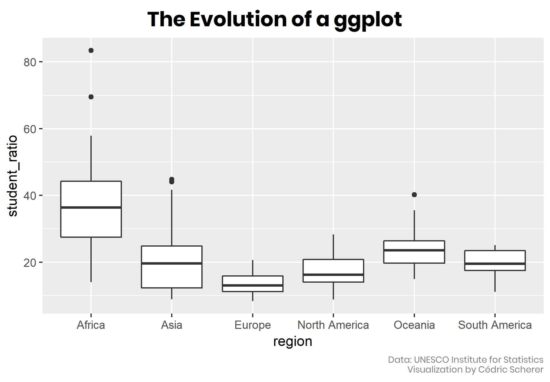
I was particularly interested to visualize the most-recent student-teacher ratio in primary education as a tile chloropleth map per country. A usual way representing several data points per group is to use a boxplot:
library(tidyverse)

ggplot(df_ratios, aes(region, student_ratio)) +
  geom_boxplot()

Sort Your Data!
A good routine with such kind of data (qualitative and unsorted) to arrange the boxplots (or any other type such as bars or violins) in an in- or decreasing order to increase readability. Since the category “continent” does not have a natural ordering, I rearrange the boxplots by their mean student-teacher ratio instead of alphabetically:
df_sorted <- df_ratios %>%
  mutate(region = fct_reorder(region, -student_ratio_region))

ggplot(df_sorted, aes(region, student_ratio)) +
  geom_boxplot()

Sort your data according to the best or worst, highest or lowest value to make your graph easily readable - do not sort them if the categories have an internal logical order such as age groups!
To increase the readability, we are going to flip the coordinates (note that we could also switch x and y arguments in the ggplot2 call - but this does not work for boxplots, so we use coord_flip()). It is also a good practice to include the 0 in plots which we can force by adding scale_y_continuous(limits = c(0, 90)).
 ggplot(df_sorted, aes(region, student_ratio)) +
  geom_boxplot() +
  coord_flip() +
  scale_y_continuous(limits = c(0, 90))

Flip the chart in case of long labels to increase readability and to avoid overlapping or rotated labels!
The order of the categories is perfect as it is after flipping the coordinates - the lower the student-teacher ratio, the better.
Let Your Plot Shine - Get Rid of the Default Settings
Let’s spice this plot up! One great thing about ggplot2 is that it is structured in an adaptive way, allowing to add further levels to an existing ggplot object. We are going to
- use a different theme that comes with the ggplot2 package by calling theme_set(theme_light()) (several themes come along with the ggplot2 package but if you need more check, for example, the packages ggthemes or hrbrthemes)
- change the font and the overall font size by adding the arguments base_size and base_family to theme_light(),
- flip the axes by adding coord_flip() (as seen before)
- let the axis start at 0 and reduce the spacing to the plot margin by adding expand = c(0.005, 0.005) as argument to the scale_y_continious()
- add some color encoding the continent by adding color = region to the aes argument and picking a palette from the ggsci package,
- add meaningful labels/removing useless labels by adding adding labs(x = NULL, y = "title y")
- adjust the new theme (e.g., changing some font settings and removing the legend and grid) by adding theme()
You can easily adjust all sizes of the theme by calling theme_xyz(base_size = ) + this is very handy if you need the same viz for a different purpose!
Do not use c(0, 0) since the zero tick is in most cases too close to the axis - use c(0.005, 0.005) instead!
I am going to save the ggplot call, and all these visual adjustments in gg object called g so we can use it for the next plots.
extrafont::loadfonts(device = "win")

theme_set(theme_light(base_size = 15, base_family = "Poppins"))

g <- ggplot(df_sorted, aes(region, student_ratio, color = region)) +
  coord_flip() +
  scale_y_continuous(limits = c(0, 90), expand = c(0.005, 0.005)) +
  scale_color_uchicago() +
  labs(x = NULL, y = "Student to teacher ratio") +
  theme(legend.position = "none",
        axis.title = element_text(size = 12),
        axis.text.x = element_text(family = "Roboto Mono", size = 10),
        panel.grid = element_blank())
(Note that to include these fonts we make use of the extrafont package. You need to have (a) the fonts installed on your system, (b) the package extrafont installed and (c) imported your fonts by running extrafont::font_import().)
The Choice of the Chart Type
We can add any geom_ to our ggplot-preset g that fits the data (note that until now it is jut an empty plot with pretty axes):

All of the four chart types let readers explore the range of values but with different detail and focus. The boxplot and the violin plot both summarize the data, they contain a lot of information by visualizing the distribution of the data points in two different ways. By contrast, the dot strip plot and the line plot show the raw data. However, a line chart is not a good choice here since it does not allow for the identification of single countries. By adding an alpha argument to geom_point(), the dot strip plot is able to highlight the range of student-teacher ratios while providing the raw data:
g + geom_point(size = 3, alpha = 0.15)

Of course, different geoms can also be combined to provide even more information in one plot:
g + geom_boxplot(color = "gray60", outlier.alpha = 0) +
  geom_point(size = 3, alpha = 0.15)

Remove the outliers to avoid overlapping points! You can achieve this via outlier.shape = NA or outlier.alpha = 0.
We are going to stick to points to visualize the countries explicitly instead of aggregating the data into box- or violin plots. To achieve higher readability, we use another geom, geom_jitter() which scatters the points in a given direction (x and/or y via width and height) to prevent overplotting:
set.seed(123)

g + geom_jitter(size = 2, alpha = 0.25, width = 0.2)

Set a seed to keep the jittering of the points fixed every time you call geom_jitter() by calling set.seed() - this becomes especially important when we later label some of the points.
(I am going to the redundant call of set.seed(123) in the next code chunks.)
More Geoms, More Fun, More Info!
As mentioned in the beginning, my intention was to visualize both the country- and continental-level ratios, in addition to the tile map. Until now, we focussed on countries only. We can indicate the continental average by adding another geom_point() which has to differ from the points of geom_jitter(). Since the average is more important here, I am going to highlight it with a bigger size and zero transparency:
 g +
  geom_jitter(size = 2, alpha = 0.25, width = 0.2) +
  geom_point(aes(region, student_ratio_region), size = 5)

To relate all these points to a baseline, we add a line indicating the worldwide average:
world_avg <- df_ratios %>%
  summarize(avg = mean(student_ratio, na.rm = T)) %>%
  pull(avg)

g +
  geom_hline(aes(yintercept = world_avg), color = "gray70", size = 0.6) +
  geom_point(aes(region, student_ratio_region), size = 5) +
  geom_jitter(size = 2, alpha = 0.25, width = 0.2)

One could derive the worldwide average also within the geom_hline() call, but I prefer to keep both steps separated.
We can further highlight that the baseline is the worldwide average ratio rather than a ratio of 0 (or 1?) by adding a line from each continental average to the worldwide average. The result is a combination of a jitter and lollipop plot:
g +
  geom_segment(aes(x = region, xend = region,
                   y = world_avg, yend = student_ratio_region),
               size = 0.8) +
  geom_hline(aes(yintercept = world_avg), color = "gray70", size = 0.6) +
  geom_jitter(size = 2, alpha = 0.25, width = 0.2) +
  geom_point(aes(region, student_ratio_region), size = 5)

Check the order of the geoms to prevent any overlapping - here, for example, draw the line after calling geom_segment() to avoid overlapping!
Add Text Boxes to Let The Plot Speak for Itself
Since I don’t want to include legends, I add some text boxes that explain the different point sizes and the baseline level via annotate("text"):
 (g_text <- g +
  geom_segment(aes(x = region, xend = region,
                   y = world_avg, yend = student_ratio_region),
               size = 0.8) +
  geom_hline(aes(yintercept = world_avg), color = "gray70", size = 0.6) +
  geom_point(aes(region, student_ratio_region), size = 5) +
  geom_jitter(size = 2, alpha = 0.25, width = 0.2) +
  annotate("text", x = 6.3, y = 35, family = "Poppins", size = 2.7, color = "gray20",
           label = glue::glue("Worldwide average:\n{round(world_avg, 1)} students per teacher")) +
  annotate("text", x = 3.5, y = 10, family = "Poppins", size = 2.7, color = "gray20",
           label = "Continental average") +
  annotate("text", x = 1.7, y = 11, family = "Poppins", size = 2.7, color = "gray20",
           label = "Countries per continent") +
  annotate("text", x = 1.9, y = 64, family = "Poppins", size = 2.7, color = "gray20",
           label = "The Central African Republic has by far\nthe most students per teacher"))

Use glue::glue() to combine strings with variables - this way, you can update your plots without copying and pasting values! (Of course, you can also use your good old friend paste0().)
… and add some arrows to match the text to the visual elements by providing start- and endpoints of the arrows when calling geom_curve(). I am going to draw all arrows with one call - but you could also draw arrow by arrow. This is not that simple as the absolute position depends on the dimension of the plot. Good guess based on the coordinates of the text boxes…
arrows <- tibble(
  x1 = c(6.2, 3.5, 1.7, 1.7, 1.9),
  x2 = c(5.6, 4, 1.9, 2.9, 1.1),
  y1 = c(35, 10, 11, 11, 73),
  y2 = c(world_avg, 19.4, 14.1, 12, 83.4)
)

g_text + geom_curve(data = arrows, aes(x = x1, y = y1, xend = x2, yend = y2),
             arrow = arrow(length = unit(0.07, "inch")), size = 0.4,
             color = "gray20", curvature = -0.3)

… and then adjust, adjust, adjust…
arrows <- tibble(
  x1 = c(6, 3.65, 1.8, 1.8, 1.8),
  x2 = c(5.6, 4, 2.07, 2.78, 1.08),
  y1 = c(world_avg + 6, 10.5, 9, 9, 76),
  y2 = c(world_avg + 0.1, 18.4, 14.48, 12, 83.41195)
)

(g_arrows <- g_text +
  geom_curve(data = arrows, aes(x = x1, y = y1, xend = x2, yend = y2),
             arrow = arrow(length = unit(0.08, "inch")), size = 0.5,
             color = "gray20", curvature = -0.3))

Since the curvature is the same for all arrows, one can use different x and y distances and directions between the start end and points to vary their shape!
One last thing that bothers me: A student-teacher ratio of 0 does not make much sense - I definitely prefer to start at a ratio of 1!
And - oh my! - we almost forgot to mention and acknowledge the data source. Let’s quickly also add a plot caption:
(g_final <- g_arrows +
  scale_y_continuous(limits = c(0, 90), expand = c(0.005, 0.005),
                     breaks = c(1, seq(20, 80, by = 20))) +
  labs(caption = "Data: UNESCO Institute for Statistics") +
  theme(plot.caption = element_text(size = 9, color = "gray50")))
## Scale for 'y' is already present. Adding another scale for 'y', which
## will replace the existing scale.

Bonus: Add a Tile Map as Legend
To make it easier to match the countries of the second plot, the country-level tile map, to each continent we have visualized with our jitter plot, we can add a geographical “legend”. For this, I encode the region by color instead by the country-level ratios:
(map_regions <- df_sorted %>%
  ggplot(aes(x = x, y = y, fill = region, color = region)) +
    geom_tile(color = "white") +
    scale_y_reverse() +
    scale_fill_uchicago(guide = F) +
    coord_equal() +
    theme(line = element_blank(),
          panel.background = element_rect(fill = "transparent"),
          plot.background = element_rect(fill = "transparent",
                                         color = "transparent"),
          panel.border = element_rect(color = "transparent"),
          strip.background = element_rect(color = "gray20"),
          axis.text = element_blank(),
          plot.margin = margin(0, 0, 0, 0)) +
    labs(x = NULL, y = NULL))

… and add this map to the existing plot via annotation_custom(ggplotGrob()):
 g_final +
  annotation_custom(ggplotGrob(map_regions), xmin = 2.5, xmax = 7.5, ymin = 55, ymax = 85)

The Final Evolved Visualization
And here it is, our final plot - evolved from a dreary gray boxplot to a self-explanatory, colorful visualization including the raw data and a tile map legend!

Thanks for reading. I hope you’ve enjoyed it! Here you find more visualizations I’ve contributed to the #TidyTuesday challenges including my full contribution to week 19 of 2019 we have dissected here:

Complete Code for Final Plot
And if you want to create the plot on your own or play around with the code, copy and paste these 60 lines:
## packages
library(tidyverse)
library(ggsci)

## load fonts
extrafont::loadfonts(device = "win")

## get data
devtools::source_gist("https://gist.github.com/Z3tt/301bb0c7e3565111770121af2bd60c11")

## tile map as legend
map_regions <- df_ratios %>%
  mutate(region = fct_reorder(region, -student_ratio_region)) %>%
  ggplot(aes(x = x, y = y, fill = region, color = region)) +
    geom_tile(color = "white") +
    scale_y_reverse() +
    scale_fill_uchicago(guide = F) +
    coord_equal() +
    theme_light() +
    theme(line = element_blank(),
          panel.background = element_rect(fill = "transparent"),
          plot.background = element_rect(fill = "transparent",
                                         color = "transparent"),
          panel.border = element_rect(color = "transparent"),
          strip.background = element_rect(color = "gray20"),
          axis.text = element_blank(),
          plot.margin = margin(0, 0, 0, 0)) +
    labs(x = NULL, y = NULL)


## calculate worldwide average
world_avg <- df_ratios %>%
  summarize(avg = mean(student_ratio, na.rm = T)) %>%
  pull(avg)

## coordinates for arrows
arrows <- tibble( x1 = c(6, 3.65, 1.8, 1.8, 1.8), x2 = c(5.6, 4, 2.07, 2.78, 1.1), y1 = c(world_avg + 6, 10.5, 9, 9, 76), y2 = c(world_avg + 0.1, 18.32, 14.4, 11.85, 83.41195) ) ## final plot ## set seed to fix position of jittered points set.seed(123) ## final plot df_ratios %>%
  mutate(region = fct_reorder(region, -student_ratio_region)) %>%
  ggplot(aes(region, student_ratio, color = region)) +
    geom_segment(aes(x = region, xend = region,
                     y = world_avg, yend = student_ratio_region),
                 size = 0.8) +
    geom_hline(aes(yintercept = world_avg), color = "gray70", size = 0.6) +
    geom_point(aes(region, student_ratio_region), size = 5) +
    geom_jitter(size = 2, alpha = 0.25, width = 0.2) +
    coord_flip() +
    annotate("text", x = 6.3, y = 35, family = "Poppins",
             size = 2.7, color = "gray20",
             label = glue::glue("Worldwide average:\n{round(world_avg, 1)} students per teacher")) +
    annotate("text", x = 3.5, y = 10, family = "Poppins",
             size = 2.7, color = "gray20",
             label = "Continental average") +
    annotate("text", x = 1.7, y = 11, family = "Poppins",
             size = 2.7, color = "gray20",
             label = "Countries per continent") +
    annotate("text", x = 1.9, y = 64, family = "Poppins",
             size = 2.7, color = "gray20",
             label = "The Central African Republic has by far\nthe most students per teacher") +
    geom_curve(data = arrows, aes(x = x1, xend = x2,
                                  y = y1, yend = y2),
               arrow = arrow(length = unit(0.08, "inch")), size = 0.5,
               color = "gray20", curvature = -0.3) +
    annotation_custom(ggplotGrob(map_regions),
                      xmin = 2.5, xmax = 7.5, ymin = 55, ymax = 85) +
    scale_y_continuous(limits = c(0, 90), expand = c(0.005, 0.005),
                       breaks = c(1, seq(20, 80, by = 20))) +
    scale_color_uchicago() +
    labs(x = NULL, y = "Student to teacher ratio",
         caption = 'Data: UNESCO Institute for Statistics') +
    theme_light(base_size = 15, base_family = "Poppins") +
    theme(legend.position = "none",
          axis.title = element_text(size = 12),
          axis.text.x = element_text(family = "Roboto Mono", size = 10),
          plot.caption = element_text(size = 9, color = "gray50"),
          panel.grid = element_blank())
Post Sciptum: Mean versus Median
One thing I want to highlight is that the final plot does not contain the same information as the original boxplot. While I have visualized the mean values of each country and across the globe, the box of a Box-and-Whisker plot represents the 25th, 50th, 75th percentile of the data (also known as first, second and third quartile):
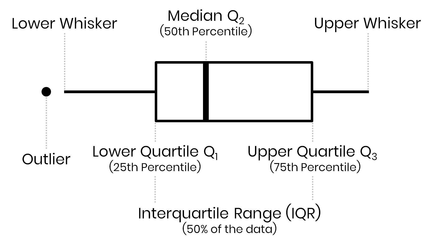
In a Box-and-Whisker plot the box visualizes the upper and lower quartiles, so the box spans the interquartile range (IQR) containing 50 percent of the data, and the median is marked by a vertical line inside the box.
The 2nd quartile is known as the median, i.e., 50% of the data points fall below this value, and the other 50% is higher than this value. My decision to estimate the mean value was based on the fact that my aim was a visualization that is easily understandable to a large (non-scientific) audience that is used to mean (“average”) values but not to median estimates. However, in the case of skewed data, the mean value of a dataset is also biased towards higher or lower values. Let’s compare both a plot based on the mean and the median:

As one can see, the differences between continents stay roughly the same, but the worldwide median is lower than the worldwide average (19.6 students per teacher versus 23.5). The plot with medians highlights that the median student-teacher ratio of Asia and Oceania are similar to the worldwide median. These plots now resemble much more the basic boxplot we used in the beginning but may be harder to interpret for some compared to the one visualizing average ratios.
Bio: Cedric Scherer is a Computational Ecologist, DataViz Enthusiast and Proud Dad.
Original. Reposted with permission.
Related: