 How to choose a visualization
 How to choose a visualization
Visualizations based on the structure of data are needed during analysis, which might be different than for the end user. A new guide for choosing the right visualization helps you flexibly understand the data first.
By Steven Franconeri, Northwestern.
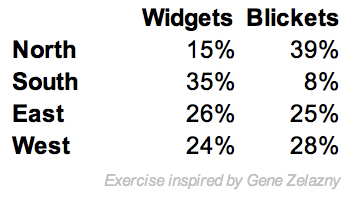
Imagine that I give you the 8 numbers at left, and ask you to graph them in a display where you can flexibly uncover patterns. I use this example frequently in data visualization workshops, and the typical result is a deer-in-the-headlights look. And these are smart audiences — college undergraduates, Ph.D. students, MBAs, or business analysts. Most are overwhelmed with options: Bars, Lines, Pies, Oh My. If I instead show the data already in a visualization and ask them to replot it, the audience pivots from being overwhelmed with options, to being unable to imagine the data plotted in any other way.
Visualization quick reference guides (also known as ‘chart choosers’) are a great solution to these problems, abstracting over wonky theories to provide direct suggestions for how to represent data. These guides are typically organized by viewer tasks — does the designer want the viewer to see a ranking, examine a distribution, inspect a relationship, or make a comparison? These guides then use these tasks to categorize (or flowchart) viable alternative designs. Students and practitioners (heck, and researchers) appreciate the way that these tools help them break out of being overwhelmed with options, or fixated on a single possibility.
There are several great task-based chart choosers out there (here’s an example from the Financial Times), so why make a new one? Choosing a visualization based on task can be a helpful constraint when it’s time to communicate a known pattern to an audience. But it can be less useful at the analysis stage before that, where you have only vague notions of potentially important tasks. Early commitment to a visualization suited to a specific task might even cause you to fixate on one pattern, and miss another. And some tasks are vaguely defined. I find ‘See Relationship’ and ‘Make Comparison’ particularly fuzzy. Didn’t Tufte proclaim that everything is a comparison? For analysts, the best visualization format is typically the one that is flexibly useful across tasks, allowing general foraging through possible patterns.
But if not task, what’s another way to organize a chooser? When I decided to set up a new one, I liked the simple objectivity of picking the visualization according to the structure of the data being plotted (though I was recently delighted to be pointed to another chooser with a similar setup).
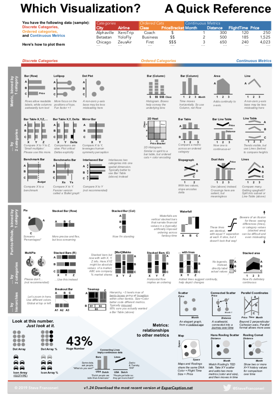
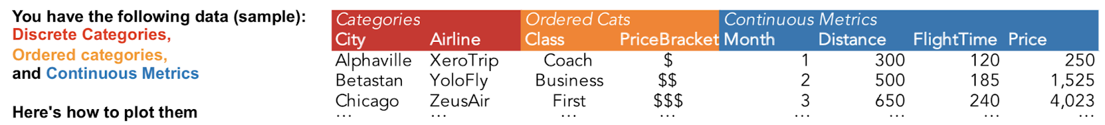
The small dataset below illustrates the typical types of quantitative data in any excel sheet: categories, ordered categories, and continuous metrics. Once you decide which columns of the dataset to throw together, the chooser (in theory) tells you the best options. I’ll walk through how it works below.
You have a pile of metrics (numbers), perhaps you’d like to bin them by discrete categories (typically, a bar graph), or maybe two categories at the same time, as in a 2-dimensional table (I like Bar Tables for this). Or perhaps you want those metrics organized along a continuous axis (another metric) as when plotting values that change over time (typically, a line graph), and then maybe you’d like to show that binned by discrete categories (typically, a line graph with multiple lines on it). If, instead of absolute values, the metrics should be interpreted as percentages, that typically entails spatially smooshing the graph into pies or stacked bars.
 Sample data.
The horizontal axis of the quick reference guide, Discrete Categories to Continuous Metrics.
I teach and analyze my data with Tableau, which automatically changes visualization designs based on whether a visualization organizes data by fields designated as discrete or continuous (which in turn is based on a history of work in data visualization). That discrete-vs.-continuous difference became the core organizing principle for the horizontal axis of the chooser. Metrics organized by discrete category bins are on the left, and metrics organized by other continuous metrics are on the right. Metrics organized by their awkward child of ordered categories sit in the middle seat.
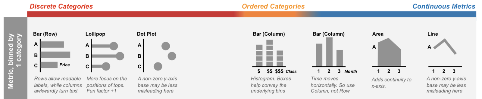
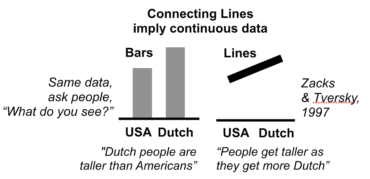
There are two key design changes that happen from left to right. First, organizing metrics by discrete categories (left side of chart chooser) leads to bar graphs with multiple discrete bars, and organizing metrics by other continuous metrics (right) leads to line graphs with continuous lines. This design change strongly influences whether viewers properly interpret the structure of the data, as seen in psychological experiments (see the population height graphs, and typical related interpretations, below, taken from the bottom-center of the chooser).
Second, for the discrete categories on the left, bars are organized vertically as a ‘row graph’ so that the ‘A,B,C’ labels, which are actually typically whole words or phrases, can have space to be written out as horizontal text. In a vertically organized ‘column graph’, those words would have to be severely cramped, or turned diagonally or vertically, which is all tough to read. For the continuous metric organizations at right (and the orange ordered category values in the middle), values are organized from left to right, because that’s what people expect. Time moves from left to right in the human mind, and so do increasing continuous quantities, like the number line posted above the chalkboard in your elementary school classroom.
The vertical organizing principle is more lumpy. The top row shows metrics organized by the entries of a single category (a single set of bars or points, or a single set of points connected by a line or area). Then the rows underneath show similar designs for organizing metrics by the entries two categories at the same time, as in a 2-dimensional table. The next section below that repeats the same organization, but for metrics that should be interpreted as percentages or parts of a whole, instead of independent absolute values.
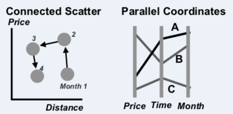
In the bottom section with the blue background, the left side simply shows engaging ways of showing single numbers or percentages, and the right side depicts ways to pit two continuous metrics against each other (mostly varieties of perpendicularly-coordinated scatterplots, though there is also an appearance from its overly-ambitious cousin, parallel coordinates). Note that the metrics in the scatterplots are still divided by the entries of a category (the number of entries of that category determines the number of dots on the scatterplot, or the number of lines for parallel coordinates).
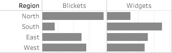
Popping back to the table of 8 numbers at the top, the structure of the data is metrics (the percentages) binned by 2 categories (ABC is Region: N,S,E,W, while XYZ is Product Type: Widgets, Blickets). So if the metrics should be thought of as absolute values, a Bar Table is best, and if percentages are the preferred focus, then Stacked Bars (Row) is an alternative to consider.
I tried to include only well-known visualizations, the types that are present in existing typical chart choosers. I did include a few newfangled options because I think they’re worth learning. Marimekko charts, connected scatterplots, and parallel coordinates take a little time to understand but can be powerful.
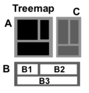 I included treemaps, which I see surprisingly often in the business world, primarily to discourage their use. Treemaps are meant to show a large hierarchical dataset with two metrics coded separately as size and color, but I frequently see them used to show non-hierarchical data, typically with size and color (confusingly) redundantly encoding the same values, typically with a diverging color ramp (so that small boxes are red, mediums are grey, and big ones are blue). Many thousands of business person hours have been lost to the confused viewers of that chart, which should just have been a bar graph.
These take time to learn, making them terrible for rapid communication to lay audiences. But for analysts, or when you have 3 minutes to teach your audience how to read them, they can be useful visualizations for complex data.
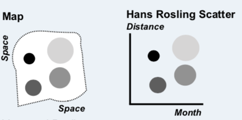
You know how you think you know something right up until you have to write it down, explain it to someone, or actually to build something, and then you realize that you know less than you know, or much of what you know doesn’t make sense? Creating this chart chooser helped me see visualizations in new ways. For a while, I no longer understood where a heatmap belonged (it has shifted around to at least three different spots on the page so far). It’s currently a way of slicing metrics by two ordered categories, but am still open to moving it. I now see that Rosling scatterplots and maps share the same DNA, with the maps using latitude and longitude as the axes of the scatterplot (this is the way that Tableau treats maps).
I realized that I have no evidence for some claims, like that Bar Tables are better than Interleaved Bars, even though one of our own studies shows otherwise, I think the right test hasn’t yet been done. That recommendation might be particularly controversial because the Bar Table puts some bar comparisons along a non-aligned baseline, which makes the comparison less precise (because you can only compare lengths and lose the ability to compare the bar ends). But I think that a small drop in visual precision is overwhelmed by the greater clarity and flexibility of the Bar Table’s 2-dimensional visual organization. There’s also no empirical evidence for the chooser’s claim that a truncated y-axis is less bad on a line graph compared to a bar graph, and I may end up deleting that factoid.
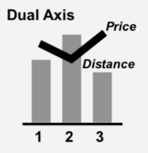
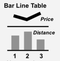
I’ve also been challenged in welcome ways. There’s a prescription in my chart chooser to always use a ‘Bar-Line Table’ instead of the ‘Dual Axis’ graph more commonly used in the business world. But every quarter or so, I have a fun fight with an analyst who swears that the dual axis allows better perception of correlation between the two sets of values (and yes, they understand that they are comparing axes that are apples and oranges, etc., they get what you are muttering to yourself right now). I am now only mostly-certain that I’m right, so I have an empirical test for that on our lab’s to-do list (Hey visualization Ph.D. students: This is a long list, contact me if you’re interested in collaborating on testing things like this).
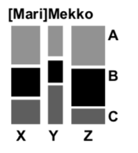
Creating and using the chooser has forced me to learn to see through visualizations, to the structure of their underlying data, and that helps overcome design fixation. At a recent workshop, we were critiquing a cash flow visualization, where money came in from a set of sources X, Y, & Z, and each source was differentially allocated to expenditure A, B & C. The original was Sankey-style flow diagram of where the money headed from each source. It was lovely but impractical spaghetti. Even I was stuck on that design, and had to force myself to look at the guide to determine that the Marimekko actually nicely fit the structure of those data.

North and South are asymmetric, East and West are similar.
This guide focuses its choices based on the structure of the data, instead of a viewer’s task. But both models are important. It points the user to a cluster of visualizations, but my advice from there is to still consider task, by quickly sketching or plotting your data in a few formats, and seeing which one shouts your pattern the loudest (or, cross-referencing with a task-based guide). For example, the Mirror Bar at right yells ‘inverse relationship’ in a way that the Bar Table above doesn’t, even with the same data. There’s probably a way to add a 3rd dimension of ‘task’ to the present guide, and I look forward to someone figuring out how to visualize that cube (hmm… interactive task-based highlighting of a subset of options?).
I’m most excited about the guide serving as a formalization of guidelines that could be validated, refined, or rejected by the practitioner and research communities (with answers perhaps bubbling up to more sophisticated frameworks). The recommendations here are imperfect, and I’m happy to continually alter it to fit the consensus opinions on what it gets wrong (I’m looking at you, DataVis Society Slack channel). I’m just as excited about the unsolved debates, which will be immediately pitched to Ph.D. students as empirical research projects, to ultimately combine what practitioners, designers, and researchers know about how to pick the most effective visualization.
Original. Reposted with permission.
Bio: Steve Franconeri is a Professor of Psychology at Northwestern, and Director of the Northwestern Cognitive Science Program. He studies Visuospatial Thinking, especially within Information Visualization and Education, as well as Visual Communication.
Related: