Bring your Pandas Dataframes to life with D-Tale
Bring your Pandas dataframes to life with D-Tale. D-Tale is an open-source solution for which you can visualize, analyze and learn how to code Pandas data structures. In this tutorial you'll learn how to open the grid, build columns, create charts and view code exports.
By Andrew Schonfeld, Full-stack Developer & Creator of D-Tale
Tired of running df.head() on your dataframes? In this tutorial, we will explore the open-source visualizer for Pandas dataframes, D-Tale. Some of the features we'll touch on are installation, startup, navigating the grid, viewing column statistics, building a chart & code exports.
What is it?
D-Tale is the combination of a Flask back-end and a React front-end to bring you an easy way to view & analyze Pandas data structures. It integrates seamlessly with ipython notebooks & python/ipython terminals. Currently this tool supports such Pandas objects as DataFrame, Series, MultiIndex, DatetimeIndex & RangeIndex.
Step 1: Installation
Installation is available using pip or conda
# conda
conda install dtale -c conda-forge

# pip
pip install -U dtale
Source code is available here.
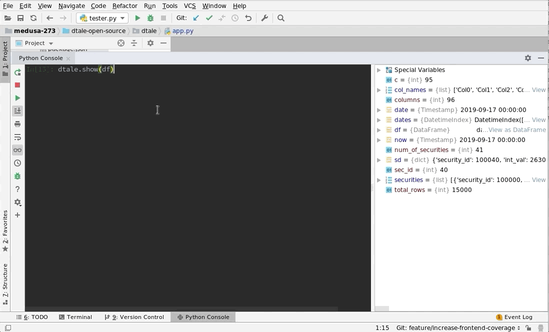
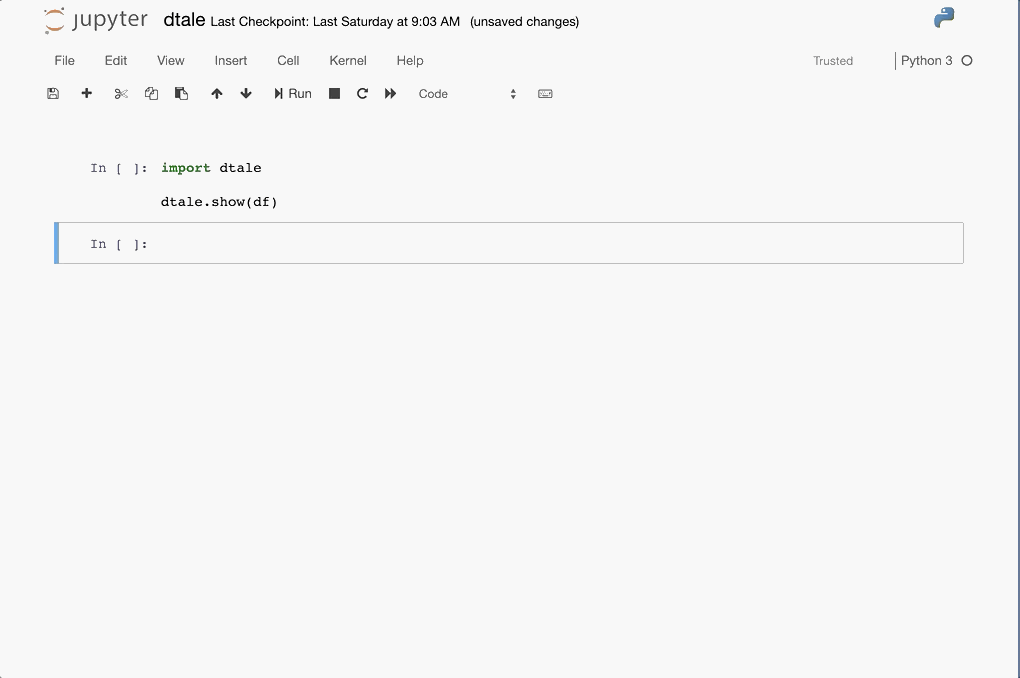
Step 2: Opening the Grid
Execute the following code within your Python console or jupyter notebook
import pandas as pd
import dtale

df = pd.DataFrame(dict(a=[1,1,2,2,3,3], b=[1,2,3,4,5,6]))
dtale.show(df)
You will be presented with one of the following:
- Python console: A link which depending on your terminal settings you can either click or copy into a browser which will bring you to the D-Tale grid.
- jupyter notebook: An output cell containing the D-Tale grid
Examples
| PyCharm | jupyter |
|---|---|
 |
 |
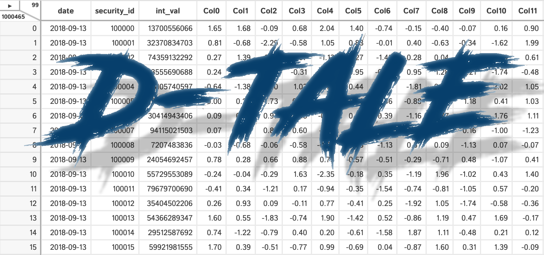
Step 3: Navigating the Grid
Once inside the grid you have all of the standard grid functionality at your fingertips by clicking column headers. If your still in the output cell of your jupyter notebook feel free to click the triangle in the upper lefthand corner to open the main menu and then click "Open in New Tab" to give you a larger workspace.
|
|
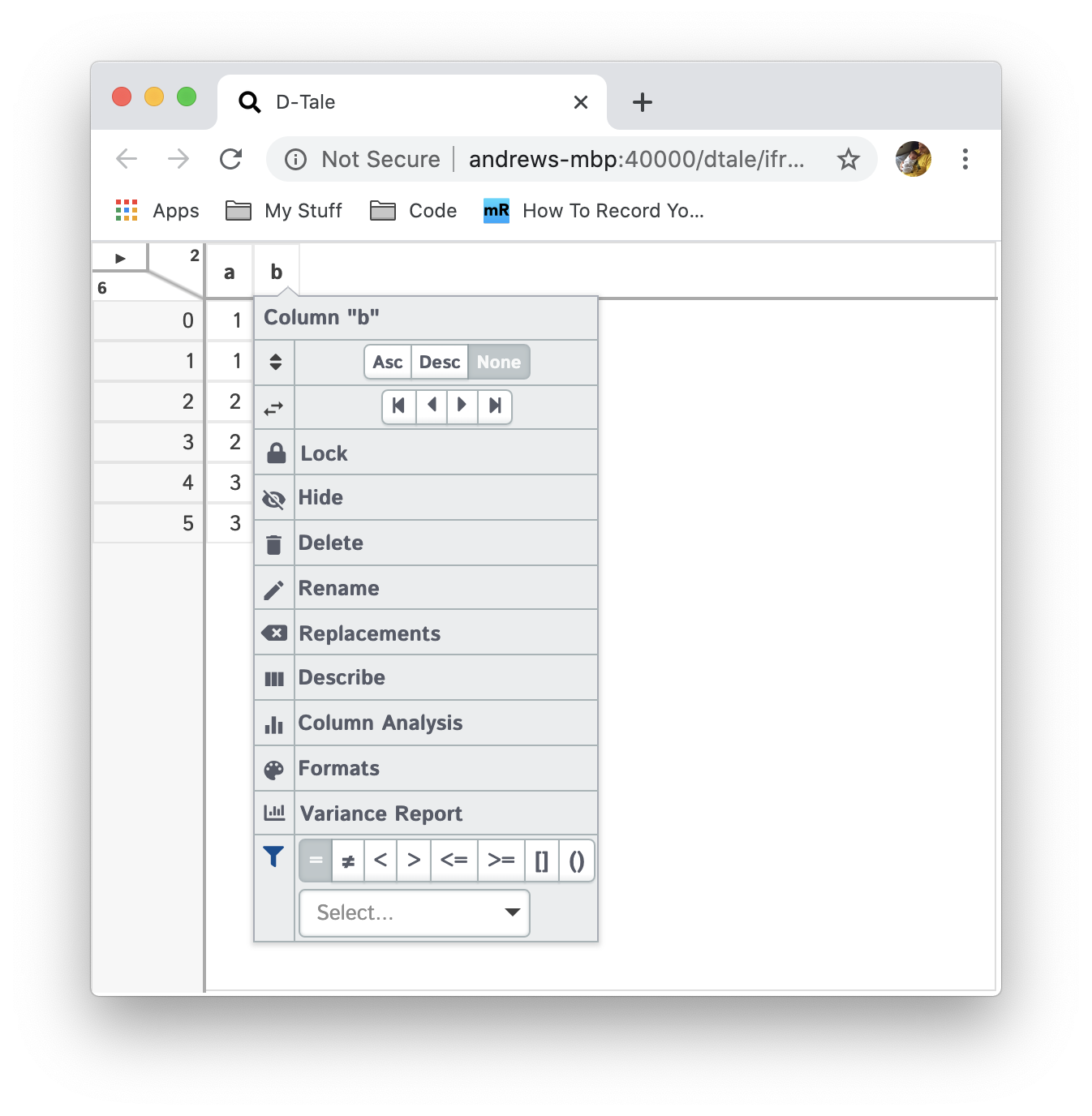
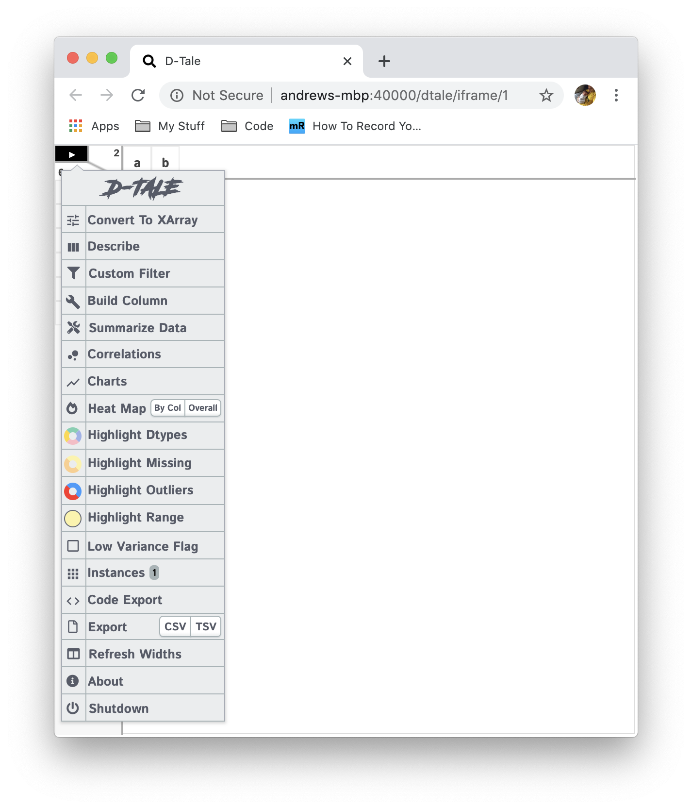
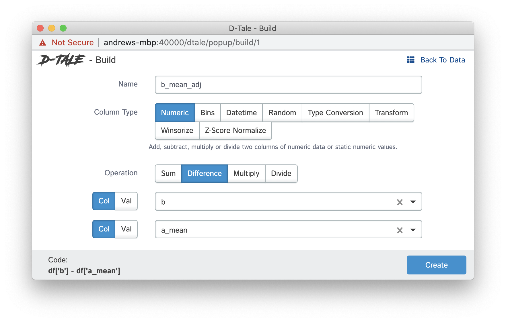
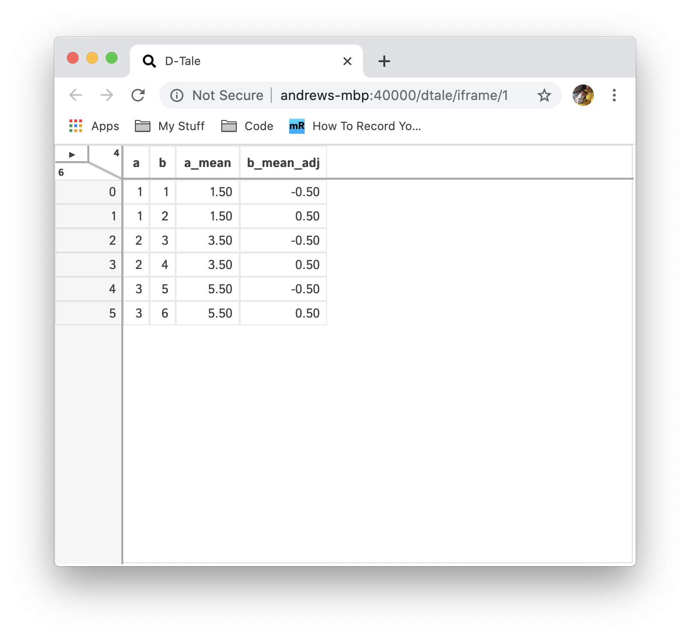
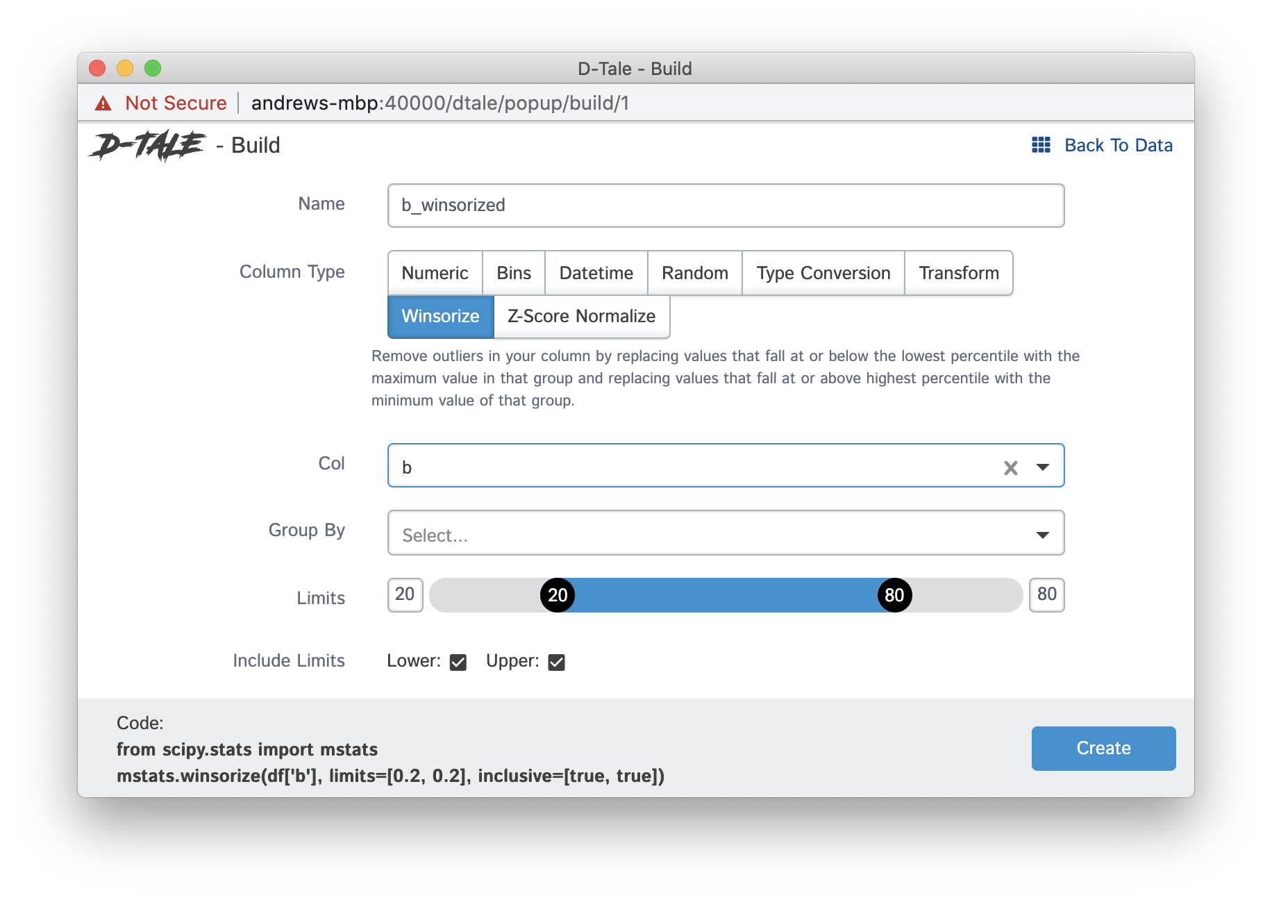
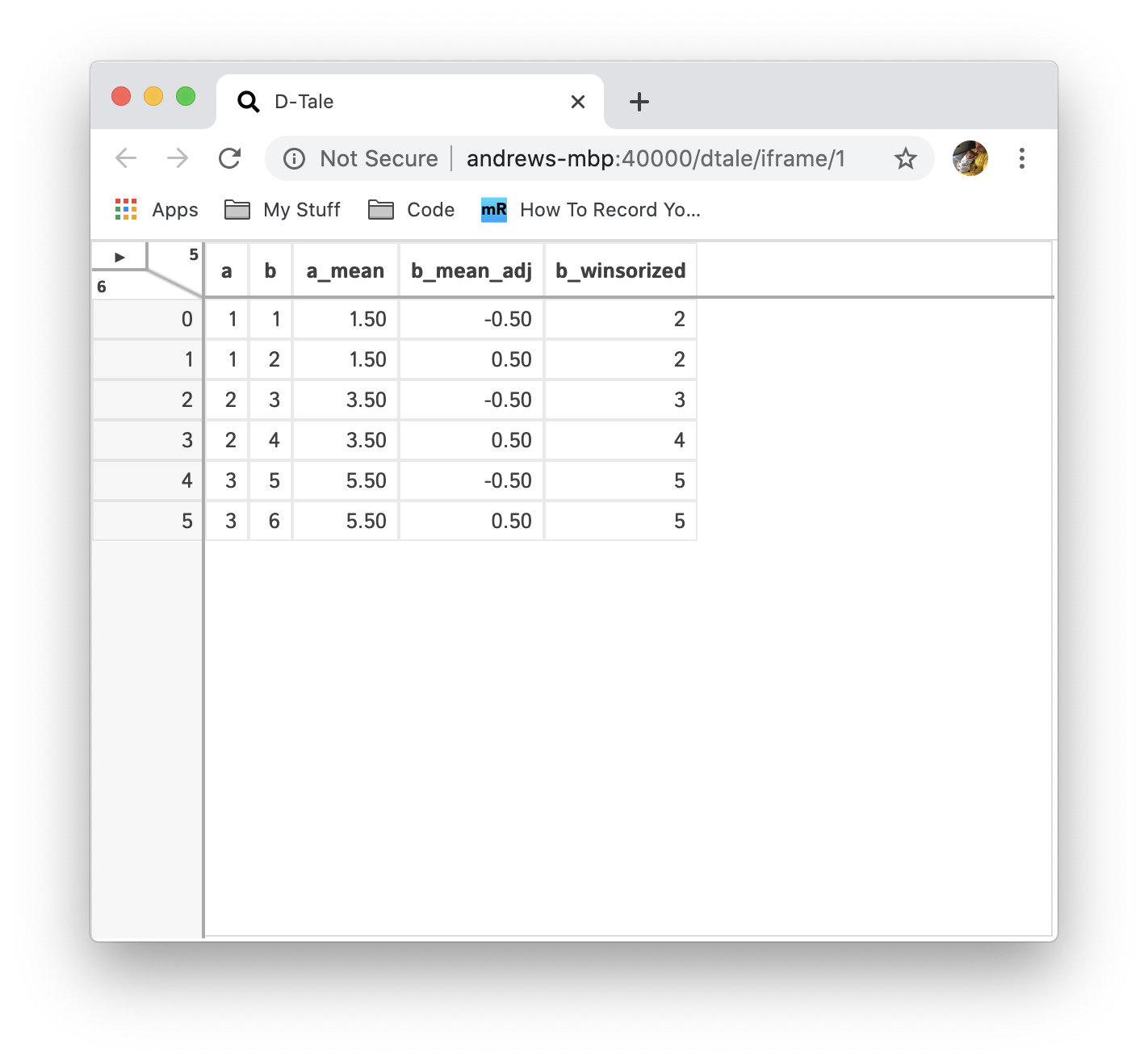
Step 4: Building Columns
If you open the main menu by clicking on the triangle in the upper lefthand corner you'll be presented with many options, one of which is "Build Columns". Click that and you see many options for different ways to build new columns based on your existing data. Here are some examples of a few of them:
| Builder | Main Menu | Column Builder Menu | Output |
|---|---|---|---|
| Transform (Groupby Mean) |
|
|
|
| Mean Adjust (Subtract Columns) |
|
|
|
| Winsorize |
|
|
Step 5: View Column Statistics
Many times you'll want to be able to view a quick overview of the contents of your dataframe. One way to do this is by running df.describe(). We've brought that function to life with the "Describe" menu option. By either opening the main menu or clicking a column header and then clicking the "Describe" button (clicking from a column header will preselect that column for you).
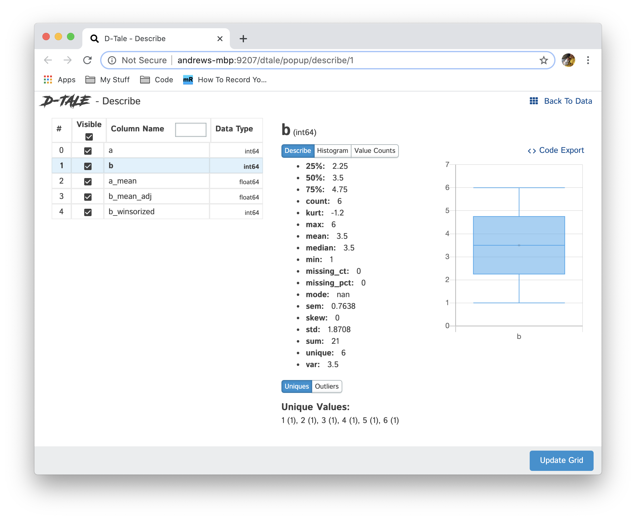
If you take a look you'll notice a listing of different statistics (which will vary based on data type of the column selected). These statistics are the output of calling df.describe() on that column as well as some other helpful statistics like percentage of missings & kurtosis. You also have the ability to view other helpful information:
- Boxplot of min, q1, median, mean, q3, max
- Histogram of column values
- Value counts of unique values
- Toggle visibility of columns using the grid on the left
Step 6: Building a Chart With Your Data
By opening the main menu once more and clicking the "Charts" button you will be brought to a new tab with the ability to build the following charts using Plotly Dash:
- Line
- Bar
- Scatter
- Pie
- Wordcloud (this is a custom plugin specific to D-Tale so some features like exporting may not work)
- Heatmap
- 3D Scatter
- Surface
- Maps (Choropleth, Scattergeo & Mapbox)
Here's an example of building a bar chart comparing the raw values (a) to its grouped mean (b_mean).
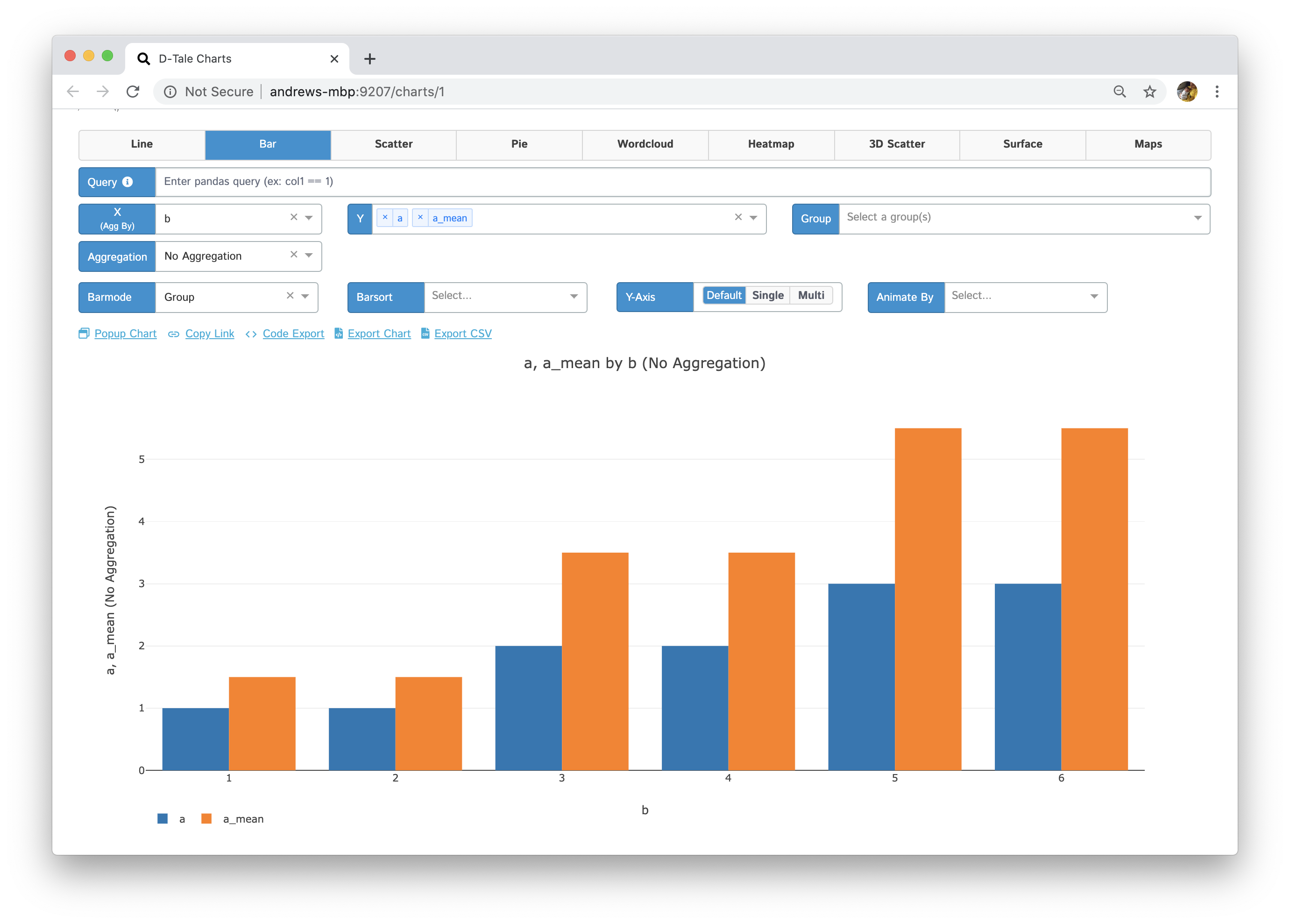
Now you'll also notice some links at the top of your chart:
- Popup Chart: Open your chart in a new tab so you can build another and compare.
- Copy Link: Copy a link to your chart into your clipboard to show someone else.
- Export Chart: Export your chart to a static HTML and send it as an attachment in e-mails.
- Export CSV: Export the underlying data of your chart to CSV.
- Code Export: Export the underlying code that built your chart so you can make any customizations or just learn how it was built.
Step 7: Code Export
Let's take a look at the output of clicking the "Code Export" link of you chart that we built in Step 6.
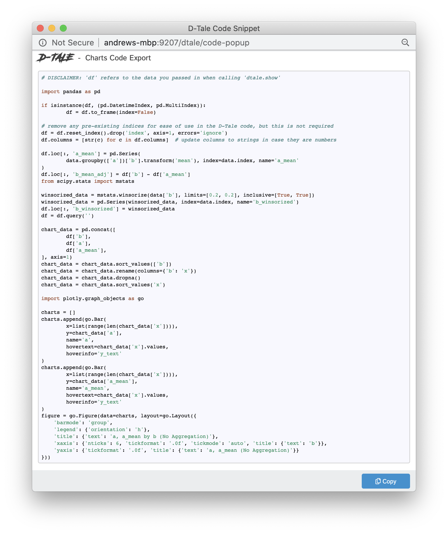
Now the goal of code export is to help users learn a little bit about what code was run to get them what their looking at, but it is by no means gospel. So feel free to submit suggestions or bugs on the Issues page page of the repo.
Here are some other competitors to D-Tale:
Thank you for reading this tutorial and I hope it helps you with your data exploration. There's many other features that I haven't touched on here so I urge you to check it out the README, particularly the different UI functions. If you liked this please support open-source and star the repo. :)
Bio: Andrew Schonfeld has been a full-stack developer for about 14+ years. Up until about 3 months ago he had spent his entire career located in Boston where he grew up working in finance. Working with a team of data scientists and being completely immersed in Python he was able to start building a suite of tools using Flask, Pandas & React on the front-end. Eventually, the problem of finding a way to visualize Pandas dataframes came along and the result was D-Tale. Along with the support of his company at the time he was able to open-source this software and it eventually gained a lot of traction with the data science community. He has spent the last 15 months working on D-Tale (mostly in my spare time since switching jobs) giving presentations at Boston & San Diego Python user groups as well as FlaskCon this past July.
Related:
- Introduction to Pandas for Data Science
- Exploratory Data Analysis on Steroids
- Speed up your Numpy and Pandas with NumExpr Package