 Exploratory Data Analysis on Steroids
 Exploratory Data Analysis on Steroids
This is a central aspect of Data Science, which sometimes gets overlooked. The first step of anything you do should be to know your data: understand it, get familiar with it. This concept gets even more important as you increase your data volume: imagine trying to parse through thousands or millions of registers and make sense out of them.
By Diego Lopez Yse, Data Scientist

Machine Learning discussions are usually centered around algorithms and their performance: how to improve the model accuracy or reduce its error rate, excel at feature engineering or finetune hyperparameters. But there is a concept that comes before anything else: Exploratory Data Analysis, or EDA.
EDA is about making sense out of data before getting ourselves busy with any model. Which makes total sense, right? Which model are we going to use if we don’t know our data yet?
Before there was a Machine Learning model, there was EDA
This is a central aspect of Data Science, which sometimes gets overlooked. The first step of anything you do should be to know your data: understand it, get familiar with it. What are the answers you’re trying to get with that data? What variables are you using, and what do they mean? How does it look from a statistical perspective? Is data formatted correctly? Do you have missing values? And duplicated? What about outliers?
This concept gets even more important as you increase your data volume: imagine trying to parse through thousands or millions of registers and make sense out of them. Next, I want to share my Python method to answer some of these questions in the most efficient way.
Describe the dataset
For this article I use an economic dataset from the World Bank, describing some worldwide key factors such as GDP, population levels, surface, etc. You can find the dataset and full code here
First, we need to import some libraries:
import pandas as pd
import numpy as np
import seaborn as sns
import xlrdPandas, Numpy and Seaborn are key in any EDA exercise. The “xlrd” package is only required for our example since we’re using an Excel file as the data source.
Now, let’s import the dataset:
df = pd.read_excel(“wbdata.xlsx”)Take a look at the data:
df.head()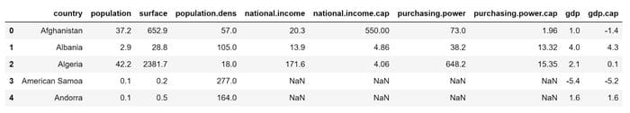
df.describe()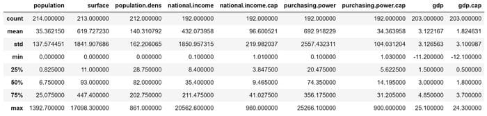
Some basic statistics of the numerical variables in the dataset.
df.shape
A quick way to see the structure of the dataset: 215 rows and 10 columns.
df.dtypes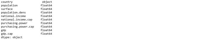
Check out the variables types: they are all floats, except for the country name which is a string. Find a tutorial on how to change variable types here.
df.info()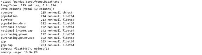
Here we see that there are some variables with null-values (e.g. the variable “population” has 1 row with missing value, “surface” 2, etc) . We’ll see how to deal with them below.
Missing values
Missing values can be caused by different reasons, such data entry errors or incomplete records. This is extremely common and can have a significant effect on the conclusions that can be drawn from the data.
We’ve seen above that the dataset in this example has several missing values, but let’s see how you can test any dataset. The first question you may want to ask you is: are there any missing values?
print(df.isnull().values.any())
Next, you may want to check how many are they:
print(df.isnull().sum().sum())
Now, let’s review a summary of these missing values
print(df.isnull().sum())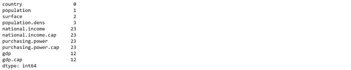
Do you see anything familiar? This is the other side of the .info() function. There are different strategies for handling missing values and no universal way of doing it. For this example, we’ll drop them since it makes no sense to make imputations:
df1 = df.copy()df1.dropna(inplace=True)And we review the new dataset:
df1.info()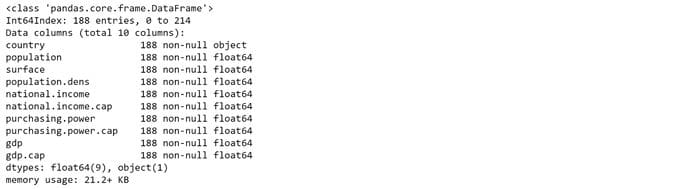
188 records remain, and no null-values. Now we’re ready to move forward.
You can find additional ways of handling missing values here.
Visualize
Let’s visualize the new dataset with Seaborn:
sns.pairplot(df1)
This way you can quickly identify outliers, clusters, and apparent correlations between variables.
Let’s combine variables “gdp” and “population”:
sns.scatterplot(x='gdp.cap', y='population', data=df1, hue='population')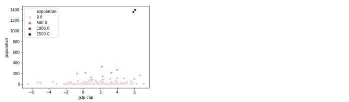
Do you see 2 clear outliers at top right? 2 countries have extreme population levels in comparison to the rest of the data universe. You can validate that observation analyzing the “population” variable on its own:
sns.kdeplot(df1[‘population’], shade=True, color=’orangered’)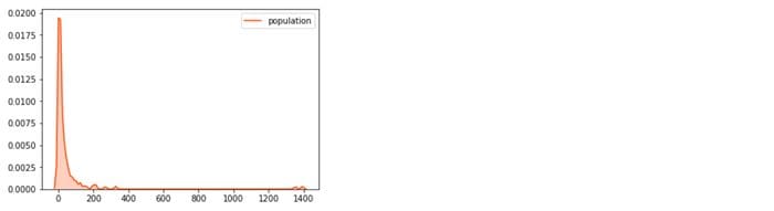
Another way to detect outliers is to draw some boxplots:
df1.plot(kind=’box’, subplots=True, layout=(3,3), sharex=False, sharey=False, figsize=(20, 20), color=’deeppink’)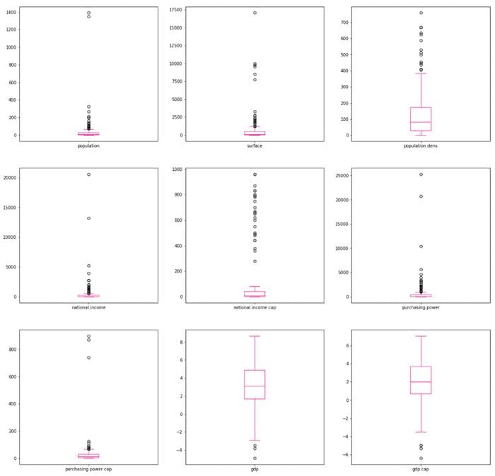
You can also display the density plots of these variables and analyze their skewness:
df1.plot(kind=’density’, subplots=True, layout=(3,3), sharex=False, figsize=(20, 20))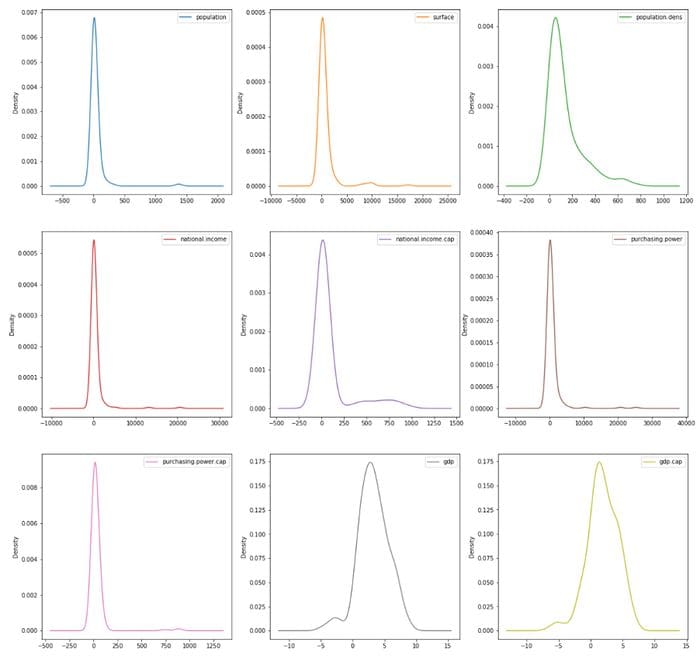
Check out this link for additional Seaborn styling tips.
In this example, I deliberately didn’t treat outliers, but there are multiple ways of doing that. You can find some examples of outliers identification and treatment here.
Correlation
Correlating variables will save you huge amounts of analysis time, and it’s a necessary step before performing any kind of hypothesis on your data. Correlations are calculated only for numeric variables, so it’s important to know the variable types in the dataset.
You can find other coefficients for non-numeric variables here.
mask = np.tril(df1.corr())
sns.heatmap(df1.corr(), fmt=’.1g’, annot = True, cmap= ‘cool’, mask=mask)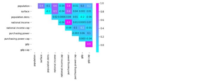
I’ve masked the lower left values to avoid duplications and give a clearer view. The value scale at the right also provides a quick reference guide for extreme values: you can easily spot high and low correlations between variables (e.g. “national income” has a highly positive correlation with “purchasing power”)
Find here additional ways to customize a correlation matrix.
Final thoughts
EDA is critical for understanding any dataset. This is where you can provide insights and make discoveries. Here is where you put your knowledge to work.
But EDA needs a lot of prep work, because data in real world are rarely clean and homogeneous. It’s often said that 80 percent of a data scientist’s valuable time is spent simply finding, cleansing, and organizing data, leaving only 20 percent to actually perform analysis.
At the same time, perfect is the enemy of good, and you need to drive your insights within a limited time frame. Preparing your data for analysis is inevitable, and the way you do that will define the quality of your EDA.
Interested in these topics? Follow me on Linkedin or Twitter
Bio: Diego Lopez Yse is an experienced professional with a solid international background acquired in different industries (capital markets, biotechnology, software, consultancy, government, agriculture). Always a team member. Skilled in Business Management, Analytics, Finance, Risk, Project Management and Commercial Operations. MS in Data Science and Corporate Finance.
Original. Reposted with permission.
Related:
- How to Prepare Your Data
- Fantastic Four of Data Science Project Preparation
- Time Complexity: How to measure the efficiency of algorithms