Automate Microsoft Excel and Word Using Python
Integrate Excel with Word to generate automated reports seamlessly.

Photo by Isaac Smith on Unsplash
Microsoft Excel and Word are without a shred of doubt the two most abundantly used software in the corporate and non-corporate world. They are practically synonymous with the term ‘work’ itself. Oftentimes, not a week goes by without us firing up the combination of the two and one way or another putting their goodness to use. While for the average daily purpose automation would not be solicited, there are times when automation can be a necessity. Namely, when you have a multitude of charts, figures, tables, and reports to generate, it can become an exceedingly tedious undertaking if you choose the manual route. Well, it doesn’t have to be that way. There is in fact a way to create a pipeline in Python where you can seamlessly integrate the two to produce spreadsheets in Excel and then transfer the results to Word to generate a report virtually instantaneously.
Openpyxl
Meet Openpyxl, arguably one of the most versatile bindings in Python that makes interfacing with Excel quite literally a stroll in the park. Armed with it you can read and write all current and legacy excel formats i.e. xlsx and xls. Openpyxl allows you to populate rows and columns, execute formulae, create 2D and 3D charts, label axes and titles, and a plethora of other abilities that can come in handy. Most importantly however, this package enables you to iterate over an endless numbers of rows and columns in Excel, thereby saving you from all that pesky number crunching and plotting that you had to do previously.
Python-docx
And then comes along Python-docx, this package is to Word what Openpyxl is to Excel. If you haven’t already studied their documentation, then you should probably take a look. Python-docx is without exaggeration one of the simplest and most self-explanatory toolkits I have worked with ever since I started working with Python itself. It allows you to automate document generation by inserting text, filling in tables and rendering images into your report automatically without any overhead whatsoever.
Without further ado let’s create our very own automated pipeline. Go ahead and fire up Anaconda (or any other IDE of your choice) and install the following packages:
pip install openpyxlpip install python-docx
Microsoft Excel Automation
Initially, we’ll load an Excel workbook that has already been created (shown below):
workbook = xl.load_workbook('Book1.xlsx')
sheet_1 = workbook['Sheet1']

Image by the author.
Subsequently, we’ll iterate over all of the rows in our spreadsheet to compute and insert the values for power by multiplying current by voltage:
for row in range(2, sheet_1.max_row + 1):
    current = sheet_1.cell(row, 2)
    voltage = sheet_1.cell(row, 3)
    power = float(current.value) * float(voltage.value)
    power_cell = sheet_1.cell(row, 1)
    power_cell.value = power
Once that is done, we will use the calculated values for power to generate a line chart that will be inserted into the specified cell as shown below:
values = Reference(sheet_1, min_row = 2, max_row = sheet_1.max_row, min_col = 1, max_col = 1)
chart = LineChart()
chart.y_axis.title = 'Power'
chart.x_axis.title = 'Index'
chart.add_data(values)
sheet_1.add_chart(chart, 'e2')
workbook.save('Book1.xlsx')

Automatically generated Excel spreadsheet. Image by the author.
Extracting Chart
Now that we have generated our chart, we need to extract it as an image so that we can use it in our Word report. First, we’ll declare the exact location of our Excel file and also where the output chart image should be saved:
input_file = "C:/Users/.../Book1.xlsx"
output_image = "C:/Users/.../chart.png"
Then access the spreadsheet using the following method:
operation = win32com.client.Dispatch("Excel.Application")
operation.Visible = 0
operation.DisplayAlerts = 0
workbook_2 = operation.Workbooks.Open(input_file)
sheet_2 = operation.Sheets(1)
Subsequently, you can iterate over all of the chart objects in the spreadsheet (if there are more than one) and save them in the specified location as such:
for x, chart in enumerate(sheet_2.Shapes):
    chart.Copy()
    image = ImageGrab.grabclipboard()
    image.save(output_image, 'png')
    passworkbook_2.Close(True)
operation.Quit()
Microsoft Word Automation
Now that we have our chart image generated, we must create a template document that is basically a normal Microsoft Word Document (.docx) formulated exactly in the way we want our report to look, including typefaces, font sizes, formatting, and page structure. Then all we need to do is to create placeholders for our automated content i.e. table values and images and declare them with variable names as shown below.
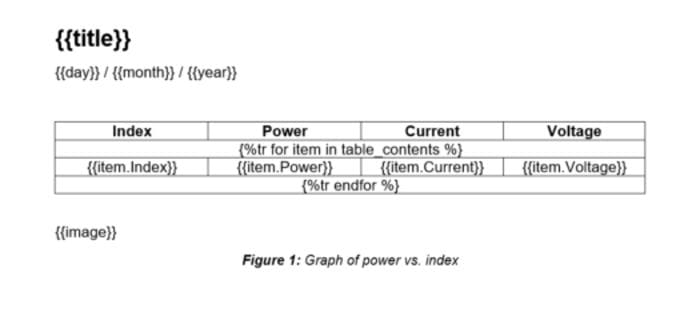
Microsoft Word document template. Image by the author.
Any automated content can be declared inside a pair of double curly brackets {{variable_name}}, including text and images. For tables, you need to create a table with a template row with all the columns included, and then you need to append one row above and one row below with the following notation:
First row:
{%tr for item in variable_name %}
Last row:
{%tr endfor %}
In the figure above the variable names are
- table_contents for the Python dictionary that will store our tabular data
- Index for the dictionary keys (first column)
- Power, Current, and Voltage for the dictionary values (second, third and fourth columns)
Then we import our template document into Python and create a dictionary that will store our table’s values:
template = DocxTemplate('template.docx')
table_contents = []for i in range(2, sheet_1.max_row + 1):
    table_contents.append({
        'Index': i-1,
        'Power': sheet_1.cell(i, 1).value,
        'Current': sheet_1.cell(i, 2).value,
        'Voltage': sheet_1.cell(i, 3).value
        })
Next we‘ll’ import the chart image that was previously produced by Excel and will create another dictionary to instantiate all of the placeholder variables declared in the template document:
image = InlineImage(template,'chart.png',Cm(10))context = {
    'title': 'Automated Report',
    'day': datetime.datetime.now().strftime('%d'),
    'month': datetime.datetime.now().strftime('%b'),
    'year': datetime.datetime.now().strftime('%Y'),
    'table_contents': table_contents,
    'image': image
    }
And finally, we’ll render the report with our table of values and chart image:
template.render(context)
template.save('Automated_report.docx')
Results
And there you go, an automatically generated Microsoft Word report with numbers and a chart created in Microsoft Excel. And with that, you have a fully automated pipeline that can be used to create as many tables, charts, and documents as you could possibly ever need.

Automatically generated report. Image by the author.
Source Code
If you want to learn more about data visualization and Python, then feel free to check out the following (affiliate linked) courses:
Data Visualization with Python
Python for Everybody Specialization
The source code and template for this tutorial can be found in the following GitHub repository.
mkhorasani/excel_word_automation
In addition, feel free to subscribe to Medium and explore more of my tutorials here.
Mohammad Khorasani is a hybrid of a data scientist and an engineer. Logistician. Candid. Realpolitik. Unlearning dogma one belief at a time. Read more of Mohammad's writings.
Original. Reposted with permission.