A Simple Guide to Machine Learning Visualisations
Create simple, effective machine learning plots with Yellowbrick

Residual plot. Image by Author.
An important step in developing machine learning models is to evaluate the performance. Depending on the type of machine learning problem that you are dealing with, there is generally a choice of metrics to choose from to perform this step.
However, simply looking at one or two numbers in isolation cannot always enable us to make the right choice for model selection. For example, a single error metric doesn’t give us any information about the distribution of the errors. It does not answer questions like is the model wrong in a big way a small number of times, or is it producing lots of smaller errors?
It is essential to also inspect the model performance visually, as a chart or graph can reveal information we may otherwise miss from observing a single metric.
Yellowbrick is a Python library dedicated to making it easy to create rich visualisations for machine learning models developed using Scikit-learn.
In the following article, I will give an introduction to this handy machine learning tool and provide code samples to create some of the most common machine learning visualisations.
Confusion Matrix
A confusion matrix is a simple way to visually evaluate how often the predictions from a classifier are right.
To illustrate the confusion matrix I am using a dataset known as ‘diabetes’. This dataset consists of a number of features for patients such as body mass index, 2-Hour serum insulin measurements and age, and a column indicating if the patient has tested positive or negative for diabetes. The aim is to use this data to build a model that can predict a positive diabetes result.
The below code imports this dataset via the Scikit-learn API.
In a binary classification problem, there can be four potential outcomes for a prediction that the model makes.
True positive: The model has correctly predicted the positive outcome, e.g. the patient's diabetes test was positive and the model prediction was positive.
False-positive: The model has incorrectly predicted the positive outcome, e.g. the patient's diabetes test was negative but the model prediction was positive.
True negative: The model has correctly predicted the negative outcome, e.g. the patient's diabetes test was negative and the model prediction was negative.
False-negative: The model has incorrectly predicted the negative outcome, e.g. the patient's diabetes test was positive but the model prediction was negative.
The confusion matrix visualises the count of each of these possible outcomes in a grid. The below code uses the Yellowbrick ConfusionMatrix visualiser to generate a confusion matrix for the model.

Confusion matrix. Image by Author.
ROC Curves
The initial output of a classifier is not a label, instead, it is the probability that a particular observation belongs to a certain class.
This probability is then turned into a class by selecting a threshold. For example, we might say that if the probability of the patient testing positive is above 0.5 then we assign the positive label.
Depending on the model, data and use case, we may choose a threshold to optimise for a particular outcome. In the diabetes example, missing a positive result could potentially be life-threatening so we would want to minimise the false negatives. Changing the threshold for a classifier is one way to optimise this outcome, and the ROC curve is one way to visualise this trade-off.
The code below uses Yellowbrick to construct a ROC curve.
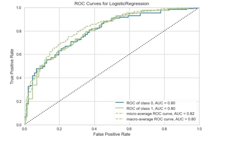
ROC curve. Image by Author.
The ROC curve plots the true positive rate against the false-positive rate. Using this we can evaluate the impact of lowering or raising the classification threshold.
Precision-Recall Curves
ROC curves are not always the best way to evaluate a classifier. If the class is imbalanced (one class has many more observations compared to another) the results of a ROC curve can be misleading.
The precision-recall curve is often a better choice in these situations.
Let’s quickly recap what we mean by precision and recall.
Precision measures how good the model is at correctly identifying the positive class. In other words out of all predictions for the positive class how many were actually correct?
Recall tell us how good the model is at correctly predicting all the positive observations in the dataset.
There is often a trade-off between precision and recall. You may increase precision at the expense of decreasing recall for example.
A precision-recall curve displays this trade-off at different classification thresholds.
The code below uses the Yellowbrick library to generate a precision-recall curve for the diabetes classifier.
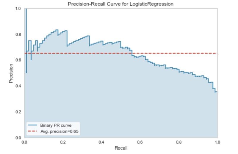
Precision-recall curve. Image by Author.
Intercluster Distance
The Yellowbrick library also contains a set of visualisation tools for analysing clustering algorithms. A common way to evaluate the performance of clustering models is with an intercluster distance map.
The intercluster distance map plots an embedding of each cluster centre and visualises both the distance between the clusters and the relative size of each cluster based on membership.
We can turn the diabetes dataset into a clustering problem by only using the features (X).
Before we cluster the data we can use the popular elbow method to find the optimal number of clusters. Yellowbrick has a method for this.
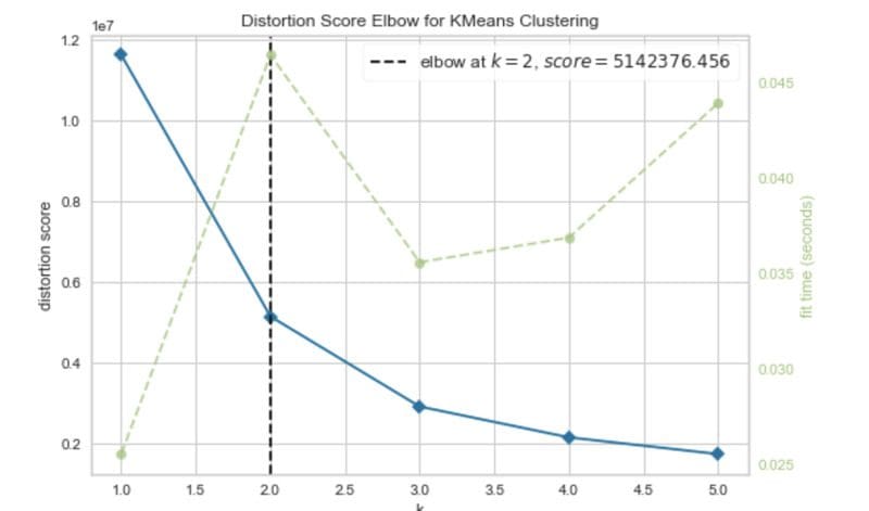
Elbow method. Image by Author.
The elbow curve suggests that two clusters are optimal.
Now let’s plot the inter-cluster map for the dataset, choosing two clusters.
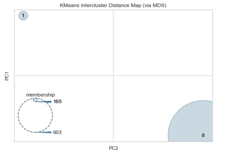
Intercluster distance map. Image by Author.
We can see from this that there is a lot of separation between the two clusters. The membership suggests that there is one cluster that has 165 observations and another with 603. This is quite close to the balance of the two classes in the diabetes dataset which is 268 and 500 observations each.
Residuals Plot
Regression-based machine learning models have their own set of visualisations. Yellowbrick also provides support for these.
To illustrate the visualisations for regression problems we will use a variation on the diabetes dataset which can be obtained via the Scikit-learn API. This dataset has similar features to the one used earlier in this article, but the target is a quantitative measure of disease progression one year after baseline.
In regression, visualising the residuals is one method to analyse the performance of the model. The residuals are the difference between the observed value and the value predicted by the model. They are one way to quantify the error in a regression model.
The code below produces a residual plot for a simple regression model.
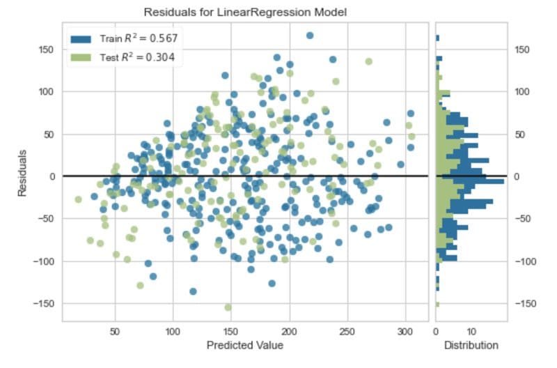
Residual plot. Image by Author.
Other available visualisations for regression-based models from the Yellowbrick library include:
- Prediction error plot.
- Alpha selection.
- Cook’s distance.
The Yellowbrick Python library offers a lightning-fast way to create machine learning visualisations for models developed using Scikit-learn. In addition to the visualisations for evaluating model performance, Yellowbrick also has tools for visualising cross-validation, learning curves and feature importances. Additionally, it provides functionality for text modelling visualisations.
As described in the article single evaluation metrics models can be useful, and in some cases, if you have a simple problem and are comparing different models it might be sufficient. However, more often than not, creating a visualisation for model performance is an important additional step to obtaining a true understanding of how effective a machine learning model is.
If you would like to read more about single evaluation metrics I have previously written an article covering evaluation metrics for classification and another for regression.
Rebecca Vickery is a Data Scientist with extensive experience of data analysis, machine learning and data engineering. 12 years experience SQL, 4+ years Python, R, Apache Airflow and Google Analytics.
Original. Reposted with permission.