How Can Python Be Used for Data Visualization?
This article discusses the different python libraries used for data visualization with examples.

Image from Freepik
Introduction
The study of how to visually represent data is known as data visualization. It effectively communicates findings from data by graphically plotting the data.
We can obtain a visual summary of our data via data visualization. The human mind processes and comprehends any given data more easily when it is presented with images, maps, and graphs.
Both small and large data sets benefit from data visualization, but massive data sets are where it shines because it is difficult to manually view, let alone process, and comprehend, all of our data.
The study of data visualization involves attempting to comprehend data by putting it in a visual context to reveal patterns, trends, and connections that might not otherwise be visible.
Data Visualization using Python
Data Visualization can be done using any programming language but, choosing python is better for visualizing data easily as python has small lines of code.
Python has easy syntaxes and takes very less time to code things, also python provides different packages or libraries for data visualization using the features that exist. Some python libraries used for data visualization are matplotlib and seaborn and many other packages which are used for data visualization.
Matplotlib, Seaborn, Bokeh, and Plotly are the libraries in python used for data visualization.
- Matplotlib is used for plotting the graphs such as scatter plots, line plots, pie charts, and bar charts and this matplotlib works with arrays and fields of the dataset.
- Seaborn is used for complex visualization of data like coloring and designing graphs and seaborn works with the whole dataset.
- Bokeh is used for visualization of data by making things interactive and uses HTML and javascript for representing data in web browsers.
- Plotly is also used for the visualization of data which makes graphs attractive and allows customization.
Now, let us see each of these in detail.
1. Matplotlib
Matplotlib is used for plotting the graphs such as scatter plots, line plots, pie charts, and bar charts and this matplotlib works with arrays and fields of the dataset.
Matplotlib is a low-level interface, which is very easy to use and provides flexibility, as discussed matplotlib works with arrays that are created using NumPy.
To install matplotlib we have to use the command,
pip install matplotlib
Run this command in the command prompt, and you would see it like this.
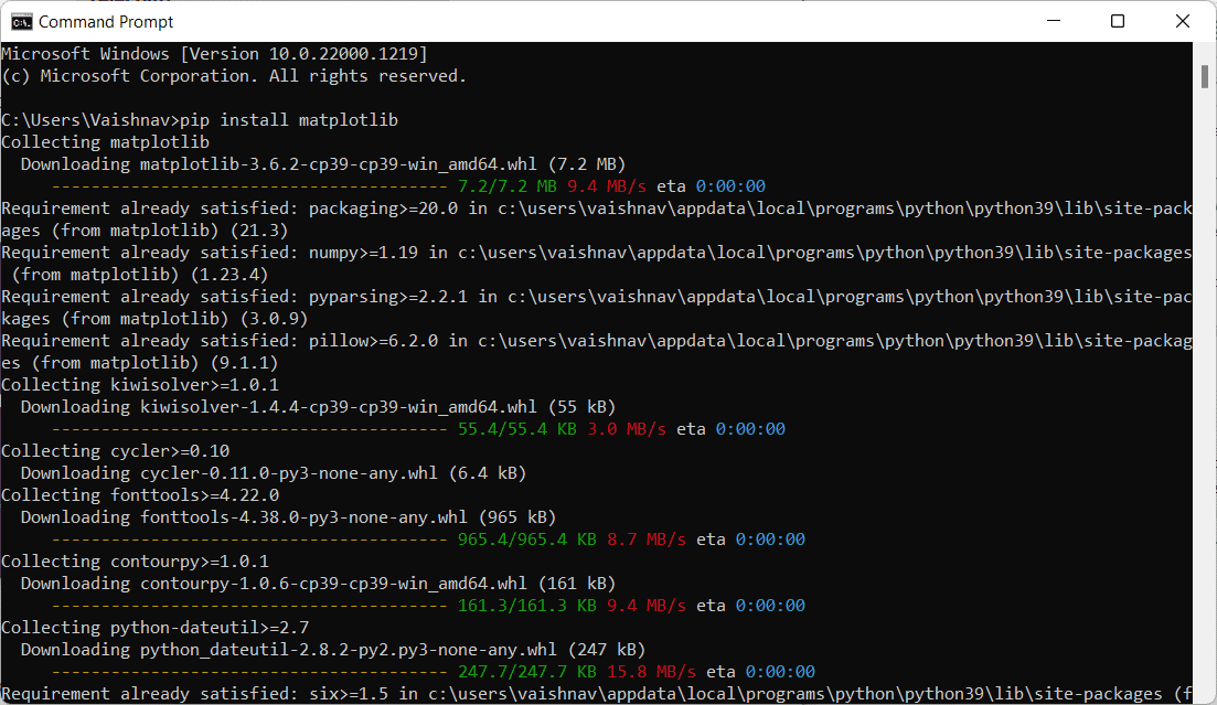
Image by Author
Now, we can use matplotlib for visualizing the data.
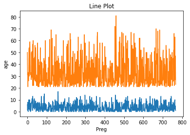
Line Chart
Line charts are used to represent the 2 different fields from the dataset or to show the relationship between 2 fields using the plot() function.
We can code in python as
import pandas as pd
import matplotlib. pyplot as plt

data = pd.read_csv("diabetes.csv")

plt. plot(data['Preg'])
plt. plot(data['age'])
plt. title("Line Plot")
plt. xlabel('Preg')
plt. label('age')
plt. show()
Output:
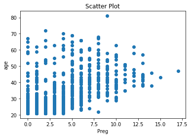
Scatter Plot
Scatter plots are used to represent the relationship between 2 fields using the scatter() function from the matplotlib library that uses dots for representing data.
We can code in python as,
import pandas as pd
import matplotlib. pyplot as plt

data = pd.read_csv("diabetes.csv")

plt. scatter(data['Preg'], data['age'])
plt. title("Scatter Plot")
plt. xlabel('Preg')
plt. label('age')
plt. show()
Output:
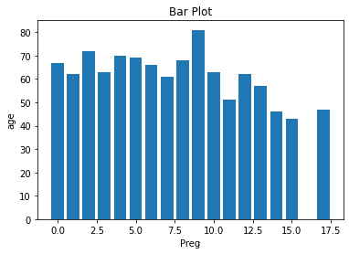
Bar Charts
Bar Charts are used to represent the categorical data using the bar() function from the matplotlib library for representing data.
We can code in python as
import pandas as pd
import matplotlib. pyplot as plt

data = pd.read_csv("diabetes.csv")

plt. bar(data['Preg'], data['age'])
plt. title("Bar Plot")
plt. xlabel('Preg')
plt. ylabel('age')
plt.show()
Output:
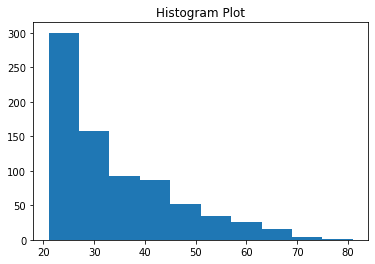
Histogram
Histograms are used to represent the data in the form of groups using the hist() function from the matplotlib library for representing data.
We can code in python as
import pandas as pd
import matplotlib.pyplot as plt

data = pd.read_csv("diabetes.csv")

plt.hist(data['age'])
plt.title("Histogram Plot")
plt.show()
Output:
2. Seaborn
Seaborn is used for complex visualization of data like coloring, designing graphs and seaborn works with the whole dataset.
Seaborn has a high-level interface that gives attractive and colorful outputs.
To install seaborn we have to use the command,
pip install seaborn
Run this command in the command and prompt, and you would see it like this.
Image by Author
Now, we can use the seaborn for visualizing the data.
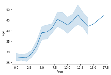
Line Plot
Line plots are used to represent the 2 different fields from the dataset or to show the relationship between the 2 field lineplot() functions in seaborn.
We can code in python as
import seaborn as sns
import matplotlib.pyplot as plt
import pandas as pd

data = pd.read_csv("diabetes.csv")

sns.lineplot(x='Preg', y='age', data=data)
plt.show()
Output:
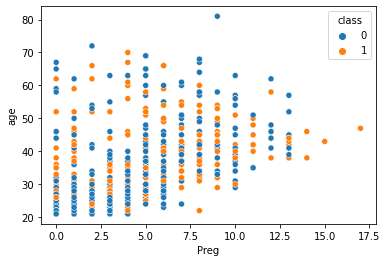
Scatter Plot
Scatter plots are used to represent the relationship between 2 fields using the scatterplot() function from the seaborn library that uses dots for representing data.
We can code in python as
import seaborn as sns
import matplotlib.pyplot as plt
import pandas as pd

data = pd.read_csv("diabetes.csv")

sns.scatterplot(x='Preg', y='age', data=data, hue='class')
plt.show()
Output:
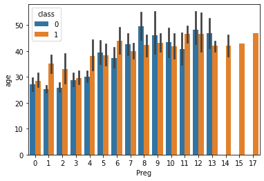
Bar Charts
Bar Charts are used to represent the categorical data using the barplot() function from the seaborn library for representing data.
We can code in python as
import seaborn as sns
import matplotlib.pyplot as plt
import pandas as pd

data = pd.read_csv("diabetes.csv")

sns.barplot(x='Preg', y='age', data=data, hue='class')
plt.show()
Output:
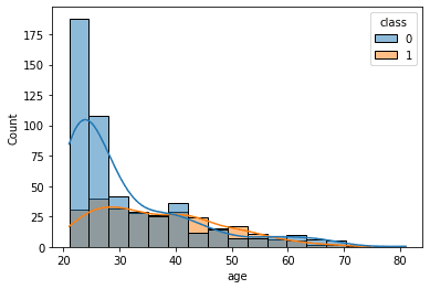
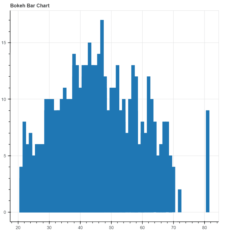
Histogram
Histograms are used to represent the data in the form of groups using the histplot() function from the matplotlib library for representing data.
We can code in python as
import seaborn as sns
import matplotlib.pyplot as plt
import pandas as pd

data = pd.read_csv("diabetes.csv")

sns.histplot(x='age',kde=True, data=data, hue='class')
plt.show()
Output:
3. Bokeh
Bokeh is used for visualization of data by making things interactive and uses HTML and javascript for representing data in web browsers and has a high-level interactiveness.
To install seaborn we have to use the command
pip install bokeh
Run this command in the command prompt, you would see it like this.
Image by Author
Now, we can use the bokeh for visualizing the data.
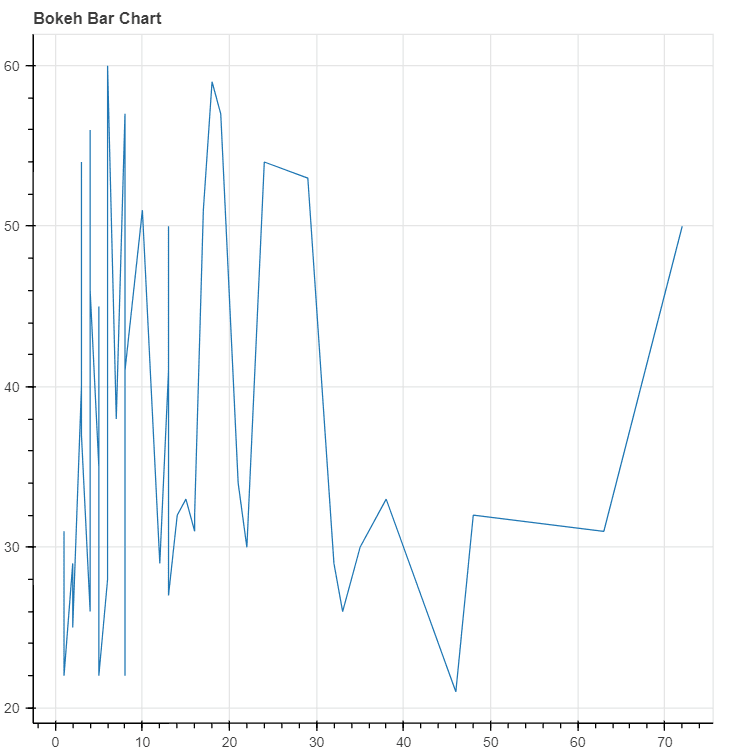
Line Plot
Line plots are used to represent the 2 different fields from the dataset or to show the relationship between 2 fields using the line() function in bokeh.
We can code in python as,
from bokeh.plotting import figure, output_file, show
import pandas as pd

graph = figure(title = "Bokeh Bar Chart")
data = pd.read_csv("diabetes.csv")

df = data['age'].value_counts()

graph.line(df, data['age'])
show(graph)
Output:
Scatter Plot
Scatter plots are used to represent the relationship between 2 fields using the scatter() function from the bokeh library that uses dots for representing data.
We can code in python as
from bokeh.plotting import figure, output_file, show
import pandas as pd

graph = figure(title = "Bokeh Bar Chart")
data = pd.read_csv("diabetes.csv")

df = data['age'].value_counts()
graph.scatter(df, data['age'])
show(graph)
Output:
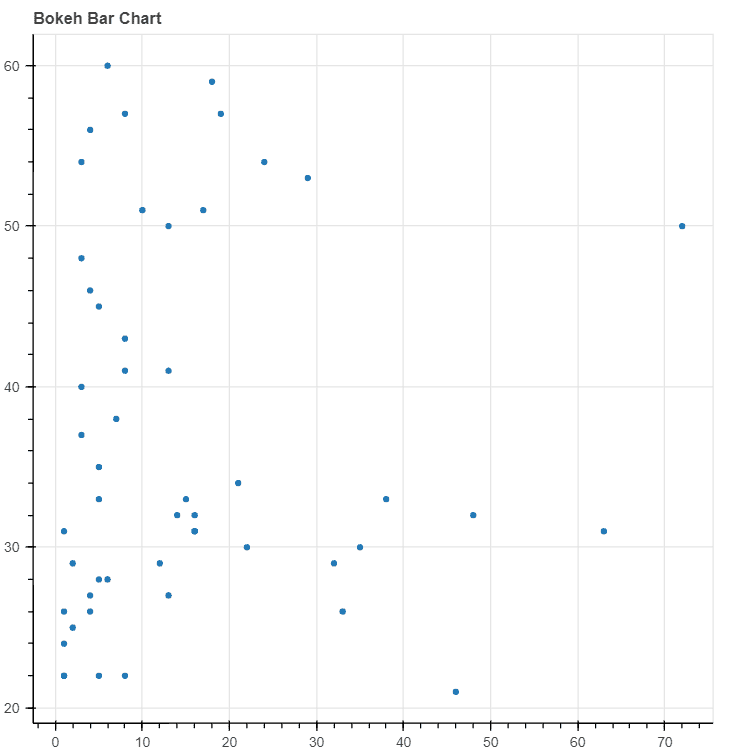
Bar Charts
Bar Charts are used to represent the categorical data using the vbar() and hbar() functions from the bokeh library for representing data.
We can code in python as
from bokeh.plotting import figure, output_file, show
import pandas as pd

graph = figure(title = "Bokeh Bar Chart")
data = pd.read_csv("diabetes.csv")

graph.vbar(data['age'], top=data['Preg'])
show(graph)
Output:
4. Plotly
Plotly is also used for the visualization of data which makes graphs attractive and allows customization.
To install plotly we have to use the command
pip install plotly
Run this command in the command prompt, you would see it like this.
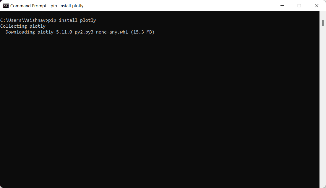
Image by Author
Now, we can use the plotly to visualize the data.
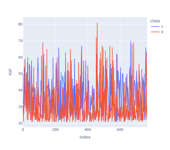
Line Plot
Line plots are used to represent the 2 different fields from the dataset or to show the relationship between 2 fields using the.line() function in plotly.
We can code in python as
import plotly.express as px
import pandas as pd

data = pd.read_csv("diabetes.csv")

fig = px.line(data, y='age', color='class')
fig.show()
Output:
Scatter Plot
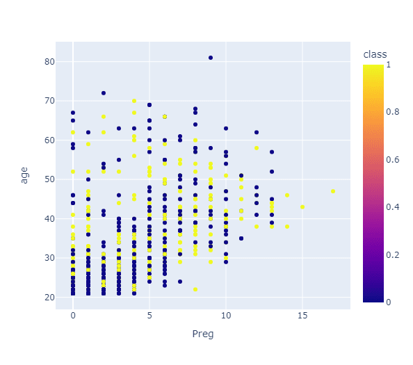
Scatter plots are used to represent the relationship between 2 fields using the scatter() function from the plotly library that uses dots for representing data.
We can code in python as
import plotly.express as px
import pandas as pd

data = pd.read_csv("diabetes.csv")

fig = px.scatter(data, x='Preg', y='age', color='class')
fig.show()
Output:
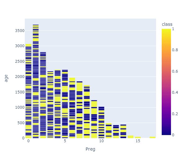
Bar Charts
Bar Charts are used to represent the categorical data using the bar() function from the plotly library for representing data.
We can code in python as
import plotly.express as px
import pandas as pd

data = pd.read_csv("diabetes.csv")

fig = px.bar(data, x='Preg', y='age', color='class')
fig.show()
Output:
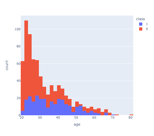
Histogram
Histograms are used to represent the data in the form of groups using the histogram() function from the matplotlib library for representing data.
We can code in python as
import plotly.express as px
import pandas as pd

data = pd.read_csv("diabetes.csv")

fig = px.histogram(data, x='age', color='class')
fig.show()
Output:
These are the different ways for visualizing data using python libraries. Now let us summarize the discussed things briefly.
Conclusion
- Firstly, we had seen what data visualization is and why to perform data visualization.
- The study of data visualization involves attempting to comprehend data by putting it in a visual context to reveal patterns, trends, and connections that might not otherwise be visible.
- Next, we saw how data visualization can be done using python and why python can be chosen for data visualization.
- We had seen the different libraries for data visualization using python.
- We understood each of the data visualization techniques with a suitable example and sample code written with the output.
Hope you gained knowledge to visualize the data easily using python and its different types of libraries. You can learn more about python and its various libraries from free resources such as Kdnuggets, Scaler, or Wiki.
Vaishnavi Amira Yada is a technical content writer. She have knowledge of Python, Java, DSA, C, etc. She found herself in writing and she loved it.