Image by Author
Data visualization isn't just about making graphs. It’s about taking data and making sense of it. And burning other peoples’ retinas with your eclectic color choices, of course.
From tracking global health trends (remember COVID-19?) to tracking your daily runs, the right chart or map can spotlight patterns and answers that raw data hides. However, not all visualization tools are created equal. Some are built for code-savvy, while others are meant for those who think Python is just a hipster name for the game they played on their Nokias. They still call it Snake.
In the following rundown, I’m going to match you with your visualization soulmate. Something like Tinder but for charts. CharTinder? I’m sure there’s a joke in there somewhere. Whether you need a quick pie chart or an interactive map, there’s a tool for that.
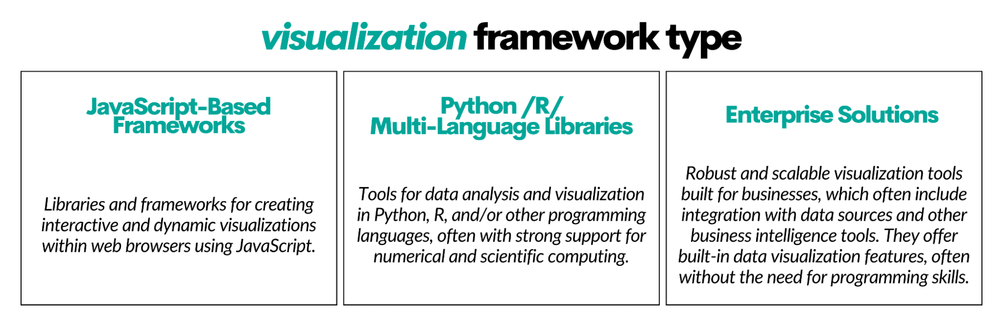
What Types of Visualization Frameworks Are There?
There’s a whole spectrum of visualization tool types. I put them into three broad categories comprising the most popular visualization tools.
I’ll give you a short description of each tool. You can find each tool’s features in the overview at the end of each visualization framework type.
To enhance your understanding and provide a more interactive learning experience, here's the video you can watch which mirrors the insights shared in this article:
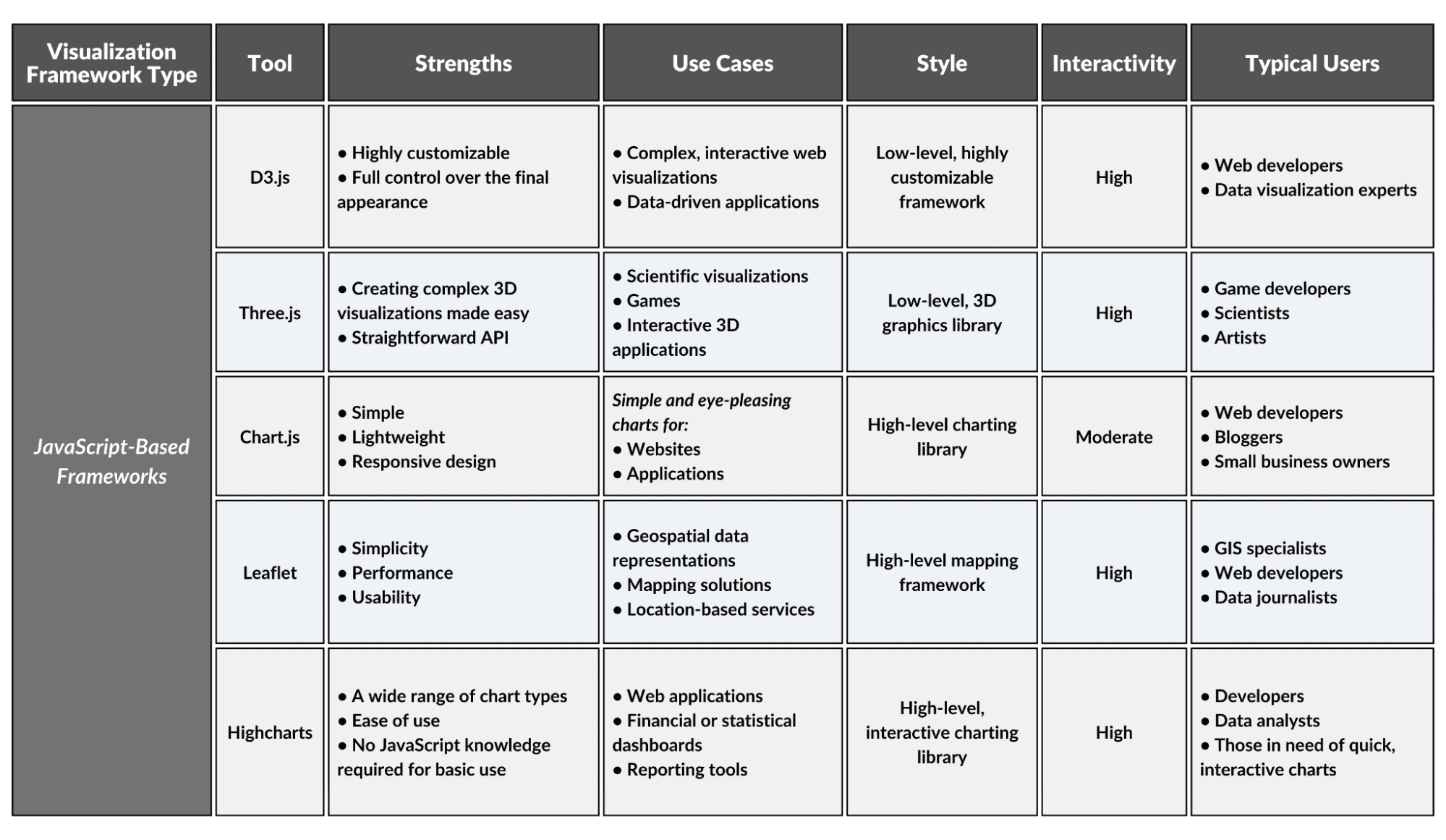
JavaScript-Based Frameworks
These are libraries and frameworks designed to create interactive and dynamic visualizations using JavaScript in web browsers. JavaScript is very flexible, and most developers know it, so these frameworks are widely used.
1. D3.js
D3.js is a powerful JavaScript library for manipulating documents based on data. It enables users to create visualizations using HTML, SVG, and CSS, offering immense control and creative potential for interactive and complex visualizations.
2. Three.js
An open-source JavaScript library and API for creating and displaying animated 3D computer graphics in a web browser. It supports the creation of sophisticated visualizations without the need for specialized 3D graphics software.
3. Chart.js
A JavaScript charting library that provides eight different types of simple charts. It is designed to be both easy to use and highly customizable for web developers looking to add responsive data visualizations.
4. Leaflet
A JavaScript library, Leaflet is great for creating interactive maps that can display extensive geospatial data, making it an invaluable resource for geographers, urban planners, and journalists who require dynamic mapping capabilities.
5. Highcharts
Highcharts is primarily a JavaScript library for creating interactive, web-standard compliant charts. It has extensive charting capabilities, making it ideal for those who require an easy-to-implement solution for complex data visualizations.
JavaScript-Based Frameworks Overview
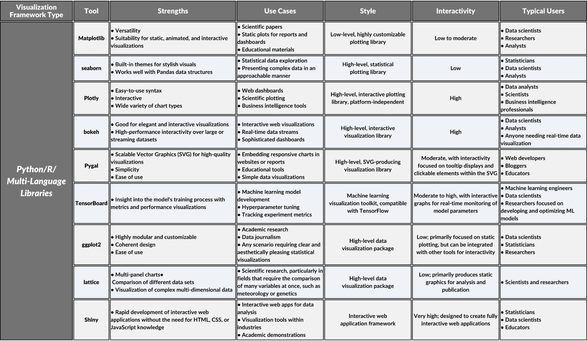
Python/R/Multi-Language Libraries
This category includes Python data visualization libraries, and those used in R or several other programming languages. These libraries focus on data scientists who create visualizations for their presentations. Most of these libraries have strong support for numerical and scientific computing.
1. Matplotlib
Matplotlib is a comprehensive Python library for creating static, animated, and interactive visualizations. It offers a wide array of tools for making complex plots and provides a solid foundation for constructing detailed graphs suitable for use in scientific publications or presentations.
2. seaborn
seaborn: a Python data visualization library based on Matplotlib. It offers a high-level interface for drawing attractive and statistical graphics. It simplifies creating beautiful visualizations that represent complex data trends and distributions.
3. Plotly
Plotly is a multi-language graphing library that lets developers and analysts create interactive, publication-quality graphs and visualizations directly from their browsers. Its intuitive interface supports a wide array of chart types, fostering a self-service environment for data visualization.
4. bokeh
Bokeh: a Python interactive visualization library for modern web browsers. It provides elegant and versatile graphics with high-performance interactivity over large or streaming datasets, geared towards creating sophisticated visualization applications and dashboards.
5. Pygal
Pygal is a Python library perfect for creating SVG (Scalable Vector Graphics) plots focusing on simplicity and style. You can generate graphs that are both interactive and highly customizable.
6. TensorBoard
A visualization tool within the TensorFlow ecosystem, TensorBoard provides Python users with a clear view of machine learning workflows. It allows developers to easily track metrics and visualize aspects of their models without the need for extensive manual graphing or external tools.
7. ggplot2
An R package that creates data visualizations using a grammar of graphics, allowing users to build complex charts with a coherent structure and design philosophy with minimal coding.
8. lattice
An R visualization tool specializing in the creation of trellis graphs, which are essential for representing multivariate data through conditioning and the use of panels, catering to scientific researchers with needs for detailed comparative visual studies.
9. Shiny
Shiny transforms R statistical code into interactive web applications, providing an accessible framework for analysts and scientists to create user-friendly data-driven interfaces, thus democratizing the accessibility of complex analytical work without web development expertise.
Python/R/Multi-Language Libraries Overview
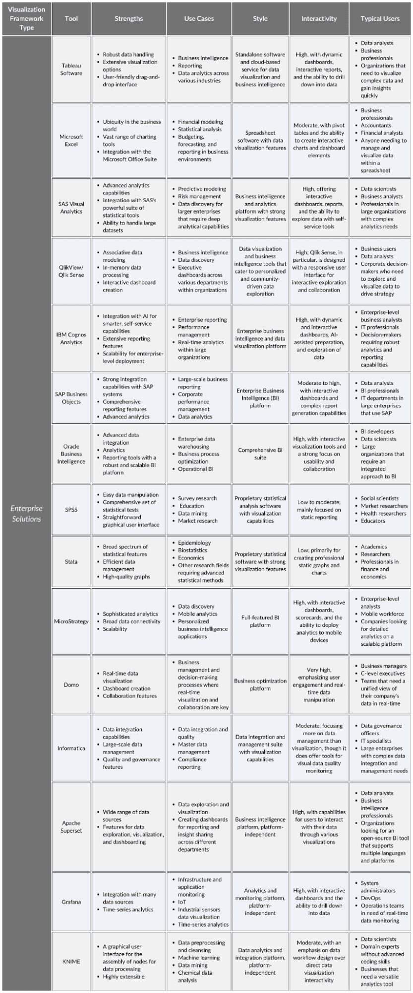
Enterprise Solutions
These are robust, scalable visualization platforms designed for businesses, which often include integration with data sources and other business intelligence tools. They allow non-technical users to create visualizations and dashboards without coding. They are often plug-and-play, as in “plug it into your database and make visualizations”.
1. Tableau Software
Tableau is an industry-standard analytics platform that delivers intuitive data visualization and business intelligence solutions, enabling users to easily connect, understand, and visualize their data in meaningful ways without requiring extensive technical support.
2. Microsoft Excel
A foundational tool for personal and professional data management, Excel offers a wide range of visualization options, from basic charts to complex graphics, catering to the everyday analytical needs of businesses worldwide.
3. SAS Visual Analytics
An advanced analytics platform that integrates visualization and business intelligence, offering powerful self-service capabilities for data exploration and insight discovery, tailored for organizations with complex data environments.
4. QlikView/Qlik Sense
QlikView and Qlik Sense are interactive business intelligence and visualization tools that leverage self-service analytics to empower users with immediate insights, utilizing associative data modeling for an intuitive and exploratory user experience.
5. IBM Cognos Analytics
A comprehensive business intelligence suite that enables efficient data management and visualization with AI-enhanced analytics and smart storytelling features designed for enterprise-scale data exploration and decision-making.
6. SAP BusinessObjects
This is an extensive enterprise analytics solution from SAP, offering a diverse suite of tools that enable organizations to uncover insights, deliver reports, and optimize business performance through powerful data visualization and dashboarding capabilities.
7. Oracle Business Intelligence
Oracle BI is a comprehensive suite of enterprise BI products with a full range of capabilities, including interactive dashboards, ad hoc analysis, and proactive intelligence. It allows businesses to derive actionable insights from their data with minimal IT intervention.
8. SPSS
SPSS by IBM is a statistical analysis powerhouse renowned for its broad application in social sciences. It simplifies the process of statistical interpretation and produces detailed visual representations, making advanced statistical analysis accessible to users with varying levels of expertise.
9. Stata
Stata is a comprehensive tool for data analysis, data management, and graphics. It's specially designed to facilitate the workflow of researchers, providing them with a robust statistical toolkit paired with high-quality graphing capabilities to streamline their data-driven inquiries.
10. MicroStrategy
MicroStrategy is a robust enterprise analytics platform that stands out for its high scalability and advanced analytics, empowering organizations with interactive dashboards, scorecards, and reports that drive strategic decision-making without extensive IT dependency.
11. Domo
Domo is a modern BI platform that excels in data consolidation, visualization, and collaboration, facilitating the creation of custom dashboards and reports to support real-time decision-making in a user-friendly interface designed for business users.
12. Informatica
Informatica is a tool that offers cloud-native data management and integration services, complemented by visualization tools that enable organizations to maintain data quality, streamline operations, and provide business intelligence insights through a governed self-service model.
13. Apache Superset
Apache Superset is an open-source analytics and business intelligence web application that allows data exploration and visualization. It enables users to create and share interactive dashboards, which are easily composed by drag-and-drop without the need for IT staff.
14. Grafana
A multi-platform open-source analytics and monitoring solution, Grafana offers end users rich, customizable dashboards for data aggregation from multiple sources. Its user-friendly interface simplifies the complex data from metrics, logs, and traces into actionable insights.
15. KNIME
An open-source data analytics platform, KNIME delivers a comprehensive range of data integration, transformation, and analysis tools. It offers an intuitive, no-code graphical user interface, enabling end users to independently build data-driven solutions and workflows.
Enterprise Solutions Overview
Conclusion
Visualization frameworks are vast, and the categories where they fit in are ever-growing. I covered twenty-nine tools here, which should be enough for you to find the one you need.
Note that each tool within a category has distinct capabilities, so familiarize yourself with them before settling on a tool you want to use.
Nate Rosidi is a data scientist and in product strategy. He's also an adjunct professor teaching analytics, and is the founder of StrataScratch, a platform helping data scientists prepare for their interviews with real interview questions from top companies. Nate writes on the latest trends in the career market, gives interview advice, shares data science projects, and covers everything SQL.