A comparison between PCA and hierarchical clustering
Graphical representations of high-dimensional data sets are the backbone of exploratory data analysis. We examine 2 of the most commonly used methods: heatmaps combined with hierarchical clustering and principal component analysis (PCA).
By Charlotte Soneson, Qlucore.
Introduction
Graphical representations of high-dimensional data sets are at the backbone of straightforward exploratory analysis and hypothesis generation. Within the life sciences, two of the most commonly used methods for this purpose are heatmaps combined with hierarchical clustering and principal component analysis (PCA).
We will use the terminology ‘data set’ to describe the measured data. The data set consists of a number of samples for which a set of variables has been measured. All variables are measured for all samples.
Method
PCA creates a low-dimensional representation of the samples from a data set which is optimal in the sense that it contains as much of the variance in the original data set as is possible. PCA also provides a variable representation that is directly connected to the sample representation, and which allows the user to visually find variables that are characteristic for specific sample groups. (Agglomerative) hierarchical clustering builds a tree-like structure (a dendrogram) where the leaves are the individual objects (samples or variables) and the algorithm successively pairs together objects showing the highest degree of similarity. These objects are then collapsed into a pseudo-object (a cluster) and treated as a single object in all subsequent steps.
Unsupervised
Both PCA and hierarchical clustering are unsupervised methods, meaning that no information about class membership or other response variables are used to obtain the graphical representation. This makes the methods suitable for exploratory data analysis, where the aim is hypothesis generation rather than hypothesis verification.
Comparison
The input to a hierarchical clustering algorithm consists of the measurement of the similarity (or dissimilarity) between each pair of objects, and the choice of the similarity measure can have a large effect on the result. The goal of the clustering algorithm is then to partition the objects into homogeneous groups, such that the within-group similarities are large compared to the between-group similarities. The principal components, on the other hand, are extracted to represent the patterns encoding the highest variance in the data set and not to maximize the separation between groups of samples directly. However, in many high-dimensional real-world data sets, the most dominant patterns, i.e. those captured by the first principal components, are those separating different subgroups of the samples from each other. In this case, the results from PCA and hierarchical clustering support similar interpretations.
The hierarchical clustering dendrogram is often represented together with a heatmap that shows the entire data matrix, with entries color-coded according to their value. The columns of the data matrix are re-ordered according to the hierarchical clustering result, putting similar observation vectors close to each other. Depicting the data matrix in this way can help to find the variables that appear to be characteristic for each sample cluster. This can be compared to PCA, where the synchronized variable representation provides the variables that are most closely linked to any groups emerging in the sample representation.
The heatmap depicts the observed data without any pre-processing. In contrast, since PCA represents the data set in only a few dimensions, some of the information in the data is filtered out in the process. The discarded information is associated with the weakest signals and the least correlated variables in the data set, and it can often be safely assumed that much of it corresponds to measurement errors and noise. This makes the patterns revealed using PCA cleaner and easier to interpret than those seen in the heatmap, albeit at the risk of excluding weak but important patterns.
Another difference is that the hierarchical clustering will always calculate clusters, even if there is no strong signal in the data, in contrast to PCA which in this case will present a plot similar to a cloud with samples evenly distributed.
As we have discussed above, hierarchical clustering serves both as a visualization and a partitioning tool (by cutting the dendrogram at a specific height, distinct sample groups can be formed). Qlucore Omics Explorer provides also another clustering algorithm, namely k-means clustering, which directly partitions the samples into a specified number of groups and thus, as opposed to hierarchical clustering, does not in itself provide a straight-forward graphical representation of the results. However, the cluster labels can be used in conjunction with either heatmaps (by reordering the samples according to the label) or PCA (by assigning a color label to each sample, depending on its assigned class). The quality of the clusters can also be investigated using silhouette plots.
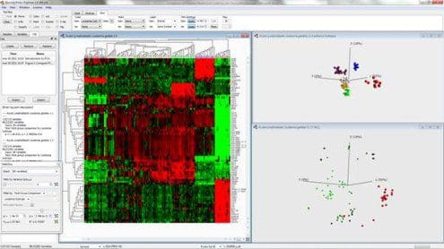
Fig. 1: Combined hierarchical clustering and heatmap and a 3D-sample representation obtained by PCA
Figure 1 shows a combined hierarchical clustering and heatmap (left) and a three-dimensional sample representation obtained by PCA (top right) for an excerpt from a data set of gene expression measurements from patients with acute lymphoblastic leukemia. Here, the dominating patterns in the data are those that discriminate between patients with different subtypes (represented by different colors) from each other. Hence, these groups are clearly visible in the PCA representation. Clusters corresponding to the subtypes also emerge from the hierarchical clustering. In this case, it is clear that the expression vectors (the columns of the heatmap) for samples within the same cluster are much more similar than expression vectors for samples from different clusters. It is also fairly straightforward to determine which variables are characteristic for each cluster. By studying the three-dimensional variable representation from PCA, the variables connected to each of the observed clusters can be inferred. The bottom right figure shows the variable representation, where the variables are colored according to their expression value in the T-ALL subgroup (red samples). The same expression pattern as seen in the heatmap is also visible in this variable plot.
Qlucore Omics Explorer is only intended for research purposes.