Visualizing High Dimensional Data In Augmented Reality
When Data Scientists first get a data set, they oftne use a matrix of 2D scatter plots to quickly see the contents and relationships between pairs of attributes. But for data with lots of attributes, such analysis does not scale.
By Benjamin Resnick.Sponsored Post.

Creative Commons license
If you are interested to try out new IBM’s Watson Machine Learning service - click here
To try the Data Science Experience - subscribe for the free trial
Imagine walking into your office on a Monday morning, just a couple years from now. You pour yourself a cup of coffee, check the news, and then put on a pair of AR glasses. You find yourself surrounded by a sea of gently glowing, colored orbs. The orbs represent all of the data that drives your business. You know this data well. The patterns and colors of these orbs are like a fingerprint. But there's something atypical about the data floating over the coffee maker. You reach out and select that data. A summary of all the relevant details appears on a nearby computer screen.
If something matters to your business, your systems track it. When you want to consume all of that info, you use this immersive visualization; bursting beyond the bounds of a computer screen, information dense, efficient, and aesthetically pleasing.
My team at IBM is working to make the experience described above real. Immersive Insights is an augmented reality data visualization app. Check out our progress in the video below:
Overview
This article outlines a technique that my team has been working on recently.
We've been experimenting with a method of summarizing and then visualizing high dimensional data using Immersive Insights. This ability to summarize important relationships in complex data is a key part of our long-term vision.
Data can have a lot of attributes. Take, for example, Instacart's open source data set on grocery purchases. Each person in this data set can be thought of as a data-point. Each of those data-points can be described by a list of purchased products. That's over 50,000 possible products for each user.
It would be pretty useful to understand how all of these people are related to one another. But how can we begin to make sense of so much data?
Oftentimes, when Data Scientists first get a data set, they'll use a matrix of 2D scatter plots to quickly overview the contents. 2D scatter plots show the relationships between pairs of attributes. But for data with lots of attributes, that type of analysis just doesn't scale.
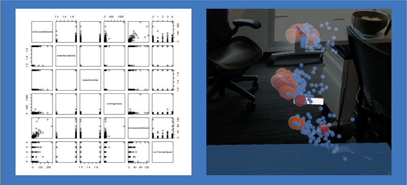
Matrix of 2D scatterplots, juxtaposed with Immersive Insights
Inspired by projector.tensorflow.org/, we've been analyzing data using the following technique:
- Reduce complex data to three dimensions that summarize important relationships (in this case by applying PCA)
- Visualize the data using IBM Immersive Insights
- Iteratively label and color-code the data according to an evolving understanding of embedded relationships.
By navigating this feature space using Immersive Insights, it is possible to validate hypotheses more quickly, and to develop an improved intuition on the relationships between entities in high dimensional datasets.
Immersive Insights is integrated with IBM DSX. This makes it possible to use immersive visualization techniques as an extension of typical data-analysis workflows. It's relatively easy to bounce back and forth between R, Python, and Immersive Insights.
The data sets that are suitable for this technique are often used to train machine learning models. If Data Scientists used this process to understand the embedded relationships in their data, it could help them improve their ML features and models. The technique could also be useful for gaining intuition on what black box predictive models might be doing under-the-hood.
In the short term, the Immersive Insights team is focusing on visualization techniques for data experts who are comfortable coding. We're developing ways for these experts to visualize time series, geographical, and networked data in AR.
In the long term, we hope to expand our product's scope so that business analysts can also use Immersive Insights!
Instacart Analysis Code
How did we create the visualization shown in the attached video?
First, data was prepared in a python notebook. View that code here.
Instacart's users were modeled with a vector which describes their relationship to every product that they could potentially purchase. This vector took the form of a sparse array of 0s and 1s. Each 1 corresponds to a product that had been purchased at least once by that user. Each 0 corresponds to an unpurchased product. This technique is called "one-hot-encoding". Then, PCA (Principal Component Analysis) is performed on the data in order to describe each user with just three numbers, or "principal components". Each principal component summarizes an aspect of variance in the data. In practice, I could only analyze 120,000 users due to memory constraints while performing PCA. After performing PCA, the prepped data is exported to CSV.
Next, data is sent to a headset for visualization through a separate R notebook. View that code here.
The R notebook color-codes users according to various criteria that could affect the user distribution in latent space. Users were color-coded according to the department from which they ordered stuff most frequently (e.g. frozen food, snacks, produce). An alternate color-coding scheme indicated whether users had purchased any organic food. I also referenced the IDs of various users in Immersive Insights, and then looked up their purchase history in the R notebook. This allowed me to gain an intuition for what types of product purchases resulted in users being placed in different areas of the latent space.
Results of the Analysis
Users who didn't purchase any organic foods were tightly clustered within the latent space. This finding was a compelling piece of evidence which supported a qualitative observation drawn from the visualization: much of the variance in Instacart purchasing patterns appears to be between users who purchase premium items, and users who prefer lower cost versions of similar items. This difference between cost conscientious and premium purchasers has meaningful implications for Instacart's marketing, promotional, and recommendation strategies.
We also found that Instacart users buy far more produce than any other category of item. There are many different types of users who love produce. Almost everyone buys produce!
When users are categorized according to the most common department from which they had purchased items (the mode department), they were not linearly separable. We found that, while helpful in understanding some relationships between user purchasing patterns, this type of categorization appears to miss much of the variance described by the dataset' three principle components.
Conclusion
This article presented a technique for analyzing Big Data using AR. This technique is most applicable to Data Scientists who are preparing to create Machine Learning models.
Big Data, AR, and ML are emerging as three disruptive technologies which will shape the future of business and society. As demonstrated, these disruptive technologies can build on each other in creative, useful ways. You can read more about the potential impact of combined disruptive technologies here: https://www.weforum.org/agenda/2016/01/the-fourth-industrial-revolution-what-it-means-and-how-to-respond/
The technique described in this article has limited scope. But the scope of Immersive Insight's vision is huge. The Immersive Insights team is excited to continue envisioning the future of data visualization and analysis. Our goal: to make data simple.
Helpful Links
What is the best way to scale parameters before running a Principal Component AnalysisPCA
This article was helpful in understanding how to prep data for PCA
http://machinelearningmastery.com/discover-feature-engineering-how-to-engineer-features-and-how-to-get-good-at-it/
This article helps to show why exploratory techniques for high dimensional data are so useful to machine learning practitioners
To try out new IBM’s Watson Machine Learning service - click here
To try the Data Science Experience - subscribe for the free trial