 Data Science Projects Employers Want To See: How To Show A Business Impact
 Data Science Projects Employers Want To See: How To Show A Business Impact
The best way to create better data science projects that employers want to see is to provide a business impact. This article highlights the process using customer churn prediction in R as a case-study.
By John Sullivan, DataOptimal
Getting a job isn’t easy, you need to set yourself apart.
One of my favorite strategies is building portfolio projects that show a business impact.
Predicting flower types can be good if you’re just starting out, but in the real-world you’re going to directly or indirectly work on something that’s geared towards the business side of things.
I’ll walk through step-by-step how to build a customer churn predictive model in R that shows a significant business impact.
Here’s a quick outline of the process:
- Scoping the Project
- Preparing the Data
- Fitting the Model
- Making Predictions
- Showing a Business Impact
- Scoping the Project
At the beginning of any real-world data science project, you need to start by asking a series of questions.
Here’s a few good ones to start with:
- What’s the problem you’re trying to solve?
- What’s your potential solution?
- How will you evaluate your model?
Let’s assume that you work in the Telecommunications industry and you have access to customer data. Your boss comes to you and asks, “how can we improve the business using our existing data?” This is pretty vague, so here’s how I would answer the questions above to develop a strategy for answering the boss’s question:
What’s the problem you’re trying to solve?
After looking at your data, you notice that it’s five times more expensive to acquire new customers than retain existing ones. Now the more focused question becomes, “how can we increase customer retention rate to decrease cost?”
What’s your potential solution?
To increase customer retention, we need to identify potentially unhappy customers. If we can intervene early in the customer lifecycle, we can offer things like discounts or alternative services to try and prevent unhappy customers from leaving. Since we have access to customer data, we can build a machine learning model to try and predict unhappy customers that would likely churn. To keep things simple, we’ll just look at using a logistic regression model.
How will you evaluate your model?
We’ll use a series of machine learning evaluation metrics (ROC, AUC, sensitivity, specificity) as well as business-oriented metrics (cost savings).
- Preparing the Data
The next step is to prepare the data.
This workflow will vary from project to project, but for our example I’m going to use the following workflow:
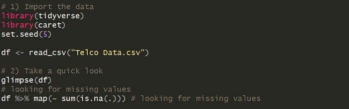
- Import the data
- Take a quick look
- Clean the data
- Split the data
I’ve left out a full exploratory phase because I want to dedicate a future full post to it. Exploration is equally, if not more important, than the modeling phase.
For the complete code with all the steps, check out the original post. Here’s a quick snapshot of the first two steps in R:
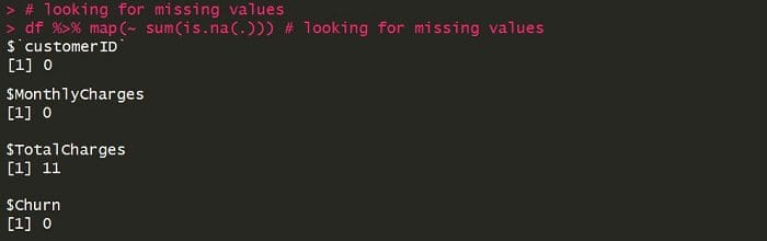
Although not shown, in the cleaning step I impute the missing values using a median. This is a simple approach, but you should definitely check out more rigorous statistical methods.
In the last step, I split my data into training and test sets, using 75% and 25% of the data, respectively. This is always good practice to attempt to prevent overfitting.
- Fitting the Model
To implement the logistic regression model, we’ll use the generalized linear models (GLM) function, GLM.
There are different types of GLMs, which includes logistic regression. To specify that we want to perform a binary logistic regression, we’ll use the argument “family=binomial”.

- Making Predictions
Now that we’ve fit our model, it’s time to see how it performs.
To do this, we’ll make predictions using the “test” dataset. We’ll pass in the “fit” model from the previous section. To predict the probabilities, we’ll specify “type=response”.


We’ll set the response threshold at 0.5, so if a predicted probability is above 0.5, we’ll convert this response to “Yes”.
The next step is to convert the character responses to factor types. This is so the encoding is correct for the logistic regression model.

We’ll take a closer look at the threshold later, so don’t worry about why we set it at 0.5.
The final step is to evaluate our model.
A useful tool is the confusion matrix. This shows us how many correct and incorrect predictions were made for each class.


The sensitivity (true positive rate) and specificity (true negative rate) are also useful metrics reported by the “confusionMatrix” function.

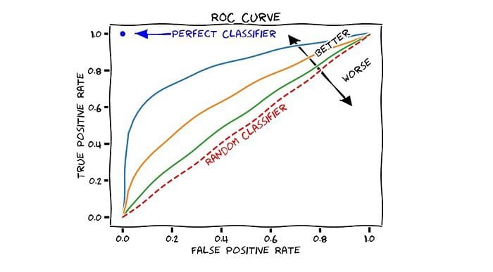
Another useful metric is the Area Under the Receiver Operating Characteristic (ROC) Curve, also known as AUC.
The ROC is a great tool because it plots the true positive rate (TPR) vs. the false positive rate (FPR) as the threshold is varied. Here’s how to plot it using the “ROCR” library:

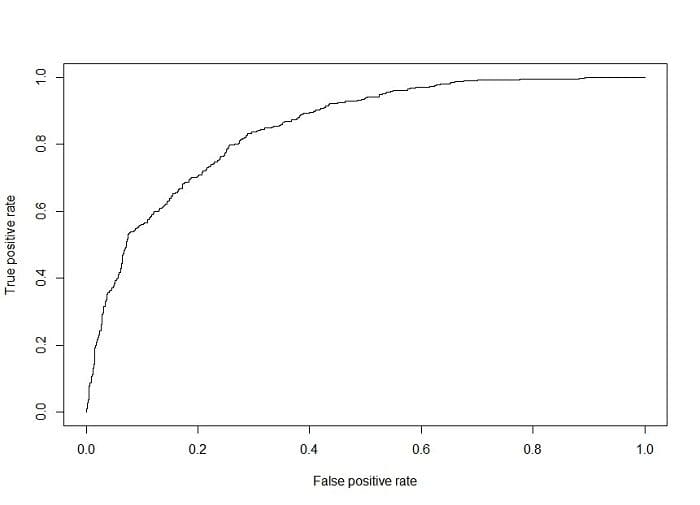
A useful way to use this plot is to take the area under the curve, also known as the AUC. The AUC can take on any value between 0 and 1, with 1 being the best. Here’s the R code for computing the AUC:


Our model has an AUC of 0.85, which is pretty good. If we were to just make random guesses, our ROC would be a 45-degree line. This would correspond to an AUC of 0.5. At the very least, we’re outperforming random guessing, so we know that our model is at least adding some value!
- Showing a Business Impact
The final step is to translate everything we’ve done so far in to a business impact.
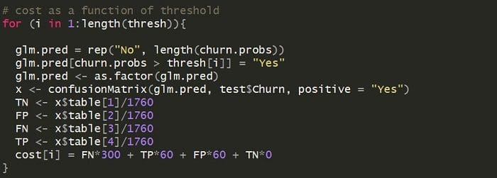
Let’s start by making some assumptions about cost. We’ll assume that it costs $300 to acquire a new customer in the telecommunications industry. We previously stated that our data shows it’s five times more expensive to acquire new customers than retain existing ones, so our retention cost will be $60.
Here’s a quick summary of how those costs are associated with the four types of predictions:
- False Negative (predict that a customer won’t churn, but they actually do): $300
- True Positive (predict that a customer would churn, when they actually do): $60
- False Positive (predict that a customer would churn, when they actually wouldn’t): $60
- True Negative (predict that a customer won’t churn, when they actually wouldn’t): $0
If we multiply the number of each prediction type by the associated cost and sum them, we get the following equation for cost:
Cost = FN($300) + TP($60) + FP($60) + TN($0)
Let’s calculate the cost per customer using various thresholds (0.1, 0.2, 0.3,…,0.9, 1.0). After initializing a threshold vector “thresh” I can loop through each and make predictions. Since I’m calculating cost on a per customer basis, I’ll divide by the total number of datapoints in my test set.
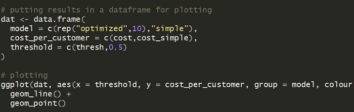
Finally, I’ll put the results in a dataframe, along with what I’m calling a “simple” model. This is our logistic regression model from before that defaults to a threshold of 0.5.
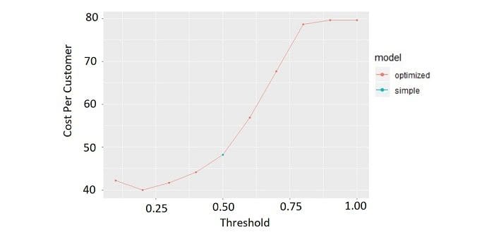
The plot shows that the minimum cost per customer is about $40 at a threshold of 0.2.
Let’s assume that our company is currently using the “simple” model, which costs about $48 per customer, at a threshold of 0.5.
If we have a customer base of approximately 500,000 then switching from the simple model to the optimized model produces a cost savings of $4MM annually! This cost savings is the type of significant business impact that employers would love to see.
Conclusion
One of the best ways to set yourself apart during the job hunt is to build portfolio projects that show real-world business impact.
If you can ask smart business questions and work through a project like a real-world data scientist, you’ll immediately be more valuable to employers.
For the full step-by-step tutorial and R code, check out the original post.
As always, make sure to document your work on your GitHub page and LinkedIn profile.
Stay positive, continue to build projects, and you’ll be on your way to landing a job. Happy job hunting!
Bio: John Sullivan is the founder of the data science learning blog, DataOptimal. You can follow him on Twitter @DataOptimal.
Resources:
- On-line and web-based: Analytics, Data Mining, Data Science, Machine Learning education
- Software for Analytics, Data Science, Data Mining, and Machine Learning
Related:
- 3 Challenges for Companies Tackling Data Science
- My secret sauce to be in top 2% of a Kaggle competition
- Intro to Data Science for Managers