A Complete Exploratory Data Analysis and Visualization for Text Data: Combine Visualization and NLP to Generate Insights
Visually representing the content of a text document is one of the most important tasks in the field of text mining as a Data Scientist or NLP specialist. However, there are some gaps between visualizing unstructured (text) data and structured data.
By Susan Li, Sr. Data Scientist

Visually representing the content of a text document is one of the most important tasks in the field of text mining. As a data scientist or NLP specialist, not only we explore the content of documents from different aspects and at different levels of details, but also we summarize a single document, show the words and topics, detect events, and create storylines.
However, there are some gaps between visualizing unstructured (text) data and structured data. For example, many text visualizations do not represent the text directly, they represent an output of a language model(word count, character length, word sequences, etc.).
In this post, we will use Womens Clothing E-Commerce Reviews data set, and try to explore and visualize as much as we can, using Plotly’s Python graphing library and Bokeh visualization library. Not only we are going to explore text data, but also we will visualize numeric and categorical features. Let’s get started!
The Data
df = pd.read_csv('Womens Clothing E-Commerce Reviews.csv')

After a brief inspection of the data, we found there are a series of data pre-processing we have to conduct.
- Remove the “Title” feature.
- Remove the rows where “Review Text” were missing.
- Clean “Review Text” column.
- Using TextBlob to calculate sentiment polarity which lies in the range of [-1,1] where 1 means positive sentiment and -1 means a negative sentiment.
- Create new feature for the length of the review.
- Create new feature for the word count of the review.
df.drop('Unnamed: 0', axis=1, inplace=True)
df.drop('Title', axis=1, inplace=True)
df = df[~df['Review Text'].isnull()]
def preprocess(ReviewText):
ReviewText = ReviewText.str.replace("(
)", "")
ReviewText = ReviewText.str.replace('().*()', '')
ReviewText = ReviewText.str.replace('(&)', '')
ReviewText = ReviewText.str.replace('(>)', '')
ReviewText = ReviewText.str.replace('(<)', '')
ReviewText = ReviewText.str.replace('(\xa0)', ' ')
return ReviewText
df['Review Text'] = preprocess(df['Review Text'])
df['polarity'] = df['Review Text'].map(lambda text: TextBlob(text).sentiment.polarity)
df['review_len'] = df['Review Text'].astype(str).apply(len)
df['word_count'] = df['Review Text'].apply(lambda x: len(str(x).split()))
To preview whether the sentiment polarity score works, we randomly select 5 reviews with the highest sentiment polarity score (1):
print('5 random reviews with the highest positive sentiment polarity: \n')
cl = df.loc[df.polarity == 1, ['Review Text']].sample(5).values
for c in cl:
    print(c[0])

Then randomly select 5 reviews with the most neutral sentiment polarity score (zero):
print('5 random reviews with the most neutral sentiment(zero) polarity: \n')
cl = df.loc[df.polarity == 0, ['Review Text']].sample(5).values
for c in cl:
    print(c[0])

There were only 2 reviews with the most negative sentiment polarity score:
print('2 reviews with the most negative polarity: \n')
cl = df.loc[df.polarity == -0.97500000000000009, ['Review Text']].sample(2).values
for c in cl:
    print(c[0])

It worked!
Univariate visualization with Plotly
Single-variable or univariate visualization is the simplest type of visualization which consists of observations on only a single characteristic or attribute. Univariate visualization includes histogram, bar plots and line charts.
The distribution of review sentiment polarity score
df['polarity'].iplot(
    kind='hist',
    bins=50,
    xTitle='polarity',
    linecolor='black',
    yTitle='count',
    title='Sentiment Polarity Distribution')
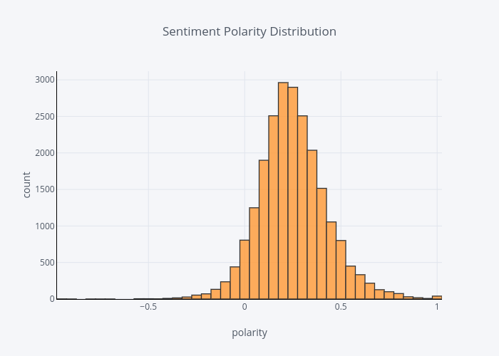
Vast majority of the sentiment polarity scores are greater than zero, means most of them are pretty positive.
The distribution of review ratings
df['Rating'].iplot(
    kind='hist',
    xTitle='rating',
    linecolor='black',
    yTitle='count',
    title='Review Rating Distribution')
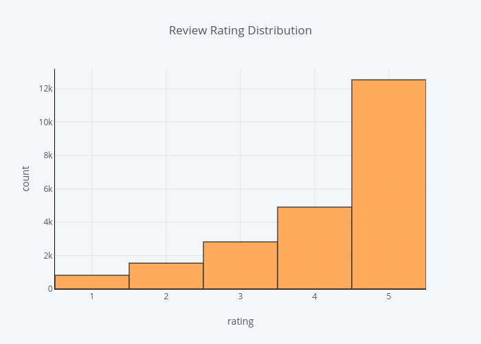
The ratings are in align with the polarity score, that is, most of the ratings are pretty high at 4 or 5 ranges.
The distribution of reviewers age
df['Age'].iplot(
    kind='hist',
    bins=50,
    xTitle='age',
    linecolor='black',
    yTitle='count',
    title='Reviewers Age Distribution')
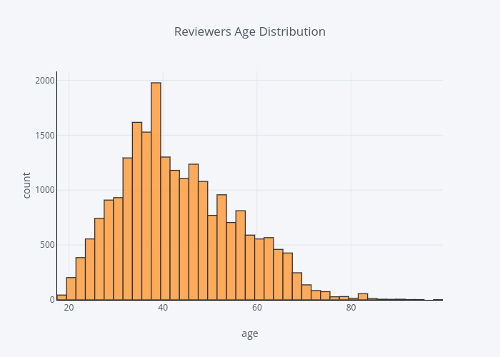
Most reviewers are in their 30s to 40s.
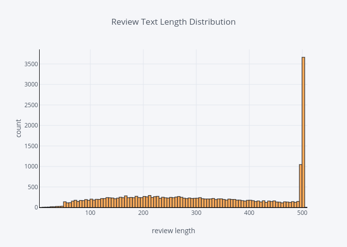
The distribution review text lengths
df['review_len'].iplot(
    kind='hist',
    bins=100,
    xTitle='review length',
    linecolor='black',
    yTitle='count',
    title='Review Text Length Distribution')
The distribution of review word count
df['word_count'].iplot(
    kind='hist',
    bins=100,
    xTitle='word count',
    linecolor='black',
    yTitle='count',
    title='Review Text Word Count Distribution')
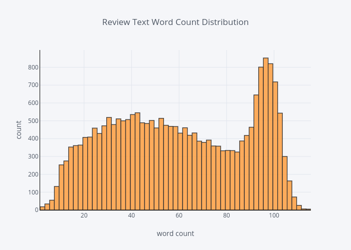
There were quite number of people like to leave long reviews.
For categorical features, we simply use bar chart to present the frequency.
The distribution of division
df.groupby('Division Name').count()['Clothing ID'].iplot(kind='bar', yTitle='Count', linecolor='black', opacity=0.8, title='Bar chart of Division Name', xTitle='Division Name')
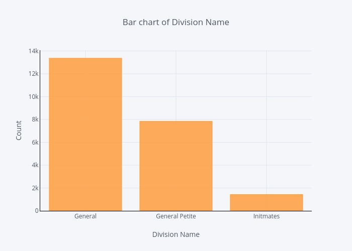
General division has the most number of reviews, and Initmates division has the least number of reviews.
The distribution of department
df.groupby('Department Name').count()['Clothing ID'].sort_values(ascending=False).iplot(kind='bar', yTitle='Count', linecolor='black', opacity=0.8, title='Bar chart of Department Name', xTitle='Department Name')
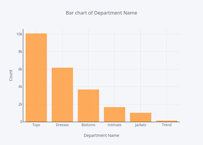
When comes to department, Tops department has the most reviews and Trend department has the least number of reviews.
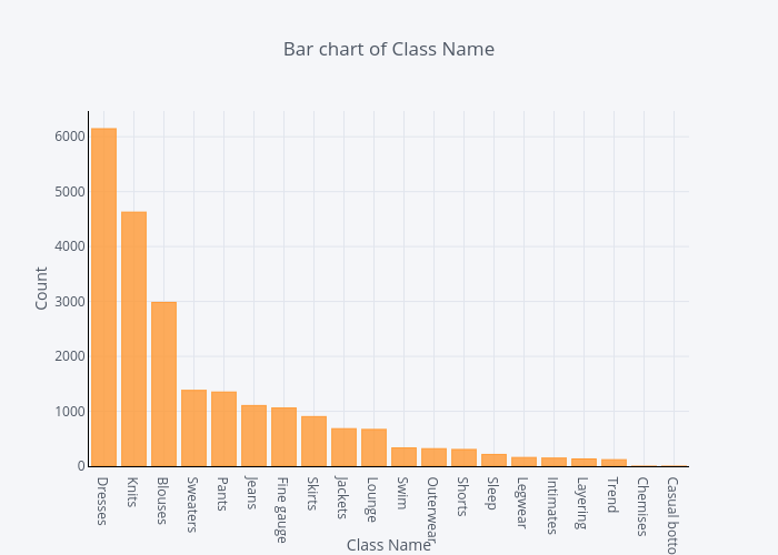
The distribution of class
df.groupby('Class Name').count()['Clothing ID'].sort_values(ascending=False).iplot(kind='bar', yTitle='Count', linecolor='black', opacity=0.8, title='Bar chart of Class Name', xTitle='Class Name')
Now we come to “Review Text” feature, before explore this feature, we need to extract N-Gram features. N-grams are used to describe the number of words used as observation points, e.g., unigram means singly-worded, bigram means 2-worded phrase, and trigram means 3-worded phrase. In order to do this, we use scikit-learn’s CountVectorizer function.
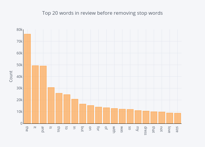
First, it would be interesting to compare unigrams before and after removing stop words.
The distribution of top unigrams before removing stop words
def get_top_n_words(corpus, n=None):
    vec = CountVectorizer().fit(corpus)
    bag_of_words = vec.transform(corpus)
    sum_words = bag_of_words.sum(axis=0)
    words_freq = [(word, sum_words[0, idx]) for word, idx in vec.vocabulary_.items()]
    words_freq =sorted(words_freq, key = lambda x: x[1], reverse=True)
    return words_freq[:n]
common_words = get_top_n_words(df['Review Text'], 20)
for word, freq in common_words:
    print(word, freq)
df1 = pd.DataFrame(common_words, columns = ['ReviewText' , 'count'])
df1.groupby('ReviewText').sum()['count'].sort_values(ascending=False).iplot(
kind='bar', yTitle='Count', linecolor='black', title='Top 20 words in review before removing stop words')
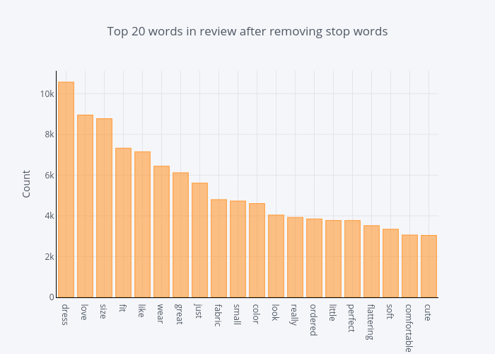
The distribution of top unigrams after removing stop words
def get_top_n_words(corpus, n=None):
    vec = CountVectorizer(stop_words = 'english').fit(corpus)
    bag_of_words = vec.transform(corpus)
    sum_words = bag_of_words.sum(axis=0)
    words_freq = [(word, sum_words[0, idx]) for word, idx in vec.vocabulary_.items()]
    words_freq =sorted(words_freq, key = lambda x: x[1], reverse=True)
    return words_freq[:n]
common_words = get_top_n_words(df['Review Text'], 20)
for word, freq in common_words:
    print(word, freq)
df2 = pd.DataFrame(common_words, columns = ['ReviewText' , 'count'])
df2.groupby('ReviewText').sum()['count'].sort_values(ascending=False).iplot(
kind='bar', yTitle='Count', linecolor='black', title='Top 20 words in review after removing stop words')
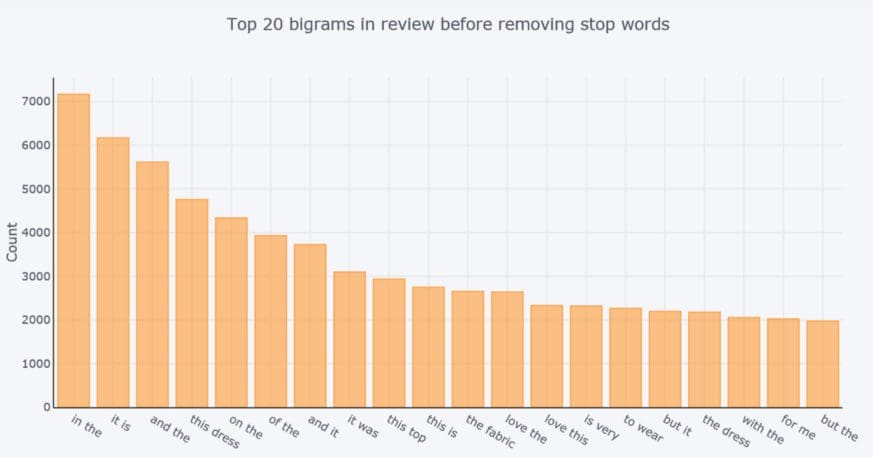
Second, we want to compare bigrams before and after removing stop words.
The distribution of top bigrams before removing stop words
def get_top_n_bigram(corpus, n=None):
    vec = CountVectorizer(ngram_range=(2, 2)).fit(corpus)
    bag_of_words = vec.transform(corpus)
    sum_words = bag_of_words.sum(axis=0)
    words_freq = [(word, sum_words[0, idx]) for word, idx in vec.vocabulary_.items()]
    words_freq =sorted(words_freq, key = lambda x: x[1], reverse=True)
    return words_freq[:n]
common_words = get_top_n_bigram(df['Review Text'], 20)
for word, freq in common_words:
    print(word, freq)
df3 = pd.DataFrame(common_words, columns = ['ReviewText' , 'count'])
df3.groupby('ReviewText').sum()['count'].sort_values(ascending=False).iplot(
kind='bar', yTitle='Count', linecolor='black', title='Top 20 bigrams in review before removing stop words')
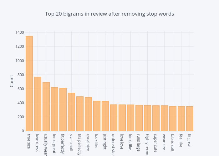
The distribution of top bigrams after removing stop words
def get_top_n_bigram(corpus, n=None):
    vec = CountVectorizer(ngram_range=(2, 2), stop_words='english').fit(corpus)
    bag_of_words = vec.transform(corpus)
    sum_words = bag_of_words.sum(axis=0)
    words_freq = [(word, sum_words[0, idx]) for word, idx in vec.vocabulary_.items()]
    words_freq =sorted(words_freq, key = lambda x: x[1], reverse=True)
    return words_freq[:n]
common_words = get_top_n_bigram(df['Review Text'], 20)
for word, freq in common_words:
    print(word, freq)
df4 = pd.DataFrame(common_words, columns = ['ReviewText' , 'count'])
df4.groupby('ReviewText').sum()['count'].sort_values(ascending=False).iplot(
kind='bar', yTitle='Count', linecolor='black', title='Top 20 bigrams in review after removing stop words')
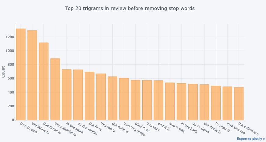
Last, we compare trigrams before and after removing stop words.
The distribution of Top trigrams before removing stop words
def get_top_n_trigram(corpus, n=None):
    vec = CountVectorizer(ngram_range=(3, 3)).fit(corpus)
    bag_of_words = vec.transform(corpus)
    sum_words = bag_of_words.sum(axis=0)
    words_freq = [(word, sum_words[0, idx]) for word, idx in vec.vocabulary_.items()]
    words_freq =sorted(words_freq, key = lambda x: x[1], reverse=True)
    return words_freq[:n]
common_words = get_top_n_trigram(df['Review Text'], 20)
for word, freq in common_words:
    print(word, freq)
df5 = pd.DataFrame(common_words, columns = ['ReviewText' , 'count'])
df5.groupby('ReviewText').sum()['count'].sort_values(ascending=False).iplot(
kind='bar', yTitle='Count', linecolor='black', title='Top 20 trigrams in review before removing stop words')
The distribution of Top trigrams after removing stop words
def get_top_n_trigram(corpus, n=None):
    vec = CountVectorizer(ngram_range=(3, 3), stop_words='english').fit(corpus)
    bag_of_words = vec.transform(corpus)
    sum_words = bag_of_words.sum(axis=0)
    words_freq = [(word, sum_words[0, idx]) for word, idx in vec.vocabulary_.items()]
    words_freq =sorted(words_freq, key = lambda x: x[1], reverse=True)
    return words_freq[:n]
common_words = get_top_n_trigram(df['Review Text'], 20)
for word, freq in common_words:
    print(word, freq)
df6 = pd.DataFrame(common_words, columns = ['ReviewText' , 'count'])
df6.groupby('ReviewText').sum()['count'].sort_values(ascending=False).iplot(
kind='bar', yTitle='Count', linecolor='black', title='Top 20 trigrams in review after removing stop words')

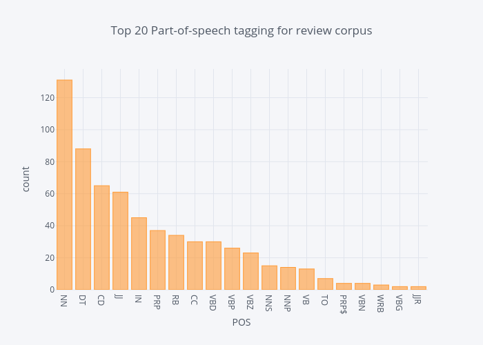
Part-Of-Speech Tagging (POS) is a process of assigning parts of speech to each word, such as noun, verb, adjective, etc
We use a simple TextBlob API to dive into POS of our “Review Text” feature in our data set, and visualize these tags.
The distribution of top part-of-speech tags of review corpus
blob = TextBlob(str(df['Review Text']))
pos_df = pd.DataFrame(blob.tags, columns = ['word' , 'pos'])
pos_df = pos_df.pos.value_counts()[:20]
pos_df.iplot(
    kind='bar',
    xTitle='POS',
    yTitle='count',
title='Top 20 Part-of-speech tagging for review corpus')
Box plot is used to compare the sentiment polarity score, rating, review text lengths of each department or division of the e-commerce store.
What do the departments tell about Sentiment polarity
y0 = df.loc[df['Department Name'] == 'Tops']['polarity']
y1 = df.loc[df['Department Name'] == 'Dresses']['polarity']
y2 = df.loc[df['Department Name'] == 'Bottoms']['polarity']
y3 = df.loc[df['Department Name'] == 'Intimate']['polarity']
y4 = df.loc[df['Department Name'] == 'Jackets']['polarity']
y5 = df.loc[df['Department Name'] == 'Trend']['polarity']

trace0 = go.Box(
    y=y0,
    name = 'Tops',
    marker = dict(
        color = 'rgb(214, 12, 140)',
    )
)
trace1 = go.Box(
    y=y1,
    name = 'Dresses',
    marker = dict(
        color = 'rgb(0, 128, 128)',
    )
)
trace2 = go.Box(
    y=y2,
    name = 'Bottoms',
    marker = dict(
        color = 'rgb(10, 140, 208)',
    )
)
trace3 = go.Box(
    y=y3,
    name = 'Intimate',
    marker = dict(
        color = 'rgb(12, 102, 14)',
    )
)
trace4 = go.Box(
    y=y4,
    name = 'Jackets',
    marker = dict(
        color = 'rgb(10, 0, 100)',
    )
)
trace5 = go.Box(
    y=y5,
    name = 'Trend',
    marker = dict(
        color = 'rgb(100, 0, 10)',
    )
)
data = [trace0, trace1, trace2, trace3, trace4, trace5]
layout = go.Layout(
    title = "Sentiment Polarity Boxplot of Department Name"
)

fig = go.Figure(data=data,layout=layout)
iplot(fig, filename = "Sentiment Polarity Boxplot of Department Name")
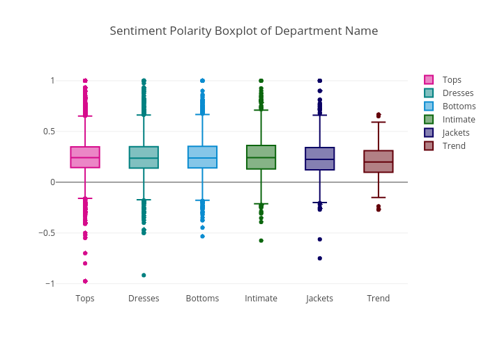
The highest sentiment polarity score was achieved by all of the six departments except Trend department, and the lowest sentiment polarity score was collected by Tops department. And the Trend department has the lowest median polarity score. If you remember, the Trend department has the least number of reviews. This explains why it does not have as wide variety of score distribution as the other departments.
What do the departments tell about rating
y0 = df.loc[df['Department Name'] == 'Tops']['Rating']
y1 = df.loc[df['Department Name'] == 'Dresses']['Rating']
y2 = df.loc[df['Department Name'] == 'Bottoms']['Rating']
y3 = df.loc[df['Department Name'] == 'Intimate']['Rating']
y4 = df.loc[df['Department Name'] == 'Jackets']['Rating']
y5 = df.loc[df['Department Name'] == 'Trend']['Rating']

trace0 = go.Box(
    y=y0,
    name = 'Tops',
    marker = dict(
        color = 'rgb(214, 12, 140)',
    )
)
trace1 = go.Box(
    y=y1,
    name = 'Dresses',
    marker = dict(
        color = 'rgb(0, 128, 128)',
    )
)
trace2 = go.Box(
    y=y2,
    name = 'Bottoms',
    marker = dict(
        color = 'rgb(10, 140, 208)',
    )
)
trace3 = go.Box(
    y=y3,
    name = 'Intimate',
    marker = dict(
        color = 'rgb(12, 102, 14)',
    )
)
trace4 = go.Box(
    y=y4,
    name = 'Jackets',
    marker = dict(
        color = 'rgb(10, 0, 100)',
    )
)
trace5 = go.Box(
    y=y5,
    name = 'Trend',
    marker = dict(
        color = 'rgb(100, 0, 10)',
    )
)
data = [trace0, trace1, trace2, trace3, trace4, trace5]
layout = go.Layout(
    title = "Rating Boxplot of Department Name"
)

fig = go.Figure(data=data,layout=layout)
iplot(fig, filename = "Rating Boxplot of Department Name")
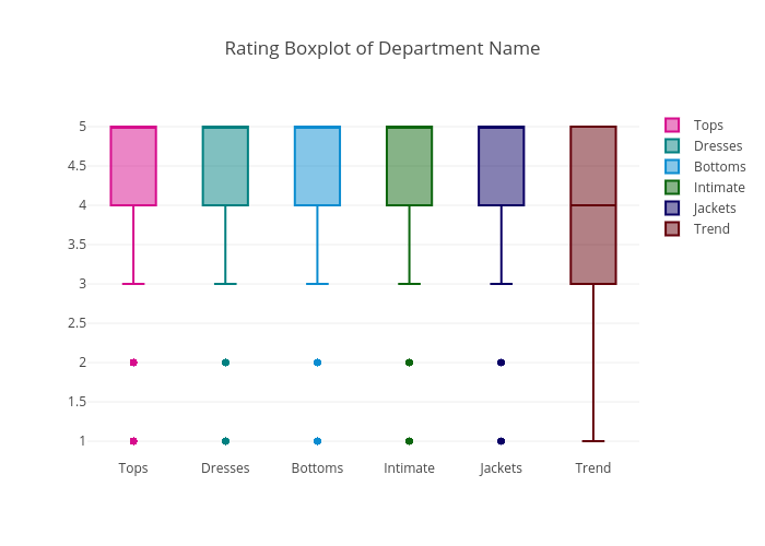
Except Trend department, all the other departments’ median rating were 5. Overall, the ratings are high and sentiment are positive in this review data set.
Review length by department
y0 = df.loc[df['Department Name'] == 'Tops']['review_len']
y1 = df.loc[df['Department Name'] == 'Dresses']['review_len']
y2 = df.loc[df['Department Name'] == 'Bottoms']['review_len']
y3 = df.loc[df['Department Name'] == 'Intimate']['review_len']
y4 = df.loc[df['Department Name'] == 'Jackets']['review_len']
y5 = df.loc[df['Department Name'] == 'Trend']['review_len']

trace0 = go.Box(
    y=y0,
    name = 'Tops',
    marker = dict(
        color = 'rgb(214, 12, 140)',
    )
)
trace1 = go.Box(
    y=y1,
    name = 'Dresses',
    marker = dict(
        color = 'rgb(0, 128, 128)',
    )
)
trace2 = go.Box(
    y=y2,
    name = 'Bottoms',
    marker = dict(
        color = 'rgb(10, 140, 208)',
    )
)
trace3 = go.Box(
    y=y3,
    name = 'Intimate',
    marker = dict(
        color = 'rgb(12, 102, 14)',
    )
)
trace4 = go.Box(
    y=y4,
    name = 'Jackets',
    marker = dict(
        color = 'rgb(10, 0, 100)',
    )
)
trace5 = go.Box(
    y=y5,
    name = 'Trend',
    marker = dict(
        color = 'rgb(100, 0, 10)',
    )
)
data = [trace0, trace1, trace2, trace3, trace4, trace5]
layout = go.Layout(
    title = "Review length Boxplot of Department Name"
)

fig = go.Figure(data=data,layout=layout)
iplot(fig, filename = "Review Length Boxplot of Department Name")
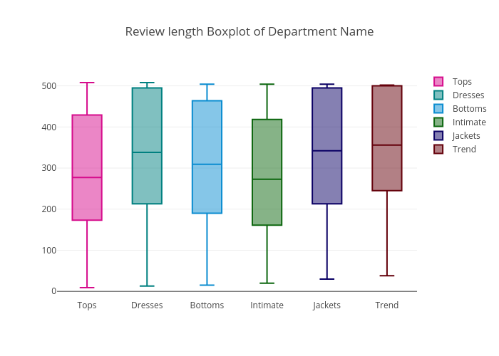
The median review length of Tops & Intimate departments are relative lower than those of the other departments.