A Complete Exploratory Data Analysis and Visualization for Text Data: Combine Visualization and NLP to Generate Insights
Visually representing the content of a text document is one of the most important tasks in the field of text mining as a Data Scientist or NLP specialist. However, there are some gaps between visualizing unstructured (text) data and structured data.
Bivariate visualization with Plotly
Bivariate visualization is a type of visualization that consists two features at a time. It describes association or relationship between two features.
Distribution of sentiment polarity score by recommendations
x1 = df.loc[df['Recommended IND'] == 1, 'polarity']
x0 = df.loc[df['Recommended IND'] == 0, 'polarity']

trace1 = go.Histogram(
    x=x0, name='Not recommended',
    opacity=0.75
)
trace2 = go.Histogram(
    x=x1, name = 'Recommended',
    opacity=0.75
)

data = [trace1, trace2]
layout = go.Layout(barmode='overlay', title='Distribution of Sentiment polarity of reviews based on Recommendation')
fig = go.Figure(data=data, layout=layout)

iplot(fig, filename='overlaid histogram')
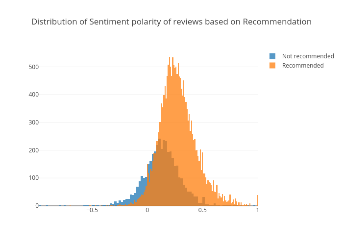
It is obvious that reviews have higher polarity score are more likely to be recommended.
Distribution of ratings by recommendations
x1 = df.loc[df['Recommended IND'] == 1, 'Rating']
x0 = df.loc[df['Recommended IND'] == 0, 'Rating']

trace1 = go.Histogram(
    x=x0, name='Not recommended',
    opacity=0.75
)
trace2 = go.Histogram(
    x=x1, name = 'Recommended',
    opacity=0.75
)

data = [trace1, trace2]
layout = go.Layout(barmode='overlay', title='Distribution of Sentiment polarity of reviews based on Recommendation')
fig = go.Figure(data=data, layout=layout)

iplot(fig, filename='overlaid histogram')
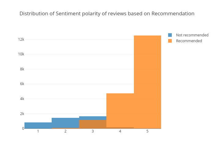
Recommended reviews have higher ratings than those of not recommended ones.
Distribution of review lengths by recommendations
x1 = df.loc[df['Recommended IND'] == 1, 'review_len']
x0 = df.loc[df['Recommended IND'] == 0, 'review_len']

trace1 = go.Histogram(
    x=x0, name='Not recommended',
    opacity=0.75
)
trace2 = go.Histogram(
    x=x1, name = 'Recommended',
    opacity=0.75
)

data = [trace1, trace2]
layout = go.Layout(barmode = 'group', title='Distribution of Review Lengths Based on Recommendation')
fig = go.Figure(data=data, layout=layout)

iplot(fig, filename='stacked histogram')
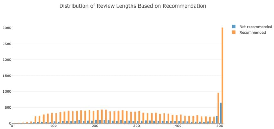
Recommended reviews tend to be lengthier than those of not recommended reviews.
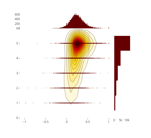
2D Density jointplot of sentiment polarity vs. rating
trace1 = go.Scatter(
    x=df['polarity'], y=df['Rating'], mode='markers', name='points',
    marker=dict(color='rgb(102,0,0)', size=2, opacity=0.4)
)
trace2 = go.Histogram2dContour(
    x=df['polarity'], y=df['Rating'], name='density', ncontours=20,
    colorscale='Hot', reversescale=True, showscale=False
)
trace3 = go.Histogram(
    x=df['polarity'], name='Sentiment polarity density',
    marker=dict(color='rgb(102,0,0)'),
    yaxis='y2'
)
trace4 = go.Histogram(
    y=df['Rating'], name='Rating density', marker=dict(color='rgb(102,0,0)'),
    xaxis='x2'
)
data = [trace1, trace2, trace3, trace4]

layout = go.Layout(
    showlegend=False,
    autosize=False,
    width=600,
    height=550,
    xaxis=dict(
        domain=[0, 0.85],
        showgrid=False,
        zeroline=False
    ),
    yaxis=dict(
        domain=[0, 0.85],
        showgrid=False,
        zeroline=False
    ),
    margin=dict(
        t=50
    ),
    hovermode='closest',
    bargap=0,
    xaxis2=dict(
        domain=[0.85, 1],
        showgrid=False,
        zeroline=False
    ),
    yaxis2=dict(
        domain=[0.85, 1],
        showgrid=False,
        zeroline=False
    )
)

fig = go.Figure(data=data, layout=layout)
iplot(fig, filename='2dhistogram-2d-density-plot-subplots')
2D Density jointplot of age and sentiment polarity
trace1 = go.Scatter(
    x=df['Age'], y=df['polarity'], mode='markers', name='points',
    marker=dict(color='rgb(102,0,0)', size=2, opacity=0.4)
)
trace2 = go.Histogram2dContour(
    x=df['Age'], y=df['polarity'], name='density', ncontours=20,
    colorscale='Hot', reversescale=True, showscale=False
)
trace3 = go.Histogram(
    x=df['Age'], name='Age density',
    marker=dict(color='rgb(102,0,0)'),
    yaxis='y2'
)
trace4 = go.Histogram(
    y=df['polarity'], name='Sentiment Polarity density', marker=dict(color='rgb(102,0,0)'),
    xaxis='x2'
)
data = [trace1, trace2, trace3, trace4]

layout = go.Layout(
    showlegend=False,
    autosize=False,
    width=600,
    height=550,
    xaxis=dict(
        domain=[0, 0.85],
        showgrid=False,
        zeroline=False
    ),
    yaxis=dict(
        domain=[0, 0.85],
        showgrid=False,
        zeroline=False
    ),
    margin=dict(
        t=50
    ),
    hovermode='closest',
    bargap=0,
    xaxis2=dict(
        domain=[0.85, 1],
        showgrid=False,
        zeroline=False
    ),
    yaxis2=dict(
        domain=[0.85, 1],
        showgrid=False,
        zeroline=False
    )
)

fig = go.Figure(data=data, layout=layout)
iplot(fig, filename='2dhistogram-2d-density-plot-subplots')
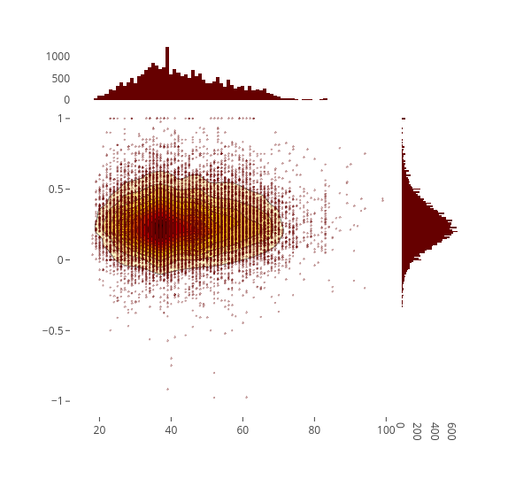
There were few people are very positive or very negative. People who give neutral to positive reviews are more likely to be in their 30s. Probably people at these age are likely to be more active.
Finding characteristic terms and their associations
Sometimes we want to analyzes words used by different categories and outputs some notable term associations. We will use scattertext and spaCy libraries to accomplish these.
First, we need to turn the data frame into a Scattertext Corpus. To look for differences in department name, set the category_colparameter to 'Department Names', and use the review present in the Review Text column, to analyze by setting the text col parameter. Finally, pass a spaCy model in to the nlp argument and call build() to construct the corpus.
Following are the terms that differentiate the review text from a general English corpus.
corpus = st.CorpusFromPandas(df, category_col='Department Name', text_col='Review Text', nlp=nlp).build()
print(list(corpus.get_scaled_f_scores_vs_background().index[:10]))

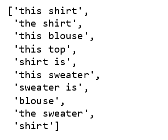
Following are the terms in review text that are most associated with the Tops department:
term_freq_df = corpus.get_term_freq_df()
term_freq_df['Tops Score'] = corpus.get_scaled_f_scores('Tops')
pprint(list(term_freq_df.sort_values(by='Tops Score', ascending=False).index[:10]))
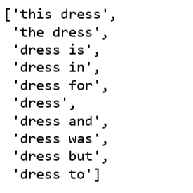
Following are the terms that are most associated with the Dresses department:
term_freq_df['Dresses Score'] = corpus.get_scaled_f_scores('Dresses')
pprint(list(term_freq_df.sort_values(by='Dresses Score', ascending=False).index[:10]))
Topic Modeling Review Text
Finally, we want to explore topic modeling algorithm to this data set, to see whether it would provide any benefit, and fit with what we are doing for our review text feature.
We will experiment with Latent Semantic Analysis (LSA) technique in topic modeling.
- Generating our document-term matrix from review text to a matrix of TF-IDF features.
- LSA model replaces raw counts in the document-term matrix with a TF-IDF score.
- Perform dimensionality reduction on the document-term matrix using truncated SVD.
- Because the number of department is 6, we set
n_topics=6. - Taking the
argmaxof each review text in this topic matrix will give the predicted topics of each review text in the data. We can then sort these into counts of each topic. - To better understand each topic, we will find the most frequent three words in each topic.
reindexed_data = df['Review Text']
tfidf_vectorizer = TfidfVectorizer(stop_words='english', use_idf=True, smooth_idf=True)
reindexed_data = reindexed_data.values
document_term_matrix = tfidf_vectorizer.fit_transform(reindexed_data)
n_topics = 6
lsa_model = TruncatedSVD(n_components=n_topics)
lsa_topic_matrix = lsa_model.fit_transform(document_term_matrix)
def get_keys(topic_matrix):
'''
returns an integer list of predicted topic
categories for a given topic matrix
'''
keys = topic_matrix.argmax(axis=1).tolist()
return keys
def keys_to_counts(keys):
'''
returns a tuple of topic categories and their
accompanying magnitudes for a given list of keys
'''
count_pairs = Counter(keys).items()
categories = [pair[0] for pair in count_pairs]
counts = [pair[1] for pair in count_pairs]
return (categories, counts)
lsa_keys = get_keys(lsa_topic_matrix)
lsa_categories, lsa_counts = keys_to_counts(lsa_keys)
def get_top_n_words(n, keys, document_term_matrix, tfidf_vectorizer):
'''
returns a list of n_topic strings, where each string contains the n most common
words in a predicted category, in order
'''
top_word_indices = []
for topic in range(n_topics):
temp_vector_sum = 0
for i in range(len(keys)):
if keys[i] == topic:
temp_vector_sum += document_term_matrix[i]
temp_vector_sum = temp_vector_sum.toarray()
top_n_word_indices = np.flip(np.argsort(temp_vector_sum)[0][-n:],0)
top_word_indices.append(top_n_word_indices)
top_words = []
for topic in top_word_indices:
topic_words = []
for index in topic:
temp_word_vector = np.zeros((1,document_term_matrix.shape[1]))
temp_word_vector[:,index] = 1
the_word = tfidf_vectorizer.inverse_transform(temp_word_vector)[0][0]
topic_words.append(the_word.encode('ascii').decode('utf-8'))
top_words.append(" ".join(topic_words))
return top_words
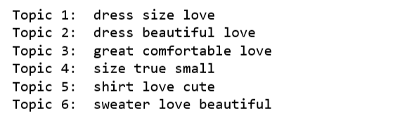
top_n_words_lsa = get_top_n_words(3, lsa_keys, document_term_matrix, tfidf_vectorizer)
for i in range(len(top_n_words_lsa)):
print("Topic {}: ".format(i+1), top_n_words_lsa[i])
top_3_words = get_top_n_words(3, lsa_keys, document_term_matrix, tfidf_vectorizer)
labels = ['Topic {}: \n'.format(i) + top_3_words[i] for i in lsa_categories]

fig, ax = plt.subplots(figsize=(16,8))
ax.bar(lsa_categories, lsa_counts);
ax.set_xticks(lsa_categories);
ax.set_xticklabels(labels);
ax.set_ylabel('Number of review text');
ax.set_title('LSA topic counts');
plt.show();
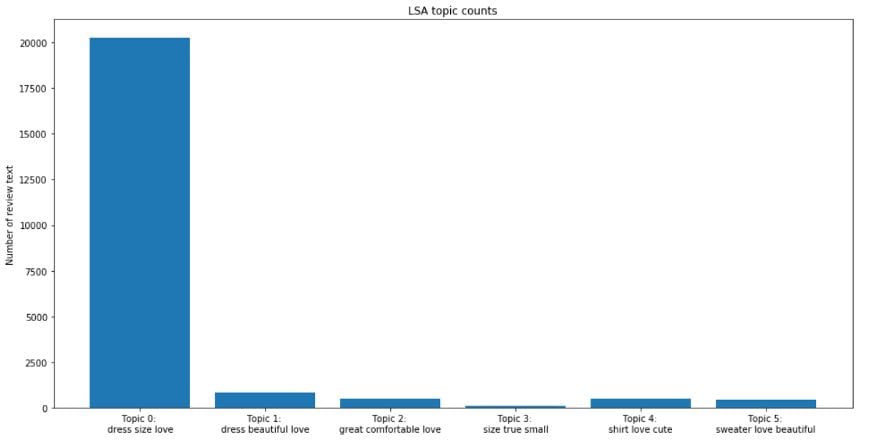
By looking at the most frequent words in each topic, we have a sense that we may not reach any degree of separation across the topic categories. In another word, we could not separate review text by departments using topic modeling techniques.
Topic modeling techniques have a number of important limitations. To begin, the term “topic” is somewhat ambigious, and by now it is perhaps clear that topic models will not produce highly nuanced classification of texts for our data.
In addition, we can observe that the vast majority of the review text are categorized to the first topic (Topic 0). The t-SNE visualization of LSA topic modeling won’t be pretty.
All the code can be found on the Jupyter notebook. And code plus the interactive visualizations can be viewed on nbviewer.
Happy Monday!
Bio: Susan Li is changing the world, one article at a time. She is a Sr. Data Scientist, located in Toronto, Canada.
Original. Reposted with permission.
Related:
- ELMo: Contextual Language Embedding
- All you need to know about text preprocessing for NLP and Machine Learning
- Machine Learning for Text Classification Using SpaCy in Python