 Activation maps for deep learning models in a few lines of code
 Activation maps for deep learning models in a few lines of code
We illustrate how to show the activation maps of various layers in a deep CNN model with just a couple of lines of code.
Deep learning has a bad rep: ‘black-box’
Deep Learning (DL) models are revolutionizing the business and technology world with jaw-dropping performances in one application area after another — image classification, object detection, object tracking, pose recognition, video analytics, synthetic picture generation — just to name a few.
However, they are like anything but classical Machine Learning (ML) algorithms/techniques. DL models use millions of parameters and create extremely complex and highly nonlinear internal representations of the images or datasets that are fed to these models.
They are, therefore, often called the perfect black-box ML techniques. We can get highly accurate predictions from them after we train them with large datasets, but we have little hope of understanding the internal features and representations of the data that a model uses to classify a particular image into a category.
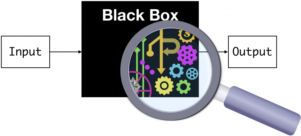
Black-box problem of deep learning — predictive power without an intuitive and easy-to-follow explanation.
This does not bode well because we, humans, are visual creatures. Millions of years of evolution have gifted us an amazingly complex pair of eyes and an even more complex visual cortex, and we use those organs for making sense of the world.
The scientific process starts with observation, and that is almost always synonymous with vision. In business, only what we can observe and measure, we can control and manage effectively.
Seeing/observing is how we start to make mental models of worldly phenomena, classify objects around us, separate a friend from a foe, love, work, and play.
Visualization helps a lot. Especially, for deep learning.
Therefore, a ‘black box’ DL model, where we cannot visualize the inner workings, often draws some criticism.
Activation maps
Among various deep learning architectures, perhaps the most prominent one is the so-called Convolutional Neural Network (CNN). It has emerged as the workhorse for analyzing high-dimensional, unstructured data — image, text, or audio — which has traditionally posed severe challenges for classical ML (non-deep-learning) or hand-crafted (non-ML) algorithms.
Several approaches for understanding and visualizing CNN have been developed in the literature, partly as a response to the common criticism that the learned internal features in a CNN are not interpretable.
The most straight-forward visualization technique is to show the activations of the network during the forward pass.
So, what are activation anyway?
At a simple level, activation functions help decide whether a neuron should be activated. This helps determine whether the information that the neuron is receiving is relevant for the input. The activation function is a non-linear transformation that happens over an input signal, and the transformed output is sent to the next neuron.
If you want to understand what precisely, these activations mean, and why are they placed in the neural net architecture in the first place, check out this article,
Fundamentals of Deep Learning - Activation Functions and When to Use Them?
Introduction Internet provides access to a plethora of information today. Whatever we need is just a Google (search)…
Below is a fantastic video by the renowned data scientist Brandon Rohrer about the basic mechanism of a CNN i.e. how a given input (say a two-dimensional image) is processed layer by layer. At each layer, the output is generated by passing the transformed input through an activation function.
Activation maps are just a visual representation of these activation numbers at various layers of the network as a given image progresses through as a result of various linear algebraic operations.
For ReLU activation based networks, the activations usually start out looking relatively blobby and dense, but as the training progresses the activations usually become more sparse and localized. One design pitfall that can be easily caught with this visualization is that some activation maps may be all zero for many different inputs, which can indicate dead filters and can be a symptom of high learning rates.
Activation maps are just a visual representation of these activation numbers at various layers of the network.
Sounds good. But visualizing these activation maps is a non-trivial task, even after you have trained your neural net well and are making predictions out of it.
How do you easily visualize and show these activation maps for a reasonably complicated CNN with just a few lines of code?
Activation maps with a few lines of code
The whole Jupyter notebook is here. Feel free to fork and expand (and leave a star for the repository if you like it).
A compact function and a nice little library
I showed previously in an article, how to write a single compact function for obtaining a fully trained CNN model by reading image files one by one automatically from your disk, by utilizing some amazing utility methods and classes offered by Keras library.
Do check out this article, because, without it, you cannot train arbitrary models with arbitrary image datasets in a compact manner, as described in this article.
A single function to streamline image classification with Keras
We show, how to construct a single, generalized, utility function to pull images automatically from a directory and…
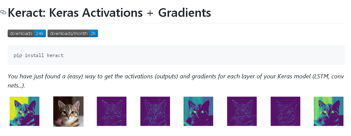
Next, we use this function along with a nice little library called Keract, which makes the visualization of activation maps super easy. It is a high-level accessory library to Keras library to show useful heatmaps and activation maps on various layers of a neural network.
Therefore, for this code, we need to use a couple of utility functions from my utils.DL_utils module - train_CNN_keras and preprocess_image to make a random RGB image compatible for generating the activation maps (these were described in the article mentioned above).
Here is the Python module — DL_utils.py. You can store in your local drive and import the functions as usual.
The dataset
For training, we are using the famous Caltech-101 dataset from http://www.vision.caltech.edu/Image_Datasets/Caltech101/. This dataset was somewhat a precursor to the ImageNet database, which is the current gold standard for image classification data repository.
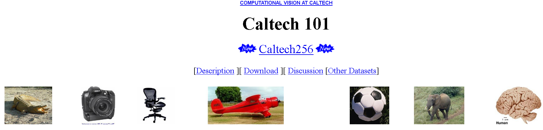
It is an image dataset of diverse types of objects belonging to 101 categories. There are about 40 to 800 images per category. Most categories have about 50 images. The size of each image is roughly 300 x 200 pixels.
However, we are training only with 5 categories of images — crab, cup, brain, camera, and chair.
This is just a random choice for this demo, feel free to choose your own categories.
Training the model
Training is done in a few lines of code only.
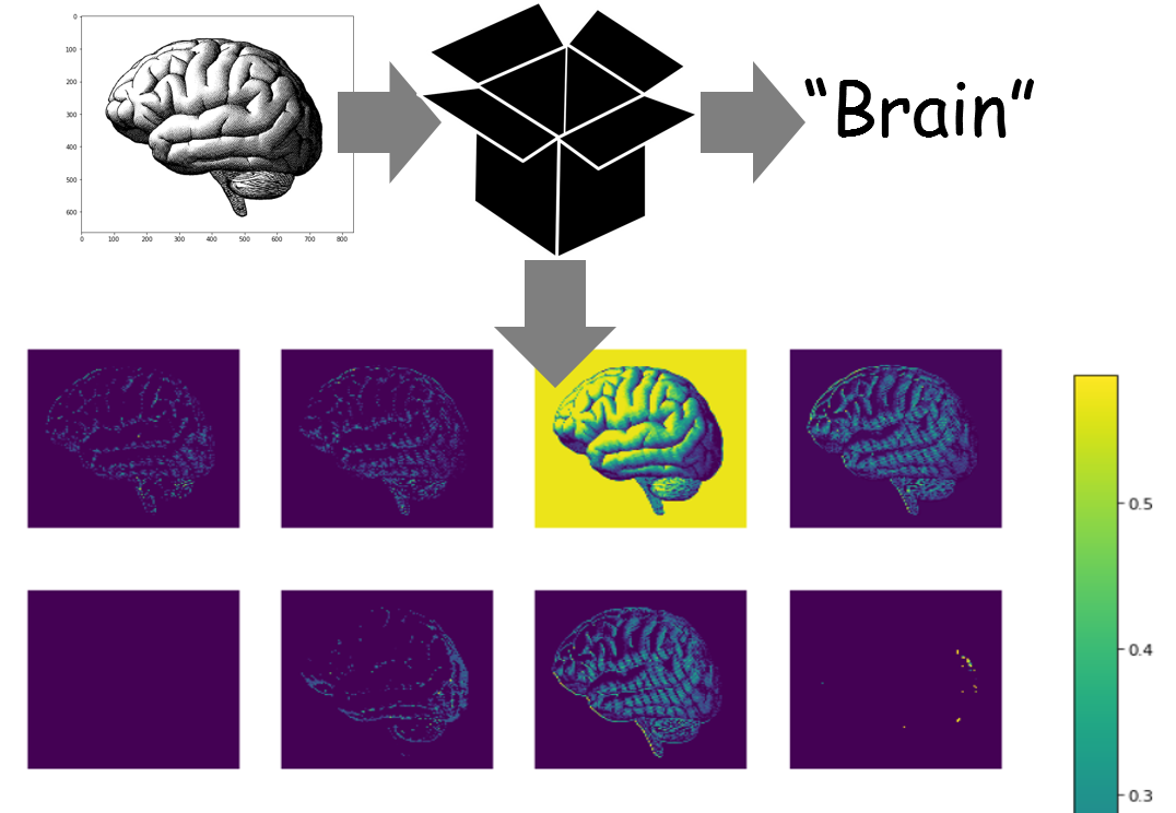
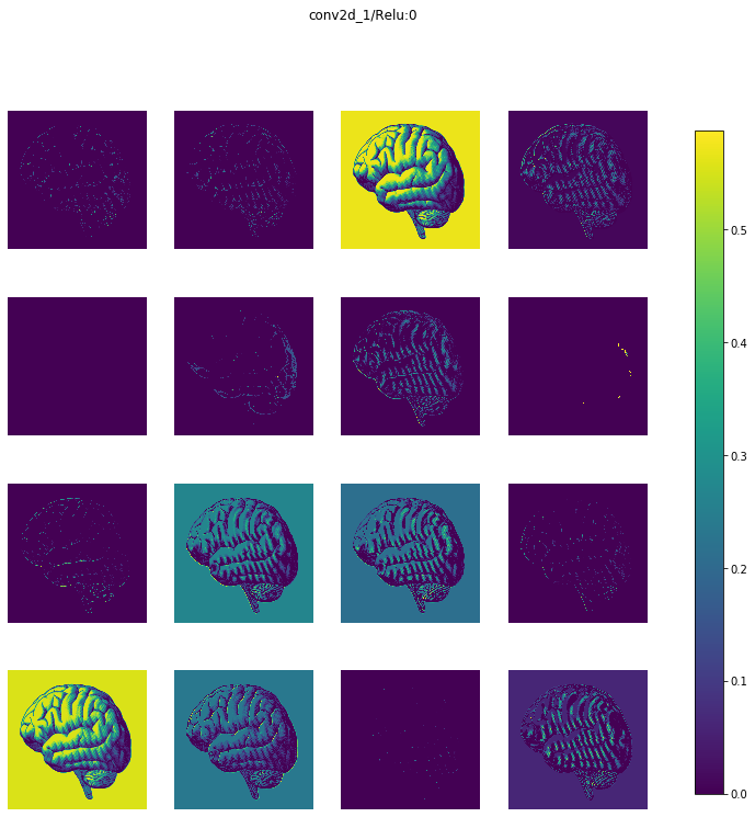
A random image of a human brain downloaded from the internet
For generating the activations, we download a random image of a human brain from the internet.

Generate the activations (a dictionary)
Then, another couple of lines of code to generate the activation.
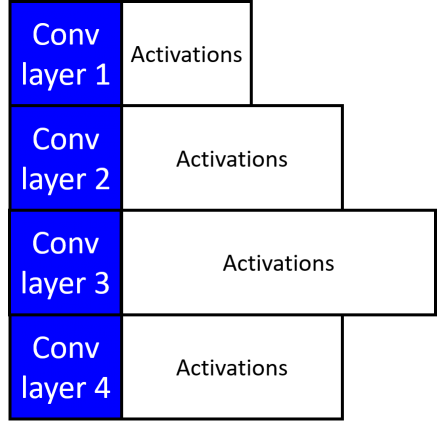
We get back a dictionary with layer names as the keys and Numpy arrays as the values corresponding to the activations. Below an illustration is shown where the activation arrays are shown to have varying lengths corresponding to the size of the filter maps of that particular convolutional layer.
Display the activations
Again, a single line of code,
display_activations(activations, save=False)
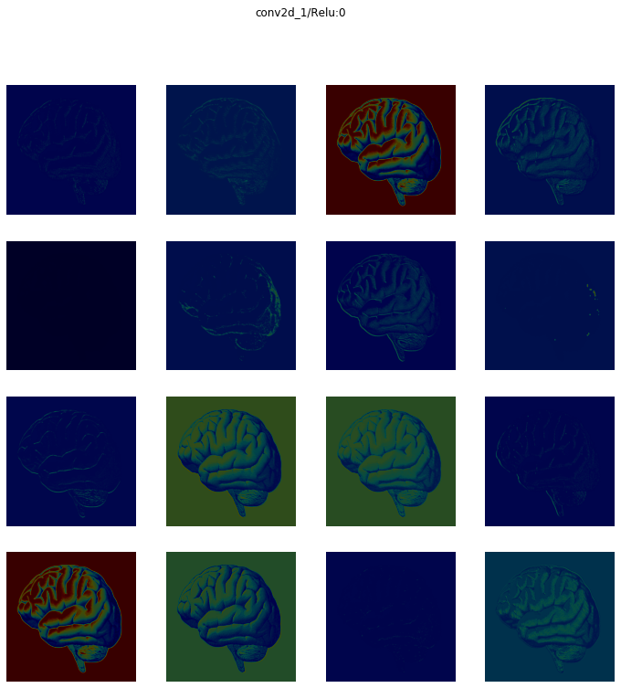
We get to see activation maps layer by layer. Here is the first convolutional layer (16 images corresponding to the 16 filters)
And, here is layer number 2 (32 images corresponding to the 32filters)
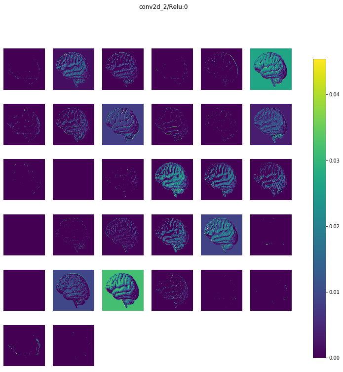
We have 5 convolutional layers (followed by Max pooling layers) in this model, and therefore, we get back 10 sets of images. For brevity, I am not showing the rest but you can see them all in my Github repo here.
Heatmaps
You can also show the activations as heatmaps.
display_heatmaps(activations, x, save=False)
Update: Quiver
After writing this article last week, I found out about another beautiful library for activation visualization called Quiver. However, this one is built on the Python microserver framework Flask and displays the activation maps on a browser port rather than inside your Jupyter Notebook.
They also need a trained Keras model as input. So, you can easily use the compact function described in this article (from my DL_uitls module) and try this library for interactive visualization of activation maps.

Summary
That’s it, for now.
The whole Jupyter notebook is here.
We showed, how using only a few lines of code (utilizing compact functions from a special module and a nice little accessory library to Keras) we can train a CNN, generate activation maps, and display them layer by layer — from scratch.
This gives you the ability to train CNN models (simple to complex) from any image dataset (as long as you can arrange it in a simple format) and look inside their guts for any test image you want.
For more of such hands-on tutorials, check my Deep-Learning-with-Python Github repo.
If you have any questions or ideas to share, please contact the author at tirthajyoti[AT]gmail.com. Also, you can check the author’s GitHub repositories for other fun code snippets in Python, R, and machine learning resources. If you are, like me, passionate about machine learning/data science, please feel free to add me on LinkedIn or follow me on Twitter.
Original. Reposted with permission.
Related:
- Overcoming Deep Learning Stumbling Blocks
- Evolving Deep Neural Networks
- Research Guide for Neural Architecture Search