11 Essential Code Blocks for Complete EDA (Exploratory Data Analysis)
This article is a practical guide to exploring any data science project and gain valuable insights.
By Susan Maina, Passionate about data, machine learning enthusiast, writer at Medium
Exploratory Data Analysis, or EDA, is one of the first steps of the data science process. It involves learning as much as possible about the data, without spending too much time. Here, you get an instinctive as well as a high-level practical understanding of the data. By the end of this process, you should have a general idea of the structure of the data set, some cleaning ideas, the target variable and, possible modeling techniques.
There are some general strategies to quickly perform EDA in most problems. In this article, I will use the Melbourne Housing snapshot dataset from kaggle to demonstrate the 11 blocks of code you can use to perform a satisfactory exploratory data analysis. The dataset includes Address, Type of Real estate, Suburb, Method of Selling, Rooms, Price, Real Estate Agent (SellerG), Date of Sale and, Distance from C.B.D. You can follow along by downloading the dataset here.
The first step is importing the libraries required. We will need Pandas, Numpy, matplotlib and seaborn. To make sure all our columns are displayed, use pd.set_option(’display.max_columns’, 100) . By default, pandas displays 20 columns and hides the rest.
import pandas as pd
pd.set_option('display.max_columns',100)import numpy as npimport matplotlib.pyplot as plt
%matplotlib inlineimport seaborn as sns
sns.set_style('darkgrid')
Panda’s pd.read_csv(path) reads in the csv file as a DataFrame.
data = pd.read_csv('melb_data.csv')
Basic data set Exploration
1. Shape (dimensions) of the DataFrame
The .shape attribute of a Pandas DataFrame gives an overall structure of the data. It returns a tuple of length 2 that translates to how many rows of observations and columns the dataset has.
data.shape### Results
(13580, 21)
We can see that the dataset has 13,580 observations and 21 features, and one of those features is the target variable.
2. Data types of the various columns
The DataFrame’s .dtypes attribute displays the data types of the columns as a Panda’s Series (Series means a column of values and their indices).
data.dtypes### Results
Suburb            object
Address           object
Rooms              int64
Type              object
Price            float64
Method            object
SellerG           object
Date              object
Distance         float64
Postcode         float64
Bedroom2         float64
Bathroom         float64
Car              float64
Landsize         float64
BuildingArea     float64
YearBuilt        float64
CouncilArea       object
Lattitude        float64
Longtitude       float64
Regionname        object
Propertycount    float64
dtype: object
We observe that our dataset has a combination of categorical (object) and numeric (float and int) features. At this point, I went back to the Kaggle page for an understanding of the columns and their meanings. Check out the table of columns and their definitions here created with Datawrapper.
What to look out for;
- Numeric features that should be categorical and vice versa.
From a quick analysis, I did not find any mismatch for the datatypes. This makes sense as this dataset version is a cleaned snapshot of the original Melbourne data.
3. Display a few rows
The Pandas DataFrame has very handy functions for displaying a few observations. data.head()displays the first 5 observations, data.tail() the last 5, and data.sample() an observation chosen randomly from the dataset. You can display 5 random observations using data.sample(5)
data.head()
data.tail()
data.sample(5)
What to look out for:
- Can you understand the column names? Do they make sense? (Check with the variable definitions again if needed)
- Do the values in these columns make sense?
- Are there significant missing values (NaN) sighted?
- What types of classes do the categorical features have?
My insights; the Postcode and Propertycount features both changed according to the Suburb feature. Also, there were significant missing values for the BuildingArea and YearBuilt.
Distribution
This refers to how the values in a feature are distributed, or how often they occur. For numeric features, we’ll see how many times groups of numbers appear in a particular column, and for categorical features, the classes for each column and their frequency. We will use both graphs and actual summary statistics. The graphs enable us to get an overall idea of the distributions while the statistics give us factual numbers. These two strategies are both recommended as they complement each other.
Numeric Features
4. Plot each numeric feature
We will use Pandas histogram. A histogram groups numbers into ranges (or bins) and the height of a bar shows how many numbers fall in that range. df.hist() plots a histogram of the data’s numeric features in a grid. We will also provide the figsize and xrot arguments to increase the grid size and rotate the x-axis by 45 degrees.
data.hist(figsize=(14,14), xrot=45)
plt.show()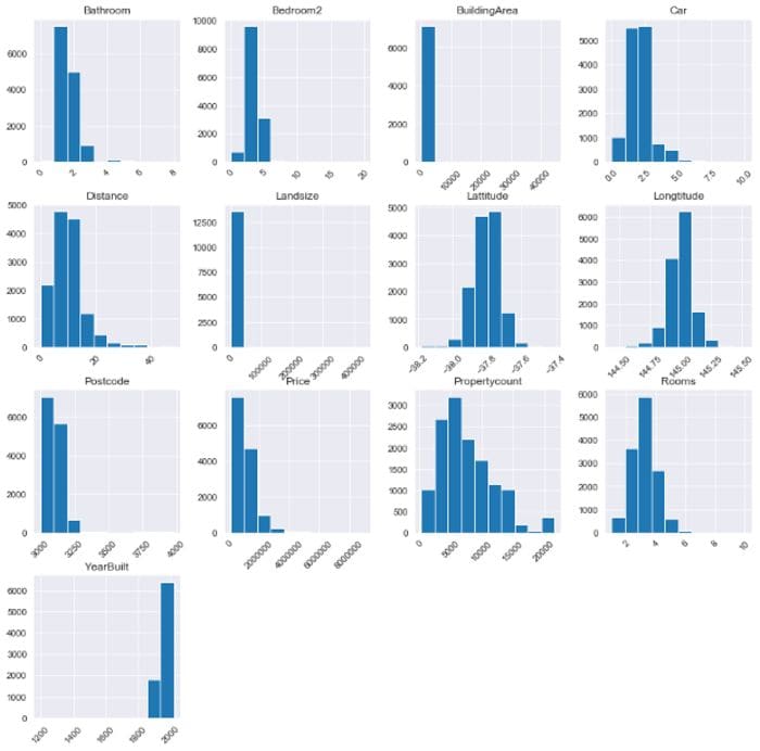
Histogram by author
What to look out for:
- Possible outliers that cannot be explained or might be measurement errors
- Numeric features that should be categorical. For example,
Genderrepresented by 1 and 0. - Boundaries that do not make sense such as percentage values> 100.
From the histogram, I noted that BuildingArea and LandSize had potential outliers to the right. Our target feature Price was also highly skewed to the right. I also noted that YearBuilt was very skewed to the left and the boundary started at the year 1200 which was odd. Let’s move on to the summary statistics for a clearer picture.
5. Summary statistics of the numerical features
Now that we have an intuitive feel of the numeric features, we will look at actual statistics using df.describe()which displays their summary statistics.
data.describe()We can see for each numeric feature, the count of values in it, the mean value, std or standard deviation, minimum value, the 25th percentile, the 50th percentile or median, the 75th percentile, and the maximum value. From the count we can also identify the features with missing values; their count is not equal to the total number of rows of the dataset. These are Car, LandSize and YearBuilt.
I noted that the minimum for both the LandSize and BuildingArea is 0. We also see that the Price ranges from 85,000 to 9,000,000 which is a big range. We will explore these columns in detailed analysis later in the project.
Looking at the YearBuilt feature, however, we note that the minimum year is 1196. This could be a possible data entry error that will be removed during cleaning.
Categorical features
6. Summary statistics of the categorical features
For categorical features, it is important to show the summary statistics before we plot graphs because some features have a lot of unique classes (like we will see for the Address) and the classes would be unreadable if visualized on a countplot.
To check the summary statistics of only the categorical features, we will use df.describe(include=’object’)
data.describe(include='object')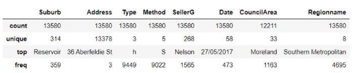
Categorical summary statistics by author
This table is a bit different from the one for numeric features. Here, we get the count of the values of each feature, the number of unique classes, the top most frequent class, and how frequently that class occurs in the data set.
We note that some classes have a lot of unique values such as Address, followed by Suburb and SellerG. From these findings, I will only plot the columns with 10 or less unique classes. We also note that CouncilArea has missing values.
7. Plot each categorical feature
Using the statistics above, we note that Type, Method and Regionname have less than 10 classes and can be effectively visualized. We will plot these features using the Seaborn countplot, which is like a histogram for categorical variables. Each bar in a countplot represents a unique class.
I created a For loop. For each categorical feature, a countplot will be displayed to show how the classes are distributed for that feature. The line df.select_dtypes(include=’object’) selects the categorical columns with their values and displays them. We will also include an If-statement so as to pick only the three columns with 10 or fewer classes using the line Series.nunique() < 10. Read the .nunique() documentation here.
for column in data.select_dtypes(include='object'):
    if data[column].nunique() < 10:
        sns.countplot(y=column, data=data)
        plt.show()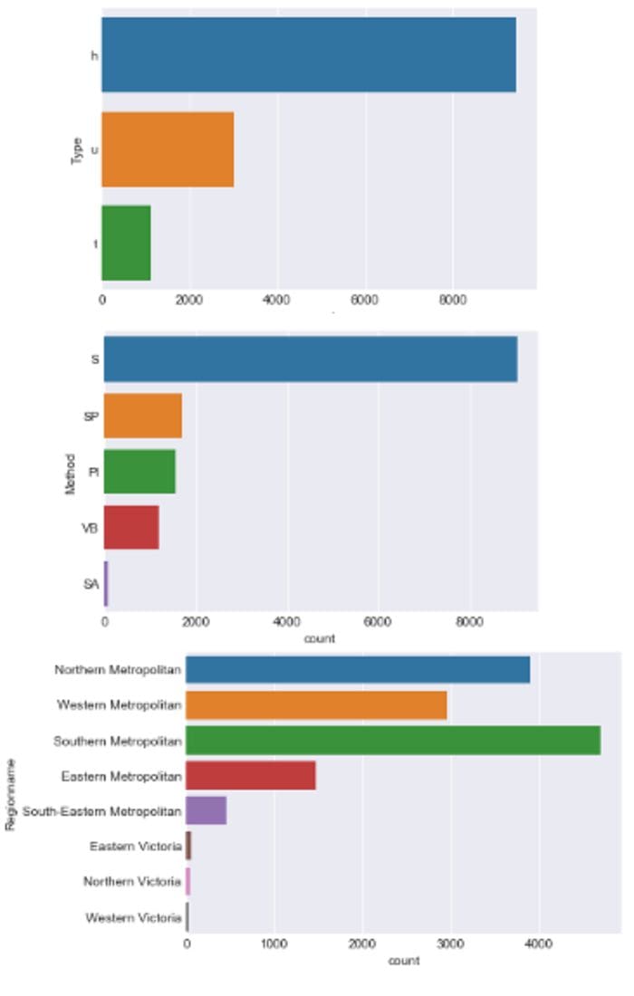
Count plots by author
What to look out for:
- Sparse classes which have the potential to affect a model’s performance.
- Mistakes in labeling of the classes, for example 2 exact classes with minor spelling differences.
We note that Regionname has some sparse classes which might need to be merged or re-assigned during modeling.
Grouping and segmentation
Segmentation allows us to cut the data and observe the relationship between categorical and numeric features.
8. Segment the target variable by categorical features.
Here, we will compare the target feature, Price, between the various classes of our main categorical features (Type, Method and Regionname) and see how the Price changes with the classes.
We use the Seaborn boxplot which plots the distribution of Price across the classes of categorical features. This tutorial, from where I borrowed the Image below, explains the boxplot’s features clearly. The dots at both ends represent outliers.
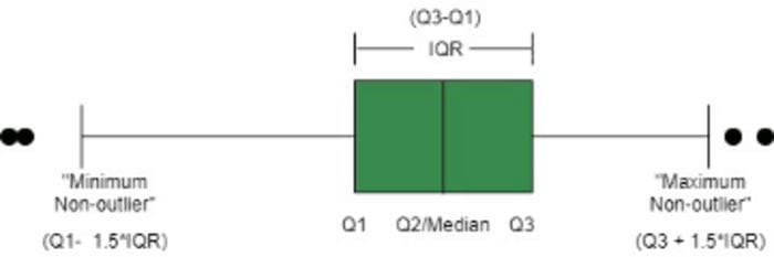
Image from www.geekeforgeeks.org
Again, I used a for loop to plot a boxplot of each categorical feature with Price.
for column in data.select_dtypes(include=’object’):
 if data[column].nunique() < 10:
 sns.boxplot(y=column, x=’Price’, data=data)
 plt.show()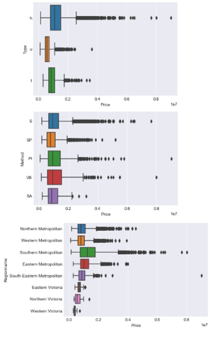
Box plots by author
What to look out for:
- which classes most affect the target variables.
Note how the Price is still sparsely distributed among the 3 sparse classes of Regionname seen earlier, strengthening our case against these classes.
Also note how the SA class (the least frequent Method class) commands high prices, almost similar prices of the most frequently occurring class S.
9. Group numeric features by each categorical feature.
Here we will see how all the other numeric features, not just Price, change with each categorical feature by summarizing the numeric features across the classes. We use the Dataframe’s groupby function to group the data by a category and calculate a metric (such as mean, median, min, std, etc) across the various numeric features.
For only the 3 categorical features with less than 10 classes, we group the data, then calculate the mean across the numeric features. We use display() which results to a cleaner table than print().
for column in data.select_dtypes(include='object'):
    if data[column].nunique() < 10:
        display(data.groupby(column).mean())
We get to compare the Type, Method and Regionname classes across the numeric features to see how they are distributed.
Relationships between numeric features and other numeric features
10. Correlations matrix for the different numerical features
A correlation is a value between -1 and 1 that amounts to how closely values of two separate features move simultaneously. A positive correlation means that as one feature increases the other one also increases, while a negative correlation means one feature increases as the other decreases. Correlations close to 0 indicate a weak relationship while closer to -1 or 1 signifies a strong relationship.
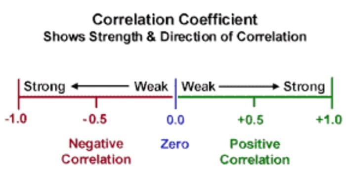
Image from edugyan.in
We will use df.corr() to calculate the correlations between the numeric features and it returns a DataFrame.
corrs = data.corr()
corrs
This might not mean much now, so let us plot a heatmap to visualize the correlations.
11. Heatmap of the correlations
We will use a Seaborn heatmap to plot the grid as a rectangular color-coded matrix. We use sns.heatmap(corrs, cmap=’RdBu_r’,annot=True).
The cmap=‘RdBu_r’ argument tells the heatmap what colour palette to use. A high positive correlation appears as dark red and a high negative correlation as dark blue. Closer to white signifies a weak relationship. Read this nice tutorial for other color palettes. annot=True includes the values of the correlations in the boxes for easier reading and interpretation.
plt.figure(figsize=(10,8))
sns.heatmap(corrs, cmap='RdBu_r', annot=True)
plt.show()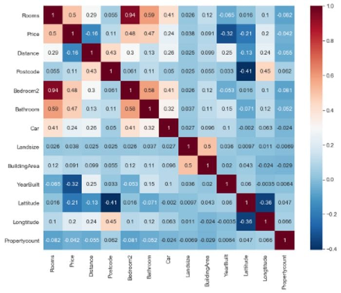
Heatmap by author
What to look out for:
- Strongly correlated features; either dark red (positive) or dark blue(negative).
- Target variable; If it has strong positive or negative relationships with other features.
We note that Rooms, Bedrooms2, Bathrooms, and Price have strong positive relationships. On the other hand, Price, our target feature, has a slightly weak negative correlation with YearBuilt and an even weaker negative relationship with Distance from CBD.
In this article, we explored the Melbourne dataset and got a high-level understanding of the structure and its features. At this stage, we do not need to be 100% comprehensive because in future stages we will explore the data more elaborately. You can get the full code on Github here. I will be uploading the dataset’s cleaning concepts soon.
Bio: Susan Maina is passionate about data, machine learning enthusiast, writer at Medium.
Original. Reposted with permission.
Related:
- Powerful Exploratory Data Analysis in just two lines of code
- Pandas Profiling: One-Line Magical Code for EDA
- Statistical and Visual Exploratory Data Analysis with One Line of Code