How to Ace Data Science Assessment Test by Using Automatic EDA Tools
By using a few lines of code, you can understand key aspects of a given dataset. These tools have helped me answer business-related questions during the data assessment test by Alooba.

Image by author | Canva Pro
Generally, the assessment test is divided into five parts; statistics, business analytics, coding, SQL, and hands-on data analytics. You will be given a dataset and 20 minutes to answer three to four business-related questions. Even if you are an expert in data analysis, you cannot do data ingestion, data analytics, and reporting in a limited time. For that, you need super tools that can automate the data analysis part so that you can focus on answering the questions from a business case study.

Image by author
In this blog, we are learning about Auto-EDA tools to assist us in passing the data analytics part. We will be learning about Deepnote, Autoviz, Pandas profiling, and Sweetviz. These tools require a few lines of code to display critical information about data.
Deepnote
Deepnote is a free cloud data science notebook that supports multiple third-parties integrations and programming languages. Recently, the platform has introduced a new way to display Pandas DataFrame. The New Year’s resolution dataset is available at Kaggle and under CC BY-SA 4.0 license. The data was gathered through a survey asking respondents about their New Year’s resolution of 2022.
As we can observe, the data frame displays the distribution of categorical and numerical features. It exhibits the min-max range of specific features and the percentage of missing values.
import pandas as pd
data = pd.read_csv("nyr_data.csv")
data

We can also use the Filter option to display a specific category or a value. Finally, the Visualize option will help us create simple data visualization without writing a single line of code.
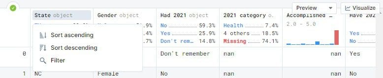
Image by author
The Visualize option will ask for the Pandas DataFrame, type of chart, X-axis, Y-axis, and Color to display an interactive visualization.
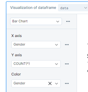
Image by author
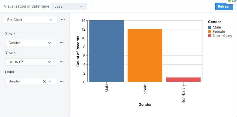
We have used visualizing of the Pandas DataFrame to display the distribution of gender in the survey using a bar chart.
Deepnote is always my first line of defense against time constraints projects and assessment tests. I can easily produce a simple data report within 20 minutes. Deepnote has also helped me in passing multiple data science and machine learning assessment tests. If you are interested in my Deepnote projects check out my profile.
AutoViz
Autoviz is used for creating automatic visualization of the tabular data using a single line of code. It displays all combinations of charts based on the feature type. If the feature text, it will display word cloud, and if it is a category, it will display the combination of bar charts. Autoviz comes with four options; SVG, Bokeh, Server, and HTML.
- SVG/PNG/JPG: matplotlib plots are generated, which can be stored locally or displayed in a Jupyter notebook.
- Bokeh: Interactive charts are generated within Jupyter notebooks.
- Server: launch a browser-based dashboard containing all the charts.
- HTML: silently create bokeh charts and save HTML files locally.
With a few lines of code we can produce; detailed information about the dataset, pairwise scatter plot, distplot, boxplot, probability plot, histogram, violin plot, heatmap, and bar chart for each category. Autoviz saved us half an hour of coding and reporting results.
from autoviz.AutoViz_Class import AutoViz_Class
%matplotlib inline
AV = AutoViz_Class()
df = AV.AutoViz("nyr_data.csv")
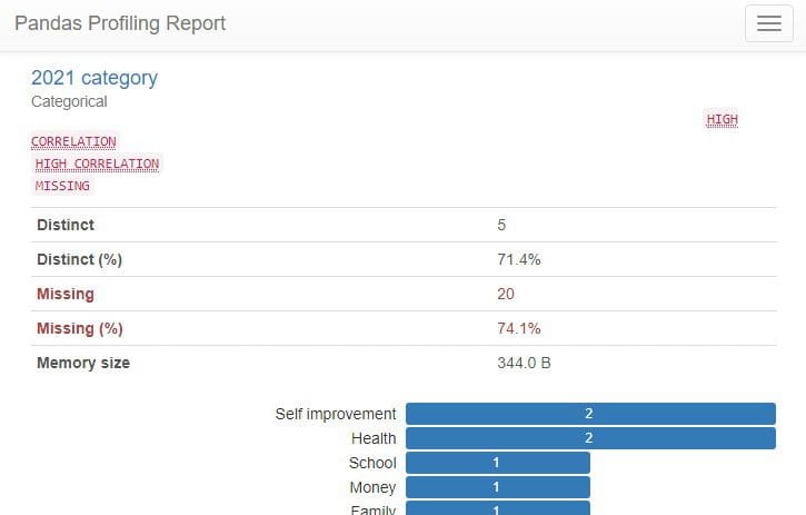
Pandas Profiling
Pandas-profiling generates detailed data reports using Pandas DataFrame. The report consists of variable types, the shape of data, unique values, histograms, statistical analysis, text analysis, and missing values.
The image below shows the summary of data profiles. The data summary also includes alerts highlighting the highly correlated variables and the frequency of missing values in a particular variable.
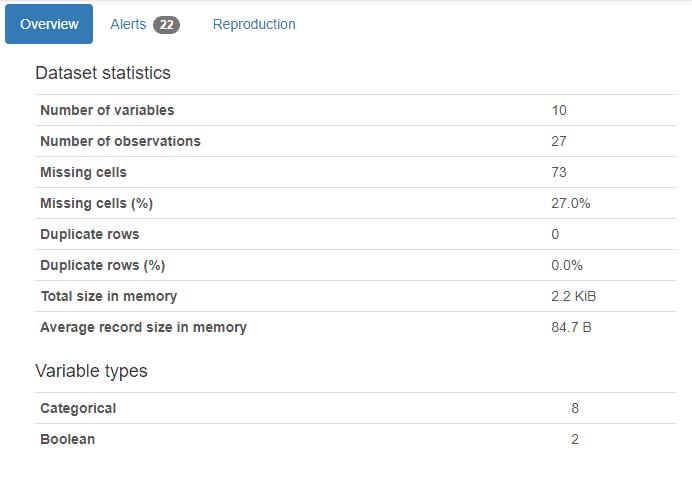
Image by author
The final report consists of comprehensive information about variable distributions, correlations matrix, missing values, and samples. This information is enough for you to answer 60% of assessment test questions.
from pandas_profiling import ProfileReport
profile = ProfileReport(data, title="Pandas Profiling Report")
profile
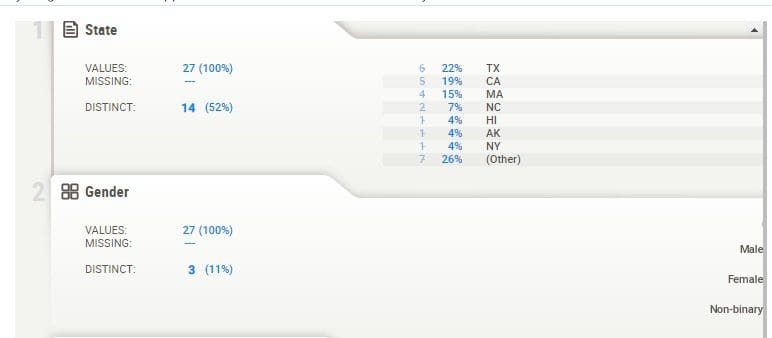
SweetViz
Sweetviz is an open-source Python library that creates high-definition visualization to support your exploratory data analysis. The user inference is interactive and easy to navigate. With a single line of code, you can produce a professional data analytical report.
The report includes; the shape of the dataset, types of features, correlation, missing values, and distribution using bar charts. It is similar to Pandas Profiling but is much cleaner and easy to navigate.
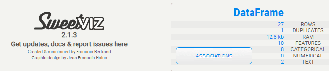
Image by author
SweetViz uses Pandas DataFrame and generates beautiful HTML-based data reports. We can save the HTML reports locally or run them directly in a Jupyter notebook using my_report.show_notebook().
import sweetviz as sv

my_report = sv.analyze(data)
my_report.show_notebook() ## Or use show_html
Conclusion
The tools we have disused are great for generating exploratory data analysis reports. In the end, it comes down to your understanding of the subject matter and your experience in the data science sector. The assessment questions are usually around a business case study, for example; historical sales data of a digital camera company. These tools can assist you in understanding the dataset but without subject matter expertise, it will be hard for you to answer the questions.
In this blog, we have learned about Deepnote, AutoViz, Pandas Profiling, and SweetViz. The automatic exploratory data analysis tools can help you understand the problem statement faster with a few lines of code.
Abid Ali Awan (@1abidaliawan) is a certified data scientist professional who loves building machine learning models. Currently, he is focusing on content creation and writing technical blogs on machine learning and data science technologies. Abid holds a Master's degree in Technology Management and a bachelor's degree in Telecommunication Engineering. His vision is to build an AI product using a graph neural network for students struggling with mental illness.