10 Amazing Machine Learning Visualizations You Should Know in 2023
Yellowbrick for creating machine learning plots with less code.
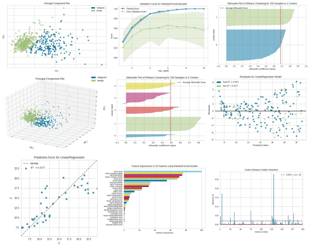
Image by Editor
Data visualization plays an important role in machine learning.
Data visualization use cases in machine learning include:
- Hyperparameter tuning
- Model performance evaluation
- Validating model assumptions
- Finding outliers
- Selecting the most important features
- Identifying patterns and correlations between features
Visualizations that are directly related to the above key things in machine learning are called machine learning visualizations.
Creating machine learning visualizations is sometimes a complicated process as it requires a lot of code to write even in Python. But, thanks to Python's open-source Yellowbrick library, even complex machine learning visualizations can be created with less code. That library extends the Scikit-learn API and provides high-level functions for visual diagnostics that are not provided by Scikit-learn.
Today, I’ll discuss the following types of machine learning visualizations, their use cases and Yellowbrick implementation in detail.
Yellowbrick — Quick start
Installation
Installation of Yellowbrick can be done by running one of the following commands.
- pip package installer:
pip install yellowbrick
- conda package installer:
conda install -c districtdatalabs yellowbrick
Using Yellowbrick
Yellowbrick visualizers have Scikit-learn-like syntax. A visualizer is an object that learns from data to produce a visualization. It is often used with a Scikit-learn estimator. To train a visualizer, we call its fit() method.
Saving the plot
To save a plot created using a Yellowbrick visualizer, we call the show() method as follows. This will save the plot as a PNG file on the disk.
visualizer.show(outpath="name_of_the_plot.png")
1. Principal Component Plot
Usage
The principal component plot visualizes high-dimensional data in a 2D or 3D scatter plot. Therefore, this plot is extremely useful for identifying important patterns in high-dimensional data.
Yellowbrick implementation
Creating this plot with the traditional method is complex and time-consuming. We need to apply PCA to the dataset first and then use the matplotlib library to create the scatter plot.
Instead, we can use Yellowbrick’s PCA visualizer class to achieve the same functionality. It utilizes the principal component analysis method, reduces the dimensionality of the dataset and creates the scatter plot with 2 or 3 lines of code! All we need to do is to specify some keyword arguments in the PCA() class.
Let’s take an example to further understand this. Here, we use the breast_cancer dataset (see Citation at the end) which has 30 features and 569 samples of two classes (Malignant and Benign). Because of the high dimensionality (30 features) in the data, it is impossible to plot the original data in a 2D or 3D scatter plot unless we apply PCA to the dataset.
The following code explains how we can utilize Yellowbrick’s PCA visualizer to create a 2D scatter plot of a 30-dimensional dataset.
Code by Author

Principal Component Plot — 2D|Image by Author
We can also create a 3D scatter plot by setting projection=3in the PCA() class.
Code by Author
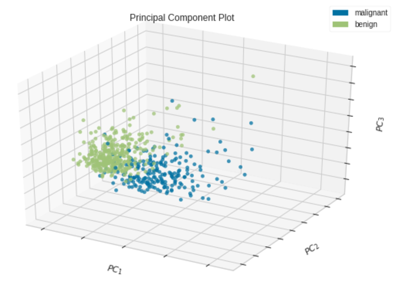
Principal Component Plot — 3D|Image by Author
The most important parameters of the PCA visualizer include:
- scale: bool, default
True. This indicates whether the data should be scaled or not. We should scale data before running PCA. Learn more about here. - projection: int, default is 2. When
projection=2, a 2D scatter plot is created. Whenprojection=3, a 3D scatter plot is created. - classes: list, default
None. This indicates the class labels for each class in y. The class names will be the labels for the legend.
2. Validation Curve
Usage
The validation curve plots the influence of a single hyperparameter on the train and validation set. By looking at the curve, we can determine the overfitting, underfitting and just-right conditions of the model for the specified values of the given hyperparameter. When there are multiple hyperparameters to tune at once, the validation curve cannot be used. Instated, you can use grid search or random search.
Yellowbrick implementation
Creating a validation curve with the traditional method is complex and time-consuming. Instead, we can use Yellowbrick’s ValidationCurve visualizer.
To plot a validation curve in Yellowbirck, we’ll build a random forest classifier using the same breast_cancer dataset (see Citation at the end). We’ll plot the influence of the max_depth hyperparameter in the random forest model.
The following code explains how we can utilize Yellowbrick’s ValidationCurve visualizer to create a validation curve using the breast_cancer dataset.
Code by Author
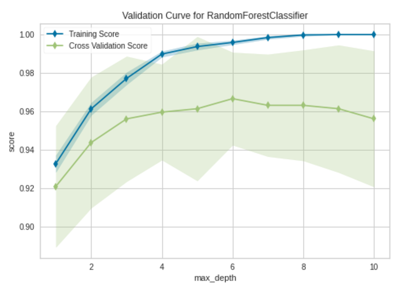
Validation Curve|Image by Author
The model begins to overfit after the max_depth value of 6. When max_depth=6, the model fits the training data very well and also generalizes well on new unseen data.
The most important parameters of the ValidationCurve visualizer include:
- estimator: This can be any Scikit-learn ML model such as a decision tree, random forest, support vector machine, etc.
- param_name: This is the name of the hyperparameter that we want to monitor.
- param_range: This includes the possible values for param_name.
- cv: int, defines the number of folds for the cross-validation.
- scoring: string, contains the method of scoring of the model. For classification, accuracy is preferred.
3. Learning Curve
Usage
The learning curve plots the training and validation errors or accuracies against the number of epochs or the number of training instances. You may think that both learning and validation curves appear the same, but the number of iterations is plotted in the learning curve’s x-axis while the values of the hyperparameter are plotted in the validation curve’s x-axis.
The uses of the learning curve include:
- The learning curve is used to detect underfitting, overfitting and just-right conditions of the model.
- The learning curve is used to identify slow convergence, oscillating, oscillating with divergence and proper convergence scenarios when finding the optimal learning rate of a neural network or ML model.
- The learning curve is used to see how much our model benefits from adding more training data. When used in this way, the x-axis shows the number of training instances.
Yellowbrick implementation
Creating the learning curve with the traditional method is complex and time-consuming. Instead, we can use Yellowbrick’s LearningCurve visualizer.
To plot a learning curve in Yellowbirck, we’ll build a support vector classifier using the same breast_cancer dataset (see Citation at the end).
The following code explains how we can utilize Yellowbrick’s LearningCurve visualizer to create a validation curve using the breast_cancer dataset.
Code by Author
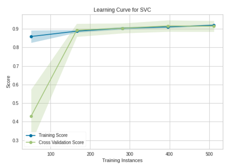
Learning Curve|Image by Author
The model will not benefit from adding more training instances. The model has already been trained with 569 training instances. The validation accuracy is not improving after 175 training instances.
The most important parameters of the LearningCurve visualizer include:
- estimator: This can be any Scikit-learn ML model such as a decision tree, random forest, support vector machine, etc.
- cv: int, defines the number of folds for the cross-validation.
- scoring: string, contains the method of scoring of the model. For classification, accuracy is preferred.
4. Elbow Plot
Usage
The Elbow plot is used to select the optimal number of clusters in K-Means clustering. The model fits best at the point where the elbow occurs in the line chart. The elbow is the point of inflection on the chart.
Yellowbrick implementation
Creating the Elbow plot with the traditional method is complex and time-consuming. Instead, we can use Yellowbrick’s KElbowVisualizer.
To plot a learning curve in Yellowbirck, we’ll build a K-Means clustering model using the iris dataset (see Citation at the end).
The following code explains how we can utilize Yellowbrick’s KElbowVisualizer to create an Elbow plot using the iris dataset.
Code by Author
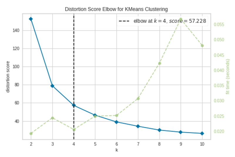
Elbow Plot|Image by Author
The elbow occurs at k=4 (annotated with a dashed line). The plot indicates that the optimal number of clusters for the model is 4. In other words, the model is fitted well with 4 clusters.
The most important parameters of the KElbowVisualizer include:
- estimator: K-Means model instance
- k: int or tuple. If an integer, it will compute scores for the clusters in the range of (2, k). If a tuple, it will compute scores for the clusters in the given range, for example, (3, 11).
5. Silhouette Plot
Usage
The silhouette plot is used to select the optimal number of clusters in K-Means clustering and also to detect cluster imbalance. This plot provides very accurate results than the Elbow plot.
Yellowbrick implementation
Creating the silhouette plot with the traditional method is complex and time-consuming. Instead, we can use Yellowbrick’s SilhouetteVisualizer.
To create a silhouette plot in Yellowbirck, we’ll build a K-Means clustering model using the iris dataset (see Citation at the end).
The following code blocks explain how we can utilize Yellowbrick’s SilhouetteVisualizer to create silhouette plots using the iris dataset with different k (number of clusters) values.
k=2
Code by Author

Silhouette Plot with 2 Clusters (k=2)|Image by Author
By changing the number of clusters in the KMeans() class, we can execute the above code at different times to create silhouette plots when k=3, k=4 and k=5.
k=3
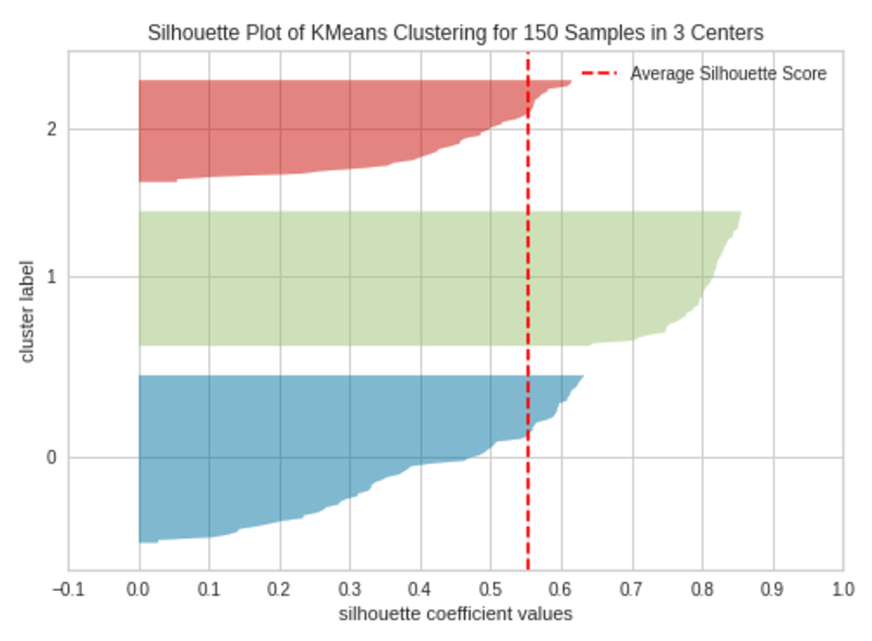
|Silhouette Plot with 3 Clusters (k=3)|Image by Author
k=4
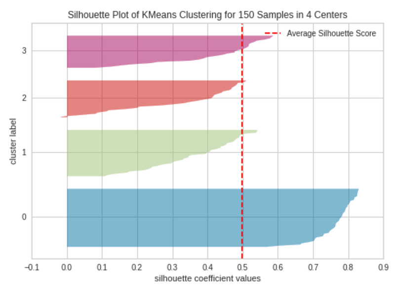
Silhouette Plot with 4 Clusters (k=4)|Image by Author
k=5
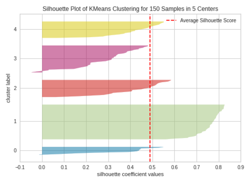
Silhouette Plot with 4 Clusters (k=5)|Image by Author
The silhouette plot contains one knife shape per cluster. Each knife shape is created by bars that represent all the data points in the cluster. So, the width of a knife shape represents the number of all instances in the cluster. The bar length represents the Silhouette Coefficient for each instance. The dashed line indicates the silhouette score — Source: Hands-On K-Means Clustering (written by me).
A plot with roughly equal widths of knife shapes tells us the clusters are well-balanced and have roughly the same number of instances within each cluster — one of the most important assumptions in K-Means clustering.
When the bars in a knife shape extend the dashed line, the clusters are well separated — another important assumption in K-Means clustering.
When k=3, the clusters are well-balanced and well-separated. So, the optimal number of clusters in our example is 3.
The most important parameters of the SilhouetteVisualizer include:
- estimator: K-Means model instance
- colors: string, a collection of colors used for each knife shape. ‘yellowbrick’ or one of Matplotlib color map strings such as ‘Accent’, ‘Set1’, etc.
6. Class Imbalance Plot
Usage
The class imbalance plot detects the imbalance of classes in the target column in classification datasets.
Class imbalance happens when one class has significantly more instances than the other class. For example, a dataset related to spam email detection has 9900 instances for the “Not spam” category and just 100 instances for the “Spam” category. The model will fail to capture the minority class (the Spam category). As a result of this, the model will not be accurate in predicting the minority class when a class imbalance occurs — Source: Top 20 Machine Learning and Deep Learning Mistakes That Secretly Happen Behind the Scenes (written by me).
Yellowbrick implementation
Creating the class imbalance plot with the traditional method is complex and time-consuming. Instead, we can use Yellowbrick’s ClassBalance visualizer.
To plot a class imbalance plot in Yellowbirck, we’ll use the breast_cancer dataset (classification dataset, see Citation at the end).
The following code explains how we can utilize Yellowbrick’s ClassBalance visualizer to create a class imbalance plot using the breast_cancer dataset.
Code by Author
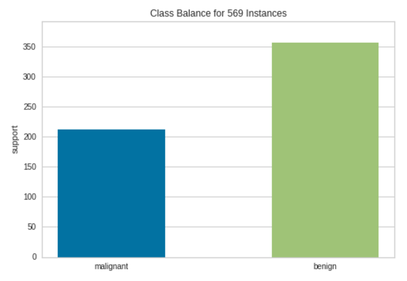
Class Imbalance Plot|Image by Author
There are more than 200 instances in the Malignant class and more than 350 instances in the Benign class. Therefore, we cannot see much class imbalance here although the instances are not equally distributed among the two classes.
The most important parameters of the ClassBalance visualizer include:
- labels: list, the names of the unique classes in the target column.
7. Residuals Plot
Usage
The residuals plot in linear regression is used to determine whether the residuals (observed values-predicted values) are uncorrelated (independent) by analyzing the variance of errors in a regression model.
The residuals plot is created by plotting the residuals against the predictions. If there is any kind of pattern between predictions and residuals, it confirms that the fitted regression model is not perfect. If the points are randomly dispersed around the x-axis, the regression model is fitted well with the data.
Yellowbrick implementation
Creating the residuals plot with the traditional method is complex and time-consuming. Instead, we can use Yellowbrick’s ResidualsPlot visualizer.
To plot a residuals plot in Yellowbirck, we’ll use the Advertising (Advertising.csv, see Citation at the end) dataset.
The following code explains how we can utilize Yellowbrick’s ResidualsPlot visualizer to create a residuals plot using the Advertising dataset.
Code by Author
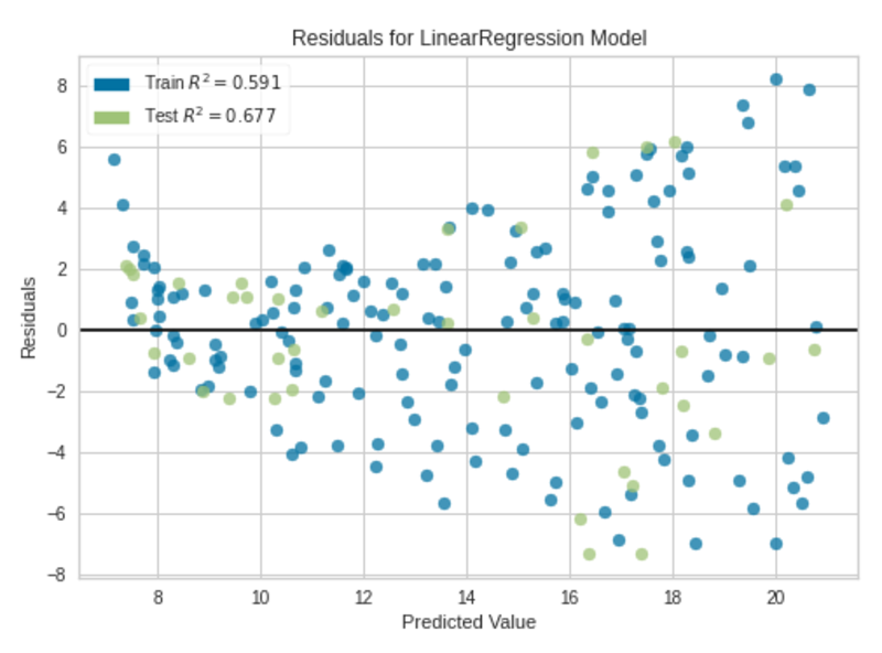
Residuals Plot|Image by Author
We can clearly see some kind of non-linear pattern between predictions and residuals in the residuals plot. The fitted regression model is not perfect, but it is good enough.
The most important parameters of the ResidualsPlot visualizer include:
- estimator: This can be any Scikit-learn regressor.
- hist: bool, default
True. Whether to plot the histogram of residuals, which is used to check another assumption — The residuals are approximately normally distributed with the mean 0 and a fixed standard deviation.
8. Prediction Error Plot
Usage
The prediction error plot in linear regression is a graphical method that is used to evaluate a regression model.
The prediction error plot is created by plotting the predictions against the actual target values.
If the model makes very accurate predictions, the points should be on the 45-degree line. Otherwise, the points are dispersed around that line.
Yellowbrick implementation
Creating the prediction error plot with the traditional method is complex and time-consuming. Instead, we can use Yellowbrick’s PredictionError visualizer.
To plot a prediction error plot in Yellowbirck, we’ll use the Advertising (Advertising.csv, see Citation at the end) dataset.
The following code explains how we can utilize Yellowbrick’s PredictionError visualizer to create a residuals plot using the Advertising dataset.
Code by Author
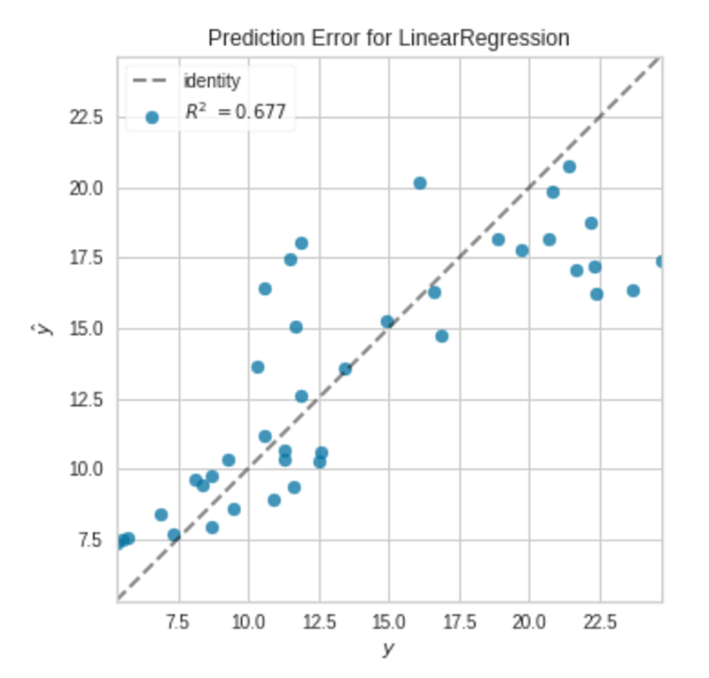
Prediction Error Plot|Image by Author
The points are not exactly on the 45-degree line, but the model is good enough.
The most important parameters of the PredictionError visualizer include:
- estimator: This can be any Scikit-learn regressor.
- identity: bool, default
True. Whether to draw the 45-degree line.
9. Cook’s Distance Plot
Usage
The Cook's distance measures the impact of instances on linear regression. Instances with large impacts are considered as outliers. A dataset with a large number of outliers is not suitable for linear regression without preprocessing. Simply, the Cook’s distance plot is used to detect outliers in the dataset.
Yellowbrick implementation
Creating the Cook’s distance plot with the traditional method is complex and time-consuming. Instead, we can use Yellowbrick’s CooksDistance visualizer.
To plot a Cook’s distance plot in Yellowbirck, we’ll use the Advertising (Advertising.csv, see Citation at the end) dataset.
The following code explains how we can utilize Yellowbrick’s CooksDistance visualizer to create a Cook’s distance plot using the Advertising dataset.
Code by Author
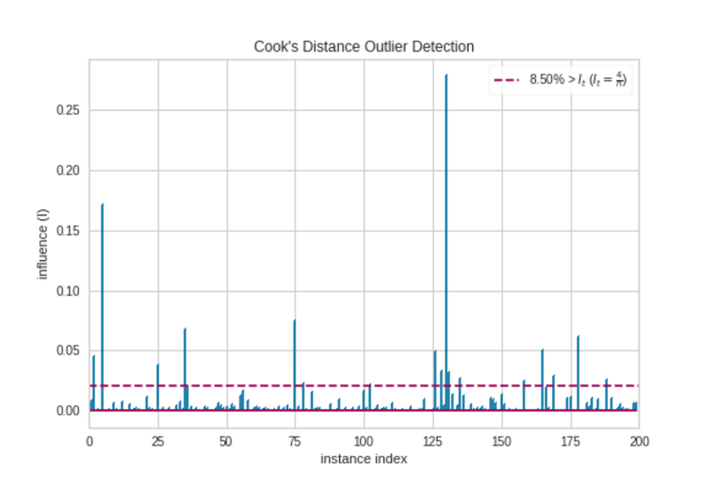
Cook’s Distance Plot|Image by Author
There are some observations that extend the threshold (horizontal red) line. They are outliers. So, we should prepare the data before we make any regression model.
The most important parameters of the CooksDistance visualizer include:
- draw_threshold: bool, default
True. Whether to draw the threshold line.
10. Feature Importances Plot
Usage
The feature importances plot is used to select the minimum required important features to produce an ML model. Since not all features contribute the same to the model, we can remove less important features from the model. That will reduce the complexity of the model. Simple models are easy to train and interpret.
The feature importances plot visualizes the relative importances of each feature.
Yellowbrick implementation
Creating the feature importances plot with the traditional method is complex and time-consuming. Instead, we can use Yellowbrick’s FeatureImportances visualizer.
To plot a feature importances plot in Yellowbirck, we’ll use the breast_cancer dataset (see Citation at the end) which contains 30 features.
The following code explains how we can utilize Yellowbrick’s FeatureImportances visualizer to create a feature importances plot using the breast_cancer dataset.
Code by Author
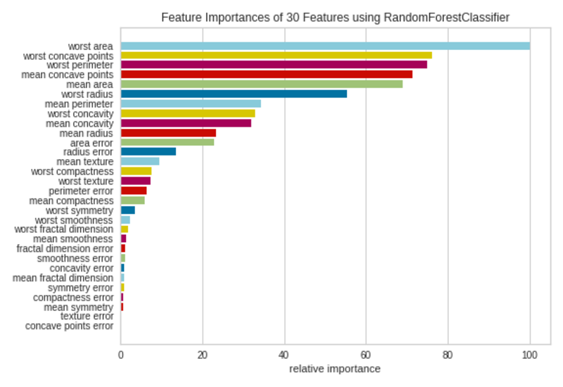
Feature Importances Plot|Image by Author
Not all 30 features in the dataset are much contributed to the model. We can remove the features with small bars from the dataset and refit the model with selected features.
The most important parameters of the FeatureImportances visualizer include:
- estimator: Any Scikit-learn estimator that supports either
feature_importances_attribute orcoef_attribute. - relative: bool, default
True. Whether to plot relative importance as a percentage. IfFalse, the raw numeric score of the feature importance is shown. - absolute: bool, default
False. Whether to consider only the magnitude of coefficients by avoiding negative signs.
Summary of the uses of ML Visualizations
- Principal Component Plot: PCA(), Usage — Visualizes high-dimensional data in a 2D or 3D scatter plot which can be used to identify important patterns in high-dimensional data.
- Validation Curve: ValidationCurve(), Usage — Plots the influence of a single hyperparameter on the train and validation set.
- Learning Curve: LearningCurve(), Usage — Detects underfitting, overfitting and just-right conditions of a model, Identifies slow convergence, oscillating, oscillating with divergence and proper convergencescenarios when finding the optimal learning rate of a neural network, Shows how much our model benefits from adding more training data.
- Elbow Plot: KElbowVisualizer(), Usage — Selects the optimal number of clusters in K-Means clustering.
- Silhouette Plot: SilhouetteVisualizer(), Usage — Selects the optimal number of clusters in K-Means clustering, Detects cluster imbalance in K-Means clustering.
- Class Imbalance Plot: ClassBalance(), Usage — Detects the imbalance of classes in the target column in classification datasets.
- Residuals Plot: ResidualsPlot(), Usage — Determines whether the residuals (observed values-predicted values) are uncorrelated (independent) by analyzing the variance of errors in a regression model.
- Prediction Error Plot: PredictionError(), Usage — A graphical method that is used to evaluate a regression model.
- Cook’s Distance Plot: CooksDistance(), Usage — Detects outliers in the dataset based on the Cook’s distances of instances.
- Feature Importances Plot: FeatureImportances(), Usage — Selects the minimum required important features based on the relative importances of each feature to produce an ML model.
This is the end of today’s post.
Please let me know if you’ve any questions or feedback.
Breast cancer dataset info
- Citation: Dua, D. and Graff, C. (2019). UCI Machine Learning Repository [http://archive.ics.uci.edu/ml]. Irvine, CA: University of California, School of Information and Computer Science.
- Source: https://archive.ics.uci.edu/ml/datasets/breast+cancer+wisconsin+(diagnostic)
- License: Dr. William H. Wolberg (General Surgery Dept.
University of Wisconsin), W. Nick Street (Computer Sciences Dept.
University of Wisconsin) and Olvi L. Mangasarian (Computer Sciences Dept. University of Wisconsin) holds the copyright of this dataset. Nick Street donated this dataset to the public under the Creative Commons Attribution 4.0 International License (CC BY 4.0). You can learn more about different dataset license types here.
Iris dataset info
- Citation: Dua, D. and Graff, C. (2019). UCI Machine Learning Repository [http://archive.ics.uci.edu/ml]. Irvine, CA: University of California, School of Information and Computer Science.
- Source: https://archive.ics.uci.edu/ml/datasets/iris
- License: R.A. Fisher holds the copyright of this dataset. Michael Marshall donated this dataset to the public under the Creative Commons Public Domain Dedication License (CC0). You can learn more about different dataset license types here.
Advertising dataset info
- Source: https://www.kaggle.com/datasets/sazid28/advertising.csv
- License: This dataset is publicly available under the Creative Commons Public Domain Dedication License (CC0). You can learn more about different dataset license types here.
References
- https://www.scikit-yb.org/en/latest/
- https://www.scikit-yb.org/en/latest/quickstart.html
- https://www.scikit-yb.org/en/latest/api/index.html
Rukshan Pramoditha (@rukshanpramoditha) has B.Sc. in Industrial Statistics. Supporting the data science education since 2020. Top 50 Data Science/AI/ML Writer on Medium. He have wrtten articles on Data Science, Machine Learning, Deep Learning, Neural Networks, Python, and Data Analytics. He has proven track record of converting complex topics into something valuable and easy to understand.
Original. Reposted with permission.