Telling a Great Data Story: A Visualization Decision Tree
Pick your visualizations strategically. They need to tell a story.
Have you ever seen a great-looking dashboard or report that doesn’t do much more than just look good? You can’t really figure out the story. It’s usually because the developers haven’t picked the right visualizations and organization. Picking the right visualization will tell the story that you may never have the time or opportunity to tell.
Imagine presenting a chart in which you hope to highlight an important trend over the past twelve months. After observing it, the executives come out of the meeting conversing about this month’s record high measure. Your point has been missed. You didn’t tell a story. This year when virtual meetings are creating a bigger challenge to capture and hold the attention of attendees, no one can afford to waste time trying to decode the meaning of a visualization.

Image by upklyak on Freepik
Great stories have compelling characters, a looming conflict, and well-organized narrative arc. Each of your key metrics is a character in the story. Conflict arises when one metric threatens to undermine another. In our banking case study, a great presentation could begin at the climax of the conflict, drawing attention to the pressing problems with liquidity and looming loan defaults with scorecard visualizations. Then the narrative arc could loop back to the beginning of the trouble showing time trend visualizations of how individual metrics began to change as the pandemic unfolded.
Next, you would compare categories to add nuance to the metrics, showing, for example, that loan risk has not increased evenly across industries. This type of character development helps build more anticipation to the looming conflict as multiple metrics interact, as shown in a scatter plot type visualization. Finally, you arrive back at the climax of the conflict, with the audience in heavy anticipation to see what you will propose to resolve the situation. The overall presentation will leave a powerful effect on the audience due to the combined impact of well-crafted narration backed by visual pictures.
A visualization should speak for itself. You should not need to spend time trying to tell its story or do its job. Stephen Few writes that “An effective [visualization] is the product not of cute gauges, meters, and traffic lights, but rather of informed design: more science than art, more simplicity than dazzle. It is above all else, communication.”
How can a visualization present YOUR story on its own?
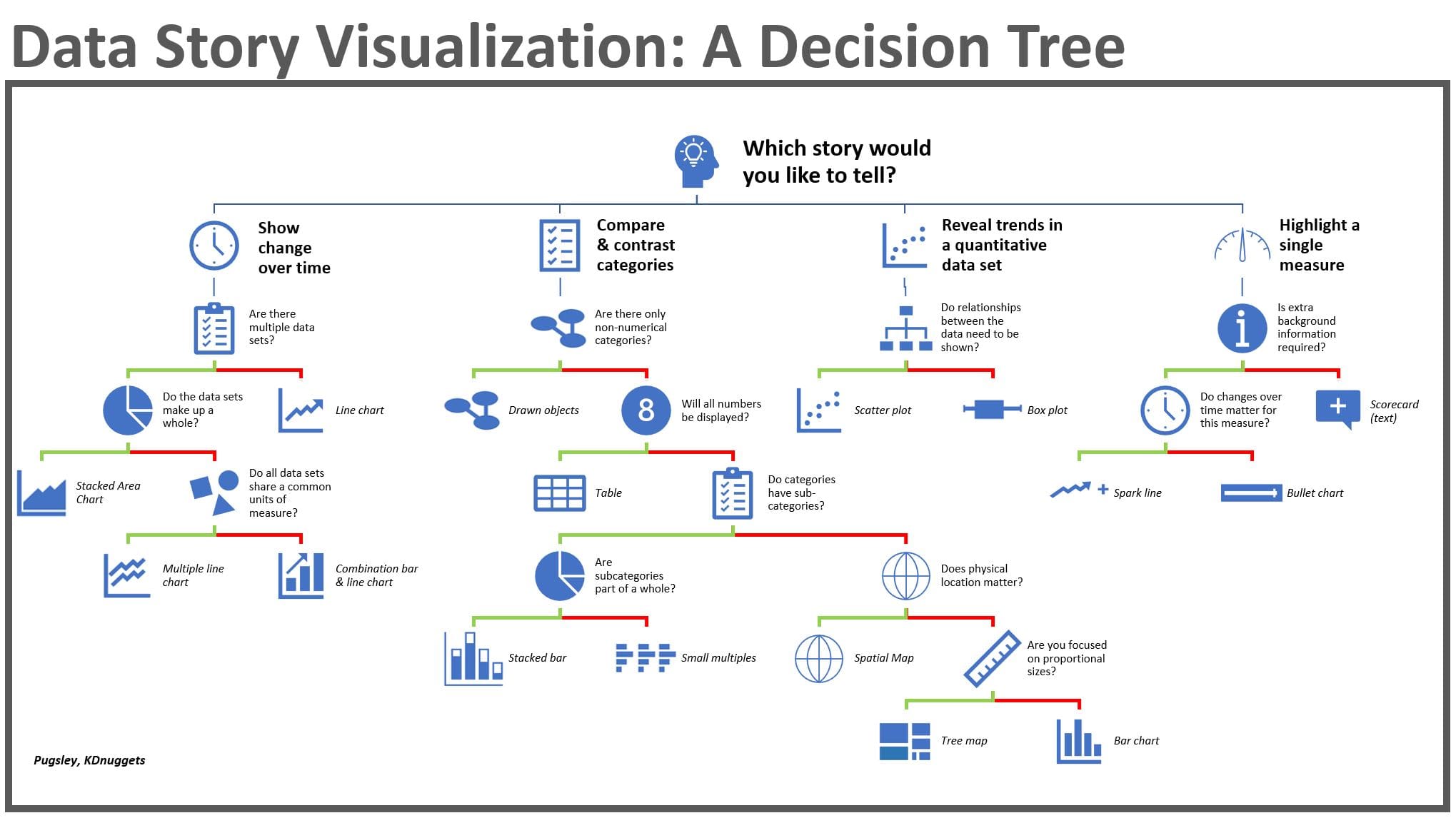
Visualization type selection is key. The decision tree above explains how to choose which type of visualization to employ depending on the story you want to tell.
In our taxonomy there are four main story narratives. Let’s walk through each of them using a case study of a bank working its way through the turbulence of a pandemic.
Change Over Time
If we imagine the presentation of a banking executive to employees, peers or the board of directors during economic turbulence, she would need to use time series analysis to set the initial context for the change.
Line charts would be the key player in this presentation. They could show the unprecedented change in a single financial metric on a daily, monthly or annual granularity.
Multiple line charts are for multiple data sets that all share common units of measure, such as showing the decline in revenue, expense, and income over the same time period.
Stacked area charts would come into play show change over time for multiple data sets that together make up a whole. In the case of the banker, she could show how each of the regions changed over time, while showing how the combination of the regional totals added up to the corporate total.
Combination bar and line charts would be used when multiple data sets need to be shown together over time, but they differ in units of measure. This would be how the banker would show staffing levels on the left Y-axis in units of people, while showing net profit on the right Y-axis in units of dollars. The combination of all these line-based visualizations would set the context for why radical measures are needed to deal with unprecedented change.
Comparing Categories
Many data stories involve comparing categories, such as comparing multiple product lines, geographical regions, or teams to evaluate performance in context of peers. Our bank presentation could involve drawn objects like a process flow or entity relationship diagram to show the flow of money from liquidity providers to loan applicants.
Tables are the best way to show a large collection of numbers across categories in a dense format.
Bar charts would be employed to compare, for example, income for each branch of the bank.
Tree maps are used for a similar purpose but show proportionally how the income compared for each branch.
Spatial maps would be helpful to regionally display the data. For a nationwide bank, a spatial map could display income by region with individual measures overlaid on each region.
Small multiples would be helpful to compare the branches on multiple levels, in a format seen frequently in Tableau. Three side by side bar graphs could represent income, expenditures, and revenue. Within these bar graphs would be bars representing each banking branch, set up for easy comparison on multiple levels.
Stacked bar graphs could also be helpful to show multiple types of expenditures with emphasis on their contribution to the overall total. Within the bar displaying each expenditure type, divisions would display the percentage of that expenditure made by each region.
Revealing Trends in Quantitative Data
Some data stories involve finding trends in a collection of measurements. For example, our bank may want to look for red flags that a borrower is a risk of defaulting on a loan. Those red flags may include financial ratios, account balances, and missed payments.
Scatter plots would be a way to show clusters of those measures and reveal correlations to loan risk.
Box plots could also be useful to show the distribution of those red flags. These types of visualizations are the backdrop to visualize the results of a regression analysis.
Highlighting a Single Measure
Some measures demand special attention and can be presented as a single number in extra large or colored font, such as a total revenue number or percent change in deposits. These are your story headlines. A scorecard could be used to emphasize a sharp decline in profit. By coloring this number in red and letting it stand alone, those present at the presentation will understand its importance.
Sparklines is a mini line chart with little or no labeling of details like axis scale that could be used to give a very high-level trend in a number. These often accompany a large scorecard value.
Bullet charts could be used to show several dimensions of a single metric, like the target profit, year-to-date profit, and projected profit. By using these single-metric visualizations, a presenter can draw focus to one story detail at a time.
The bottom line is that there is a science behind how to select the right visualization. You can’t just hand the assignment to a graphic designer to select a visualization based on the look. To make a visualization tell your story, you need the visualization type that is built for your purposes. Learning the concepts outlined in figure 1 will make for a more powerful and effective story told.
Stan Pugsley is a data warehouse and analytics consultant with Eide Bailly Technology Consulting based in Salt Lake City, UT. He is also an adjunct faculty member at the University of Utah Eccles School of Business. You can reach the author via email.