Image by Editor
Introduction
There has been a well-documented surge in positions related to Diversity, Equity, and Inclusion over the past 3-5 years. DEI Analysts may spend their time tracking, analyzing, and answering questions such as,
- How do salaries compare across gender?
- How do our departments rank in terms of diversity of race?
- Which positions and titles are the least diverse?
While DEI Analysts focus on answering different types of questions than Business Analysts, they still use the same technical skills and techniques.
Protected classes are typically categorical: Gender, Race, Ethnicity, and Age (usually Age is broken down into categories)
Numeric data, such as salary, can be aggregated across protected classes with
- Average
- Median
- Minimum
- Maximum
When you analyze the combination of a Categorical and a Numeric variables, SQL makes it quite easy:
SELECT
  ethnicity,
  AVG(salary) as AVG_SALARY,
  MEDIAN(salary) as MEDIAN_SALARY
FROM
  HRDATA
GROUP BY
  ethnicity
| Ethnicity | AVG_SALARY | MEDIAN_SALARY |
| White | $68,513 | $60,050 |
| African American | $67,691 | $55,114 |
| Asian | $68,842 | $65,632 |
But what methods exist to analyze Categorical and Categorical variables together? The standard choices are quite limited:
- Mode (most common)
- Count Distinct
SELECT
  department,
  COUNT(1) AS employees,
  COUNT(DISTINCT ethnicity) AS DISTINCT_ETHNICITY,
  MODE(ethnicity) AS MOST_COMMON_ETHNICITY
FROM
  HRDATA
GROUP BY
  ethnicity
| Department | Employees | Distinct Genders | Most Common Gender |
| Sales | 100 | 2 | Male |
| IT | 100 | 2 | Male |
At first glance, the departments look to be very similar. But how would you tell the difference between:
- Sales has 99 male employees and 1 female employee
- IT has 51 male employees and 49 female employees
Surely, we would consider the latter to be more diverse, but how would we know that quickly using SQL?
I am here to teach you about an underrated aggregate function called Entropy, which will help us quantify exactly how diverse each department is.
| Department | Employees | Distinct Genders | Most Common Gender | Entropy |
| Sales | 100 | 2 | Male | 0.08 |
| IT | 100 | 2 | Male | 0.99 |
Unfortunately it isn’t as easy as simply doing SELECT Department, ENTROPY(ethnicity), but I will teach you the SQL logic, as well as add it into the open-source SQL Generator 5000, so that you can generate this SQL anytime you need it.
Some example HR data
Dr. Rich Huebner provides some sample HR data on Kaggle.com that we can use to explore some of the ways to analyze Diversity.
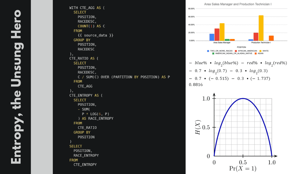
Let’s start by querying the data to compare the Position with the Race. We’ll begin with the basics: Count, Count Distinct, and Mode.
SELECT
  POSITION,
  COUNT(1) AS employees,
  COUNT(DISTINCT RACEDESC) AS DISTINCT_RACE,
  MODE(RACEDESC) AS MOST_COMMON_RACE
FROM HR_DATA
 WHERE DATEOFTERMINATION IS NULL /*active employees*/
GROUP BY
  POSITION
ORDER BY 2 DESC
Looking at the results, the 3 most popular positions appear to be very similar in diversity:
Entropy to the rescue
So, how would we rank these 3 departments in terms of diversity? This is where Entropy comes in.
What is Entropy?
Before we continue, let’s take a minute to understand what Entropy is, and how we can interpret it. The concept of Entropy is rooted deep in the study of Information Theory, and has many different applications including machine learning, thermodynamics, and cryptography. Therefore, if you look up the definition, it can be confusing.
Yet the most simple definition of entropy is something along the lines of this: Entropy is a numeric measure to describe how diverse something is.
Consider a bag of marbles that only have two colors: red, and blue.
Now, imagine we counted up the marbles in the bag and discovered that there were 99 blue and only 1 red marble. This situation is not very diverse, so the entropy of the bag is low.
Next, imagine a bag that has 50 blue and 50 red marbles. This bag is very diverse, in fact it can’t get any more diverse. A bag with 51 blue and 49 red marbles is slightly less diverse. Therefore, this bag has high entropy.
Thus,
- A bag with 100 blue marbles and 0 blue marbles is the least diverse: Entropy = 0
- A bag with 50 blue marbles and 50 red marbles is the most diverse: Entropy = 1
Therefore, entropy reaches a maximum of 1 at 50/50. Here is a common plot of how Entropy changes with the Blue % of marbles:
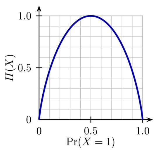
Credit: https://commons.wikimedia.org/wiki/File:Binary_entropy_plot.png
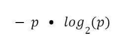
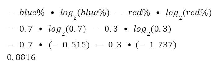
To calculate entropy, we calculate the percentage for each color, and remember the formula:
Then, for a bag that is 70% blue marbles, we construct the formula like this:
When you extend this to more than 2 choices, you simply change the log’s base to match the number of possibilities.
Using SQL
This is a rather simple and efficient operation for SQL to handle.
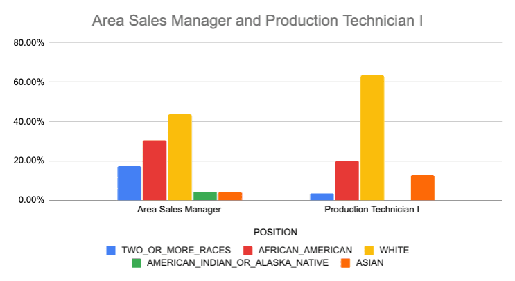
The final result shows us that while neither position is perfectly diverse, Area Sales Manager is more diverse than Production Technician.
We can confirm this visually by plotting this on a graph.
Conclusion
Entropy is a helpful method for describing diversity. It allows you to sort or rank departments, positions, or companies by combining those categories with a protected class such as race or gender. Even though the function doesn’t exist directly in most RDMBS, we can easily construct the SQL to calculate it. I believe it is important for anyone who works in Diversity, Equity, and Inclusion to use these calculations when looking at their oganizations workforce. Additionally, having worked in data for most of my career it’s great to see that the power of SQL works across all data informed teams, from traditional data analysts all the way to DEI analysts.
Josh Berry (@Twitter) leads Customer Facing Data Science at Rasgo and has been in the data and analytics profession since 2008. Josh spent 10 years at Comcast where he built the data science team and was a key owner of the internally developed Comcast feature store - one of the first feature stores to hit the market. Following Comcast, Josh was a critical leader in building out Customer Facing Data Science at DataRobot. In his spare time Josh performs complex analysis on interesting topics such as baseball, F1 racing, housing market predictions, and more.