
Photo by Pixabay from Pexels
Visualization is a big part of the data world as humans understand the information easily when it is presented right. That is why creating an informative and attractive visualization is expected from any data person.
A histogram chart is one of the most common yet useful graphs. The histogram is a chart with bars representing the frequency of data divided into certain bins. It’s often used to visualize numerical data to understand the data distribution and identify the trend.
How do we create a beautiful histogram chart? Let’s learn how to do it.
Histogram Visualization with Seaborn
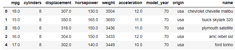
For our dataset example, we would use the MPG open data from the Seaborn package.
import seaborn as sns

mpg = sns.load_dataset('mpg')
mpg.head()
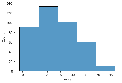
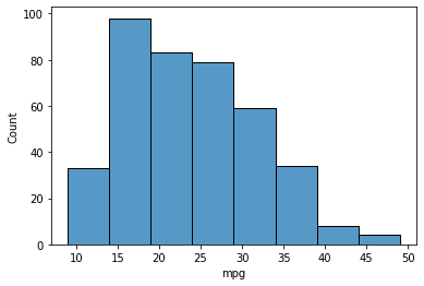
From our dataset example, we would quickly develop a simple histogram chart using the Seaborn package. To do that, we need to use the histplot function.
The function would default take the numerical data variable as an argument, and the output is the histogram of the passed values. Let’s try the function.
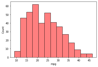
# Create a histogram of the "mpg" variable
sns.histplot(data=mpg, x="mpg")

From one line of code, we end up with a nice histogram visualization. The “mpg” variable distribution was skewed right as many values fall between 15-25. This is the kind of information we could get with a histogram.
Customized the Histogram Visualization
The Seaborn histogram default visualization is good, but we might want to change the histogram graph to make it more beautiful.
In this case, there are various customize options using the Seaborn package.
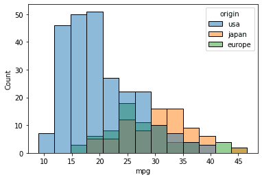
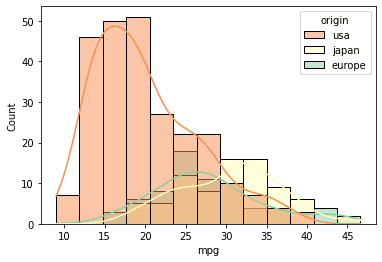
Multiple histogram plots based on categorical columns
Sometimes, we want to compare the variable numerical distribution based on the other variable value. To do that, we can pass the variable name to compare in the hue parameter.
sns.histplot(data=mpg, x="mpg", hue = 'origin')
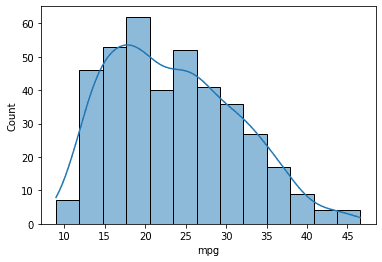
Show Kernel Density Estimate (KDE) curve
Kernel Density Estimate or KDE is a non-parametric way to estimate the probability of the data using density function. Basically, KDE smoothes the histogram to show the distribution. To show the KDE curve, we could use the following code.
sns.histplot(data=mpg, x="mpg", kde=True)
Change the bins number
Histogram plot depends on the interval number for binning the variable values. If we want to change the bin number, it is possible to do that by passing the bins parameter using the following code.
sns.histplot(data=mpg, x="mpg", bins = 5)
It is also possible to change the bin number based on the width using the binwidth parameter.
sns.histplot(data=mpg, x="mpg", binwidth=5)
Furthermore, it is possible to limit the minimum and the maximum bin range using the binrange parameter.
sns.histplot(data=mpg, x="mpg", binrange=(5, 30))

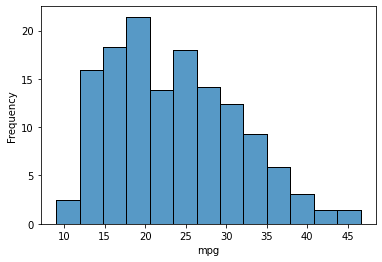
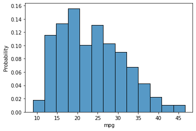
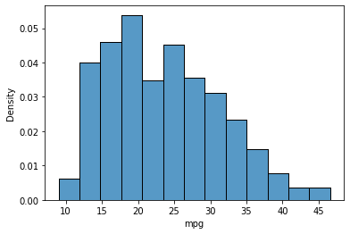
Change the aggregate statistic
By default, Seaborn assumed the histogram was used to count the values that fall in each bin. However, we could change the aggregate statistic. A few options are available in seaborn, including:
- Frequency
Show the number of observed values divided by the bin width.
sns.histplot(data=mpg, x="mpg", stat = 'frequency')
- Probability
Show the normalized values so the bar height sum is 1.
sns.histplot(data=mpg, x="mpg", stat = 'probability')
- Density
Show the normalized values so the total area of the histogram is 1.
sns.histplot(data=mpg, x="mpg", stat = 'density')
Tweaking histogram aesthetic
It is possible to change the color and transparency of the histogram plot. For a single histogram plot, we could pass the color string value to the color parameter and the transparent value to the alpha parameter.
sns.histplot(data=mpg, x="mpg", color = 'red', alpha = 0.5)
If we have multiple histogram plots, we could change the overall color theme by changing the palette parameter. To know which values to use in the palette parameter, we could find them in the documentation.
sns.histplot(data=mpg, x="mpg", kde = True, palette = "Spectral", hue ='origin')
Conclusion
Histogram is a plot to visualize numerical variables and acquire the distribution trend information. It is a helpful visualization when we need to present what happens in our data. Using the Seaborn Python package, we could easily create a beautiful histogram plot and tweak them as required.
Cornellius Yudha Wijaya is a data science assistant manager and data writer. While working full-time at Allianz Indonesia, he loves to share Python and Data tips via social media and writing media.