Creating Visuals with Matplotlib and Seaborn
Learn the basic Python package visualization for your work.

Image by storyset on Freepik
Data visualization is essential in data work as it helps people understand what happens with our data. It’s hard to ingest the data information directly in a raw form, but visualization would spark people's interest and engagement. This is why learning data visualization is important to succeed in the data field.
Matplotlib is one of Python's most popular data visualization libraries because it’s very versatile, and you can visualize virtually everything from scratch. You can control many aspects of your visualization with this package.
On the other hand, Seaborn is a Python data visualization package that is built on top of Matplotlib. It offers much simpler high-level code with various in-built themes inside the package. The package is great if you want a quick data visualization with a nice look.
In this article, we will explore both packages and learn how to visualize your data with these packages. Let’s get into it.
Visualization with Matplotlib
As mentioned above, Matplotlib is a versatile Python package where we can control various aspects of the visualization. The package is based on the Matlab programming language, but we applied it in Python.
Matplotlib library is usually already available in your environment, especially if you use Anaconda. If not, you can install them with the following code.
pip install matplotlib
After the installation, we would import the Matplotlib package for visualization with the following code.
import matplotlib.pyplot as plt
Let’s start with the basic plotting with Matplotlib. For starters, I would create sample data.
import numpy as np

x = np.linspace(0,5,21)
y = x**2
With this data, we would create a line plot with the Matplotlib package.
plt.plot(x, y, 'b')
plt.xlabel('X Axis')
plt.ylabel('Y Axis')
plt.title('Sample Plot')
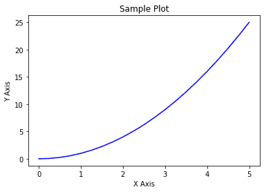
In the code above, we pass the data into the matplotlib function (x and y) to create a simple line plot with a blue line. Additionally, we control the axis label and title with the code above.
Let’s try to create a multiple matplotlib plot with the subplot function.
plt.subplot(1,2,1)
plt.plot(x, y, 'b--')
plt.title('Subplot 1')
plt.subplot(1,2,2)
plt.plot(x, y, 'r')
plt.title('Subplot 2')
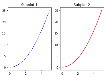
In the code above, we create two plot side by side. The subplot function controls the plot position; for example, plt.subplot(1,2,1) means that we would have two plots in one row (first parameter) and two columns (second parameter). The third parameter is to control which plot we are now referring to. So plt.subplot(1,2,1) means the first plot of the single row and double columns plots.
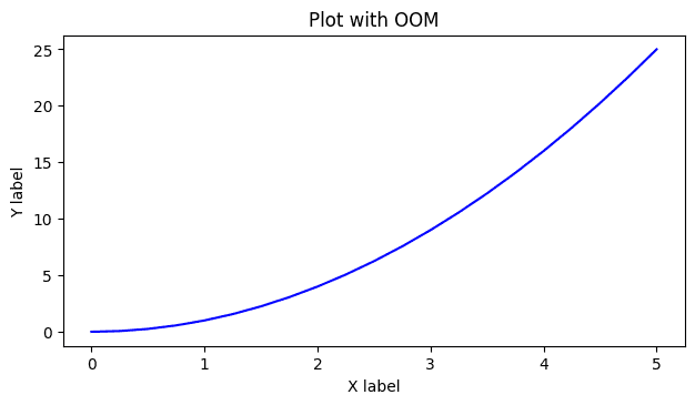
That is the basis of the Matplotlib functions, but if we want more control over the Matplotlib visualization, we need to use the Object Oriented Method (OOM). With OOM, we would produce visualization directly from the figure object and call any attribute from the specified object.
Let me give you an example visualization with Matplotlib OOM.
#create figure instance (Canvas)
fig = plt.figure()

#add the axes to the canvas
ax = fig.add_axes([0.1, 0.1, 0.7, 0.7]) #left, bottom, width, height (range from 0 to 1)

#add the plot to the axes within the canvas
ax.plot(x, y, 'b')
ax.set_xlabel('X label')
ax.set_ylabel('Y label')
ax.set_title('Plot with OOM')
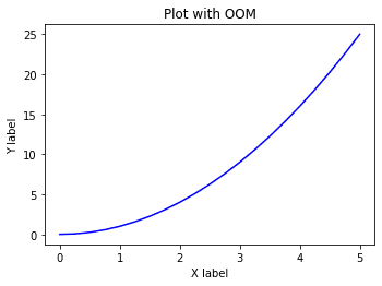
The result is similar to the plot we created, but the code is more complex. At first, it seemed counterproductive, but using the OOM allowed us to control virtually everything with our visualization. For example, in the plot above, we can control where the axes are located within the canvas.
To see how we see the differences in using OOM compared to the normal plotting function, let’s put two plots with their respective axes overlapping on each other.
#create figure instance (Canvas)
fig = plt.figure()

#add two axes to the canvas
ax1 = fig.add_axes([0.1, 0.1, 0.7, 0.7])
ax2 = fig.add_axes([0.2, 0.35, 0.2, 0.4])

#add the plot to the respective axes within the canvas
ax1.plot(x, y, 'b')
ax1.set_xlabel('X label Ax 1')
ax1.set_ylabel('Y label Ax 1')
ax1.set_title('Plot with OOM Ax 1')

ax2.plot(x, y, 'r--')
ax2.set_xlabel('X label Ax 2')
ax2.set_ylabel('Y label Ax 2')
ax2.set_title('Plot with OOM Ax 2')
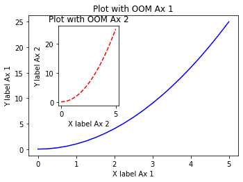
In the code above, we specified a canvas object with the plt.figure function and produced all these plots from the figure object. We can produce as many axes as possible within one canvas and put a visualization plot inside them.
It’s also possible to automatically create the figure, and axes object with the subplot function.
fig, ax = plt.subplots(nrows = 1, ncols =2)

ax[0].plot(x, y, 'b--')
ax[0].set_xlabel('X label')
ax[0].set_ylabel('Y label')
ax[0].set_title('Plot with OOM subplot 1')
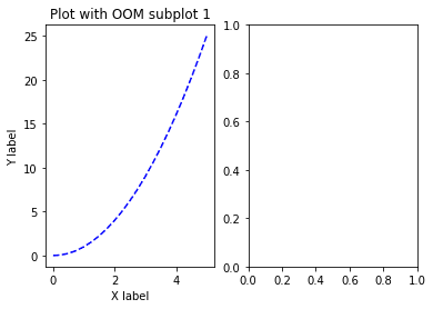
Using the subplots function, we create both figures and a list of axes objects. In the function above, we specify the number of plots and the position of one row with two column plots.
For the axes object, it’s a list of all the axes for the plots we can access. In the code above, we access the first object on the list to create the plot. The result is two plots, one filled with the line plot while the other only the axes.
Because subplots produce a list of axes objects, you can iterate them similarly to the code below.
fig, axes = plt.subplots(nrows = 1, ncols =2)

for ax in axes:

    ax.plot(x, y, 'b--')
    ax.set_xlabel('X label')
    ax.set_ylabel('Y label')
    ax.set_title('Plot with OOM')

plt.tight_layout()
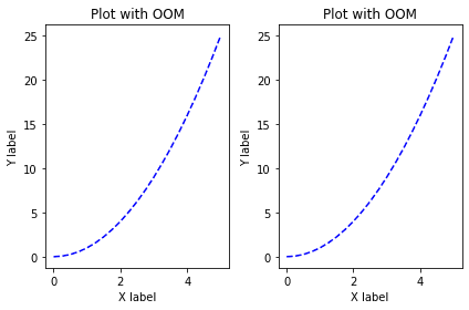
You can play with the code to produce the needed plots. Additionally, we use the tight_layout function because there is a possibility of plots overlapping.
Let’s try some basic parameters we can use to control our Matplotlib plot. First, let’s try changing the canvas and pixel sizes.
fig = plt.figure(figsize = (8,4), dpi =100)
The parameter figsize accept a tuple of two number (width, height) where the result is similar to the plot above.
Next, let’s try to add a legend to the plot.
fig = plt.figure(figsize = (8,4), dpi =100)

ax = fig.add_axes([0.1, 0.1, 0.7, 0.7])

ax.plot(x, y, 'b', label = 'First Line')
ax.plot(x, y/2, 'r', label = 'Second Line')
ax.set_xlabel('X label')
ax.set_ylabel('Y label')
ax.set_title('Plot with OOM and Legend')
plt.legend()

By assigning the label parameter to the plot and using the legend function, we can show the label as a legend.
Lastly, we can use the following code to save our plot.
fig.savefig('visualization.jpg')
There are many special plots outside the line plot shown above. We can access these plots using these functions. Let’s try several plots that might help your work.
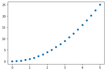
Scatter Plot
Instead of a line plot, we can create a scatter plot to visualize the feature relationship using the following code.
plt.scatter(x,y)
Histogram Plot
A histogram plot visualizes the data distribution represented in the bins.
plt.hist(y, bins = 5)
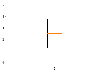
Boxplot
The boxplot is a visualization technique representing data distribution into quartiles.
plt.boxplot(x)
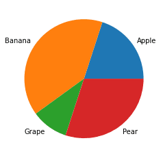
Pie Plot
The Pie plot is a circular shape plot that represents the numerical proportions of the categorical plot—for example, the frequency of the categorical values in the data.
freq = [2,4,1,3]
fruit = ['Apple', 'Banana', 'Grape', 'Pear']
plt.pie(freq, labels = fruit)
There are still many special plots from the Matplotlib library that you can check out here.
Visualization with Seaborn
Seaborn is a Python package for statistical visualization built on top of Matplotlib. What makes Seaborn stand out is that it simplifies creating visualization with an excellent style. The package also works with Matplotlib, as many Seaborn APIs are tied to Matplotlib.
Let’s try out the Seaborn package. If you haven’t installed the package, you can do that by using the following code.
pip install seaborn
Seaborn has an in-built API to get sample datasets that we can use for testing the package. We would use this dataset to create various visualization with Seaborn.
import seaborn as sns

tips = sns.load_dataset('tips')
tips.head()
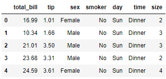
Using the data above, we would explore the Seaborn plot, including distributional, categorical, relation, and matrix plots.
Distributional Plots
The first plot we would try with Seaborn is the distributional plot to visualize the numerical feature distribution. We can do that we the following code.
sns.displot(data = tips, x = 'tip')
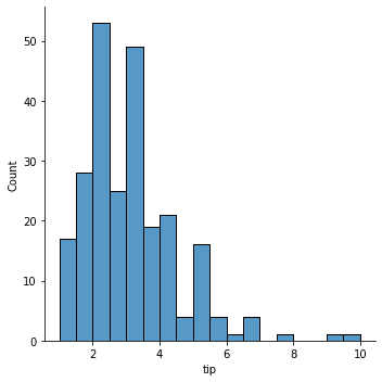
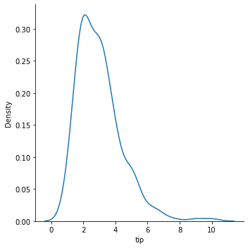
By default, the displot function would produce a histogram plot. If we want to smoothen the plot, we can use the KDE parameter.
sns.displot(data = tips, x = 'tip', kind = 'kde')
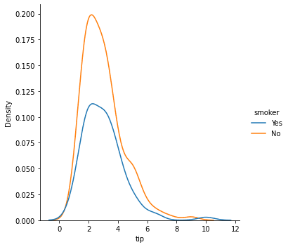
The distributional plot can also be split according to the categorical values in the DataFrame using the hue parameter.
sns.displot(data = tips, x = 'tip', kind = 'kde', hue = 'smoker')
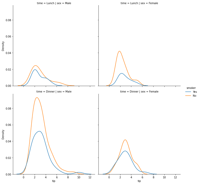
We can even split the plot even further with the row or col parameter. With this parameter, we produce several plots divided with a combination of categorical values.
sns.displot(data = tips, x = 'tip', kind = 'kde', hue = 'smoker', row = 'time', col = 'sex')
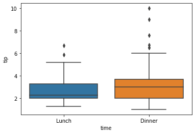
Another way to display the data distribution is by using the boxplot. Seabron could facilitate the visualization easily with the following code.
sns.boxplot(data = tips, x = 'time', y = 'tip')
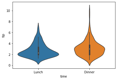
Using the violin plot, we can display the data distribution that combines the boxplot with KDE.
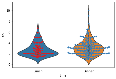
Lastly, we can show the data point to the plot by combining the violin and swarm plots.
sns.violinplot(data = tips, x = 'time', y = 'tip')
sns.swarmplot(data = tips, x = 'time', y = 'tip', palette = 'Set1')
Categorical Plots
A categorical plot is a various Seaborn API that applies to produce the visualization with categorical data. Let’s explore some of the available plots.
First, we would try to create a count plot.
sns.countplot(data = tips, x = 'time')
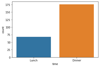
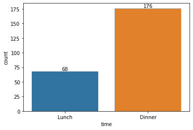
The count plot would show a bar with the frequency of the categorical values. If we want to show the count number in the plot, we need to combine the Matplotlib function into the Seaborn API.
p = sns.countplot(data = tips, x = 'time')
p.bar_label(p.containers[0])
We can extend the plot further with the hue parameter and show the frequency values with the following code.
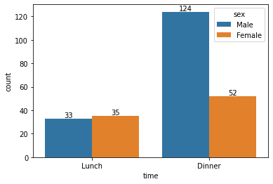
p = sns.countplot(data = tips, x = 'time', hue = 'sex')
for container in p.containers:
    ax.bar_label(container)
Next, we would try to develop a barplot. Barplot is a categorical plot that shows data aggregation with an error bar.
sns.barplot(data = tips, x = 'time', y = 'tip')
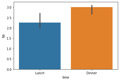
Barplot uses a combination of categorical and numerical features to provide the aggregation statistic. By default, the barplot uses an average aggregation function with a confidence interval 95% error bar.
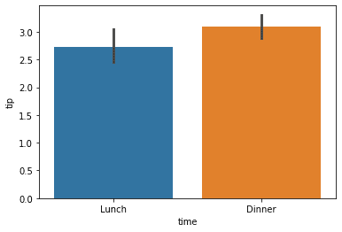
If we want to change the aggregation function, we can pass the function into the estimator parameter.
import numpy as np
sns.barplot(data = tips, x = 'time', y = 'tip', estimator = np.median)
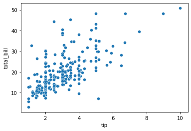
Relational Plots
A relational plot is a visualization technique to show the relationship between features. It’s mainly used to identify any kind of patterns that exist within the dataset.
First, we would use a scatter plot to show the relation between certain numerical features.
sns.scatterplot(data = tips, x = 'tip', y = 'total_bill')
We can combine the scatter plot with the distributional plot using a joint plot.
sns.jointplot(data = tips, x = 'tip', y = 'total_bill')

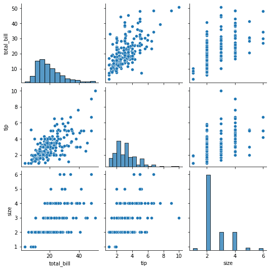
Lastly, we can automatically plot pairwise relationships between features in the DataFrame using the pairplot.
sns.pairplot(data = tips)
Matrix Plots
Matrix plot is used to visualize the data as a color-encoded matrix. It is used to see the relationship between the features or help recognize the clusters within the data.
For example, we have a correlation data matrix from our dataset.
tips.corr()
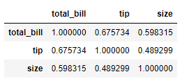
We could understand the dataset above better if we represented them in a color-encoded plot. That is why we would use a heatmap plot.
sns.heatmap(tips.corr(), annot = True)
The matrix plot could also produce a hierarchal clustering plot that infers the values within our dataset and clusters them according to the existing similarity
sns.clustermap(tips.pivot_table(values = 'tip', index = 'size', columns = 'day').fillna(0))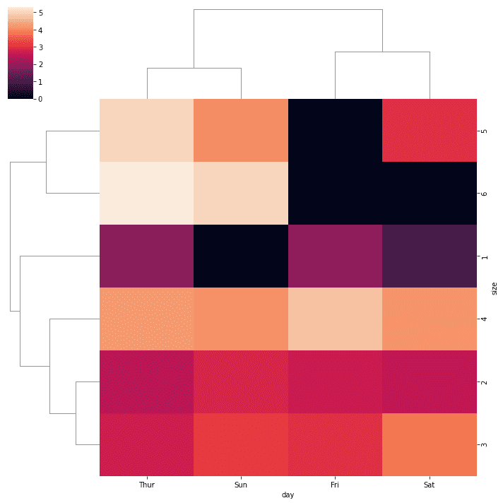
Conclusion
Data visualization is a crucial part of the data world as it helps the audience to understand what happens with our data quickly. The standard Python packages for data visualization are Matplotlib and Seaborn. In this article, we have learned the primary usage of the packagesWhat other packages besides Matplotlib and Seaborn are available for data visualization in Python? and introduced several visualizations that could help our work.
Cornellius Yudha Wijaya is a data science assistant manager and data writer. While working full-time at Allianz Indonesia, he loves to share Python and Data tips via social media and writing media.