Introduction to Data Visualization Using Matplotlib
Data Visualization is an important aspect of Data Science that enables the data to speak for itself by uncovering the hidden details. Follow this guide to get started with Matplotlib which is one of the most widely used plotting libraries in Python.

Image by Author
Introduction
Numerous organizations collect vast amounts of data for making their business decisions. Data Visualization is the process of presenting this information in form of various charts and graphs. It simplifies complex data making it easier to identify patterns, analyze trends and discover actionable insights. Matplotlib is a multi-platform data visualization library in python. It was initially created to emulate MATLAB’s plotting capabilities but is robust and easy to use. Some of the pros of Matplotlib are as follows:
- Easier to customize
- Simpler for getting started
- High-quality output
- Readily accessible
- Provides good control to various elements of a figure
Getting Started
Installing Matplotlib
To install the Matplotlib, run the following command in the terminal for Windows, Mac os, and Linux:
pip install matplotlib
For Jupyter notebook:
!pip install matplotlib
For anaconda environment:
conda install matplotlib
Importing Libraries
import numpy as np
import pandas as pd  #If you are reading data from CSV
import matplotlib.pyplot as plt
Matplotlib Basics
Creating Plots
There are two approaches to creating the plots in matplotlib:
1) Functional Approach
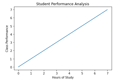
They are simple to use but do not allow a very high degree of control. It makes use of py.plot(x,y) function. We will not be using this anywhere else in the tutorial but you should know how it works so let's have a look at one of its examples.
x = np.arange(0,8)
y = x

plt.plot(x, y)
plt.xlabel('Hours of Study')
plt.ylabel('Class Performance')
plt.title('Student Performance Analysis')
plt.show() # For non-jupyter users
2) OOP Approach
OOP Approach is the recommended way to create the plots. It makes use of creating the figure objects and then the axes are added to it. Figure objects are not visible unless you add the axes to them.
fig = plt.figure()
Before we draw the axis let us understand its syntax.
figureobject.add_axes([a,b,c,d])
Here a,b refers to the position of origin. (0,0) means the bottom left corner and c,d sets the width and height of the plot. Both values range from 0 - 1.
fig = plt.figure() # blank canvas
axes = fig.add_axes([0, 0, 0.5, 0.5])
axes.plot(x, y)
plt.show()
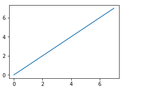
Figure objects can take in some additional parameters like dpi and figure size. Dpi refers to dots per inch and increases the resolution of the figure if it's blurry. While figure size controls the size of the figure in inches.
fig = plt.figure(figsize=(0.5,0.5),dpi=200) # blank canvas
axes = fig.add_axes([0, 0, 0.5, 0.5])
axes.plot(x, y)
plt.show()
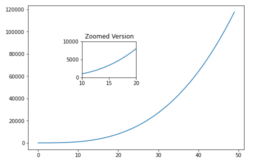
You can also add multiple axes to the figure object as follows:
a = np.arange(0,50)
b = a**3
fig = plt.figure()
outer_axes = fig.add_axes([0,0,1,1])
inner_axes = fig.add_axes([0.25,0.5,0.25,0.25])
outer_axes.plot(a,b)
inner_axes.set_xlim(10,20)   #sets the range on x-axis
inner_axes.set_ylim(0,10000) #sets the range on y-axis
inner_axes.set_title("Zoomed Version")
inner_axes.plot(a,b)
plt.show()
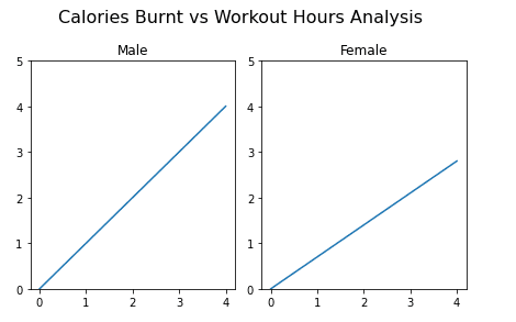
We can use the subplots() function to create multiple plots instead of manually managing the different axes in the figure object. Let's examine its syntax,
fig, axes = plt.subplots(nrows=1, ncols=2)
It returns a tuple containing the figure object along with the numpy array holding all the axes objects. We have to specify the number of rows and columns that we want in the actual set of axis. Each axes object is returned separately that can be accessed independently.
exercise_hrs = np.arange(0, 5)
male_cal = exercise_hrs
female_cal = 0.70 * exercise_hrs
fig, axes = plt.subplots(nrows=1, ncols=2)
axes[0].plot(exercise_hrs, male_cal)
axes[0].set_ylim(0, 5)  # Sets range of y
axes[0].set_title("Male")
axes[1].plot(exercise_hrs, female_cal)
axes[1].set_ylim(0, 5)
axes[1].set_title("Female")
fig.suptitle(
    "Calories Burnt vs Workout Hours Analysis", fontsize=16
)  # Displays the main title
fig.tight_layout()  # Prevents overlapping of subplots
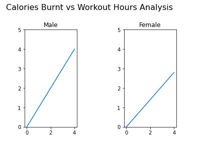
Subplots spacing can be manually adjusted by using the following method:
fig.subplots_adjust(left=None,top=None,right=None,top=None,wspace=None, hspace=None)
- left = Left side of the subplots of the figure
- right = Right side of the subplots of the figure
- bottom = Bottom of the subplots of the figure
- top = Top of the subplots of the figure
- wspace = Amount of width reserved for space between subplots
- hspace = Amount of height reserved for space between subplots
fig.subplots_adjust(left=0.2,top=0.8,wspace=0.9, hspace=0.1)
Apply this to the above plot:
Customizing Plots
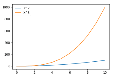
1) Legend
If we are creating multiple plots in a figure object, it may become confusing to identify which plot is representing what. So, we add the label= “text” attribute in the axes.plot() function and then, later on, call the axes.legend() function to display the key.
axes.legend(loc=0) or axes.legend() #Default - Matplotlib decides position
axes.legend(loc=1) # upper right
axes.legend(loc=2) # upper left
axes.legend(loc=3) # lower left
axes.legend(loc=4) # lower right
axes.legend(loc=(x,y)) # At (x,y) position
axes.legend() also have an argument loc that decides where to place it.
x = np.arange(0,11)
fig = plt.figure()
ax = fig.add_axes([0,0,0.75,0.75])
ax.plot(x, x**2, label="X^2")
ax.plot(x, x**3, label="X^3")
ax.legend(loc=0) #Let matplotlib decide
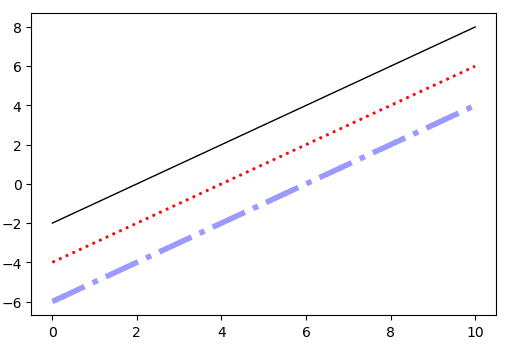
2) Line Styling
Matplotlib gives a lot of customization options. Let's analyze the syntax to change the line color, width, and style.
axes.plot(x, y, color or c = 'red',alpha= ‘0.5’, linestyle or ls = ':', linewidth or lw= 5)
color: We can define the color using their names or RGB values or use the Matlab type syntax where r means red etc. We can also set the transparency using the alpha attribute
linestyle: Custom styles can also be created but as we are concerned mainly with the visualization so simple styles would work for us. They are as follows:
linestyle = “-”  or linestyle = “solid”
linestyle = “:”  or linestyle = “dotted”
linestyle = “--” or linestyle = “dashed”
linestyle = “-.” or linestyle = “dashdot”
linewidth: The default value is 1 but we can change it as per our need.
fig, ax = plt.subplots()
ax.plot(x, x-2, color="#000000", linewidth=1 , linestyle='solid')
ax.plot(x, x-4, color="red", lw=2 ,ls=":")
ax.plot(x, x-6, color="blue",alpha=0.4,lw=4 , ls="-.")
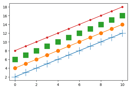
3) Marker Styling
In matplotlib, all the plotted points are called markers. By default, we only see the final line but we can set the marker type and its size as per our own choice.
axes.plot(x, y,marker =”+” , markersize or ms= 20)
Markers are of numerous types that are mentioned here but we will discuss only the major ones:
marker='+' # plus
marker='o' # circle
marker='s' # square
marker='.' # point
Example:
fig, ax = plt.subplots()
ax.plot(x, x+2,marker='+',markersize=20)
ax.plot(x, x+4,marker='o',ms=10)
ax.plot(x, x+6,marker='s',ms=15,lw=0)
ax.plot(x, x+8,marker='.',ms=10)
Types of Plots
Matplotlib offers a wide variety of special plots because all types of data do not require the same format of representation. The choice of the plot depends on the problem under analysis. For example, a pie chart can be used if you are interested in part to the whole relationship, bar charts for comparing the values or groups, scatter plots for observing correspondence between different variables, etc. For this tutorial, we will walk through the examples and discuss only the 5 most frequently used plots. Let’s get started:
1) Line Chart
It is the simplest form of representing data. They are mostly used to analyze the data concerning time and therefore, are also known as the time series plot. The upward trend represents the positive correlation between the variables and vice versa. It has a wide range of applications from weather forecasting and stock market predictions to monitoring daily customers or sales etc.
# Data is collected from worldometer
years = ["1980", "1990", "2000", "2010", "2020"]
Asia = [2649578300, 3226098962, 3741263381, 4209593693, 4641054775]
Europe = [693566517, 720858450, 725558036, 736412989, 747636026]
fig, ax = plt.subplots()
ax.set_title("Population Analysis (1980 - 2020)")
ax.set_xlabel("Years")
ax.set_ylabel("Population in billions")
ax.plot(years, Asia, label="Asia")
ax.plot(years, Europe, label="Europe")
ax.legend()
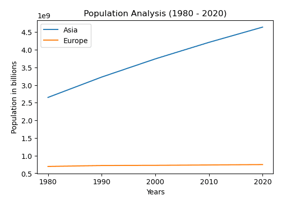
We can see that there is an exponential rise in the population of Asia since 1980.
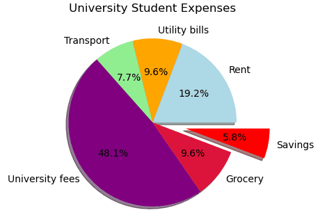
2) Pie Chart
The pie chart divides the circle into proportional segments that represent the part-whole relationship. Each portion combines to a total of 100%. The area of the slices is also known as the wedges.
matplotlib.pyplot.pie(data,explode=None,labels=None,colors=None,autopct=None, shadow=False)
- data = array of values that you want to plot
- explode = separate the wedges of the plot
- labels = string that represents different slices
- colors = fill the wedge with mentioned colors
- autopct = label numerical value on wedge
- shadow = adds shadows to wedges
labels = [
    "Rent",
    "Utility bills",
    "Transport",
    "University fees",
    "Grocery",
    "Savings",
]
expenses = [200, 100, 80, 500, 100, 60]
explode = [0.0, 0.0, 0.0, 0.0, 0.0, 0.4]
colors = [
    "lightblue",
    "orange",
    "lightgreen",
    "purple",
    "crimson",
    "red",
]
fig, ax = plt.subplots()
ax.set_title("University Student Expenses")
ax.pie(
    expenses,
    labels=labels,
    explode=explode,
    colors=colors,
    autopct="%.1f%%",
    shadow=True,
)
plt.show()
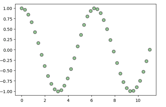
3) Scatter Plot
Scatter plots also called XY plots are used to observe the relationship between the dependent and the independent variables. It plots the individual data points for trend analysis. Outlier detection and correlational relationship can be easily detected using scatter plots.
matplotlib.pyplot.scatter(x, y, s=None, c=None, marker=None,alpha=None, linewidths=None, edgecolors=None)
- (x,y) = data positions
- s= size of the marker
- c= sequence of marker colors
- marker= marker style
- alpha= transparency
- linewidth= line width of marker edges
- edgecolors= color of marker edge
x = np.linspace(0, 11, 40)
y = np.cos(x)
fig, ax = plt.subplots()
ax.scatter(
    x,
    y,
    s=50,
    c="green",
    marker="o",
    alpha=0.4,
    linewidth=2,
    edgecolor="black",
)
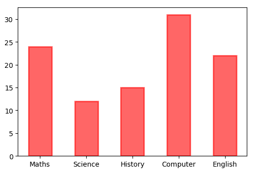
4) Bar Chart
A bar chart is used to visualize the categorical data with rectangular bars placed vertically or horizontally. The length or height of the bar depending on whether it is a column chart or horizontal bar plot represents its numerical value. Bar charts are extremely useful when you want to compare certain groups.
matplotlib.pyplot.bar(x, height, width, bottom, align)
- x= categorical variable
- height= corresponding numerical values
- width= width of bar chart (Default value is 0.8)
- bottom= initial point for the base of the bar (Default value is 0)
- align= alignment of the category name (Default value is center)
Note: color, edgecolor, and linewidth can also be customized.
fig,ax = plt.subplots()
courses = ['Maths', 'Science', 'History', 'Computer', 'English']
students = [24,12,15,31,22]
ax.bar(courses,students,width=0.5,color="red",alpha=0.6,edgecolor="red",linewidth=2)
We can also stack the categories by adjusting the bottom attribute.
# For Horizontal Bar Chart
ax.barh(
    courses,
    students,
    height=0.7,
    color="red",
    alpha=0.6,
    edgecolor="red",
    linewidth=2,
)
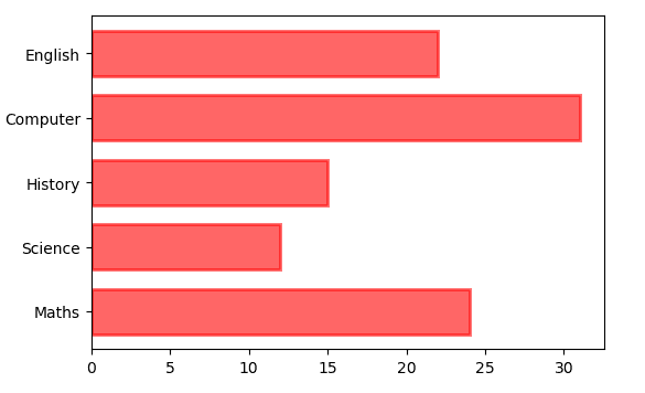
We can also stack the categories by adjusting the bottom attribute.
fig,ax = plt.subplots()
courses = ['Maths', 'Science', 'History', 'Computer', 'English']
students = [[24,12,15,31,22],[19,14,19,26,18]] #Male array then female array
ax.bar(courses,students[0],width=0.5,label="male")
ax.bar(courses,students[1],width=0.5,bottom=students[0],label="female")
ax.set_ylabel("No of Students")
ax.legend()
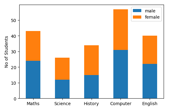
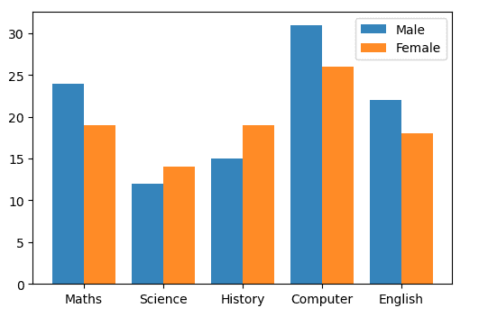
We can also plot multiple bars by playing with the thickness and position of the bars.
fig,ax = plt.subplots()
courses = ['Maths', 'Science', 'History', 'Computer', 'English']
males = (24,12,15,31,22)
females = (19,14,19,26,18)
index=np.arange(5)
bar_width=0.4
ax.bar(index,males,bar_width,alpha=.9,label="Male")
# We will adjust the bar_width so it is placed side to side
ax.bar(index + bar_width ,females,bar_width,alpha=.9,label="Female")
ax.set_xticks(index + 0.2,courses) # Show labels
ax.legend()
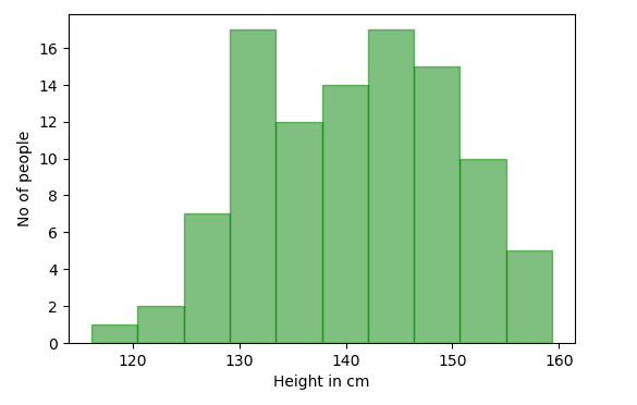
5) Histogram
Many people often confuse it with the bar chart due to its resemblance but it is different in terms of the information it represents. It organizes the group of data points into ranges known as bins plotted across the X-axis while Y-axis contains the information regarding the frequency. Unlike a bar chart, it is used to only represent numerical data.
matplotlib.pyplot.hist(x,bins=None,cumulative=False,range=None,bottom=None,histtype=’bar’,rwidth=None, color=None, label=None, stacked=False)
- bins = if int then equal-width bins else depends on the sequence
- cumulative = last bin will give total data points (Based on cumulative frequency)
- bottom = position of the bin
- range = To cut the data
- histtype= bar,barstacked, step,stepfilled (Default= bar)
- rwidth= relative width of bins
- stacked= Multiple data are stacked on top of each other if True
- data = np.random.normal(140, 10,100) # Generating height of 100 people
- bins = 10
data = np.random.normal(140, 10,100) # Generating height of 100 people
bins = 10
fig,ax = plt.subplots()
ax.set_xlabel("Height in cm")
ax.set_ylabel("No of people")
ax.hist(data,bins=bins, color="green",alpha=0.5,edgecolor="green")
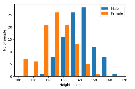
male = np.random.normal(140, 10,100) # Generating height of 100 males
female = np.random.normal(125,10,100) # Generating height of 100 females
bins = 10
fig,ax = plt.subplots()
ax.set_xlabel("Height in cm")
ax.set_ylabel("No of people")
ax.hist([male,female],bins=bins,label=["Male","Female"])
ax.legend()
Conclusion
I hope you enjoyed reading the article and that you are now capable enough to perform different visualizations using Matplotlib. Please feel free to share your thoughts or feedback in the comment section. Here is the link to Matplotlib Documentation, if you are interested to dig even deeper.
Kanwal Mehreen is an aspiring software developer with a keen interest in data science and applications of AI in medicine. Kanwal was selected as the Google Generation Scholar 2022 for the APAC region. Kanwal loves to share technical knowledge by writing articles on trending topics, and is passionate about improving the representation of women in tech industry.