Plotting and Data Visualization for Data Science
In this article, we examine various types of plots used in data science and machine learning.

Photo by Isaac Smith on Unsplash
Key Takeaways
- Most beginners interested in getting into the field of data science are always concerned about the math requirements.
- Data science is a very quantitative field that requires advanced mathematics.
- But to get started, you only need to master a few math topics.
- In this article, we discuss the importance of plotting and data visualization in data science and machine learning.
Plotting and Data Visualization
Most of basic data science is focused on finding the relationship between features (predictor variables) and a target variable (outcome). The predictor variables are also referred to as the independent variables, while the target variable is the dependent variable.
Plotting and data visualization can tell different types of stories between features and target variables e.g. comparing different quantities, studying trends, quantifying relationships, or displaying proportions. Plotting or data visualization is the oldest and most important branch of data science.
In this article, we examine various types of plots used in data science and machine learning.
Essential Components for Generating a Plot
A good plot or data visualization is made up of several components that have to be pieced up together to produce an end product:
- Data Component: An important first step in deciding how to visualize data is to know what type of data it is, e.g., categorical data, discrete data, continuous data, time-series data, etc.
- Geometric Component:Here is where you decide what kind of visualization is suitable for your data, e.g., scatter plot, line graphs, bar plots, histograms, Q-Q plots, smooth densities, boxplots, pair plots, heatmaps, pie charts, etc.
- Mapping Component:Here, you need to decide what variable to use as your independent variable (x-variable) and what to use as your dependent variable (y-variable). This is important, especially when your dataset is multi-dimensional with several features.
- Scale Component:Here, you decide what kind of scales to use in your plot, e.g., linear scale, log scale, etc.
- Labels Component:This includes things like axes labels, titles, legends, font size to use, etc.
- Ethical Component: Here, you want to make sure your visualization tells the true story. You need to be aware of your actions when cleaning, summarizing, manipulating, and producing a data visualization and ensure you aren’t using your visualization to mislead or manipulate your audience.
Important data visualization tools include Python’s matplotlib and seaborn packages, and R’s ggplot2 package.
Examples of Plots and Data Visualizations
In this section, we discuss several plots used in data science and machine learning. The caption for each plot contains a link that will take you to the original article where you can find more details such as dataset and source code used for generating the plots.
1. Barplots for comparing different quantities
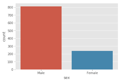
Figure 1. Distribution of dataset. N=1050: 812 (male) and 238 (female) heights. This shows that we have a very unbalanced dataset, with 77% male heights, and 23% female heights. Source: Bayes’ Theorem Explained.
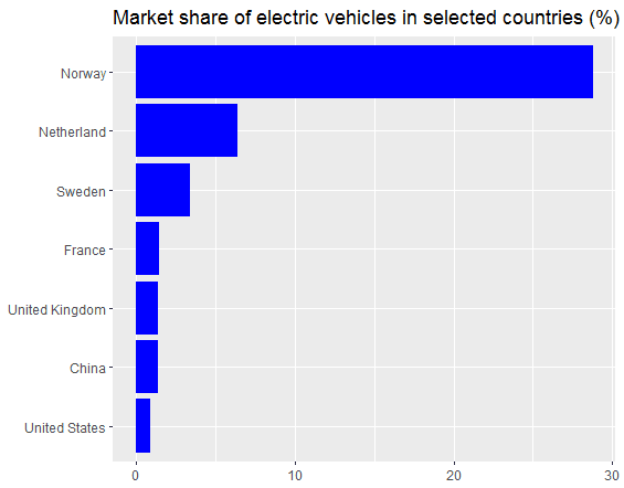
Figure 2. 2016 Market share of electric vehicles in selected countries. Image by Benjamin O. Tayo.

Figure 3. 2020 Worldwide number of jobs by skill using LinkedIn search tool. Image by Benjamin O. Tayo.
2. Density plots for studying distribution of a Variable
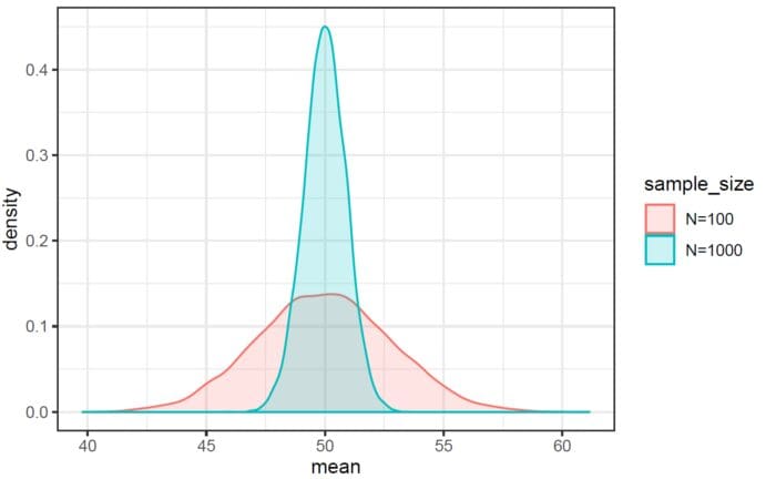
Figure 4. The probability distribution of the sample means of a uniform distribution using Monte-Carlo simulation. Image by Benjamin O. Tayo.
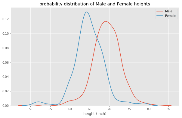
Figure 5. Probability distribution of male and female heights. Shows that males are on average taller than females.
3. Scatter plots for studying relationships
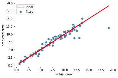
Figure 6. Ideal and fitted plots for the crew variable using multiple regression analysis. Image by Benjamin O. Tayo.
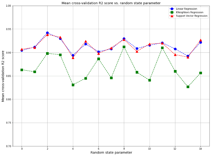
Figure 7. Mean cross-validation scores for different regression models. Image by Benjamin O. Tayo.
4. Heatmap plot for quantifying relationships
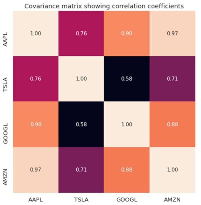
Figure 8. Covariance matrix plot for selected tech stocks.
5. Time-dependent plots for studying trends
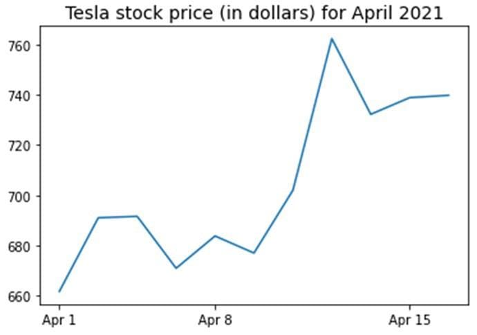
Figure 9. Tesla stock price for first 16 days in April 2021.
6. Pie chart for displaying proportions
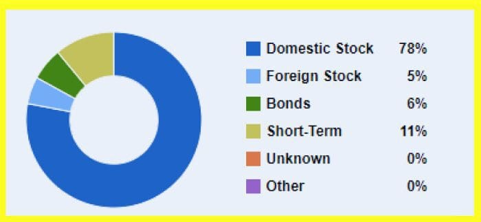
Figure 10. Pie Chart showing various asset classes in a portfolio.
Summary
- Most data science problems boil down to studying the mathematical relationship between feature and target variables.
- Plotting or data visualization is the first step for quantifying the relationship between feature and target variables.
- A good data visualization has several essential components such as data component, geometric component, mapping component, scale component, label component, and ethical component.
- The are several types of plots such as comparison plots, plots for studying trends, plots for displaying proportions, etc.
- It is important to understand a given dataset before determining the plot or visualization that would be suitable for your data.
Benjamin O. Tayo is a Physicist, Data Science Educator, and Writer, as well as the Owner of DataScienceHub. Previously, Benjamin was teaching Engineering and Physics at U. of Central Oklahoma, Grand Canyon U., and Pittsburgh State U.