Create a Dashboard Using Python and Dash
The article explains how to build a Netflix dashboard with Python and Dash to visualize content distribution and classification using maps, charts, and graphs.
Introduction
In the realm of data science and analytics, the power of data is unleashed not just by extracting insights but also by effectively communicating these insights; this is where data visualization comes into play.

Data visualization is a graphical representation of information and data. It uses visual elements like charts, graphs, and maps, which make it easier to see patterns, trends, and outliers in the raw data. For data scientists and analysts, data visualization is an essential tool that facilitates a quicker and more precise understanding of the data, supports storytelling with data, and aids in making data-driven decisions.
In this article, you’ll learn to use Python and the Dash framework to create a dashboard to visualize Netflix’s content distribution and classification.

What is Dash?
Dash is an open-source low-code framework developed by Plotly to create analytical web applications in pure Python. Traditionally, for such purposes, one might need to use JavaScript and HTML, requiring you to have expertise in both backend (Python) and frontend (JavaScript, HTML) technologies.
However, Dash bridges this gap, enabling Data Scientists and Analysts to build interactive, aesthetic dashboards only using Python. This aspect of low-code development makes Dash a suitable choice for creating analytical dashboards, especially for those primarily comfortable with Python.
Dataset Analysis
Now that you’ve been acquainted with Dash, let’s begin our hands-on project. You’ll use the Netflix Movies and TV Shows dataset available on Kaggle, created by Shivam Bansal.
This dataset comprises details about the movies and TV shows available on Netflix as of 2021, such as the type of content, title, director, cast, country of production, release year, rating, duration, and more.
Even though the dataset was created in 2021, it’s still a valuable resource for developing data visualization skills and understanding trends in media entertainment.
Using this dataset, you’ll aim to create a dashboard that allows visualizing the following points:
- Geographical content distribution: A map graph showcasing how content production varies across different countries over the years.
- Content classification: This visualization divides Netflix’s content into TV shows and movies to see which genres are most prominent.
Setting up the Project Workspace
Let’s start creating a directory for the project named netflix-dashboard, then initialize and activate a Python virtual environment via the following commands:
# Linux & MacOS
mkdir netflix-dashboard && cd netflix-dashboard
python3 -m venv netflix-venv && source netflix-venv/bin/activate
# Windows Powershell
mkdir netflix-dashboard && cd netflix-dashboard
python -m venv netflix-venv && .\netflix-venv\Scripts\activate
Next, you’ll need to install some external packages. You’ll be using pandas for data manipulation, dash for creating the dashboard, plotly for creating the graphs, and dash-bootstrap-components to add some style to the dashboard:
# Linux & MacOS
pip3 install pandas dash plotly dash-bootstrap-components
# Windows Powershell
pip install pandas dash plotly dash-bootstrap-components
Cleaning the Dataset
Going through the Netflix dataset, you’ll find missing values in the director, cast, and country columns. It would also be convenient to convert the date_added column string values to datetime for easier analysis.
To clean the dataset, you can create a new file clean_netflix_dataset.py, with the following code and then run it:
import pandas as pd

# Load the dataset
df = pd.read_csv('netflix_titles.csv')

# Fill missing values
df['director'].fillna('No director', inplace=True)
df['cast'].fillna('No cast', inplace=True)
df['country'].fillna('No country', inplace=True)

# Drop missing and duplicate values
df.dropna(inplace=True)
df.drop_duplicates(inplace=True)

# Strip whitespaces from the `date_added` col and convert values to `datetime`
df['date_added'] = pd.to_datetime(df['date_added'].str.strip())

# Save the cleaned dataset
df.to_csv('netflix_titles.csv', index=False)
Getting started with Dash
With the workspace set up and the dataset cleaned, you’re ready to start working on your dashboard. Create a new file app.py, with the following code:
from dash import Dash, dash_table, html
import pandas as pd

# Initialize a Dash app
app = Dash(__name__)

# Define the app layout
app.layout = html.Div([
        html.H1('Netflix Movies and TV Shows Dashboard'),
        html.Hr(),
])

# Start the Dash app in local development mode
if __name__ == '__main__':
    app.run_server(debug=True)
Let’s break down the code within app.py:
app = Dash(__name__): This line initializes a new Dash app. Think of it as the foundation of your application.app.layout = html.Div(…): Theapp.layoutattribute lets you write HTML-like code to design your application’s user interface. The above layout uses ahtml.H1(…)heading element for the dashboard title and a horizontal rulehtml.Hr()element below the title.app.run(debug=True): This line starts a development server that serves your Dash app in local development mode. Dash uses Flask, a lightweight web server framework, to serve your applications to web browsers.
After running app.py, you’ll see a message in your terminal indicating that your Dash app is running and accessible at http://127.0.0.1:8050/. Open this URL in your web browser to view it:

Your first Dash app!
The result looks very plain, right? Don’t worry! This section aimed to showcase the most basic Dash app structure and components. You’ll soon add more features and components to make it an awesome dashboard!
Incorporating Dash Bootstrap Components
The next step is to write the code for the layout of your dashboard and add some style to it! For this, you can use Dash Bootstrap Components (DBC), a library that provides Bootstrap components for Dash, enabling you to develop styled apps with responsive layouts.
The dashboard will be styled in a tab layout, which provides a compact way to organize different types of information within the same space. Each tab will correspond to a distinct visualization.
Let’s go ahead and modify the contents of app.py to incorporate DBC:
from dash import Dash,dcc, html
import pandas as pd
import dash_bootstrap_components as dbc

# Initialize the Dash app and import the Bootstrap theme to style the dashboard
app = Dash(__name__, external_stylesheets=[dbc.themes.BOOTSTRAP])

app.layout = dbc.Container(
    [
        dcc.Store(id='store'),
        html.H1('Netflix Movies and TV Shows Dashboard'),
        html.Hr(),
        dbc.Tabs(
            [
                dbc.Tab(label='Geographical content distribution', tab_id='tab1'),
                dbc.Tab(label='Content classification', tab_id='tab2'),
            ],
            id='tabs',
            active_tab='tab1',
        ),
        html.Div(id='tab-content', className='p-4'),
    ]
)

if __name__ == '__main__':
    app.run(debug=True)
In this modified layout, you’ll see new components:
dbc.Container: Usingdbc.Containeras the top-level component wraps the entire dashboard layout in a responsive and flexible container.dcc.Store: This Dash Core component allows you to store data client-side (on the user’s browser), enhancing the application’s performance by keeping the data locally.dbc.Tabsanddbc.Tab: Eachdbc.Tabrepresents an individual tab, which will contain different visualizations. Thelabelproperty is what appears on the tab itself, and thetab_idis used to identify the tab. Theactive_tabproperty ofdbc.Tabsis used to specify the active tab when the Dash app starts.
Now run app.py. The resulting dashboard will now have a Bootstrap-styled layout with two empty tabs:
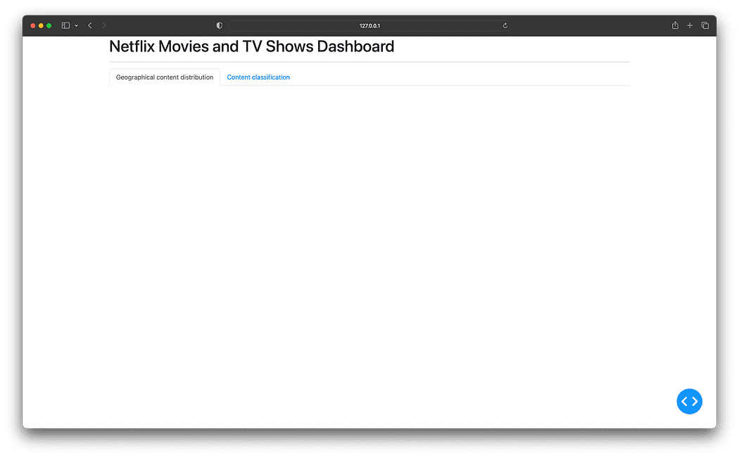
Incorporating Bootstrap for a tab-styled layout
Good going! You’re finally ready to add visualizations to the dashboard.
Adding Callbacks and Visualizations
When working with Dash, interactivity is achieved through callback functions. A callback function is a function that gets automatically called when an input property changes. It’s named “callback” because it’s a function that is “called back” by Dash whenever a change happens in the application.
In this dashboard, you will use callbacks to render the relevant visualization in the selected tab, and each visualization will be stored within its own Python file under a new components directory for better organization and modularity of the project structure.
Geographical content distribution visualization
Let’s create a new directory named components, and within it, create the geographical_content.py file that will generate a choropleth map illustrating how Netflix’s content production varies by country over the years:
import pandas as pd
import plotly.express as px
from dash import dcc, html

df = pd.read_csv('netflix_titles.csv')

# Filter out entries without country information and if there are multiple production countries,
# consider the first one as the production country
df['country'] = df['country'].str.split(',').apply(lambda x: x[0].strip() if isinstance(x, list) else None)

# Extract the year from the date_added column
df['year_added'] = pd.to_datetime(df['date_added']).dt.year
df = df.dropna(subset=['country', 'year_added'])

# Compute the count of content produced by each country for each year
df_counts = df.groupby(['country', 'year_added']).size().reset_index(name='count')

# Sort the DataFrame by 'year_added' to ensure the animation frames are in ascending order
df_counts = df_counts.sort_values('year_added')

# Create the choropleth map with a slider for the year
fig1 = px.choropleth(df_counts,
                     locations='country',
                     locationmode='country names',
                     color='count',
                     hover_name='country',
                     animation_frame='year_added',
                     projection='natural earth',
                     title='Content produced by countries over the years',
                     color_continuous_scale='YlGnBu',
                     range_color=[0, df_counts['count'].max()])
fig1.update_layout(width=1280, height=720, title_x=0.5)

# Compute the count of content produced for each year by type and fill zeros for missing type-year pairs
df_year_counts = df.groupby(['year_added', 'type']).size().reset_index(name='count')

# Create the line chart using plotly express
fig2 = px.line(df_year_counts, x='year_added', y='count', color='type',
               title='Content distribution by type over the years',
               markers=True, color_discrete_map={'Movie': 'dodgerblue', 'TV Show': 'darkblue'})
fig2.update_traces(marker=dict(size=12))
fig2.update_layout(width=1280, height=720, title_x=0.5)

layout = html.Div([
    dcc.Graph(figure=fig1),
    html.Hr(),
    dcc.Graph(figure=fig2)
])
The above code filters and groups the data by 'country' and 'year_added' , then computes the count of content produced by each country for each year within the df_counts DataFrame.
Then, the px.choroplet function builds the map graph using the columns from the df_counts DataFrame as values for its arguments:
locations='country': Allows you to specify the geographic location values contained in the'country'column.locationmode='country names': This argument “tells the function” that the providedlocationsare country names since Plotly Express also supports other location modes like ISO-3 country codes or USA states.color='count': It is used to specify the numeric data used to color the map. Here, it refers to the'count'column, which contains the count of content produced by each country for each year.color_continous_scale='YlGnBu': Builds a continuous color scale for each country in the map when the column denoted bycolorcontains numeric data.animation_frame='year_added': This argument creates an animation over the'year_added'column. It adds a year slider to the map graph, allowing you to view an animation that represents the evolution of this content production in each country year after year.projection='natural earth': This argument doesn’t use any columns from thedf_countsDataFrame; however, the'natural earth'value is required to set the projection with the Earth's world map.
And right below the choropleth map, a line chart with markers is included showcasing the change in the content volume, categorized by type (TV shows or movies), over the years.
To generate the line chart, a new DataFrame df_year_counts is created, which groups the original df data by 'year_added' and 'type' columns, tallying the content count for each combination.
This grouped data is then used with px.line where the 'x' and 'y' arguments are assigned to the 'year_added' and 'count' columns respectively, and the 'color' argument is set to 'type' to differentiate between TV shows and movies.
Content classification visualization
The next step is to create a new file named content_classification.py, which will generate a treemap graph to visualize Netflix’s content from a type and genre perspective:
import pandas as pd
import plotly.express as px
from dash import dcc, html

df = pd.read_csv('netflix_titles.csv')

# Split the listed_in column and explode to handle multiple genres
df['listed_in'] = df['listed_in'].str.split(', ')
df = df.explode('listed_in')

# Compute the count of each combination of type and genre
df_counts = df.groupby(['type', 'listed_in']).size().reset_index(name='count')

fig = px.treemap(df_counts, path=['type', 'listed_in'], values='count', color='count',
                 color_continuous_scale='Ice', title='Content by type and genre')

fig.update_layout(width=1280, height=960, title_x=0.5)
fig.update_traces(textinfo='label+percent entry', textfont_size=14)

layout = html.Div([
    dcc.Graph(figure=fig),
])
In the above code, after loading the data, the 'listed_in' column is adjusted to handle multiple genres per content by splitting and exploding the genres, creating a new row for each genre per content.
Next, the df_counts DataFrame is created to group the data by 'type', and 'listed_in' columns, and calculate the count of each type-genre combination.
Then, the columns from the df_counts DataFrame are used as values for the px.treemap function arguments as follows:
path=['type', 'listed_in']: These are the hierarchical categories represented in the treemap. The'type'and'listed_in'columns contain the types of content (TV shows or movies) and genres, respectively.values='count': The size of each rectangle in the treemap corresponds to the'count'column, representing the content amount for each type-genre combination.color='count': The'count'column is also used to color the rectangles in the treemap.color_continous_scale='Ice': Builds a continuous color scale for each rectangle in the treemap when the column denoted bycolorcontains numeric data.
After creating the two new visualization files, here is how your current project structure should look like:
netflix-dashboard
├── app.py
├── clean_netflix_dataset.py
├── components
│   ├── content_classification.py
│   └── geographical_content.py
├── netflix-venv
│   ├── bin
│   ├── etc
│   ├── include
│   ├── lib
│   ├── pyvenv.cfg
│   └── share
└── netflix_titles.csv
Implementing callbacks
The last step is to modify app.py to import the two new visualizations within the components directory and implement callback functions to render the graphs when selecting the tabs:
from dash import Dash, dcc, html, Input, Output
import dash_bootstrap_components as dbc
from components import (
    geographical_content,
    content_classification
)

app = Dash(__name__, external_stylesheets=[dbc.themes.BOOTSTRAP])

app.layout = dbc.Container(
    [
        dcc.Store(id='store'),
        html.H1('Netflix Movies and TV Shows Dashboard'),
        html.Hr(),
        dbc.Tabs(
            [
                dbc.Tab(label='Geographical content distribution', tab_id='tab1'),
                dbc.Tab(label='Content classification', tab_id='tab2'),
            ],
            id='tabs',
            active_tab='tab1',
        ),
        html.Div(id='tab-content', className='p-4'),
    ]
)


# This callback function switches between tabs in a dashboard based on user selection.
# It updates the 'tab-content' component with the layout of the newly selected tab.
@app.callback(Output('tab-content', 'children'), [Input('tabs', 'active_tab')])
def switch_tab(at):
    if at == 'tab1':
        return geographical_content.layout
    elif at == 'tab2':
        return content_classification.layout


if __name__ == '__main__':
    app.run(debug=True)
The callback decorator @app.callback listen to changes in the 'active_tab' property of the 'tabs' component, represented by the Input object.
Whenever the 'active_tab' changes, the switch_tab function gets triggered. This function checks the 'active_tab' id and returns the corresponding layout to be rendered in the 'tab-content' Div, as indicated by the Output object. Therefore, when you switch tabs, the relevant visualization appears.
Finally, run app.py once again to view the updated dashboard with the new visualizations:

Netflix Movies and TV Shows Dashboard — Final result
Wrapping up
This article taught you how to create a dashboard to explore and visualize Netflix’s content distribution and classification. By harnessing the power of Python and Dash, you’re now equipped to create your own visualizations, providing invaluable insights into your data.
You can take a look at the entire code of this project in the following GitHub repository: https://github.com/gutyoh/netflix-dashboard
If you found this article helpful and want to expand your knowledge on Python and Data Science, consider checking out the Introduction to Data Science track on Hyperskill.
Let me know in the comments below if you have any questions or feedback regarding this blog.
Hermann Rösch is a Technical Author for the Go programming track at Hyperskill, where he blend my passion for EdTech to empower the next generation of software engineers. Simultaneously, delving into the world of data as a Master's student at the University of Illinois at Urbana-Champaign.
Original. Reposted with permission.