How to Create an Interactive Dashboard in Three Steps with KNIME Analytics Platform
In this blog post I will show you how to build a simple, but useful and good-looking dashboard to present your data - in three simple steps!
By Emilio Silvestri, Intern at KNIME
Everybody loves charts, graphs...visualizations!
They are neat, fast, and straightforward. Even with messy and disorganized data, a good visualization is the key to show insights and features that are difficult to point out on a raw table. In this blog post I will show you how to build a simple, but useful and good-looking dashboard to present your data - in three simple steps!
- Step 1: Create some beautiful charts
- Step 2: Wrap them up into a component
- Step 3: Deploy the interactive view as a web page
The dataset
In this blog post we will dig into the Netflix Movies and TV shows dataset, freely available on Kaggle. It contains all the shows offered in the US by the streaming platform as of January 2020. Each entry carries the title of the show, whether it is a Movie or a TV Show, the director and cast, the country and year of production, the date when it has been added to the catalog, the duration and category and a short description. Enough information to pull out some interesting visualizations!
Prestep: importing and preprocessing the data
You can download the dataset directly from the Kaggle page. Once on your machine, import the data into a new workflow by drag and drop. As often happens, some preprocessing is needed. Inspecting the raw data we can see that the date_added column has a verbose format that makes it difficult to work with. So, I converted it to the Date&Time format and grouped all the steps in the Preprocessing metanode.
The workflow developed for this blog post is available on the KNIME Hub and can be downloaded here:
After importing it into your KNIME Analytics Platform, you can have a look at the content of the metanode “Preprocessing” more in detail.
Step 1: Create a few beautiful charts
There are two kinds of people: the ones who watch Netflix and the ones who lie. But we can also split the population into two different categories: movie people and TV series people!
Also, do we know how many movies and series are on Netflix? Which one is the most popular category? How long is the longest movie? With the right chart, this is soon said.
For example, a Sunburst Chart (Figure 1) can easily point out how the shows are distributed among the categories. Attach a Sunburst Chart node to the Preprocessing metanode, configure it as to group first by type (movie or TV show), then by category, and execute it. Now, right-click on the Sunburst Chart node and select “Interactive View: Sunburst Chart”. The view shown in Fig. 1 will pop up: we can see that the movies are double than the TV shows, and that the most populated categories are International, Dramas and Comedies. Did you know that?
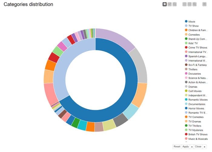
Fig. 1. Sunburst chart: the number of movies offered is double than TV series. Hover on a portion of the chart to show the percentage.
One more aspect we can explore is the evolving of the catalog over the years: I grouped the shows by the year_added column and displayed the result on a Line Plot (Fig. 2). Apparently, the number of productions added to the offer keeps increasing every year: in the first month of 2020 Netflix have already added more shows than in the whole 2015!
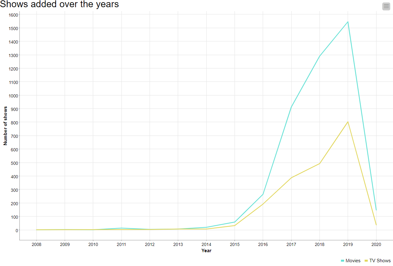
Fig. 2. Line plot showing the number of movies and TV series added to the Netflix catalog over the years.
Then I built a Bar Chart (Fig. 3) to visualize the number of seasons produced for the TV Shows and a Histogram (Fig. 4) that groups movies per duration. Did you expect so many TV Shows left with only one season? Did you know that there are movies longer than 4 hours?
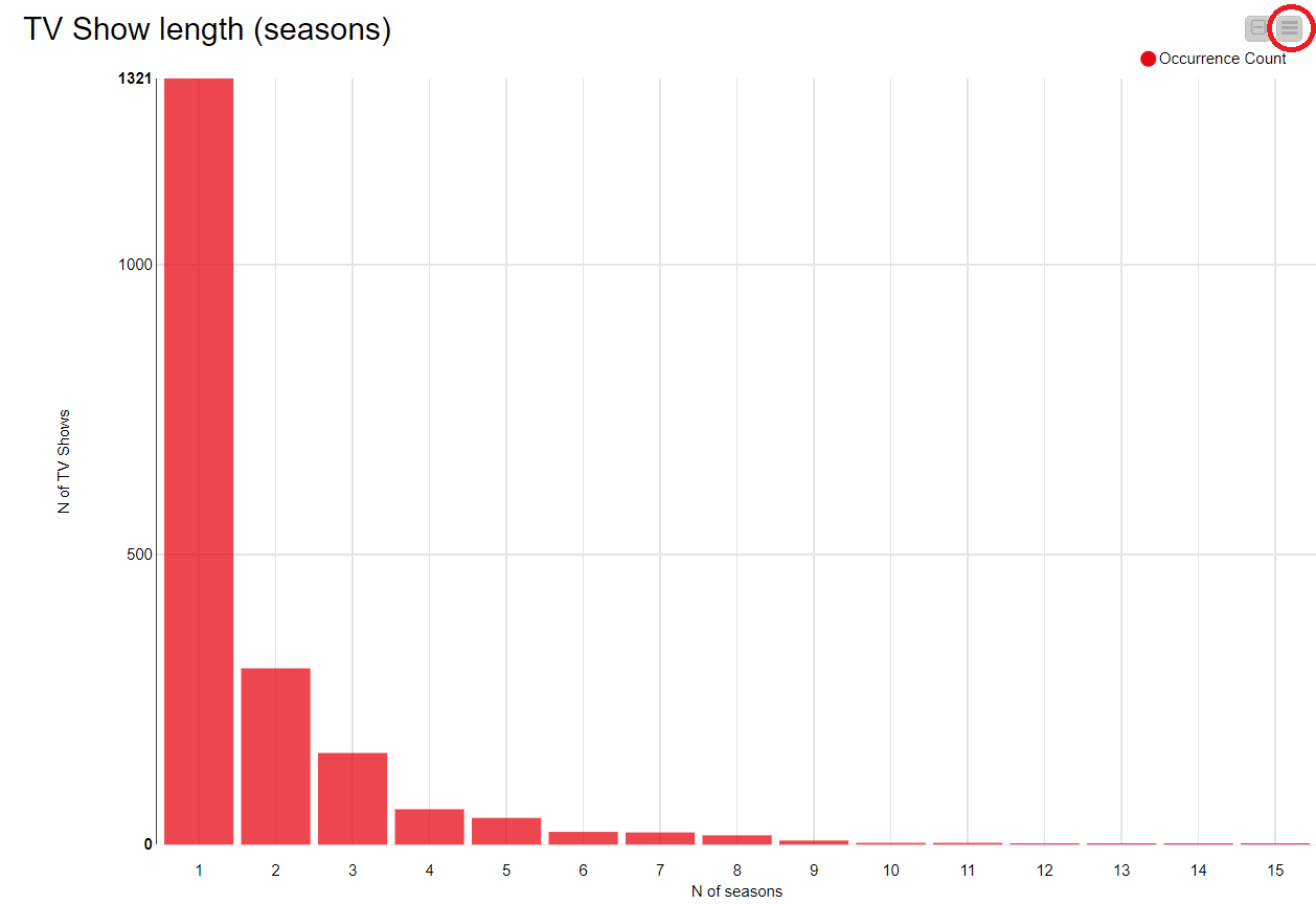
Fig. 3. Bar chart showing the number of seasons for TV shows.
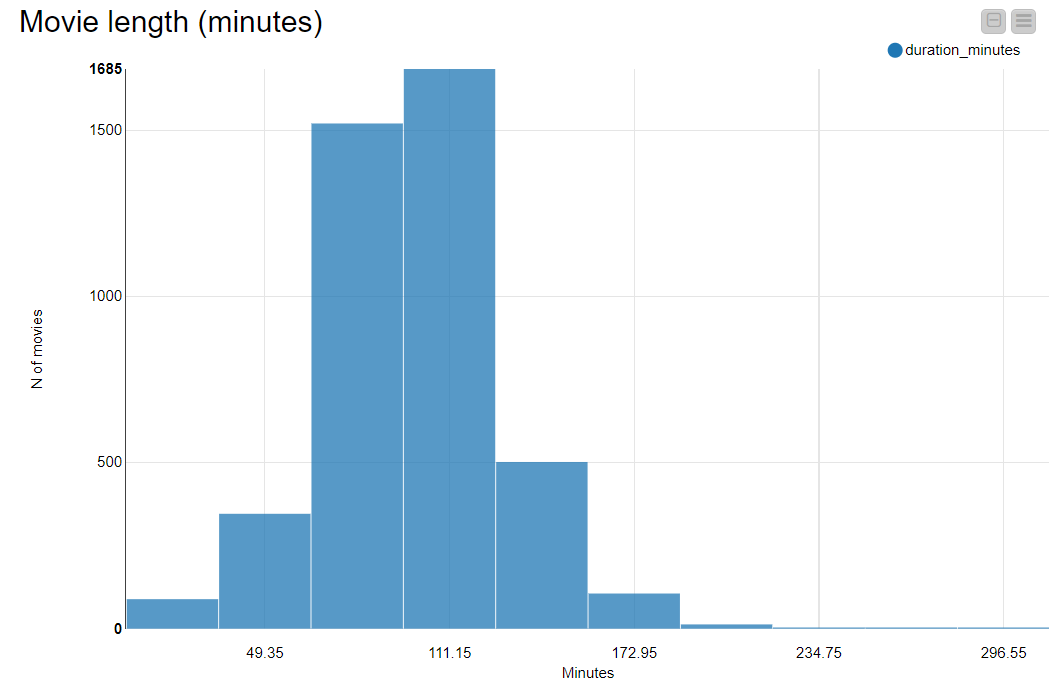
Fig. 4. A histogram that groups movies according to their duration.
There are plenty of opportunities for data visualization in KNIME Analytics Platform. You can find dedicated nodes in Node Repository > Views -> Javascript and even build your own visualization using the Generic Javascript View node.
If you are running out of imagination, there is an entire selection of workflows on the EXAMPLES Server full of useful visualizations that you can easily readapt to your needs.
Charts are also customizable! See for example the Bar Chart in Figure 3, where I changed the default blue to the -official- Netflix red.
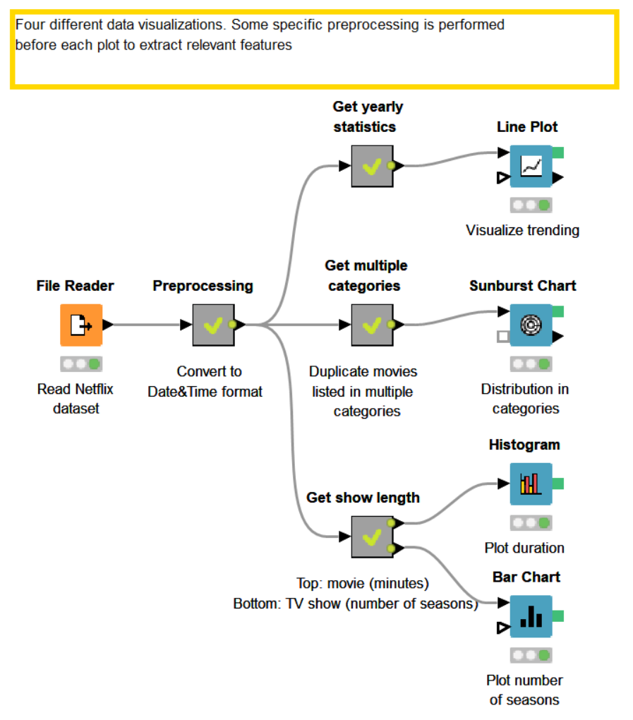
Fig. 5. This is a screenshot of the workflow that performs these visualizations. The preprocessing related to each visualization is grouped into the metanodes.
Download and try out the workflow yourself, called "Create an interactive dashboard in 3 steps: Netflix shows" from the KNIME Hub.
All produced charts and plots are interactive. You can change the visualized data, the plot properties, the selected points and more directly from the interactive view by clicking on the upper right Setting icon, circled in red in Figure 3. For more in-depth customizations, check the guide showing how to integrate CSS code to make your JavaScript visualizations shine.
Step 2: Wrap them up into a component
If one plot is nice...two plots are nicer! Let’s organize all our wonderful graphics in a complete dashboard. Select all four nodes used for the visualizations and right click -> “Create Component…”. This creates a new gray node: the component.
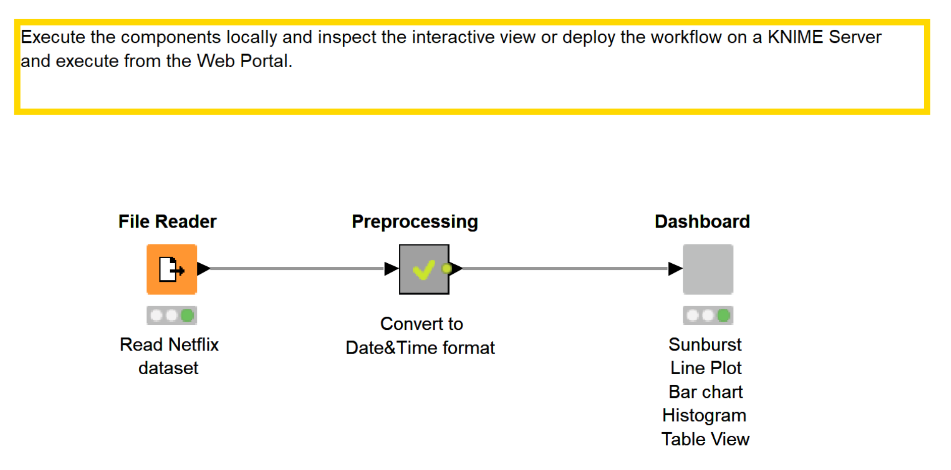
Fig. 6. The final workflow. All of the visualization nodes have been grouped into a component.
This ensemble visualization can also be enriched and customized. CTRL + double click on the component to open it. Add a Text Output Widget node and type the description you want to add to your visualization.
We can make the dashboard more interactive adding, for example, a Table View node for selection. I set it to only display the shows selected in the Histogram and Bar Chart.
This is a good way to inspect the content of the different bins.
For example, do you know which is the longest movie on Netflix? Open the interactive view of the component, select the last histogram bin - which contains only one movie - and look at the table view. If you have heard about that movie you can easily imagine why it lasts so long!
It’s now time to organize our dashboard to make it neater and understandable. From inside the component, click the last icon of the toolbar (see screenshot in Fig.7) to open the Node Usage and Layout window. Here you can arrange your charts, set position, dimension, and create groups. If you have created a nested component, it will be handled as a grouped visualization.
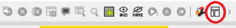
Fig. 7. Open the Node Usage and Layout window to organize your dashboard.
Step 3: Deploy the interactive view as a web page
You can also inspect the component's interactive view as a web page in a web browser. To perform this operation, you need to deploy your workflow to a KNIME Server instance, using the one-click-deployment. Do this by going to the KNIME Explorer panel, right-clicking your workflow and selecting “Deploy to Server…”. Now choose the desired destination and click OK.
To visualize the dashboard, right-click the uploaded workflow and select Open -> In Web Portal. Your browser will let you execute the workflow and visualize the dashboard built by the component (Figure 8).
Summary
In this blog post we discovered how simple it is to create an interactive dashboard for your data in KNIME Analytics Platform. Set up your charts, wrap up the nodes into a component and customize it if needed, execute locally or on the KNIME WebPortal and play with your visualization. As easy as a pie (chart)!
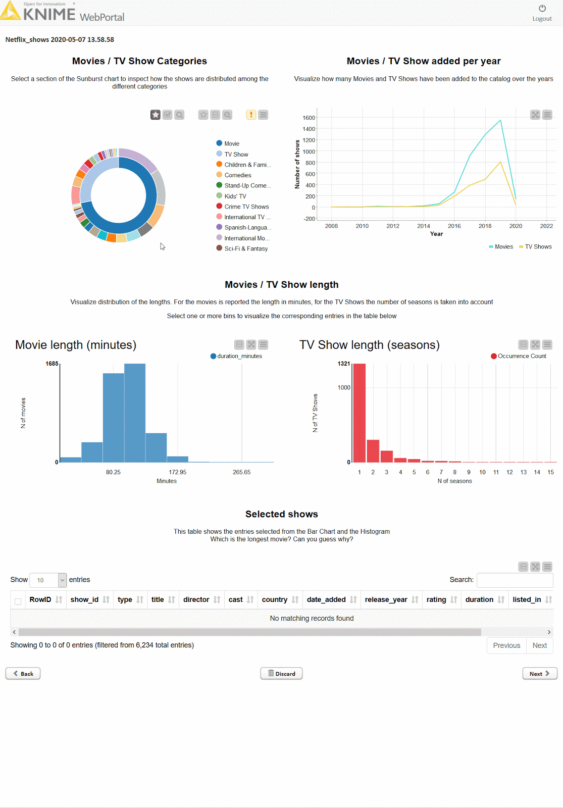
Fig. 8. This is the dashboard visualization as it would appear on the KNIME WebPortal.
Want more visualizations? Here are some more advanced ideas you can easily implement. You'll find these visualizations in this more advanced version of the example workflow on the KNIME Hub here: https://kni.me/w/grHmwo1F0xiQPdO7
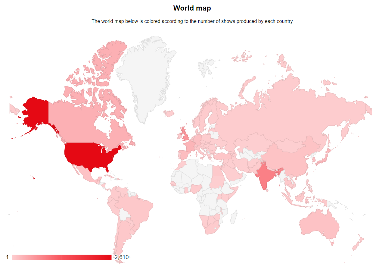
Fig. 9. World map showing movies produced by each country.
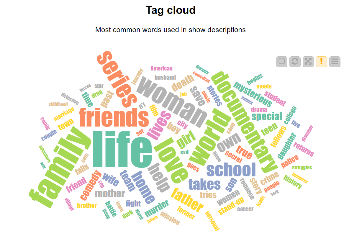
Fig. 10. Tag cloud showing the words used most in descriptions of shows.
Resources
The workflows shown in this article are both available for you to download and try out yourself on the KNIME Hub:
- Create an interactive dashboard in 3 steps: Netflix shows
- Create an interactive dashboard in 3 steps: Netflix shows (advanced)
Bio: Emilio Silvestri is an intern at KNIME in the Evangelism Team. He developed a solid interest for the Data Science topic during his bachelor's degree in Computer Science, when he worked on a thesis about epilepsy recognition using Convolutional Neural Networks. He eventually decided to move to the University of Konstanz to complete his Master's Degree.
As first published on the KNIME Blog.
Original. Reposted with permission.
Related: