The Easiest Way to Make Beautiful Interactive Visualizations With Pandas
Check out these one-liner interactive visualization with Pandas in Python.
By Frank Andrade, Data Scientist and Python Instructor

Photo by Jerry Zhang on Unsplash
If you’ve been following my data visualization guides, you probably know that I like creating nice-looking and readable visualizations in Python without getting too technical and wasting a lot of time.
Interactive visualizations are no exception, so I’ve been searching for friendly libraries in Python for quite some time. There are many libraries out there that do the job, but when it comes to working along with Pandas, things get messy.
Fortunately, there’s an easy way to create interactive visualizations directly from Pandas, and we’ll see how it works in detail in this guide.
First things first
Install the libraries
To easily create interactive visualizations, we need to install Cufflinks. This is a library that connects Pandas with Plotly, so we can create visualizations directly from Pandas (in the past you had to learn workarounds to make them work together, but now it’s simpler)
First, make sure you install Pandas and Plotly running the following commands on the terminal:
pip install pandas
pip install plotly
Note that you can also use conda to install Plotlyconda install -c plotly.
Once you have Plotly installed, run the following commands to install Cufflinks:
pip install cufflinks
Import the libraries
To start working, import the following libraries:
import pandas as pd
import cufflinks as cf
from IPython.display import display,HTMLcf.set_config_file(sharing='public',theme='ggplot',offline=True)
In this case, I’m using the ‘ggplot’ theme, but feel free to choose any theme you want. Run the command cf.getThemes() to get all the themes available.
To make interactive visualizations with Pandas in the following sections, we only need to use the syntaxdataframe.iplot().
The data
For this guide, we’ll use a population dataframe. First, download the CSV file available on Google Drive or Github, move the file where your Python script is located, and then read it in a Pandas dataframe as shown below.
df_population = pd.read_csv('population_total.csv')
The dataframe contains the population throughout the years for most countries around the world and looks like this:
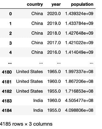
Image by author
This dataframe is almost ready for plotting, we just have to drop null values, reshape it and then select a couple of countries to test our interactive plots. The code shown below does all of this.
# dropping null values
df_population = df_population.dropna()# reshaping the dataframe
df_population = df_population.pivot(index='year', columns='country',
                                    values='population')# selecting 5 countries
df_population = df_population[['United States', 'India', 'China',
                               'Indonesia', 'Brazil']]
Now the dataframe look like the picture below and is ready for plotting.
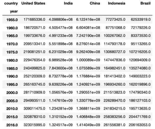
Image by author
If you’d like to know how a data scientist collects real-world data like this “population_total.csv”, check this guide I made. (you won’t always have a Kaggle dataset available for a data science project)
Now let’s start making interactive visualization!
Lineplot
Let’s make a lineplot to compare how much the population has grown from 1955 to 2020 for the 5 countries selected.
As mentioned before, we will use the syntax df_population.iplot(kind='name_of_plot') to make plots as shown below.
df_population.iplot(kind='line',xTitle='Years', yTitle='Population',
                    title='Population (1955-2020)')
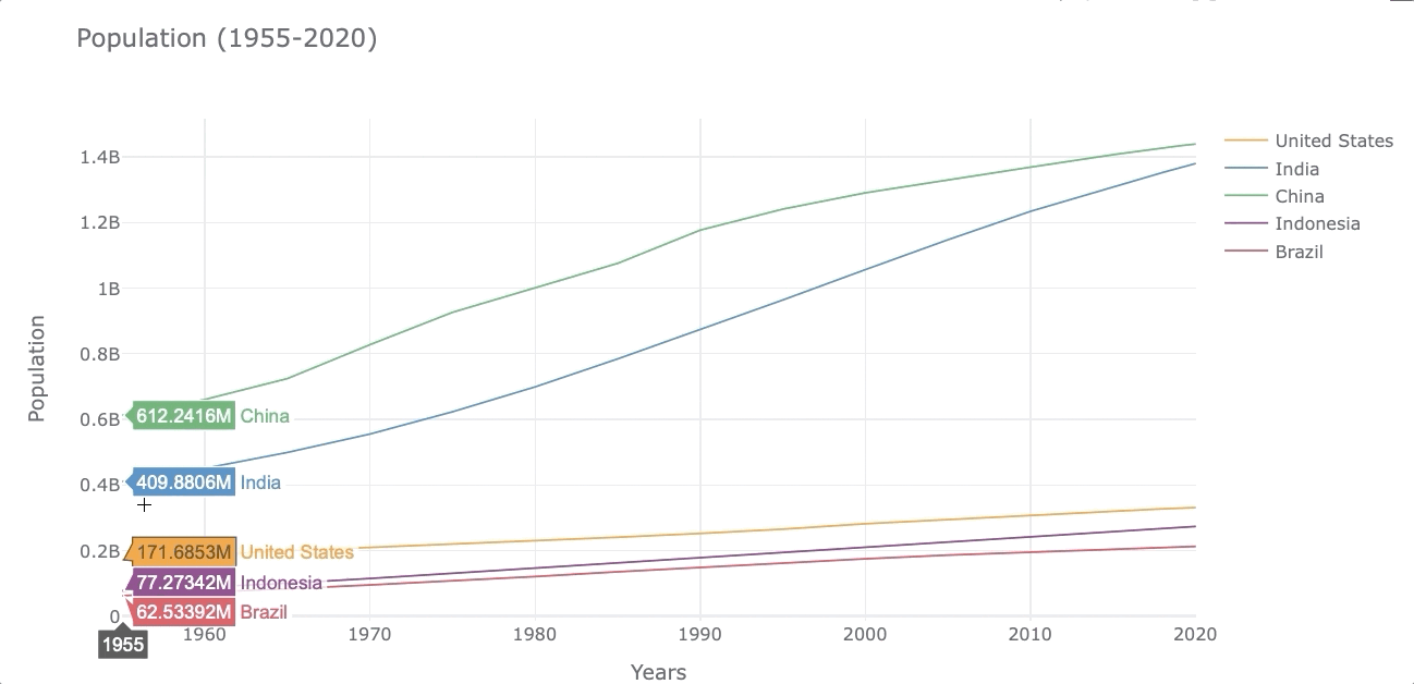
Image by author
At first glance, it’s easy to see that the population in India has grown faster than the other countries.
Barplot
We can make a single barplot on barplots grouped by categories. Let’s have a look.
Single Barplot
Let’s create a barplot that shows the population of each country by the year 2020. To do so, first, we select the year 2020 from the index and then transpose rows with columns to get the year in the column. We’ll name this new dataframe df_population_2020 (we’ll use this dataframe again when plotting piecharts)
df_population_2020 = df_population[df_population.index.isin([2020])]
df_population_2020 = df_population_2020.T
Now we can plot this new dataframe with .iplot(). In this case, I’m going to set the bar color to light-green using the color argument.
df_population_2020.iplot(kind='bar', color='lightgreen',
                         xTitle='Years', yTitle='Population',
                         title='Population in 2020')
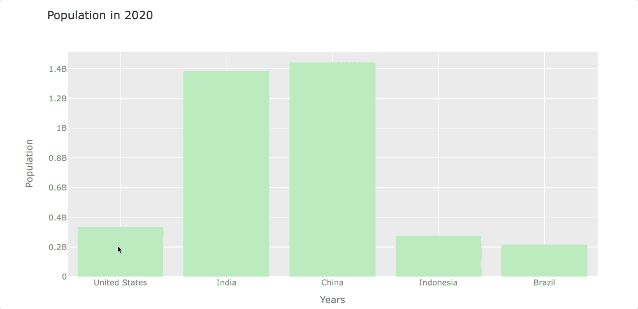
Image by author
Barplot grouped by “n” variables
Now let’s see the evolution of the population at the beginning of each decade.
# filter years out
df_population_sample = df_population[df_population.index.isin([1980, 1990, 2000, 2010, 2020])]# plotting
df_population_sample.iplot(kind='bar', xTitle='Years',
                           yTitle='Population')
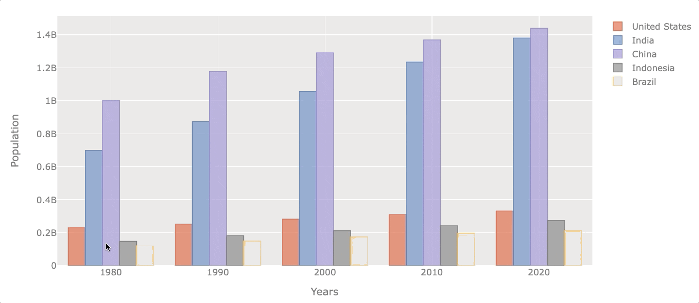
Image by author
Naturally, all of them increased their population throughout the years, but some did it at a faster rate.
Boxplot
Boxplots are useful when we want to see the distribution of the data. The boxplot will reveal the minimum value, first quartile (Q1), median, third quartile (Q3), and maximum value. The easiest way to see those values is by creating an interactive visualization.
Let’s see the population distribution of the USA.
df_population['United States'].iplot(kind='box', color='green',
                                     yTitle='Population')

Image by author
Let’s say now we want to get the same distribution but for all the selected countries.
df_population.iplot(kind='box', xTitle='Countries',
                    yTitle='Population')
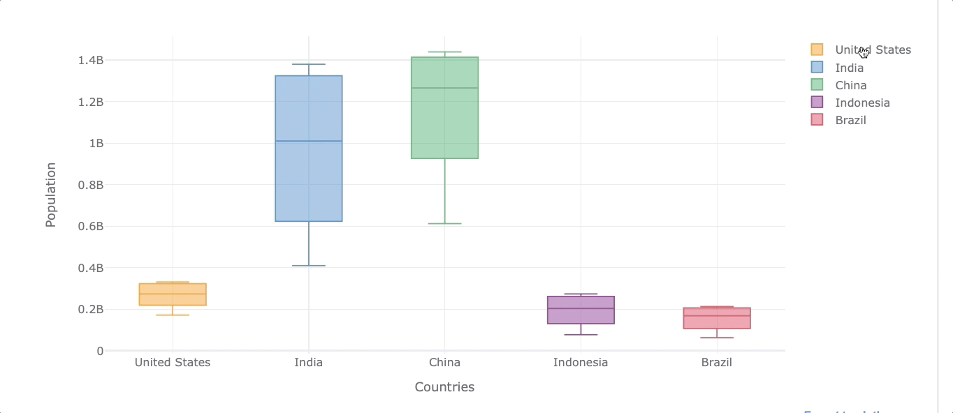
Image by author
As we can see, we can also filter out any country by clicking on the legends on the right.
Histogram
A histogram represents the distribution of numerical data. Let’s see the population distribution of the USA and Indonesia.
df_population[['United States', 'Indonesia']].iplot(kind='hist',
                                                xTitle='Population')
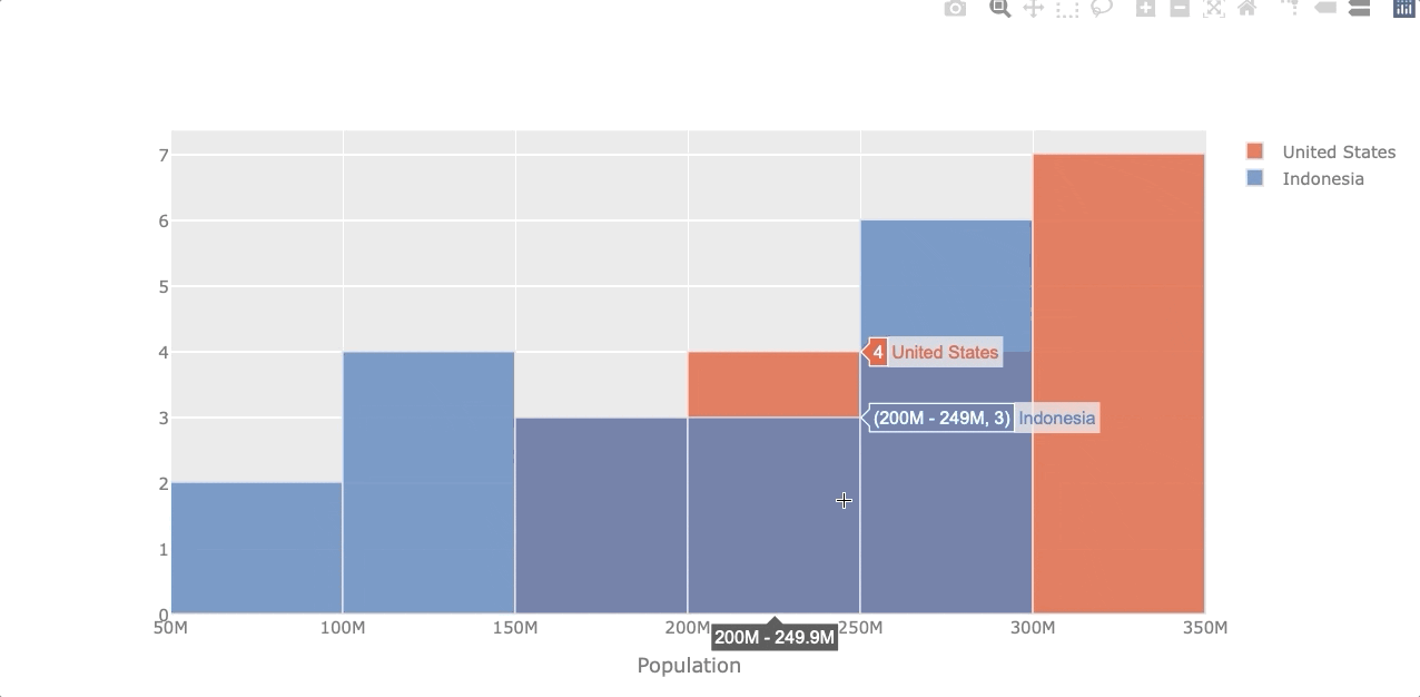
Image by author
Piechart
Let’s compare the population by the year 2020 again but now with a piechart. To do so, we’ll use the df_population_2020 dataframe created in the “Single Barplot” section.
However, to make a piechart we need the “country” as a column and not as an index, so we use .reset_index() to get the column back. Then we transform the 2020 into a string.
# transforming data
df_population_2020 = df_population_2020.reset_index()
df_population_2020 =df_population_2020.rename(columns={2020:'2020'})# plotting
df_population_2020.iplot(kind='pie', labels='country',
                         values='2020',
                         title='Population in 2020 (%)')
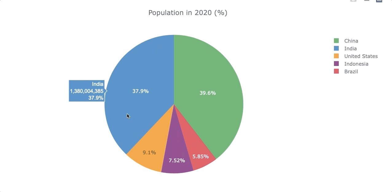
Image by author
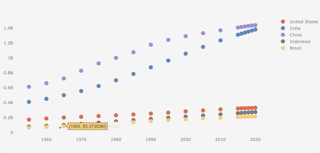
Scatterplot
Although population data is not suitable for a scatterplot (the data follows a common pattern), I would make this plot for the purposes of this guide.
Making a scatterplot is similar to a line plot, but we have to add the mode argument.
df_population.iplot(kind='scatter', mode='markers')
That’s it! Now you’re ready to make your own beautiful interactive visualization with Pandas. If you want to learn other visualization libraries in Python such as Matplotlib and Seaborn and also want to know how to make wordclouds, check these guides I made.
If you enjoy reading stories like these and want to support me as a writer, consider signing up to become a Medium member. It’s $5 a month, giving you unlimited access to thousands of Python guides and Data science articles. If you sign up using my link, I’ll earn a small commission with no extra cost to you.
Bio: Frank Andrade is a Data Scientist, a Python Instructor, and a Top 1000 Writer on Medium.
Original. Reposted with permission.