


How to Use Marimo for Interactive Data Analysis
Learn how to use Marimo for interactive data analysis with Python, Pandas, and Altair, and turn a reactive notebook into a simple shareable dashboard.

Traditional Python notebooks are great for exploring data, but they can quickly become difficult to manage. Cells may be executed in the wrong order, results can become out of sync, and turning a notebook into something interactive usually means adding more tools or rebuilding the analysis somewhere else.
Marimo takes a much cleaner approach. It is an open-source reactive Python notebook where cells automatically update when their dependencies change. The notebook is also stored as a normal Python file, which makes it easier to reproduce, version with Git, and share.
In this guide, we will build a simple interactive data analysis dashboard using Marimo, Pandas, and Altair. We will create a dataset, add interactive filters, connect them to our analysis, build a visualization, and finally run the same notebook as an interactive application.
1. Installing Marimo
Start by installing Marimo along with the libraries we will use for the analysis:
pip install marimo pandas altairYou can also install Marimo using uv or Conda. There is also a marimo[recommended] installation that includes useful data tools such as DuckDB, Polars, and Altair.
Create your first notebook with:
python -m marimo edit analysis.pyThis opens the Marimo editor in your browser. One thing I really like here is that, unlike Jupyter's .ipynb format, Marimo saves the notebook as a normal .py file.
2. Creating a Dataset
Now, let's create a slightly more realistic sales dataset that we can use throughout the rest of the tutorial. We will generate data for different products, regions, and quarters, along with units sold, pricing, and revenue.
import altair as alt
import numpy as np
import pandas as pd
import marimo as mo

rng = np.random.default_rng(42)

products = [
    ("Laptop", "Tech", 800, 1500),
    ("Phone", "Tech", 500, 1200),
    ("Tablet", "Tech", 250, 800),
    ("Monitor", "Tech", 150, 600),
    ("Keyboard", "Accessories", 30, 150),
    ("Mouse", "Accessories", 15, 90),
    ("Headphones", "Accessories", 50, 400),
    ("Webcam", "Accessories", 40, 250),
]
regions = ["US", "Europe", "Asia"]
region_scale = {"US": 1.0, "Europe": 0.75, "Asia": 0.55}
quarters = ["Q1", "Q2", "Q3", "Q4"]

rows = []
for _quarter in quarters:
    for _region in regions:
        for _name, _category, _lo, _hi in products:
            units_sold = int(
                rng.integers(_lo, _hi) * region_scale[_region] * rng.uniform(0.7, 1.3)
            )
            unit_price = round(rng.uniform(_lo, _hi) / 8, 2)
            rows.append(
                {
                    "product": _name,
                    "category": _category,
                    "region": _region,
                    "quarter": _quarter,
                    "units_sold": units_sold,
                    "unit_price": unit_price,
                    "revenue": round(units_sold * unit_price, 2),
                }
            )

df = pd.DataFrame(rows)
df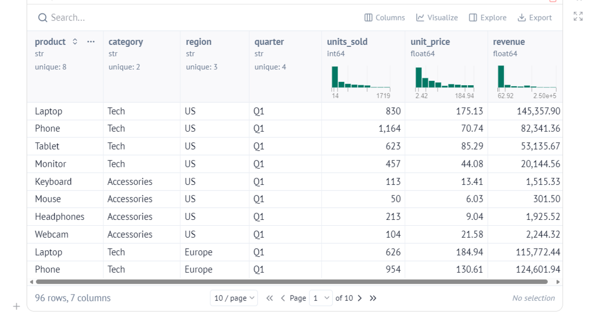
One nice thing about Marimo is that you do not need any extra code just to inspect the DataFrame. By placing df at the end of the cell, Marimo automatically displays it as an interactive table where you can search, sort, and filter the data.
It works with both Pandas and Polars, so you can use whichever DataFrame library you already prefer.
3. Adding Interactive Controls
Next, let us add a dropdown for selecting a region and a slider for setting the minimum sales value:
region = mo.ui.dropdown(
    options=["All"] + sorted(df["region"].unique().tolist()),
    value="All",
    label="Region",
)

min_sales = mo.ui.slider(
    start=0,
    stop=int(df["units_sold"].max()),
    value=0,
    label="Minimum units sold",
)

mo.hstack([region, min_sales])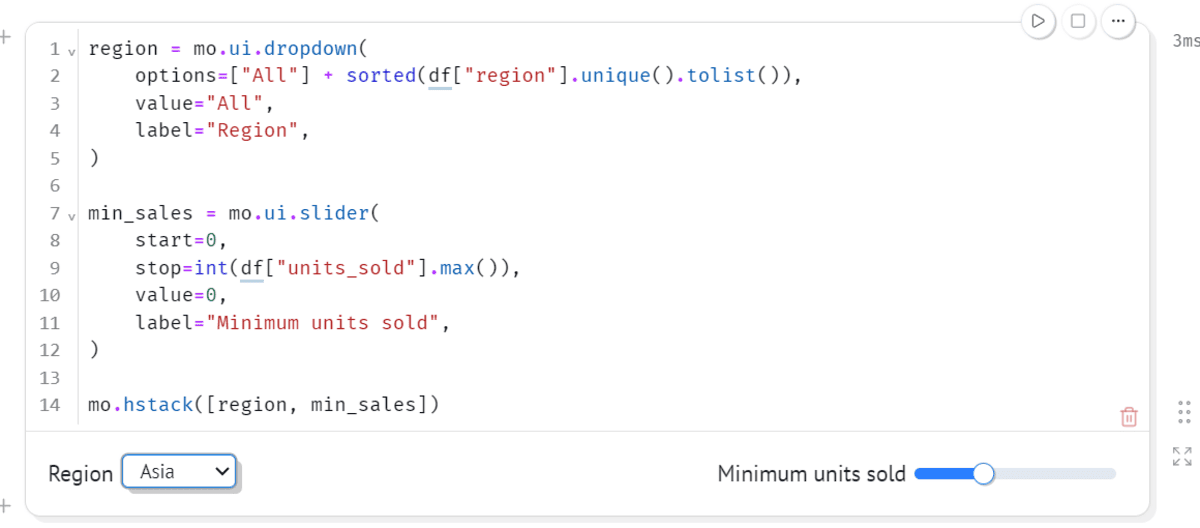
Marimo comes with several built-in UI components, including sliders, dropdowns, checkboxes, date pickers, tables, file uploads, and text inputs.
4. Filtering the Data
Now we can connect those controls to our DataFrame:
filtered_df = df[df["units_sold"] >= min_sales.value]

if region.value != "All":
    filtered_df = filtered_df[
        filtered_df["region"] == region.value
    ]

mo.ui.table(filtered_df)
Try changing the region or moving the slider.
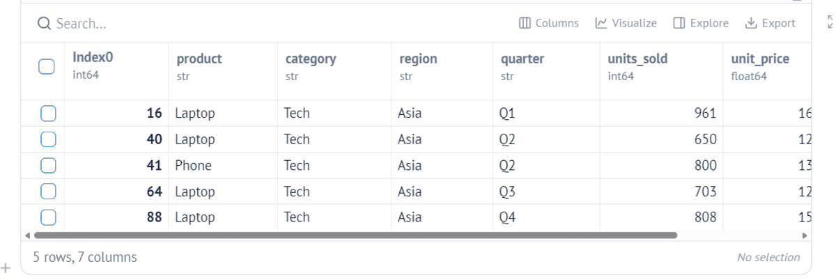
You do not have to manually rerun the cell. Marimo knows that filtered_df depends on region and min_sales, so it automatically reruns the affected cells whenever those values change.
This reactive execution is one of the main things that makes Marimo different from traditional notebooks.
5. Creating an Interactive Visualization
We can now visualize the filtered data using Altair:
chart = (
    alt.Chart(filtered_df)
    .mark_bar()
    .encode(
        x="product:N",
        y="units_sold:Q",
        color="region:N",
        tooltip=["product", "region", "quarter", "units_sold", "revenue"],
    )
    .properties(width=600, height=350)
)

chart
Now when you change the dropdown or slider, both the table and the chart update automatically.

Marimo works with popular visualization libraries such as Matplotlib, Plotly, Altair, Seaborn, and HoloViews. It can also pass selections from supported charts back into Python, which makes it possible to build much more interactive analysis workflows.
6. Running the Notebook as an App
One of my favorite Marimo features is that the same notebook can also be turned into an interactive application.
From the terminal, run:
python -m marimo run analysis.py # run as read-only appMarimo launches the notebook in app mode and hides the editable Python code.

This means you can use the same file for exploring your data while developing and then share it as a simple dashboard or interactive application without rebuilding everything using another framework.
Final Thoughts
After using Marimo, I really like how simple the whole experience is. You can write normal Python, add interactive controls, visualize your data, and turn the same notebook into an application without setting up a separate dashboard framework.
For this kind of workflow, it feels much cleaner than a traditional notebook setup. There are fewer moving parts and fewer extra dependencies to manage. You also do not need a hosted Jupyter environment or a separate notebook service. Once Marimo is installed, you can run everything locally and open it directly in your browser.
Sharing is also much easier because the notebook is just a regular Python file. It works nicely with Git, is easy for someone else to run, and does not come with the usual .ipynb notebook state and cell-order problems.
I also really like how polished Marimo looks out of the box. The tables, sliders, dropdowns, and charts make even a small analysis feel like a proper interactive application without spending time building a frontend.
For me, that is the biggest advantage of Marimo. It is a very simple, out-of-the-box solution for going from Python analysis to something interactive and presentable, without adding a complicated stack around it.
Abid Ali Awan (@1abidaliawan) is a certified data scientist professional who loves building machine learning models. Currently, he is focusing on content creation and writing technical blogs on machine learning and data science technologies. Abid holds a Master's degree in technology management and a bachelor's degree in telecommunication engineering. His vision is to build an AI product using a graph neural network for students struggling with mental illness.