Revamping Data Visualization: Mastering Time-Based Resampling in Pandas
Unlock the power of time-based data visualization with Pandas as we delve into the art of resampling, turning your data into insightful temporal masterpieces.

Image by Freepik
This comprehensive article will discuss time-based data visualization using Python with the Pandas library. As you know, time-series data is a treasure trove of insights, and with the skillful resampling technique, you can transform raw temporal data into visually compelling narratives. Whether you're a data enthusiast, scientist, analyst, or just curious about unraveling the stories hidden within time-based data, this article help you with the knowledge and tools to revamp your data visualization skills. So, let’s start discussing the Pandas resampling techniques and turn data into informative and captivating temporal masterpieces.
Why Data Resampling?
While working with time-based data visualization, Data resampling is crucial and very useful. It allows you to control the granularity of the data to extract meaningful insights and create visually compelling representations to understand it better. In the below picture, you can observe that you can either upsample or downsample your time series data in terms of frequencies based on your requirements.
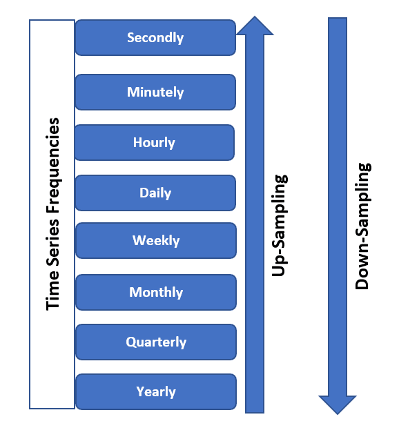
Image from SQLRelease
Basically, the two primary purposes of data resampling are mentioned below:
- Granularity Adjustment: Collecting the big data allows you to change the time intervals at which data points are collected or aggregated. You can get only the vital information instead of getting the noise. This can help you remove the noisy data, which converts the data to more manageable for visualization.
- Alignment: It also helps align data from multiple sources with different time intervals, ensuring consistency when creating visualizations or conducting analyses.
For Example,
Suppose you have daily stock price data for a particular company that you are getting from a stock exchange, and you aim to visualize the long-term trends without including the noisy data points in your analysis. So, to do this, you can resample this daily data to a monthly frequency by taking the average closing price for each month, and as a result, the size of the data for visualization purpose decrease, and your analysis can provide better insights.
import pandas as pd
# Sample daily stock price data
data = {
'Date': pd.date_range(start='2023-01-01', periods=365, freq='D'),
'StockPrice': [100 + i + 10 * (i % 7) for i in range(365)]
}
df = pd.DataFrame(data)
# Resample to monthly frequency
monthly_data = df.resample('M', on='Date').mean()
print(monthly_data.head())
In the above example, you have observed that we have resampled the daily data into monthly intervals and calculated the mean closing price for each month, due to which you got the smoother, less noisy representation of the stock price data, making it easier to identify long-term trends and patterns for decision making.
Choosing the Right Resampling Frequency
When working with time-series data, the main parameter for resampling is the frequency, which you must select correctly to get insightful and practical visualizations. Basically, there is a tradeoff between granularity, which implies how detailed the data is, and clarity, which means how well the data patterns are revealed.
For Example,
Imagine you have temperature data recorded every minute for a year. Suppose you have to visualize the annual temperature trend; using minute-level data would result in an excessively dense and cluttered plot. On the other hand, if you aggregate the data to yearly averages, you might lose valuable information.
# Sample minute-level temperature data
data = {
    'Timestamp': pd.date_range(start='2023-01-01', periods=525600, freq='T'),
    'Temperature': [20 + 10 * (i % 1440) / 1440 for i in range(525600)]
}

df = pd.DataFrame(data)

# Resample to different frequencies
daily_avg = df.resample('D', on='Timestamp').mean()
monthly_avg = df.resample('M', on='Timestamp').mean()
yearly_avg = df.resample('Y', on='Timestamp').mean()

print(daily_avg.head())
print(monthly_avg.head())
print(yearly_avg.head())
In this example, we resample the minute-level temperature data into daily, monthly, and yearly averages. Depending on your analytical or visualization goals, you can choose the level of detail that best serves your purpose. Daily averages reveal daily temperature patterns, while yearly averages provide a high-level overview of annual trends.
By selecting the optimal resampling frequency, you can balance the amount of data detail with the clarity of your visualizations, ensuring your audience can easily discern the patterns and insights you want to convey.
Aggregation Method and Techniques
When working with time-based data, it's essential to understand various aggregation methods and techniques. These methods allow you to effectively summarize and analyze your data, revealing different aspects of your time-based information. Standard aggregation methods include calculating sums and means or applying custom functions.
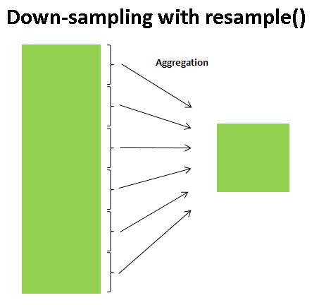
Image from TowardsDataScience
For Example,
Consider you have a dataset containing daily sales data for a retail store over a year. You want to analyze the yearly revenue trend. To do this, you can use aggregation methods to calculate the total sales for each month and year.
# Sample daily sales data
data = {
'Date': pd.date_range(start='2023-01-01', periods=365, freq='D'),
'Sales': [1000 + i * 10 + 5 * (i % 30) for i in range(365)]
}
df = pd.DataFrame(data)

# Calculate monthly and yearly sales with the aggregation method
monthly_totals = df.resample('M', on='Date').sum()
yearly_totals = df.resample('Y', on='Date').sum()

print(monthly_totals.head())
print(yearly_totals.head())
In this example, we resample the daily sales data into monthly and yearly totals using the sum() aggregation method. By doing this, you can analyze the sales trend at different levels of granularity. Monthly totals provide insights into seasonal variations, while yearly totals give a high-level overview of the annual performance.
Depending on your specific analysis requirements, you can also use other aggregation methods like calculating means and medians or applying custom functions depending on the dataset distribution, which is meaningful according to the problem. These methods allow you to extract valuable insights from your time-based data by summarizing it in a way that makes sense for your analysis or visualization goals.
Handling Missing Data
Handling missing data is a critical aspect of working with time series, ensuring that your visualizations and analyses remain accurate and informative even when dealing with gaps in your data.
For Example,
Imagine you're working with a historical temperature dataset, but some days have missing temperature readings due to equipment malfunctions or data collection errors. You must handle these missing values to create meaningful visualizations and maintain data integrity.
# Sample temperature data with missing values
data = {
    'Date': pd.date_range(start='2023-01-01', periods=365, freq='D'),
    'Temperature': [25 + np.random.randn() * 5 if np.random.rand() > 0.2 else np.nan for _ in range(365)]
}
df = pd.DataFrame(data)

# Forward-fill missing values (fill with the previous day's temperature)
df['Temperature'].fillna(method='ffill', inplace=True)

# Visualize the temperature data
import matplotlib.pyplot as plt
plt.figure(figsize=(12, 6))
plt.plot(df['Date'], df['Temperature'], label='Temperature', color='blue')
plt.title('Daily Temperature Over Time')
plt.xlabel('Date')
plt.ylabel('Temperature (°C)')
plt.grid(True)
plt.show()
Output:
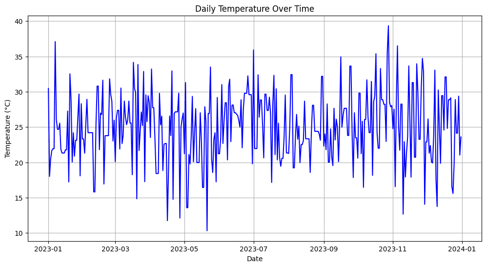
Image by Author
In the above example, you can see that firstly, we have simulated the missing temperature values (about 20% of the data) and then used the forward-fill (ffill) method to fill in the gaps, which means that the missing values are replaced with the temperature from the previous day.
Therefore, handling the missing data ensures that your visualizations accurately represent the underlying trends and patterns in the time series, preventing gaps from distorting your insights or misleading your audience. Various strategies, such as interpolation or backward-filling, can be employed based on the nature of the data and the research question.
Visualizing Trends and Patterns
Data resampling in pandas allows you to visualize trends and patterns in sequential or time-based data, which further helps you to collect insights and effectively communicate the results to others. As a result, you can find clear and informative visual representations of your data to highlight the different components, including trends, seasonality, and irregular patterns (possibly the noise in the data)
For Example,
Suppose you have a dataset containing daily website traffic data collected over the past years. You aim to visualize the overall traffic trend in the subsequent years, identify any seasonal patterns, and spot irregular spikes or dips in traffic.
# Sample daily website traffic data
data = {
'Date': pd.date_range(start='2019-01-01', periods=1095, freq='D'),
'Visitors': [500 + 10 * ((i % 365) - 180) + 50 * (i % 30) for i in range(1095)]
}
df = pd.DataFrame(data)

# Create a line plot to visualize the trend
plt.figure(figsize=(12, 6))
plt.plot(df['Date'], df['Visitors'], label='Daily Visitors', color='blue')
plt.title('Website Traffic Over Time')
plt.xlabel('Date')
plt.ylabel('Visitors')
plt.grid(True)

# Add seasonal decomposition plot
from statsmodels.tsa.seasonal import seasonal_decompose
result = seasonal_decompose(df['Visitors'], model='additive', freq=365)
result.plot()
plt.show()
Output:
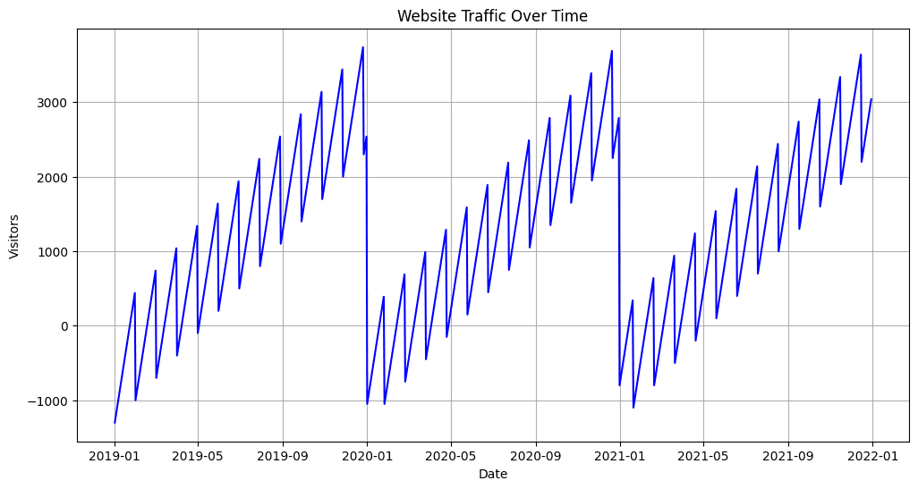
Image by Author
In the above example, we have first created a line plot to visualize the daily website traffic trend over time. This plot describes the overall growth and any irregular patterns in the dataset. Also, to decompose the data into different components, we use the seasonal decomposition technique from the statsmodels library, including trend, seasonality, and residual components.
This way, you can effectively communicate the website's traffic trends, seasonality, and anomalies to stakeholders, which enhances your ability to derive important insights from time-based data and convert it into data-driven decisions.
Wrapping it Up
Colab Notebook link: https://colab.research.google.com/drive/19oM7NMdzRgQrEDfRsGhMavSvcHx79VDK#scrollTo=nHg3oSjPfS-Y
In this article, we discussed the time-based resampling of data in Python. So, to conclude our session, let’s summarize the important points covered in this article:
- Time-based resampling is a powerful technique for transforming and summarizing time-series data to get better insights for decision-making.
- Careful selection of resampling frequency is essential to balance granularity and clarity in data visualization.
- Aggregation methods like sum, mean, and custom functions help reveal different aspects of time-based data.
- Effective visualization techniques aid in identifying trends, seasonality, and irregular patterns, facilitating clear communication of findings.
- Real-world use cases in finance, weather forecasting, and social media analytics demonstrate the wide-ranging impact of time-based resampling.
Aryan Garg is a B.Tech. Electrical Engineering student, currently in the final year of his undergrad. His interest lies in the field of Web Development and Machine Learning. He have pursued this interest and am eager to work more in these directions.
Aryan Garg is a B.Tech. Electrical Engineering student, currently in the final year of his undergrad. His interest lies in the field of Web Development and Machine Learning. He have pursued this interest and am eager to work more in these directions.