Random vs Pseudo-random – How to Tell the Difference
Statistical know-how is an integral part of Data Science. Explore randomness vs. pseudo-randomness in this explanatory post with examples.
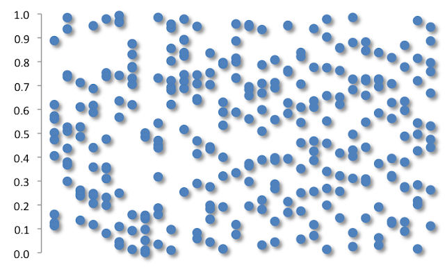
Inspect this picture below. What do you see? Is it an immense field of random data, or something much more than that? One hint is that you are looking at vertical series of data values, and all of them are in the range of 0 and 1. So now reviewing the illustration below for the second time, does anything else come to mind?

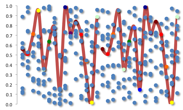
So the data are not merely random. The left half and the right half are different. A smaller point in the analysis is that the simulated generation of initial 15 values is identical on the left, as it is for the 15 initial values on the right. These are often termed initialisation numbers. We trace this out (in red) with the recoloring below.
Do either side seem more random to you? A larger point in the analysis is that on the left, a trained eye can see that the values continue to be random, while on the right the values instead are more quasirandom (e.g., similar to the Sobol sequence credited to 20th century Russian mathematician Russian mathematician Илья Меерович Соболь, or I. M. Sobol). The latter approach allows for a random path, partially depending on prior sampled values. In this case, the right hand side has the grand aim to create data values that are widely spread out. On the left side, there is no such consideration.
What we see below is that despite how the simulated values begin, the rest of the vertical series is random on the left and less pseudorandom (encircled in green) on the right. Random values on the left surprise many in that they are abundantly clumpy, while we have the objective on the right of "more evenly" spaced values. Creating a simulated, dependent random sample is valuable in that it allows one to better focus their energy on consistently understanding the values near the center of a distribution. For example, the expected value of a random variable X is always equal to the average of X. The simulation style doesn't matter. But if we were instead trying to understand the expected parameter value of the 40th or 60th percentile, the 50th percentile (median), or even the higher moments (here, here), then ensuring that we always get values spread about this level is important.
Note that in skewed variables, the median is not equal to the average but rather moves further in the opposite direction of the skew (the average moves further in the same direction of the skew). Put differently, we would want to get the same level of accuracy on our central value approximation using a simulation technique that consumes fewer data. And this is the benefit of the more quasirandom technique on the right.
To get into the mathematics a little more, we note here that the left and the right have expected values of 0.5 (or 50%), due to symmetry. The standard deviation (standard error) of the sample means is tighter on the right, due to the objective of greater dispersion between the 0 and 1 range. In fact the error is nearly double on the left what it is on the right. On the left, the standard deviation of a discrete unit uniform is approximately √[1/12*(1-0)2] or ~√1/12. For more on discrete dispersions see the Looking at dispersions article. The standard deviation of the sample means is therefore ~√(1/12)*√(1/10), or ~0.07. It can vary a bit though, and in the illustrations shown in this article, it is just less than twice this value. On the right however, the standard deviation of the sample means is <0.07. Now in theory the deterministic, low-discrepancy pseudorandom succession has been shown in recent mathematics literature to have a perturbation term that diminishes at a rate proportional to the [1/sample size] (i.e., 10). This is so much faster -or with much less data needed for similar results- than what we have on the left where the error is proportional to the [1/√(sample size)]. In practice here we are close, though not perfect, to those ratios.
The decisions one can make from a better random value generation would be smarter and more accurate. This is why we will have a future blog article where we demonstrate this quasirandom process in numerous dimensions, instead of the single linear dimension we start with here.
Now these generated values can be further mapped to important nonparametric distribution of interest or a part of a quasi-Monte Carlo scheme. Say the random variable X is the life of a battery from a new service center about to sell it, the estimated heights of baby born in a hospital, or next hour's change in the Yuan Renminbi rate.
Furthermore the dispersions otherwise happen to be similar between the left and the right, though generally they have the potential to be erratically wider or more narrow on the left, due to the clumping of sample generated values at either the extremes or center, respectively.
Bio: Salil is a top-selling mathematics and statistics book author. Academic statistician, C-suite advisor, and risk strategist.
Original.
Related:
So the data are not merely random. The left half and the right half are different. A smaller point in the analysis is that the simulated generation of initial 15 values is identical on the left, as it is for the 15 initial values on the right. These are often termed initialisation numbers. We trace this out (in red) with the recoloring below.
Do either side seem more random to you? A larger point in the analysis is that on the left, a trained eye can see that the values continue to be random, while on the right the values instead are more quasirandom (e.g., similar to the Sobol sequence credited to 20th century Russian mathematician Russian mathematician Илья Меерович Соболь, or I. M. Sobol). The latter approach allows for a random path, partially depending on prior sampled values. In this case, the right hand side has the grand aim to create data values that are widely spread out. On the left side, there is no such consideration.
What we see below is that despite how the simulated values begin, the rest of the vertical series is random on the left and less pseudorandom (encircled in green) on the right. Random values on the left surprise many in that they are abundantly clumpy, while we have the objective on the right of "more evenly" spaced values. Creating a simulated, dependent random sample is valuable in that it allows one to better focus their energy on consistently understanding the values near the center of a distribution. For example, the expected value of a random variable X is always equal to the average of X. The simulation style doesn't matter. But if we were instead trying to understand the expected parameter value of the 40th or 60th percentile, the 50th percentile (median), or even the higher moments (here, here), then ensuring that we always get values spread about this level is important.
Note that in skewed variables, the median is not equal to the average but rather moves further in the opposite direction of the skew (the average moves further in the same direction of the skew). Put differently, we would want to get the same level of accuracy on our central value approximation using a simulation technique that consumes fewer data. And this is the benefit of the more quasirandom technique on the right.
To get into the mathematics a little more, we note here that the left and the right have expected values of 0.5 (or 50%), due to symmetry. The standard deviation (standard error) of the sample means is tighter on the right, due to the objective of greater dispersion between the 0 and 1 range. In fact the error is nearly double on the left what it is on the right. On the left, the standard deviation of a discrete unit uniform is approximately √[1/12*(1-0)2] or ~√1/12. For more on discrete dispersions see the Looking at dispersions article. The standard deviation of the sample means is therefore ~√(1/12)*√(1/10), or ~0.07. It can vary a bit though, and in the illustrations shown in this article, it is just less than twice this value. On the right however, the standard deviation of the sample means is <0.07. Now in theory the deterministic, low-discrepancy pseudorandom succession has been shown in recent mathematics literature to have a perturbation term that diminishes at a rate proportional to the [1/sample size] (i.e., 10). This is so much faster -or with much less data needed for similar results- than what we have on the left where the error is proportional to the [1/√(sample size)]. In practice here we are close, though not perfect, to those ratios.

The decisions one can make from a better random value generation would be smarter and more accurate. This is why we will have a future blog article where we demonstrate this quasirandom process in numerous dimensions, instead of the single linear dimension we start with here.
Now these generated values can be further mapped to important nonparametric distribution of interest or a part of a quasi-Monte Carlo scheme. Say the random variable X is the life of a battery from a new service center about to sell it, the estimated heights of baby born in a hospital, or next hour's change in the Yuan Renminbi rate.
Furthermore the dispersions otherwise happen to be similar between the left and the right, though generally they have the potential to be erratically wider or more narrow on the left, due to the clumping of sample generated values at either the extremes or center, respectively.
Bio: Salil is a top-selling mathematics and statistics book author. Academic statistician, C-suite advisor, and risk strategist.
Original.
Related: