 What makes a good data visualization – a Data Scientist perspective
 What makes a good data visualization – a Data Scientist perspective
We examine principles of good data visualization, including some great and terrible examples, guidelines for human perception, focus on key variables, changes and trends, avoiding chart junk, and more.
Data visualization has been a subject of many thousands of books, courses, and blogs. My course on data mining included a one-hour lecture on Data Visualization. However, since you, my reader, don't have an hour to read this blog, here is a KDnuggets-sized summary of what makes a good data visualization from a perspective of a Data Scientist.
This excellent map by french engineer Charles Minard effectively tells the story of advance and disastrous retreat of Napoleon army in Russia in 1812.

Fig. 1: Napoleon campaign into Russia in 1812, Charles Minard map
The map shows several key variables: the size of Napoleon army (width of the bar - one mm indicates 10 thousand man), location on a map; temperature (on second scale), direction of travel, and time.
Data Science is more than just building predictive models - it is also about explaining the models and using them to help people to understand data and make decisions. Data visualization is an integral part of presenting data in a convincing way.
There is a ton of research of good data visualization and how people best perceive information - see work by Stephen Few and many others.
Guidelines on improving human perception include
From Data Science point of view, what makes visualization important is highlighting the key aspects of data - what are the most important variables, what is their relative importance, what are the changes and trends.
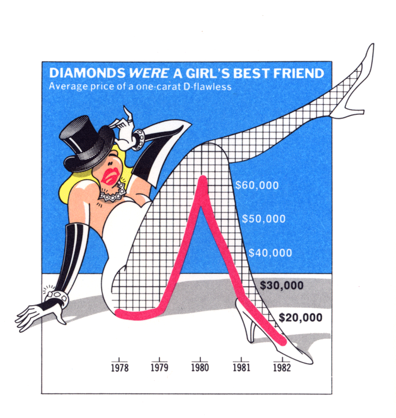
 Data visualization should be visually appealing but not at the expense of loading a chart with unnecessary junk, as shown in the image on the right.
Prof. Edward Tufte 3 principles of Graphical Excellence (see The Visual Display of Quantitative Information) say:
Give the viewer
One common error(or misleading tactic) is to change the axis to increase the size of effect.

Fig. 2: Misleading Visualization: Same Data, Different Axis.
Ok, so we mention how to avoid making a bad visualization.
How do we make a good data visualization?
To do that, choose the right type of chart for your data:
However, you can go beyond 2 dimensions by also using color, labels, and size to effectively represent additional dimensions.
Here is a toy example with US Presidential elections since 1976 (based on this data).
Below is an example of how not to visualize this data.

Fig. 3: US Presidential Elections, 1976-2016, bad visualization
It is bad for several reasons:

Fig. 4: US Presidential Elections, 1976-2016, better visualization.
Sometimes the story you want to tell may require a non-standard visualization, even if it requires some manual editing.
Good data visualization matters a lot on social media.
My most successful post on LinkedIn got over 23,000 views, mostly on the strength of the visualization below (Fig. 5) that compares Gartner Magic Quadrants for Data Science Platforms in 2017 vs 2016. This visualization overlays quadrants for 2 years and uses arrows to show significant movement of firms between the years. Color is used to show positive movement (green), and negative one (red). New entries are shown as green circles, while dropped firms are crossed with red X-s.
Fig. 5: Gartner Magic Quadrants for Data Science Platforms compared, 2017 vs 2016.
Overall, you see both the current positions in MQ and changes quite clearly.
What do you think makes a good data visualization?
References:
This excellent map by french engineer Charles Minard effectively tells the story of advance and disastrous retreat of Napoleon army in Russia in 1812.
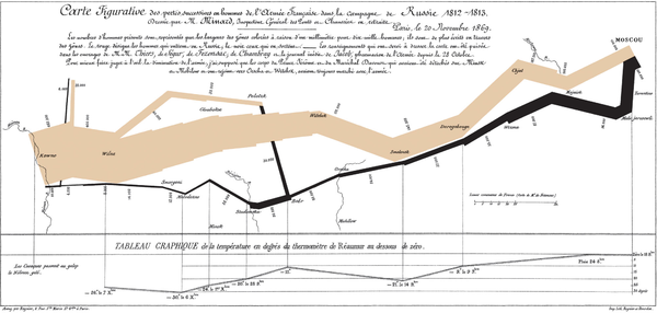
Fig. 1: Napoleon campaign into Russia in 1812, Charles Minard map
The map shows several key variables: the size of Napoleon army (width of the bar - one mm indicates 10 thousand man), location on a map; temperature (on second scale), direction of travel, and time.
Data Science is more than just building predictive models - it is also about explaining the models and using them to help people to understand data and make decisions. Data visualization is an integral part of presenting data in a convincing way.
There is a ton of research of good data visualization and how people best perceive information - see work by Stephen Few and many others.
Guidelines on improving human perception include
- position data along a common scale
- bars are more effective than circles or squares in communicating size
- color is more discernible than shape in scatterplots
- avoid pie chart unless it is for showing proportions
- avoid 3D charts and reduce chartjunk
- Sunburst visualization is more effective for hierarchical plots
- use small multiples (even though animation looks cool, it is less effective for understanding changing data.)
From Data Science point of view, what makes visualization important is highlighting the key aspects of data - what are the most important variables, what is their relative importance, what are the changes and trends.
 Data visualization should be visually appealing but not at the expense of loading a chart with unnecessary junk, as shown in the image on the right.
Prof. Edward Tufte 3 principles of Graphical Excellence (see The Visual Display of Quantitative Information) say:
Give the viewer
- the greatest number of ideas
- in the shortest time
- with the least ink in the smallest space.
One common error(or misleading tactic) is to change the axis to increase the size of effect.
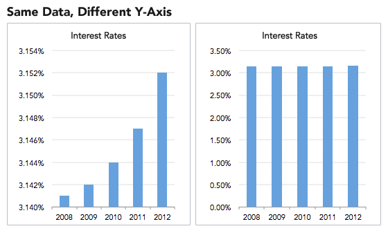
Fig. 2: Misleading Visualization: Same Data, Different Axis.
Ok, so we mention how to avoid making a bad visualization.
How do we make a good data visualization?
To do that, choose the right type of chart for your data:
- Line Charts to track changes or trends over time and show the relationship between two or more variables.
- Bar Charts to compare quantities of different categories.
- Scatter Plots show joint variation of two data items.
- Pie Charts to compare parts of a whole - used them sparingly since people have hard time comparing the area of pie slices
- You can show additional variables on a 2-D plot using color, shape, and size
- Use interactive dashboards to allow experiments with key variables
However, you can go beyond 2 dimensions by also using color, labels, and size to effectively represent additional dimensions.
Here is a toy example with US Presidential elections since 1976 (based on this data).
Below is an example of how not to visualize this data.

Fig. 3: US Presidential Elections, 1976-2016, bad visualization
It is bad for several reasons:
- First, the percent of popular vote is not the most important variable, since US elections are decided on Electoral college votes, not popular votes. Better chart should show both popular and electoral votes.
- Second, the scale arbitrarily starts at 40%, unfairly magnifying the differences.
- Third, in some elections (1980, 1992, 1996, 2000) there were 3rd party candidates that got significant number of votes. A better way to show the competitiveness of an election is to look at the difference between the winner and the 2nd place, in both electoral college and popular votes.
- Finally, the use of colors for different bars is very distracting and does not convey any useful information. Better use of color is for the party, for example, blue for Democrats, red for Republicans (as is now conventionally used).

Fig. 4: US Presidential Elections, 1976-2016, better visualization.
Sometimes the story you want to tell may require a non-standard visualization, even if it requires some manual editing.
Good data visualization matters a lot on social media.
My most successful post on LinkedIn got over 23,000 views, mostly on the strength of the visualization below (Fig. 5) that compares Gartner Magic Quadrants for Data Science Platforms in 2017 vs 2016. This visualization overlays quadrants for 2 years and uses arrows to show significant movement of firms between the years. Color is used to show positive movement (green), and negative one (red). New entries are shown as green circles, while dropped firms are crossed with red X-s.

Fig. 5: Gartner Magic Quadrants for Data Science Platforms compared, 2017 vs 2016.
Overall, you see both the current positions in MQ and changes quite clearly.
What do you think makes a good data visualization?
References:
- What makes a good visualization, David McCandless, Information is Beautiful
- 5 Data Visualization Best Practices, GoodData
- 39 studies about human perception in 30 minutes, Kenn Elliott
- Data Visualization for Human Perception, landmark work by Stephen Few (key ideas summarized here)