Building Zoomable Line Charts in jQuery
Learn how to build zoomable line charts using FusionCharts’ core JS library and its jQuery charts plugin, and get started making some beautiful data visualizations for the web.
By Rohit Boggarapu, @4two2.
In my last article - ‘getting started with data visualization’ - I used FusionCharts’ core JavaScript charts library to build a simple bubble chart. But since many people don’t use vanilla JavaScript in building modern day web applications, I decided to build today’s project using jQuery - one of the most popular JavaScript libraries.
In this tutorial, we are going to build zoomable line chart using FusionCharts’ core JS library and its jQuery charts plugin. Zoom line charts are best suited for plotting tens of thousands of data points all at once. In this chart type, you begin with a bird’s eye view, and then use zoom & scroll features to have a microscopic view. It also supports ‘pin’ functionality using which you can compare non-adjacent datasets.
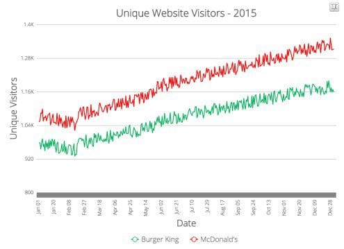
Here is a look into our project (link to JSFiddle demo):
Go to the live demo linked above and try zooming, scrolling and pinning features to experience the power of zoomable charts.
Four Step Process to Building a Chart in jQuery
This time as well, I have divided the complete process into four easy-to-understand steps:
- Step 1: Structuring the data
- Step 2: Including required dependencies
- Step 3: Creating and selecting a container for chart
- Step 4: Inserting the chart
Now, let’s explore each step in detail.
Step 1 - Structuring the Data
Line charts with zoom feature make sense only when you have large quantities of data that you want to visualize. For example, for this project I have taken random data to represent unique website visitors of two websites. Although this sample is relatively small, you can plot tens of thousands of data points using the same chart.
Once you have the data, it’s time to structure it in a format that our charting library understands. Here is that format for the two series we want to plot:
"dataset": [{
    "seriesname": "Burger King",
    "data": "978|976|..."
}, {
    "seriesname": "McDonald's",
    "data": "1053|1057..."
}]
In the above code snippet, we are forming a dataset array. It has two objects - one for each series. Inside each object we have a data string which will have data for individual series (separated by ‘|’). If this is going over the head a bit, head over to the source code on JSFiddle to understand it better.
In the same way we define categories array to specify the string of data labels that will be rendered along the x-axis. (Jan 01, Jan 02,…)
"categories": [{
    "category": "Jan 01|Jan 02|..."
}]
Step 2 - Including Required Dependencies
As the next step we start setting up our page by including required JavaScript dependencies through HTML <script> tags. First one is jQuery library. Include it through CDN or your own server. Next is FusionCharts’ core JavaScript charts library, and final is its jQuery charts plugin.
This is how we include above files:
<!-- jQuery-->
<script type="text/javascript" src="/location/of/jQuery"></script>

<!-- FusionCharts JS file-->
<script type="text/javascript" src="/location/of/fusioncharts.js"></script>
<script type="text/javascript" src="/location/of/fusioncharts.charts.js"></script>

<!-- jQuery charts plugin -->
<script type="text/javascript" src="/location/of/jquery-plugin.js"></script>
Step 3 - Creating and Selecting a Chart Container
We are going to use an HTML <div> element to house our chart:
<body>
    <div id="zoomline-chart">a beautiful chart will load here.</div>
</body>
Next we select our container using jQuery’s $ selector:
$('#zoomline-chart')Note: every chart on your page will need a separate <div> container.
Step 4 - Inserting the Chart
As the final step we are going to insert the chart in our page using insertFusionCharts method provided by the jQuery plugin. Below is the jQuery code to do that:
(function() {
  $("#zoomline-chart").insertFusionCharts({
    type: 'zoomline',
    width: '100%',
    height: '500',
    dataFormat: 'json',
    dataSource: {
      "chart": {
        "caption": "Unique Website Visitors - 2015",
          // more chart properties
      },
      "categories": [{
        "category": "Jan 01|Jan 02..."
      }],
      "dataset": [{
        // contains data as explained in step-1
      }]
    }
  });
}());
Let’s look at some of the configuration options we have defined above:
type: defines the type of chart -zoomlinein our example.height: height of the chart.width: width of the chart (100% if you want to occupy full width of container).dataFormat: JSON, since we are using JSON. We can also use XML data format.chart: contains chart attributes like caption, background color etc. Explained in more detail in the next step “Customizing Your Chart”.dataset: the data for constructing the chart. Explained in detail in step-1 above.
Customizing Your Chart
Below are some of the chart attributes that you can use to customize looks and functionality of your chart:
caption: defines the heading of the chart - “Unique Website Visitors - 2015” in our example.bgColorandcanvasBgColor: these attributes define background color for the chart and canvas. Any hex color code is acceptable as input.yAxisMaxValue: controls the maximum value of Y-axis.
Above attributes are just tip of the iceberg, as I have only listed four out of possibly hundreds of attributes. For more information, please visit chart attributes page for zoom line chart.
Explore Further
If you want to use a zoomable line chart for your project, you will find below resources helpful:
- Official plugin page: head over to official jQuery charts plugin page to find out all the relevant information on it - docs, examples, GitHub repo.
- Developer center: make use of FusionCharts official documentation if you are ever stuck while making your charts.
As always, feel free to hit me on Twitter if you have any questions :-)
Bio: Rohit is currently a software engineer at Adobe. He loves developing cool things and writing for the web. When not writing code, you will find him either practicing Yoga, or talking about it. He is always up for a quick chat on Twitter.
Related: