Avoid These Common Data Visualization Mistakes
Data Visualization is a handy tool which can lead to interesting discoveries about the data, which otherwise wouldn’t have been possible. But, there are common mistakes which could produce the misdirecting results. Learn what are they and how you can avoid them.
By Alex Ivanovs, Stack Diary
We tend do believe in facts displayed to us via data visualizations. In his article in The Guardian, John Burn-Murdoch, attributes this predisposition to the way information is presented to us during our education. While text is frequently presented to students for critique, diagrams and data visualizations are overwhelmingly used simply as a medium of displaying final results. Consequently, it’s easier for us to read a text with a critical approach than to look at a well-presented map or line graph and stay alert to logical or methodological mistakes. This combined with our confirmed by sciencepreference for the visual content, leaves a lot of space for data abuse and spreading of misinformation. Read on about most common data visualization mistakes and don’t allow yourself to get carried away by pretty visual packages with no substance.
Problems with basic math
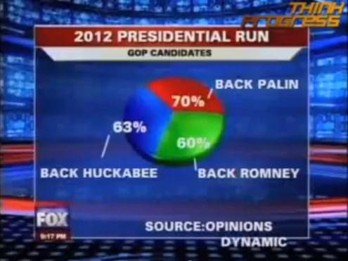
As surprising as it may sound, the most common data visualization mistakes are incorrect calculations like in the example above from fox news. Usually charts are made up of scales or visual elements that should add up to 100 and create a whole. You would be surprised to see how many data visualization creators deserve to go back to high school math class, because it seems as if they forgot how to add or at least use a calculator.It’s most conspicuous and embarrassing in the case of pie charts. Sometimes the nature of the survey allows for more than one answer and the results won’t add up to 100. In this case a pie chart just isn’t the right data visualization choice. Even if the data you’ve collected is correct, the format of the pie chart renders it untrue.Make sure that the chart you’ve chosen supports the data you want to display. It should clearly show the relationships between numbers and give a meaningful result.
Acting without plan
You’ve made your homework and gathered a massive body of data you meticulously stuffed into Excel tables. Now you are feeling generous and you want to show your audience all the data you gathered. Consequently you create a clustered, meaningless chart which makes it impossible for the audience to figure out where and what to focus on.

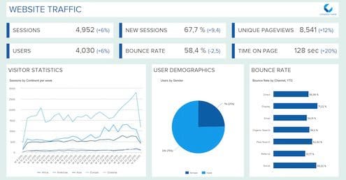
Over-complication negates the grounding principle of data visualizations – facilitating of data analytics.You can avoid this situation by starting out with a plan. Consider in advance what information you want to extract from your data or what is most important and useful for your audience. If you find it difficult to shuffle between various databases with different formats and sources of data, and you find the volume of data overwhelming, then turn to an online tool. There are many providers of data visualization tools out there who can help you out by providing an easy-to-use interface with the help of which you will be able to prepare dashboards like the one below yourself, with no programming skills needed.
Forgetting about the user
If you are the creator of the chart you clearly know the meaning behind every visual element. But don’t take anything for granted. Describe any visual element you display even if you will feel you are stating the obvious. Your audience may see it in a different way. Don’t forget to annotate all elements of the chart, add a scale and a legend. Visuals are great but sometimes they don’t suffice to carry all the meaning. Moreover, you can add some graphic elements to make the data even more meaningful – for example a trend line or any other benchmark they can refer too. Remember that although you’ve probably already analyzed that data and you know it by heart, your audience may see them for the very first time.
Surprising the user
People are used to seeing data displayed in a logical way, ordered by categories, alphabetically, sequentially or by value. We are used to the standard way of reading charts, with certain types of relationships between data displayed always in a given way, for example income growth year by year is usually a bar chart with years rising chronologically from left to right, and bars growing accordingly.

Don’t try hard to be original and deviate from this pattern like in the confusing example above. Be sure your visuals are as clear as possible even if it puts them on the verge of being obvious. Don’t confuse your viewers. Allow them to analyze data and draw insights as fast as possible. After all, that’s what data visualization is all about.

Bio: Alex Ivanovs (@stackdiary) is writing on web technology, small business, and marketing on his site Stack Diary and in such leading sites as Huffington Post, Shopify, and MediaTemple.
Related: